Mirror mirror on the wall….

As many of you know, I have a passion for mirrors and my home is full of them. At last count I had 27 and it's only a two bedroom apartment!  

You can't have too many mirrors in the home. Apart from their functional purpose, they are a superb way to bring light into a space, can be used as artwork or generally to enhance the aesthetics of a room.

Here are some of the mirrors in my home and how I've used them.

Read more

Decorex 2016 here we come!

On Tuesday my friend Jane Fitch, also an interior designer, and I made our annual pilgrimage to Decorex at Syon Park. Decorex is internationally renowned for being THE event to discover the very best and most coveted products from 400 exhibitors.  Decorex has been running for 39 years and this is the third year that I have been.

We were not blown away by much this year as it was very much the same exhibitors as last year. However some new blood gave a much needed injection of interest.  I've included below a few newcomers as well as some highlights.

Naomi Paul beautiful crocheted lampshades were a feature in the VIP lounge as well as on their stand. Their ethos is to create beautiful functional textile objects by highly skilled craftsmanship and they certainly have achieve this. The lampshades are simple, stylish and elegant.

Bert and May are another newcomer to Decorex. They are committed to raw materials, natural pigments and fine craftsmanship which they certainly have achieved in their products. They launched a fabric range at Decorex which were beautiful subtle colours and bold geometric designs.

Santorus is another exciting newcomer. Brother and sister, Fabian and Tara have a rich cultural heritage of Indian and Italian parents and their products certainly reflect this. I adore the patterns and colours of their fabrics and wallpapers.

Tom Raffield is a relative newcomer to Decorex.  Their beautiful wooden lighting and furniture are made in a woodland workshop in Cornwall where the company is based. 

Tom Faulkner is not a newcomer to Decorex but I am always interested in visiting their stand and seeing their exquisite handmade furniture.

No visit to Decorex would be complete without a vist to the Ochre stand. I am always in awe of their celestial pebble light!

There is always the obligatory over-the-top glitz and these Murano chandeliers by iDogi were no exception! 

I always look forward to the floral displays on the exhibition stands but they were few and far between this year and very disappointing. The one that stood out for me was on the Sir John Soane Museum stand which was designed by Ben Pentreath and the magnificent display of dahlias was grown and designed by Ben's partner Charlie McCormick.  This stand stood out from all the others for its design and colour.

To finish this whistlestop tour, here are a few more shots that I took.

I hope you enjoyed seeing a few of the highlights of Decorex.  It was a long day as there were over 400 stands to see.  A few glasses of bubbly in the VIP lounge with canapes helped to keep up our energy levels!

Did you go to Decorex this year? What did you think of it and what were your favourites? I would love to hear so do drop me a note.


You may also like to read

Give a piece of furniture a new lease of life

I'm a great one for up-cycling furniture with a lick of paint rather than get rid of it.  I usually paint with Annie Sloan chalk paint as it's so easy to use - no prep required and you can paint it on any surface including on fabric!  However this time I wanted a specific colour which doesn't come in the Annie Sloan range so I opted for Farrow & Ball which had the exact colour.

I'm a huge fan of Farrow & Ball paint and I have used it throughout my home. Most, if not all, my clients have F&B throughout their homes. I particularly like the way F&B split their neutrals into six groups which makes it so much easier for people when trying to choose a neutral colour(s).  In fact I use the six neutral groups as the basis for my colour talks.

Read more

Headboard or Artwork in a Bedroom?

Do you have a headboard on your bed? Many of us don't. So what alternatives are there?   Mirrors, artwork, wall hangings.......... ?

In one of my bedrooms the bed has no headboard so I have added a very narrow bookcase on which are two lamps. However the wall above that was completely empty and crying out for a wow factor alternative to a headboard. 

I recently purchased a boxed set by Natural Curiosities of 14 x 14 inch square prints called 'Images for the Inquisitive - Volume 12 - Hortus Eystettensis'. They bear the authentic Latin name of an important 1613 collection of engravings of every species in the palace garden of Prince Bishop of Eichstätt in Bavaria).  The box had been sitting in a cupboard and this was the perfect opportunity to have some of them framed and placed as art decor behind the bed.  I used my wonderful picture framers, Read and Booth, in Wandsworth Bridge Road, London SW6, who helped me select nine of the prints and a suitable frame (with no mount).  I planned to hang them 3 x 3 to add a real sense of drama to the room. The ceilings are very high in the room so there was plenty of space below the picture rail.  I also painted the lamp bases in Annie Sloan's 'Aubusson Blue' and bought a pair with a lovely botanical fern pattern pleated shades by Pooky Lighting

In the other bedroom there is a headboard but the wall above the headboard needed something on it to complement the headboard and add a wow factor.

I had forgotten all about a very old book of Pierre-Joseph Redouté rose prints that was my grandmother's. Belgian born Redouté achieved success as a painter working for the French royal court as a tutor to Marie Antoinette and later from 1798 was appointed to paint the flowers of Malmaison by Josephine Bonaparte. His famous published works include 'Les Liliacées' and 'Les Roses'. This version of 'Les Roses' was published in 1954 and I had rescued it from my grandmother's house in New Zealand when she passed away over 40 years ago!!  I had a light bulb moment and decided to create a group of framed rose prints above the bed as the colours would beautifully complement the headboard and the colours of the cushions and Kantha throw. Also, the wall colour, Farrow & Ball 'Teresa's Green' would provide the perfect colour to enhance their beauty. Once again my lovely framers, David and James from Read and Booth helped me select the eight prints from the book and a suitable frame. The frame is a reddish-brown wood which really works well with the background colour of the prints and the red/pink colours of the roses.

I hope I have inspired you to use art in a bedroom in place of a headboard or even to enhance a headboard.  I would love to see what you have done with the wall above your bed(s) so do send me pics.


You may also like to read

Inspiration from the colours at the Isabella Plantation

It's that time of year when the azaleas and rhododendrons are in flower and what better place to see them in all their glory than the Isabella Plantation in Richmond Park.  For those of you who aren't familiar with this London landmark, the Isabella Plantation is a 40 acre woodland garden set within a Victorian woodland plantation planted in the 1830s. It was first opened to the public in 1953 and it's best known for its azaleas which line the ponds and streams and are at their best in late April early May.  Given the bad weather we've had recently they are a bit behind schedule and should be at their best about next week.  The Plantation also is home to a wide variety of rhododendruns and many other rare and unusual trees and shrubs.

It's amazing how much inspiration for interior decoration you can gain from looking at nature and what better than a display of colour from acres of azaleas and rododendruns!!  Their colours are simply mind-blowing when seen in a condensed area as they are in the Plantation.

When we arrived, we immediately entered the bluebell wood which had this sea of blue beneath the canopy.  I was pleased to note that the bluebells are English bluebells and not the pesky Spanish bluebells which seem to be invading our woods.

It had rained heavily in the days leading up to our visit and also the night before so everything was heavy with rain and there was a lovely mist across the Plantation. However it was warm and the paths were not too soggy. I actually preferred to be there without direct sunlight as it's better for photography and also the azaleas and rhododendrons were only half out which made them a lot more interesting to view.

There is a huge variety of trees in the Plantation and some very beautiful trunks, especially after the rain.

Before I get to the azaleas which are obviously the star of the show, there are so many other features of the Plantation, not the least the pocket handerchief tree which my sister is totally obsessed with!!

The rhododendrons are also a feature of the plantation but had only just started to flower.

There are other interesting plants in the Plantation (I'm keeping you in suspense with the azaleas!)

And now for the star of the show, the azaleas. They were only 50% in flower but actually I preferred to see them like this than in full bloom

If you are in London in the next week or two, take the time to visit the Isabella Plantation as it really is a very special place.


You may also like to read

Back to Petersham for inspiration and sourcing

Hi everyone.  I went back to Petersham Nurseries this week armed with my Nikon D5500 camera.  It was a sunny but cold day and I decided to take a walk along the Thames before lunch (Petersham Nurseries is a stone's throw from the river).  There was even someone launching a boat and taking a jaunt up the river, despite the cold.

Along the river bank I found some pretty delicate wild flowers

I branched off the towpath along the river into the woodlands of Petersham Lodge.  Signs of spring were everywhere:

The woods led to a pretty iron gate that separates the gardens of Petersham Lodge (which are private) from the woodlands. 

The Belted Galloways are back in the Petersham Meadows by Petersham. Dogs are banned during the grazing season, April to October.

I returned to the Nurseries and spent time before lunch taking photos in the cutting garden where there was a superb display of tulips.

There were so many beautiful flowers to photograph

And of course the highlight of my visits to Petersham is the shop. I love the way it is styled with plants, flowers, furniture, accessories etc.  And I am always tempted to buy something!

These two beautiful bowls of flowers greeted you as you enter the restaurant

SEEKING STYLE INSPIRATION?

If you’re working on your own home decorating project and looking for some inspiration, please get in touch and see how I can help. 


You may also like to read

Upcycle with Annie Sloan paint

As many of you know, I love upcycling furniture with Annie Sloan paint. I use this paint because it doesn't involve sanding or undercoating - you just slap it on and away you go!

I have recently had a bit of a binge of painting pieces of furniture that I've been procrastinating about for nearly a year. 

My favourite Annie Sloan colours are Graphite and English Yellow.  This 50s cabinet was first up - English Yellow at the back and Graphite everywhere else.  I was given this piece of furniture by someone who was getting rid of it and I was going to sell it but I rather like it now that it's painted. No distresssing on this piece, just Annie Sloan clear wax.

Next up was this little vintage Hungarian table which I use for my printer. It was already painted in a hideous yellow gloss paint (sorry no "before" image) so I decided to give it a dousing in English Yellow with distressing.

While I was on a roll with the English Yellow, next up to get a dousing was a gilt mirror that I bought in a second hand shop two years ago for £20.  I fancied something different and fun so it certainly scores on both these points. I may add more dark wax into the crevices but for now it gives a lovely sunny warmth to the kitchen.

Next up, my workstation. This is a cupboard that I use for my work and the yellow mirror sits on top of it.  It was painted in a dark grey gloss paint and I prefer a chalk paint finish. Once again I used Graphite.  However this colour can look a bit dull on some textured furniture and that's what's happened here. This can be resolved with a coat of dark wax over the clear wax.

The biggest success was the next item, a gilt mirror that I have had for 5 years and never really liked.  Sometimes it's all about trial and error when painting furniture so do have a go. Mix colours together, put one colour on top of another, use a wash (diluted 50/50 paint/water) etc etc.  On this mirror I've used Aubusson Blue and Old White then clear wax and dark wax.  It is a stunning transformation and the shape of the mirror is really enhanced (sorry no before pics).

The jury is out on the next piece -  I don't like the finished look.  The table was originally a light grey/green colour when I bought it (first image below), then I painted it Graphite. I should have left it at that because now the effect doesn't suit the elegance of the table.  So it's back to the drawing board with this piece. As I say, trial and error!!

I'd love to hear about pieces of furniture that you have painted in Annie Sloan and see some images so do share them with me.


You may also like to read

Make a statement with your table lamps

Hi everyone.  Firstly I must apologise for the lack of blog posts in the last few weeks; in fact since 5 March when I posted the last one.  I've had a manically busy few weeks having taken on a number of new clients. Also, I am preparing for a photo shoot of my flat in mid April which has been stressing me out somewhat.  So I've been furiously upcycling some of my furniture with Annie Sloan paint (separate blog post shortly) and changing lampshades on all my table lamps.

Table lamps can be so boring and serve no other purpose than to provide a lighting source. Gone are the days when you only had a limited choice of shades, mainly 50 shades of beige or cream!!  Now you can buy the most divine shades and make a real statement, a wow factor, even if the lamp base is a bit "meh".    The reverse is a statement lamp base with a plain shade that doesn't compete.   However, beware as you can spend hundreds of pounds on a lamp shade and even thousands of pounds on a lamp base.  It's a matter of finding something affordable and you really love.

There is a great shop in London called Pooky Lighting which sells affordable and fun lamp bases and shades so I popped in and bought three pairs of lampshades for the bedrooms and kitchen.  What a difference they have made to the rooms; the lighting has transformed the spaces from "meh" to "tah-dah" !!!


In the kitchen I changed the shades from plain taupe coloured silk to these gorgeous silk Ikat pleated shades by Pooky Lights.  In the sitting room I replaced a pair of beige linen shades in the alcoves with black & white Ikat ones which really draw the eye in.

And finally, I bought a rather expensive but absolutely divine lamp base from Nicholas Haslam designed by Paolo Moschino.  It is my piece de resistance but one of those items that you see and just have to have!!  It is solid handcarved brass and it was the way it opened up like a flower and had such beautiful flowing lines that made me fall in love with it.  The jury is out on whether any of my friends like it !!

I would love to hear what sort of table lamps you have and would be happy to offer some advice if you are thinking of changing them so do contact me.


You may also like to read

Inspiration for home styling

As regular followers of my blog know, one of my favourite haunts is Petersham Nurseries which is about 20 minutes from my home. It's somewhere I go for inspiration and to take photos. It gets my creative juices going and all I want to do is take loads of photos and buy lots of plants and items for the home!  I've become quite obsessed with photography since I invested in my first DSLR camera, a Nikon D5500. Macro photography is my passion so Petersham is the perfect place to go as I can take closeups of flowers, plants and the gorgeous items for sale.

The way they style the shop and the glasshouses with plants and flowers is absolutely superb. And there is the added bonus of great food and coffee in the cafe or if I want to treat myself, the other end of the glasshouse where the shop is located is a Michelin star restaurant!  The floors in the glasshouses are just earth, even in the Michelin star restaurant but that's what makes Petersham so unique. 

If I have some free time and the sun in shining my first thought is to head to Petersham.  I could bore you with loads of superlatives but I'd rather stimulate your creative juices with a visual feast. It's not the same as being there in person but it gives you a good idea of why I love the place so much.

Some advice when looking at the photos below. Look at the way they style the items in the shop as this should help you when you style your own home - the way they group items, colours they put together, textures etc.  This is one of the things that I really find helpful when I go there. I hope you enjoy my photography; don't all budding photographers aim to take the perfect photo?!

I'll start with some closeups of the flowers

I have a passion for vintage chandeliers and Petersham always has a range of the most beautiful ones (in fact I bought a small antique French chandelier from them a few weeks ago which is being wired up currently and will then have pride of place of my kitchen table). 

The sun was shining on one particularly large chandelier this time, and I was mesmorised by the colours in the crystals so became rather "trigger happy" with my camera. These images come with a health warning - you may need your dark glasses on !

There was a lot of new stock in the shop since I was last there a week ago and quite a number of ceramic pots with incredible shapes and textures. You can see from the scale of the small items next to these pots the sheer size of some of them.

Petersham always has a good selection of vintage mirrors. I have bought quite a few over the years and recently have been buying some of their convex mirrors in various sizes.  And then there are so many other interesting items on display which you think "I want that" but then "where can I put it in my home?" and then "oh heck, who cares, I just want it" and you go ahead and buy it !!

I hope you enjoyed these images and that they have given you some fresh ideas about how to style your own home. If you have any questions or comments, please don't hesitate to contact me.


You may also like to read

Top tips for buying & arranging flowers for your home

Hi everyone. Sorry for the lack of blog posts recently; I’ve been manically busy with client work.  Can’t complain, quite the contrary but something has to give and it’s usually my blog.  I am continually asked by friends and clients to write a blog post about how to arrange flowers in the home so here goes.

There are so many places to buy flowers – florists, markets, outdoor stalls, petrol station forecourts, local shops etc – but it’s the supermarkets that have usurped most of these outlets. How many of you are regularly tempted to buy flowers when you are in your local supermarket? I for one am guilty of it – the flowers are so reasonably priced and always fresh so it’s hard to resist the temptation. However the selection is limited and there are always so many awful mixed bunches of flowers (even worse in petrol station forecourts) where they mix one of every colour and every variety.  Avoid these like the plague and NEVER give them as gifts to someone who loves flowers!

But what do you do with the flowers when you get them home?  So many people just jam a bunch into a vase with some water and hope for the best.  No wonder they never look good and don’t last as long as they should.

Here are my top tips for flowers in the home:

1. Best shaped containers have a narrower opening than the base - try to buy containers like this as they allow the flowers to fan out better. However for flowers like daffodils, narcissi and tulips a straight sided container works well as it will emulate how they grow, straight!

2. Monotones work best – buy flowers that are one colour as monotones create the most impact. Of course there are exceptions to this rule - mixed colours of the SAME flower, for example, tulips are rather lovely in mixed colours though I still prefer them in monotones or two colours (as you can see in the images below). 

3. Prepare your flowers well before putting in a vase - strip off a lot of the foliage on the stems so that it isn't sitting in the water getting smelly!  Also, the foliage takes nutrients so if there is less the flower will have a better chance of survival.  With roses, remove any thorns as they also take nutrients.  Always cut the stems on a diagonal and with any woody stems (stock, hydrangeas, blossom, pussy willow or any other hard stemmed flowers or greenery) cut a slit vertically up the stem as well, about half an inch (see image below).

4. Don't waste anything - when stripping the stems of foliage there are often offshoots. Don't throw these away, put them in little vintage bottles on a window ledge or a small vase. I waste nothing!  Freesias and hyacinths are classic examples where they have a lot of offshoots that look like they will never flower but usually they will.

5. Keep the vase clear of water marks - I add a drop of bleach to the water AFTER I've filled the vase (if you do it before you add the water it will create a lot of froth) and this stops the water smelling and any water marks on the vase (crucial with glass containers). I also add a sachet of flower food.

6. Keep it simple! - Don't always feel you have to add foliage to flowers that have their own foliage as it just detracts from their beauty.  Less is definitely more! Flowers should look as if they are growing especially spring flowers like tulips and daffodils. You would never see Eucalpytus growing in the middle of a clump of daffodils! Same with roses, they have beautiful leaves so don't add anything else.

7. Try and buy flowers that have their own foliage -  They look so much more natural in a vase with their own foliage. I'm particularly fond of spring flowers and dahlias with their own foliage.  Unfortunately most of the retailers sell them without leaves but I've managed to find them in my local florist and local market stall.

8. Use flowers to style a room - flowers are a great way to add colour to a room but don't forget they can also add texture, height, scent and of course to create a focal point.  Here are some examples of how I've used flowers in my home this week:

9. Do it on a budget - it doesn't have to cost you a lot of money to style your home with plants and flowers. If you buy carefully and look after your flowers you can create multiple containers of beautiful flowers, some large and some very small, that will last you several weeks (or even longer).  Here are some that I have in my home currently, both inside and outside.

I hope these tips will help you to enjoy buying flowers for your home.  If you have any questions or comments please don't hesitate to contact me. I'm always happy to help!


You may also like to read

Look at the outdoors to inspire your interior style

Hi everyone. We've had the most amazing few days in London rather like in the Nordics - freezing temperatures, clear blue skies, no wind and the most incredible sunrises and sunsets.  It's been such a mild winter until recently so a proper cold spell was long overdue.  However it only lasted until yesterday and today it rained and the temperatures rose to a balmy 11 degrees Celsius!

I took full advantage of the glorious sunny days being out and about with my Nikon D5500 DSLR camera. I'm still a total novice with it but it's less intimidating now and I'm actually starting to enjoy using it.  It is my first ever DSLR camera hence the trepidation.   But the photos you take on a DSLR (and NOT on auto setting I stress!) are fantastic compared to a compact camera aka point-and-shoot.

On Tuesday I'm sitting at my kitchen table working away when I suddenly felt the urge to be out in the sunshine taking photos so I donned layer after layer of warm gear (I ride a little Vespa moped so keeping warm is always a challenge) and headed to the Chelsea Physic Garden as it's snowdrop week there.  I am a member of this wonderful little garden which is older than Kew Gardens. It is a walled garden in the heart of Chelsea, founded in 1673 by the Worshipful  Society of Apothecaries for its apprentices to study the medicinal qualities of plants. It became one of the most important centres of botany and plant exchange in the world. It really is an oasis in the heart of Chelsea, flanked by the Embankment (constant traffic) and Royal Hospital Road which is quite a busy road, but you are hardly aware of the traffic once you are inside the walls of the garden.

I spent two hours wandering around photographing the plants.  It's winter so you wouldn't expect to see much in flower.  However, there were spring bulbs in flower and two of my favourite plants in full bloom and creating both a visual and sensual impact - Wintersweet (Chimonanthus praecox) and Daphne bholua 'Jacqueline Postill'. 

I always use the outdoors to inspire my interior design and styling.  Here are a few tips to help get you started:

1. Look at the way the colours of flowers work together in gardens. For example, you may not dream of using purple & orange or pink & orange in a colour scheme but they work brilliantly outdoors.  If you are afraid of colour, do some "interior gardening" and bring indoors plants and flowers in bright colours (even clashing colours). This is an inexpensive way of introducing colour and if you can't cope with the colour you can just remove it!!

2. Look at the textures and layering in a garden as these add so much interest.  Most people never think of this when styling their homes so everything is very one-dimensional.  Stimulate the sensesby aiming for at least three different textures - introduce these with cushions, throws, rugs, lighting etc. For example, glass, wool and velvet - a chandelier, a sheepskin rug and velvet cushions - and voila, you have textures and layering.

3. Never stop looking at the outdoors and visually framing scenes as if they were rooms.  This can really help when you are trying to decide how to style a room. For example, different heights are really important - try using floor lamps, tall vases of flowers or plants on a mantelpiece and compilations of artwork and furniture of different heights. 

4. And don't forget weights of colour. We are environmentally conditioned to think that darker colours should go lower down, something to do with the earth beneath our feet and the lightness of the sky and air above. so we are subconsciously emulating the outdoors with which we are both familiar and comfortable. However, it doesn't have to be the rule of thumb and there are a lot of people bucking the trend and painting walls & ceilings in dark colours and having a lighter coloured flooring.  Either way, remember to mix up the shades of colour.

Enough said, and now I want to share with you some of the photos I took at the Chelsea Physic Garden, the best of them. It's a visual feast of colours and textures and hopefully will stimulate you to look at your interiors differently. Please note that these photos are all unfiltered, not Photoshopped, exactly as I took them on my Nikon.

I hope you enjoyed looking at these photos and that they have inspired your interior styling.  If you are London based and would like some help/advice, give me a call. I offer an initial free consultation and then I charge by the hour so you can use me as little or as much as you wish.

You may also like to read

Make your New Year's Resolutions enjoyable!

Happy New Year everyone. As you may have noticed, I took a couple of weeks' break from blog posting over the festive period.  This was due a busy social calendar and also I was helping my older son pack up his life in London and move to Sydney to live, where my other son has been living for over two years.  It's a weird feeling to have one's children all living on the other side of the world; now I know how my parents in New Zealand felt with all three of their children living 12,000 miles away. However technology has moved on from when we left home and communication was restricted to letters, faxes and (land line) phone calls. With Skype, Facetime and free calls via tools like Whatsapp and Viber, the distance feels much smaller especially when you can see your children on your phone or computer.  Hey ho, at least I have a good reason to visit Sydney regularly!

I'm sure many of you have made serious lists of new year's resolutions.  There are all the usual things that people have on their list of new year's resolutions, the self-flagellation things like no alcohol for January, joining a gym, losing weight, not spending any money and so on.  I'm of the opinion that our new year's resolutions should be about doing things we enjoy especially creative things, stretching ourselves by getting out of our comfort zones.  For example, I'm going to learn how to dance salsa even though I'm a lousy dancer.  I know I'll enjoy it even if I don't master all those sexy hip movements!!

Below are five suggestions for some new year's resolutions that are both enjoyable and creative and will also develop you by making you push the boundaries:

1. Learn how to paint furniture - up-cycle your own items, those already in your home or ones you find at junk shops, markets or auctions. Find your nearest Annie Sloan stockist and sign up to an Annie Sloan Workshop to learn how to paint furniture with confidence and to achieve a professional finish.  I did the workshop three years ago at Phoenix on Golborne which is a fabulous shop and one of my regular haunts. I love the fact that you just slap on the paint - no sanding or undercoating - and eureka, you have transformed a piece of furniture!  You can paint any surface including silver, ceramic, wood, metal, walls etc. The day after I did the workshop I was so inspired I painted my mahogany sideboard which I had actually planned to get rid of.  I started with a coat of Aubusson Blue (my favourite colour) and then a coat of Florence - I adore both of these colours.  Then distressed it with a coat of clear wax, then dark wax and finally another coat of clear wax. It was so much fun transforming the sideboard and gave me a warm fuzzy feeling when friends and family paid me a lot of compliments!!  At the end of this blog you will find links to other items I've painted. Please sign up to an Annie Sloan workshop; you won't regret it.

2.  Transform a room in your home with a strong colour - most people are terrified of colour and stick to decorating rooms with neutrals.  If you are one of these people, be brave and have some fun - transform a downstairs loo or walk in pantry or cupboard in a bold, strong paint colour or fabulous extravagant wallpaper. Loos are great places to have real fun with decorating.  Here are a couple of ideas: Farrow and Ball 'Stiffkey Blue' is a stunning darkish blue paint and looks stunning on walls.  You can also paint the ceiling and skirtings in the same colour or contrast these with white to complement the white loo and basin.  Or paper the walls with one of the divine Cole and Son Fornasetti II Acquario wallpapers (several colourways though I'm partial to the black background one).  Both these ideas can be seen in the two images below. 

3.  Take classes in something fun and creative - I've signed up salsa classes!  I'm no dancer and I know this is right out of my comfort zone but I am sure it will be really enjoyable (eeek!!).  I'm also going to learn how to play bridge. I've always thought bridge was for the "oldies" as I associated it with my grandma and mother but I'm constantly being proved wrong; it seems to be quite trendy these days and it is great for the brain!

4. Buy more flowers and plants for the home - I bang on about having flowers in the home in many of my blog posts (it's the florist in me!).  Flowers & plants are not only beautiful but they can be therapeutic to have around as they always make you feel happy.  I have them in most rooms and often they actually make me smile when I enter a room and see a vase of beautiful blooms.  They are also a great way to introduce colour into a neutral colour scheme. Be brave, be bold - buy purple and orange tulips and put them in the same vase as I love to do (my two favourite colours); pink and orange roses in the same vase; an orchid plant in the bathroom.  Just three suggestions. I'm not a huge fan of green plants but I do love flowering spring plants like hyacinths and daffodils so buy some of these when they are in season and put them in pretty pots around the house.

5. Be kind to yourself - Have a regular beauty treatment - I have found a local spa that offers a half hour back & neck massage for only £20 and the girl who does the treatment is absolutely superb.  I feel totally "filleted" after the massage and they always encourage me to chill out afterwards on their reclining sofas with a herbal tea for a half hour.  I struggle to get up after that and go home!!  I cannot stress enough how important it is to treat yourself - a manicure, pedicure, massage or other (just not a waxing as that's self-flaggation in my book !!!!!).

I hope you will consider some or all of the above five suggestions for your new year's resolutions.  Just remember to love yourself and you deserve to enjoy life a bit more. So less of the self-flaggation and more of the above tips!!

I'd love to hear of any resolutions that you have on your list that involve enjoyment and creativity as well as pushing you out of your comfort zone.


You may also like to read


Tips for decorating your home at Christmas

Christmas is only three days away!  If you haven't finished decorating your home here are some tips on preparing your home for the festive season:

1. Start the festive feel outside the front door with a Christmas wreath on the door. It's all about curb appeal!  This is a lovely welcome to anyone coming to visit.  Last year I decided to have a different sort of wreath so I bought a dried hydrangea one (see image below). This year I opted for a more traditional wreath made from fresh Norwegian spruce and decorated with real cones, dried oranges and apples to which I added some cinnamon sticks which exude a heady scent of spice.

2. Ensure you continue the Christmassy feel with a ta-dah moment once you enter the front door. I chose to do this with red Amaryllis in a tall vase and coloured lights (battery powered). 

3. Use fresh flowers and greenery in abundance.  I have a huge vintage preserving jar of holly in my hall and a large vase of scented Longi lilies in the sitting room and another in the kitchen. Don't forget poinsettias as they always create a splash of colour if you group them together. I prefer the white ones so have a couple of tiny plants which just one flower on each! 

4. You always need a pièce de résistance, a large Christmas tree. My preference is for a real tree but there's nothing wrong with an artificial one.  It needs to be placed where its beauty is maximised and can be seen from various angles and ideally reflected in a mirror.  As children we looked up at the tree so I ensure that my two sons can always look up at the tree so it needs to be taller than them - we're up to a seven and a half foot tree now!  I tend to decorate my tree in two colours rather than multi-coloured. This year it is silver and glass with pops of purple.

5. If you have children around over Christmas make sure there are decorations that can be appreciated by children. I have a little faux tree from The White Company that I place on a table in the hall and all the decorations are geared to children.  I also have five little straw angels with musical instruments that I bought in a Christmas market in Bratislava that children love.

5. Continue the festive theme by decorating your mantle pieces, stair rails, mirrors and other available surfaces.  I bought a lovely metal tree with glass tea light holders from Petersham Nurseries which I placed on my mantelpiece with sprigs of fresh spruce at its base.

I'd love to hear how you decorate your home for Christmas so do send me some comments.  May I take this opportunity to wish you all a very Merry Christmas.


You may also like to read

Find inspiration for Christmas at Petersham Nurseries

Hi everyone. I guess you are all frantically preparing for Christmas - decorating your homes and trying to decide what gifts to buy and what food you will eat.  I got off to a late start this year so on Friday I decided I needed some inspiration. So I headed to my favourite mecca for inspiration and soul soothing, Petersham Nurseries.  For those of you who are regular readers of my blog, I'm a sucker for Petersham and I've done quite a few blog posts on it. They are usually highly visual posts i.e. few words and loads of images, because Petersham is all about visual stimulation.  I therefore have decided that what you all need is few words and loads of gorgeous photos to feast your eyes on.  Hopefully they will inspire you on how to decorate your homes and your Christmas trees and also what gifts to buy. If you are lucky enough to live in London or the surrounding area, jump in the car and head over to Petersham.  Take a tray of coffee and cake into one of the glasshouses or a tray of lunch depending when you arrive.  Here's my coffee and delicious apple cake. Don't you just love these vintage painted distressed metal tables & chairs?

I took my new Nikon DSLR camera this time and spent three hours practising my photographic skills. I hope you are impressed with some of them; I'm very much a beginner but I'm really enjoying the learning curve!

I hope you enjoyed that.  Now it's back to the grind of lists and shopping. Bring on the festivities! 

I'd love to get some feedback from you about how you prepare your homes for Christmas so please write to me and I promise to respond!


You may also like to read


Inspiring locals with my 'Colour in the Home' talk

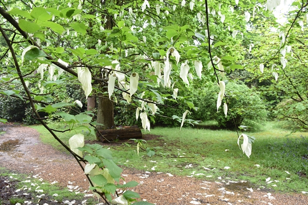
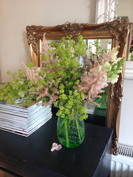
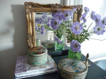
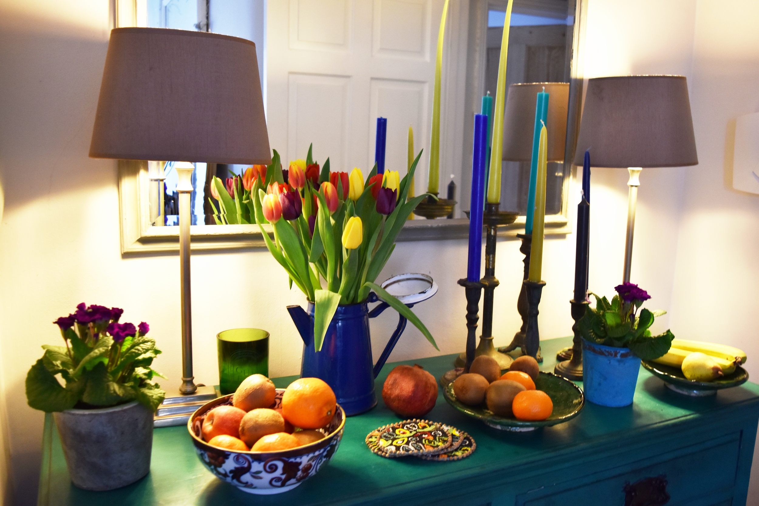
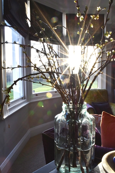
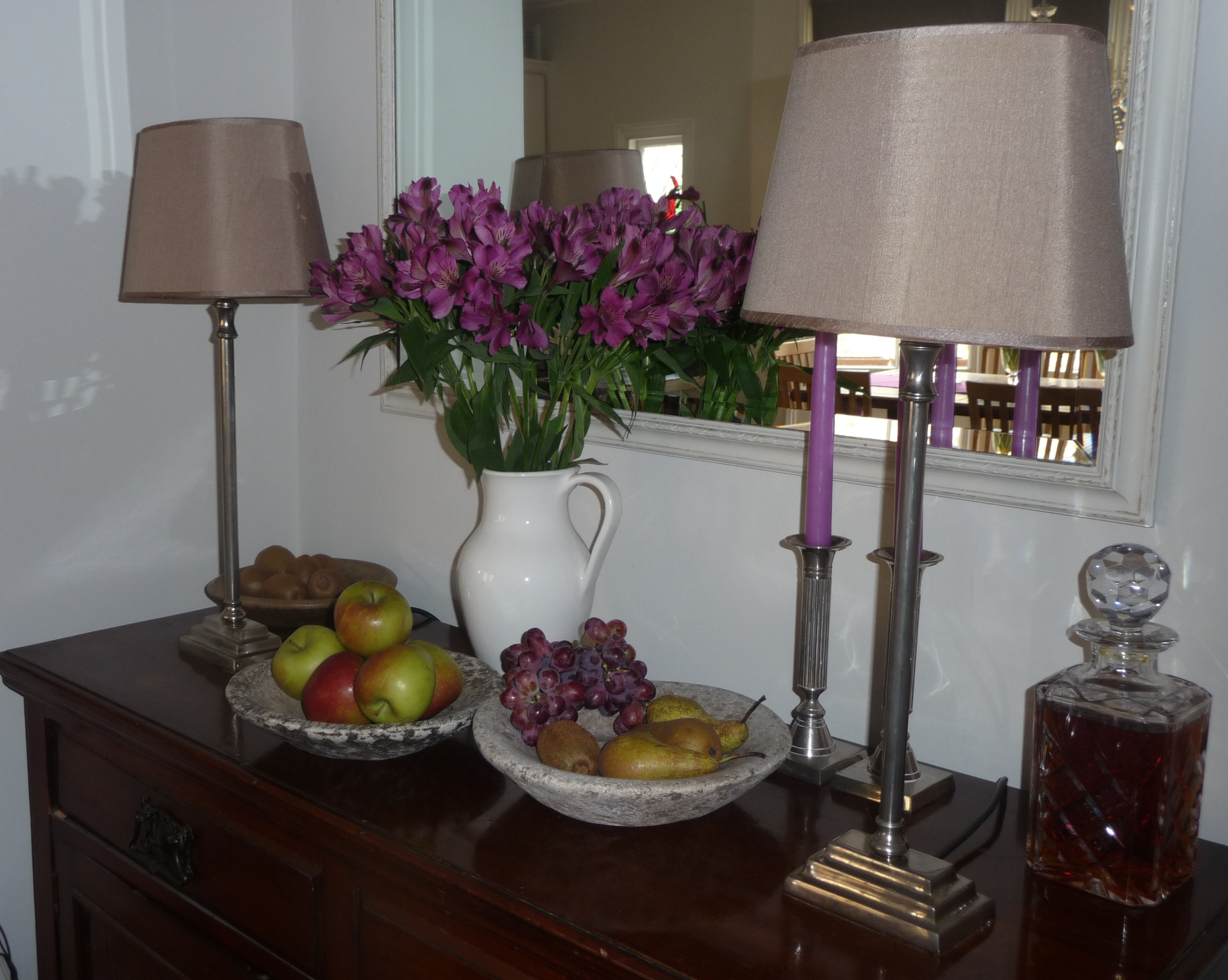
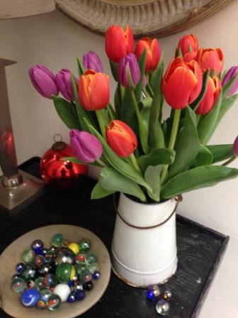
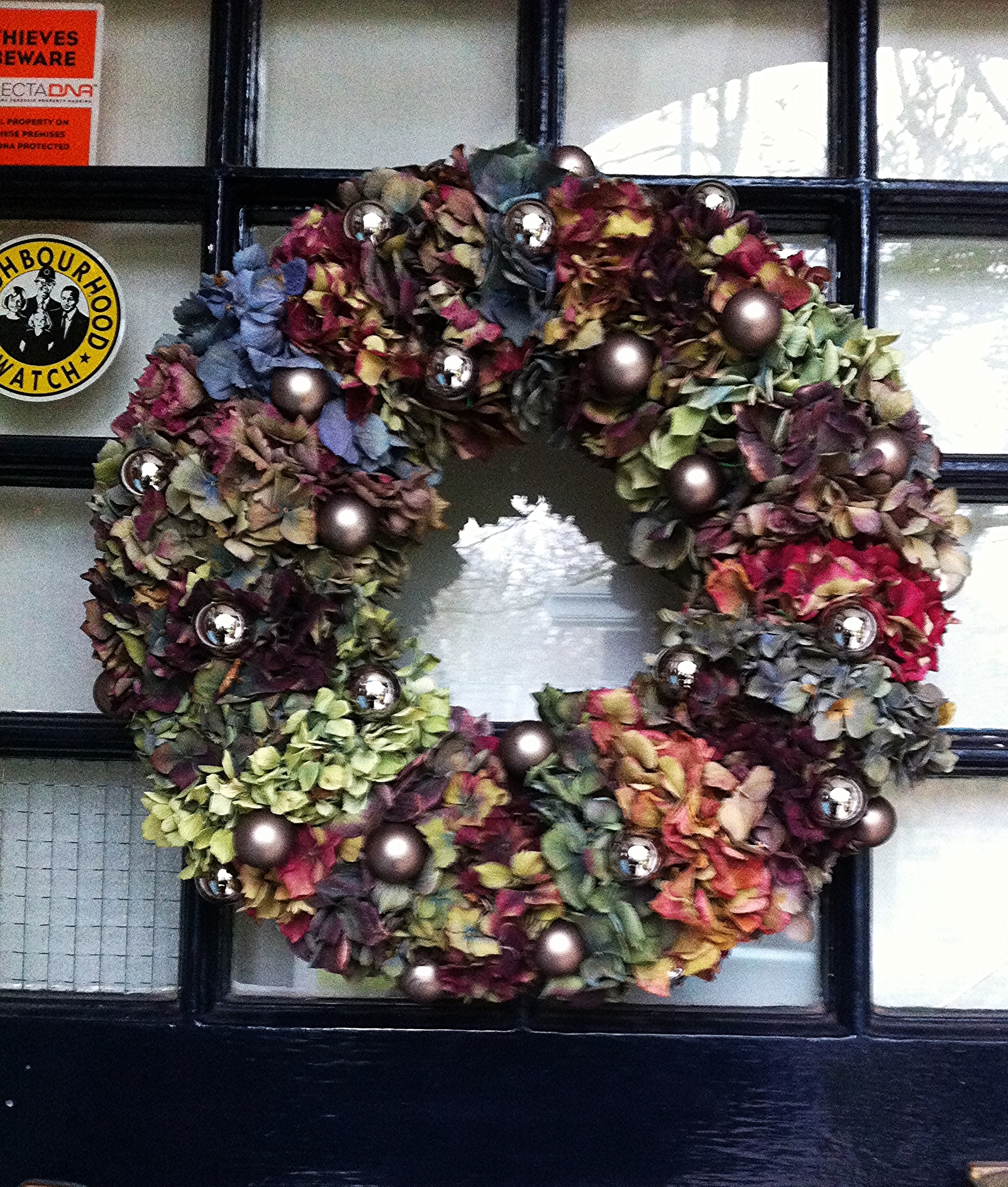
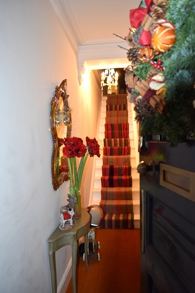
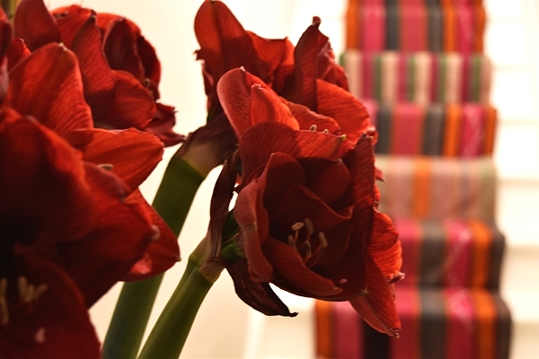
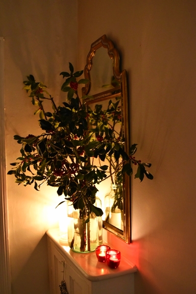
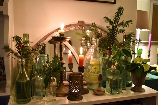
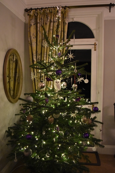
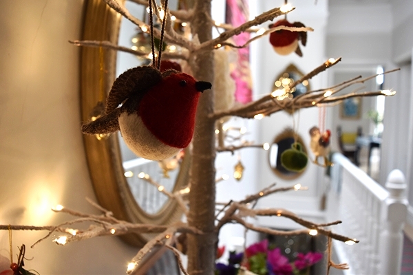
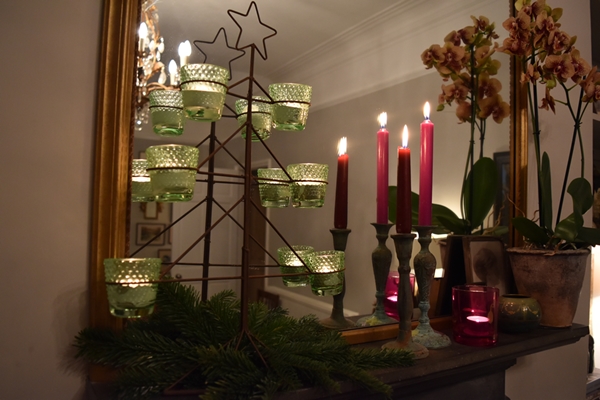
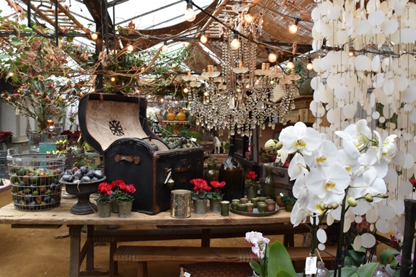
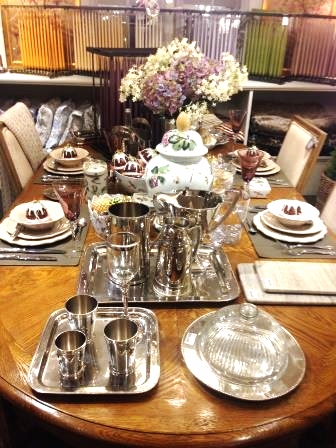
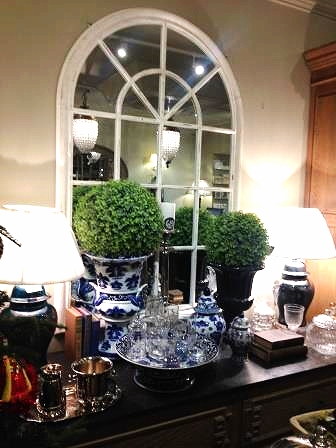
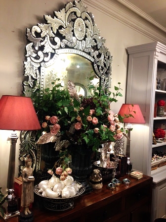
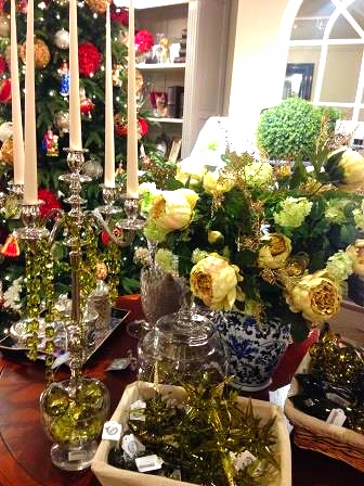
Hi Everyone, I guess you are in the throws of starting to decorate your homes for Christmas and furiously buying presents. It's a lovely time of year; I love all that anticipation. 

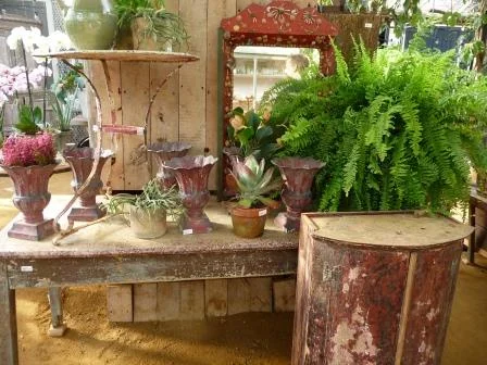
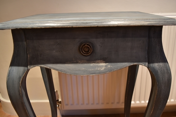
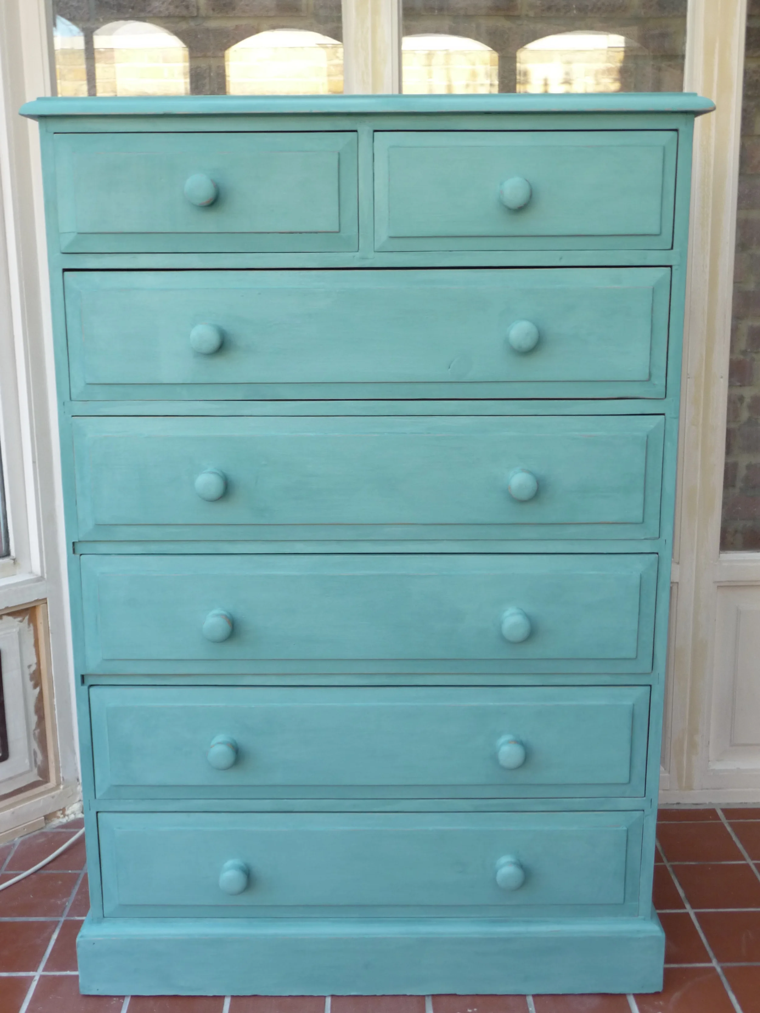
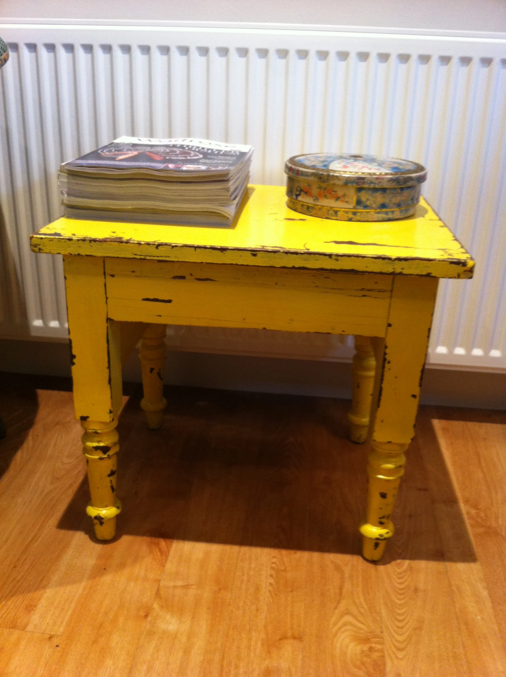
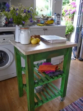
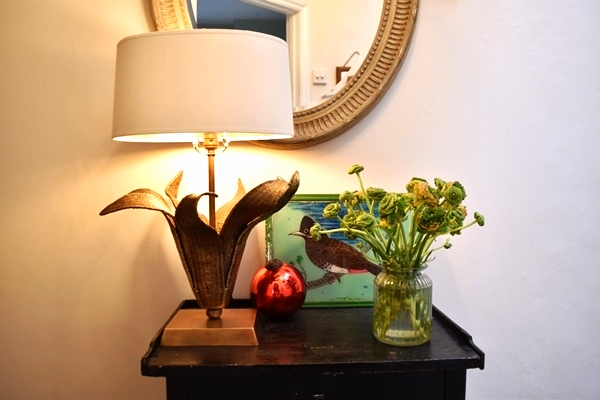
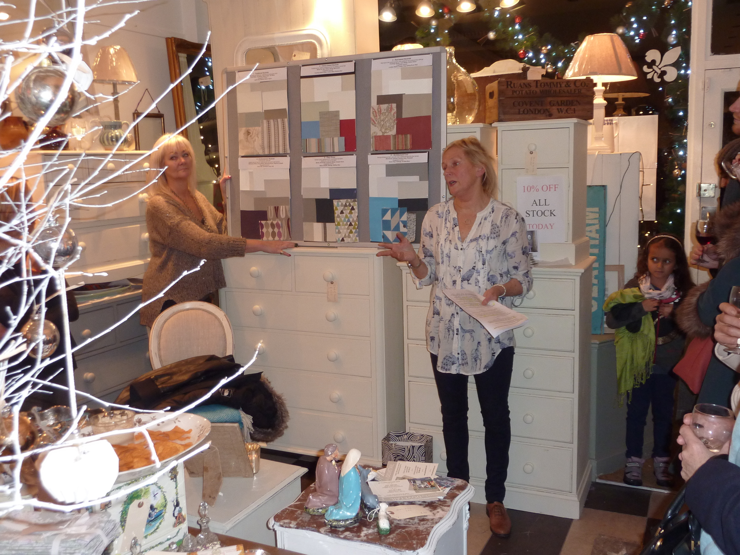
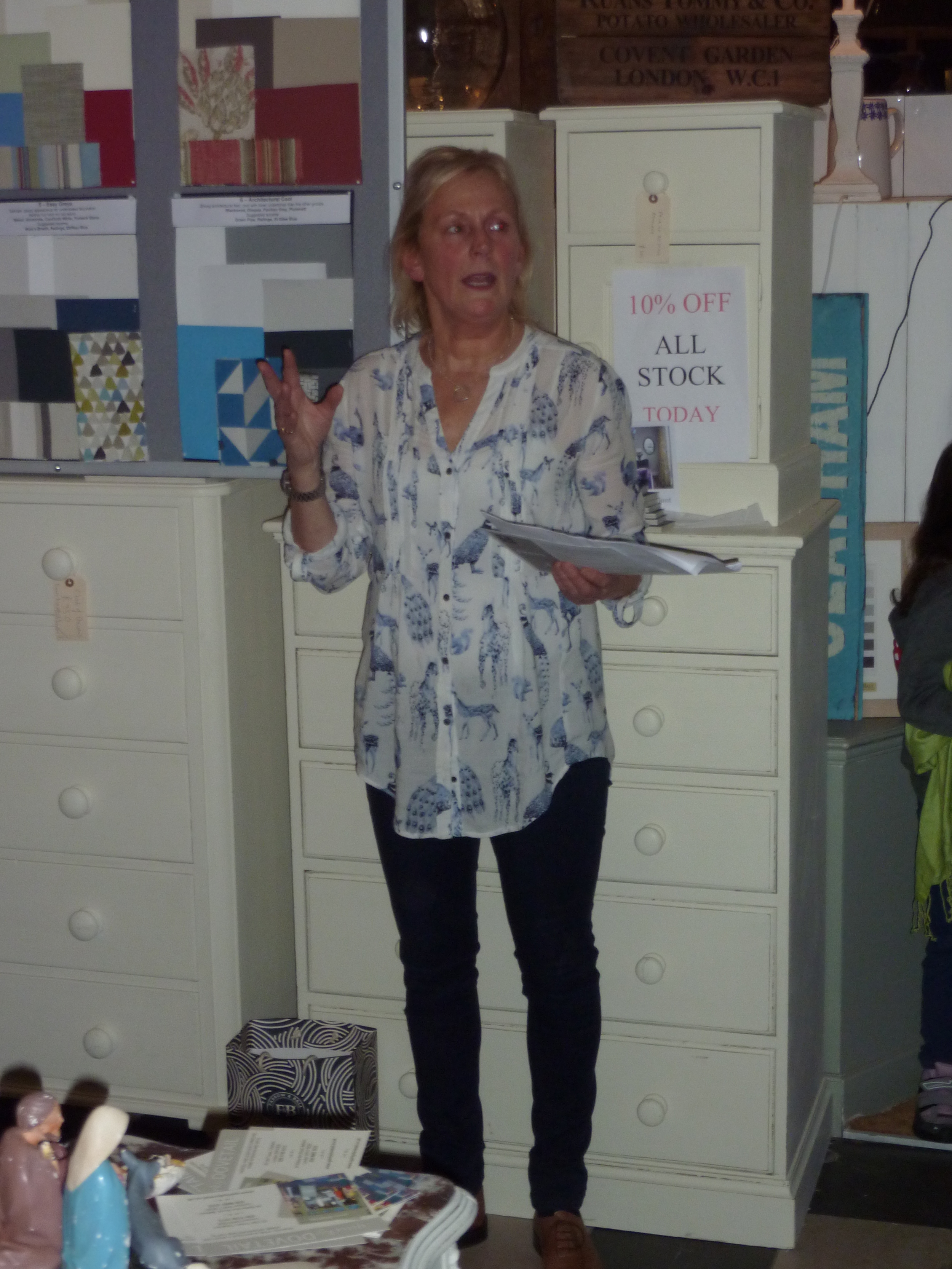
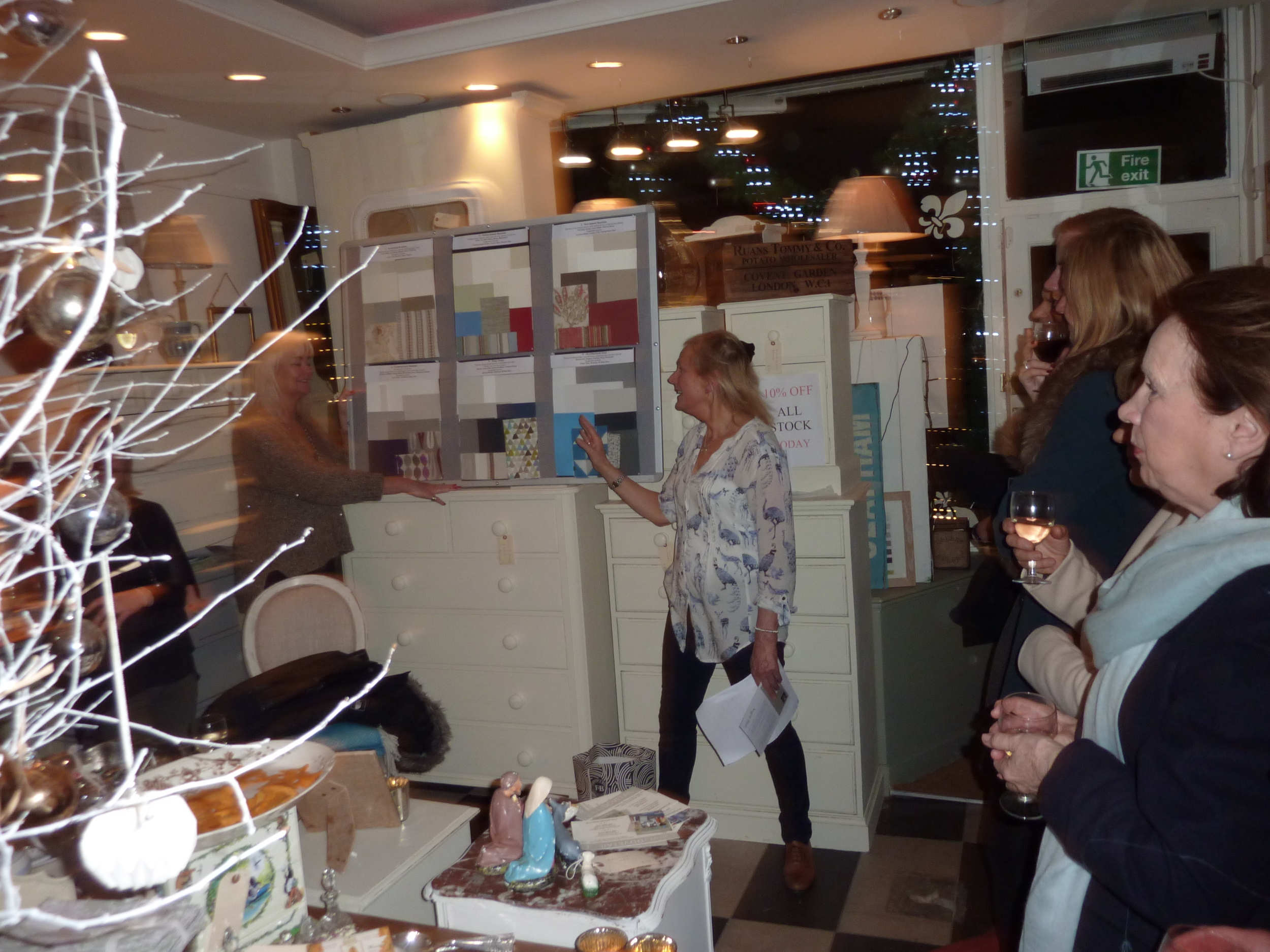
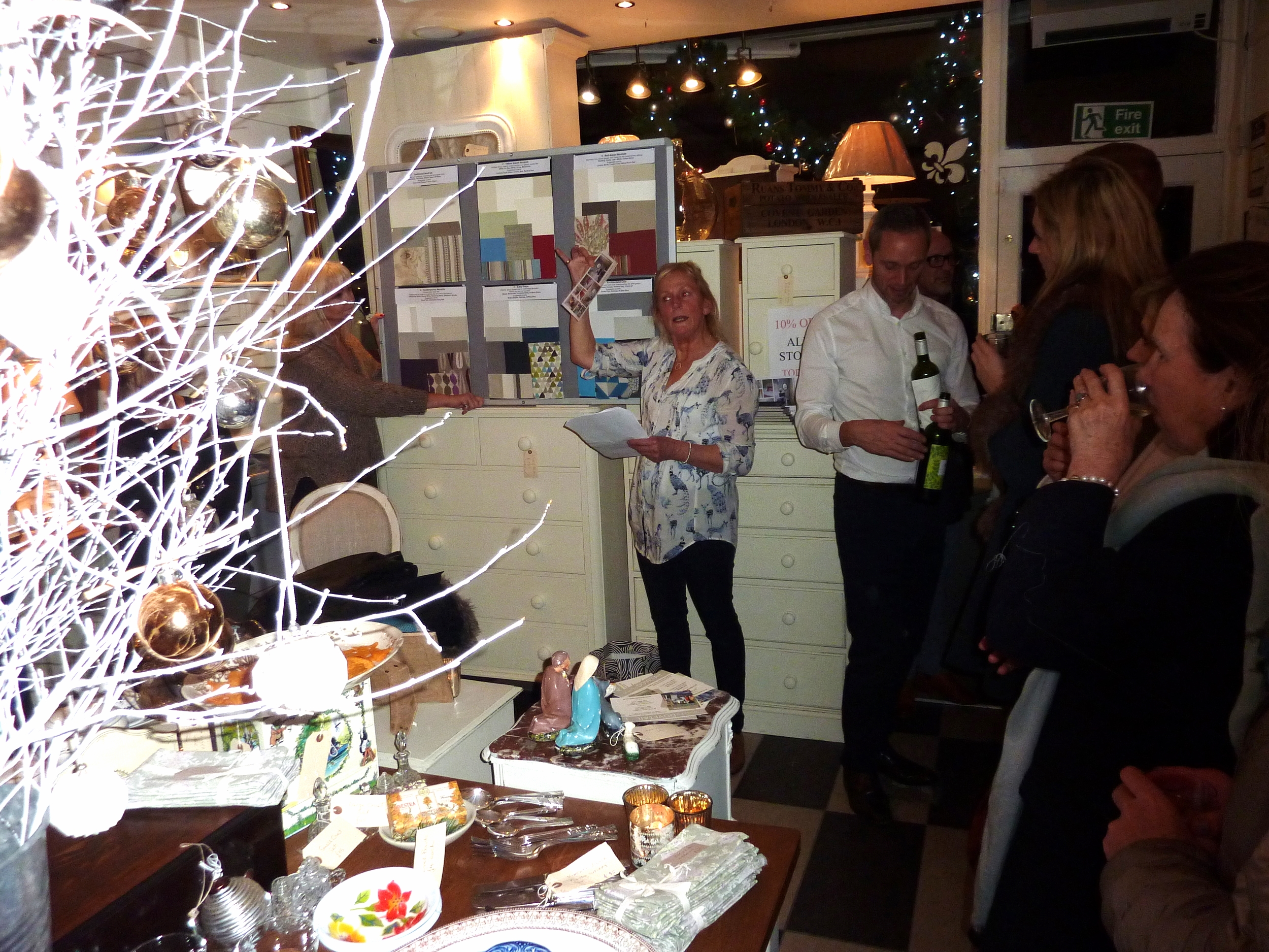
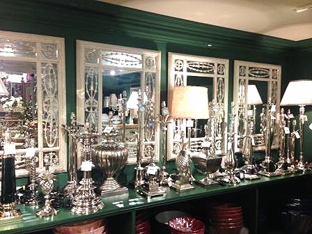
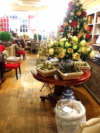
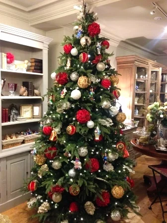
Last week I gave a talk on 'Colour in the Home' at the local interiors shop where I work two days a week, Quirky Dovetail.   This is a lovely local interiors shop where I've been working (running the shop) part-time for the last three years.  We specialise in up-cycling old furniture and painting it in Farrow and Ball neutral paint colours as well as selling antique and vintage items and homewares.  The event at which I spoke was our annual Christmas shopping evening which is always well attended by regular clients, new clients and friends.  Given that I am an interior decorator and colour consultations are a crucial part of my services, and also I'm absolutely passionate about colour, I decided to give a half hour talk on how to use colour in the home.  The majority of our clients are afraid of colour so I wanted to show them how they could inject some colour into a neutral colour scheme.  Grey is definitely the trend currently and many people paint rooms grey, add grey flooring and furniture but then wonder why the room looks bland and insipid.  I hope I inspired them enough to introduce some colour; the feedback after my talk certainly gave that impression!

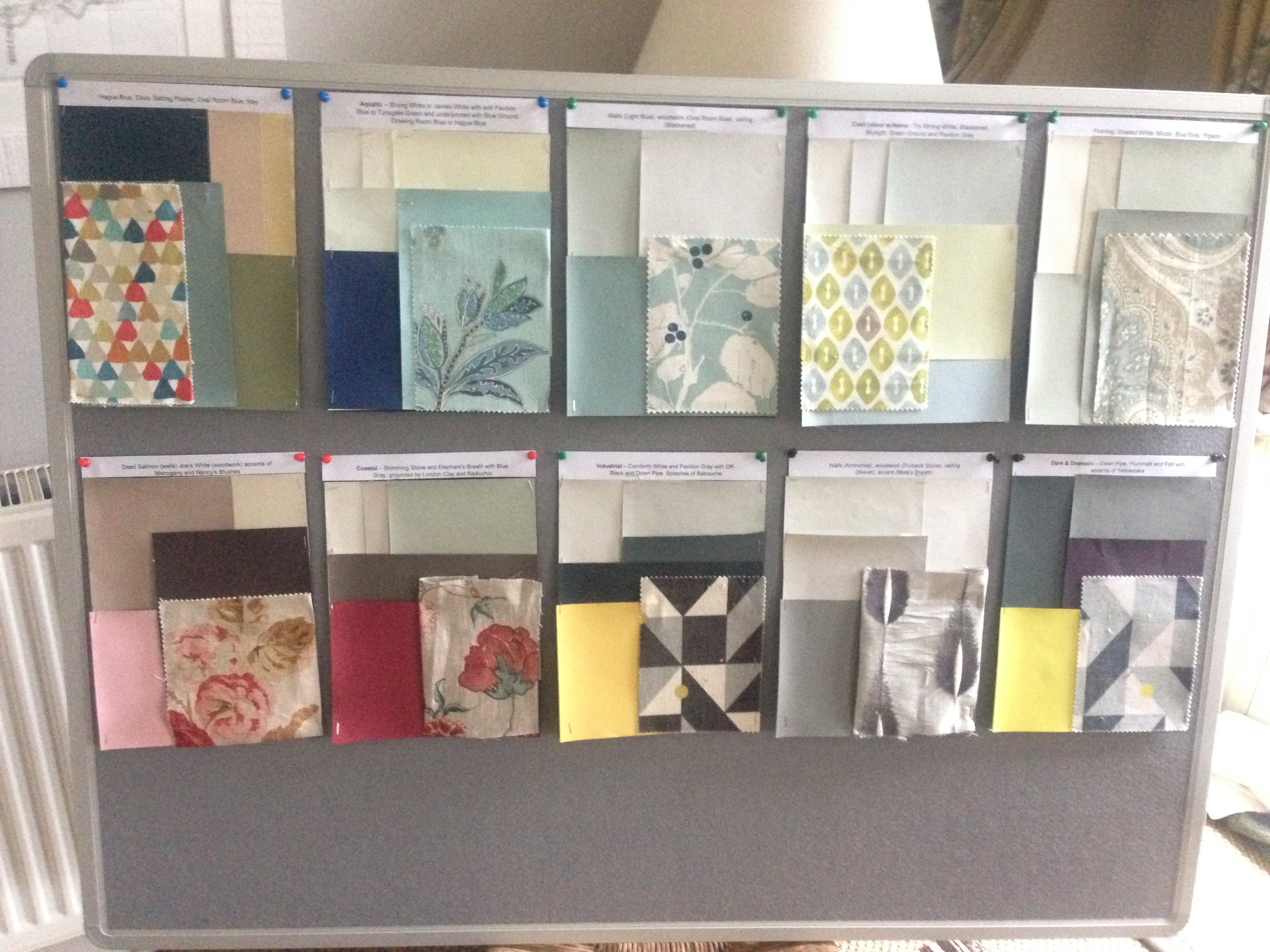
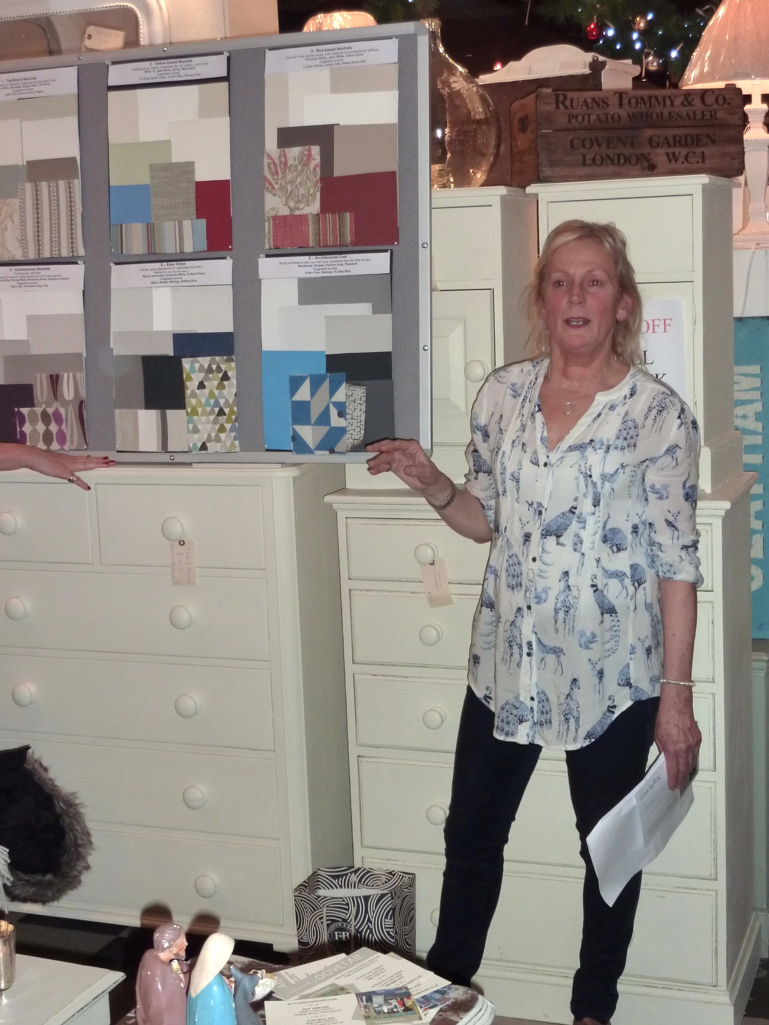
Given that Quirky Dovetail paint furniture in Farrow and Ball paint, I used the six Farrow and Ball neutral families as the basis for my talk.  There are so many colour brands and each paint chart has way too many colours but I like the fact that Farrow and Ball have created these six neutral families to make our lives easier when selecting a colour scheme. And Farrow and Ball paint is particularly lovely with such high levels of pigment and such depth of colour.

I know the word 'neutral' can sound really dully and boring, even a bit of a cop-out to some of you, however neutrals are easy to live with, elegant and un-demanding if they are used correctly.  It's all about how you put the neutral shades together as to whether the effect is sophisticated or insipid.

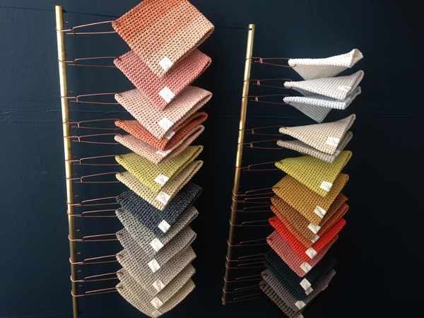
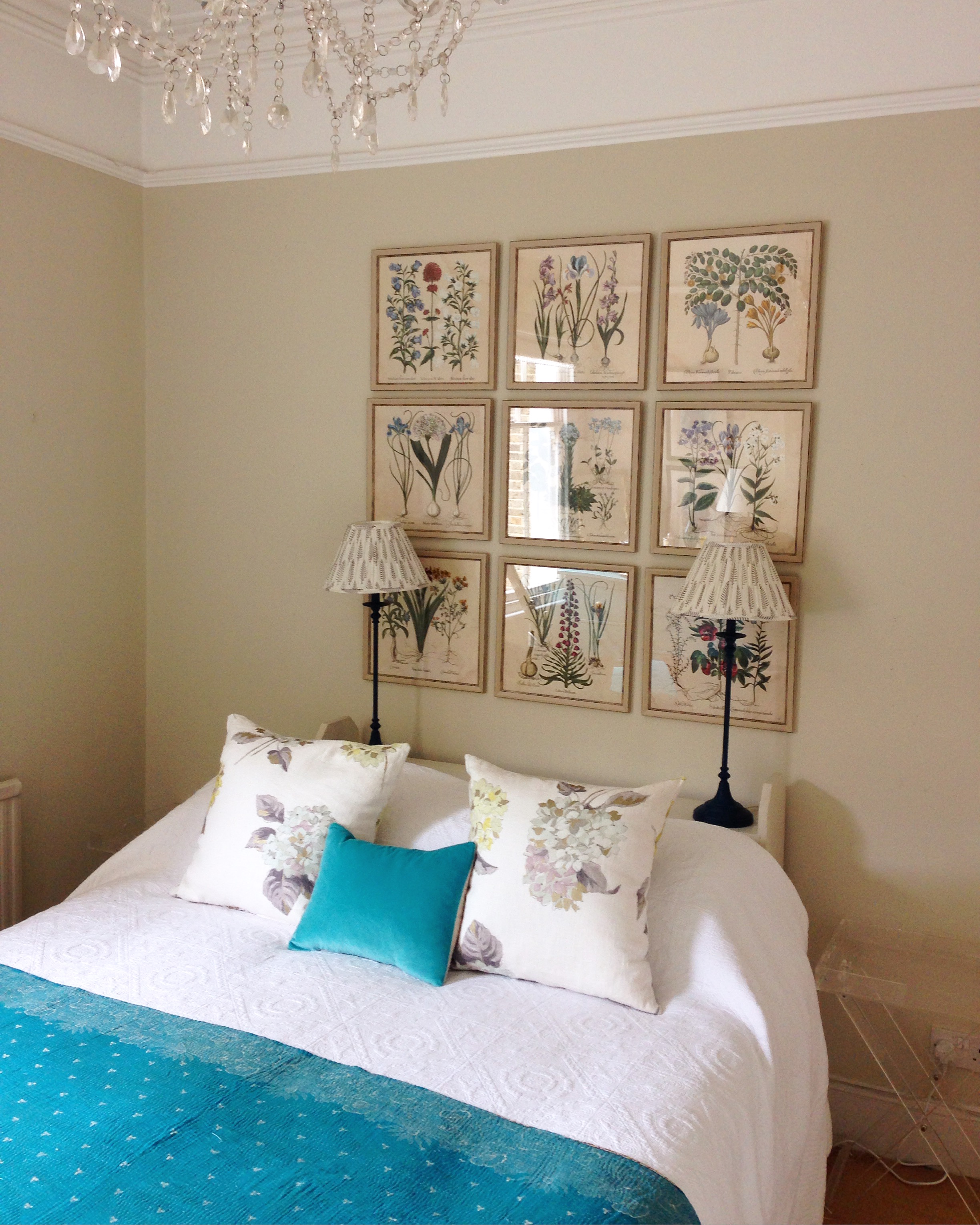
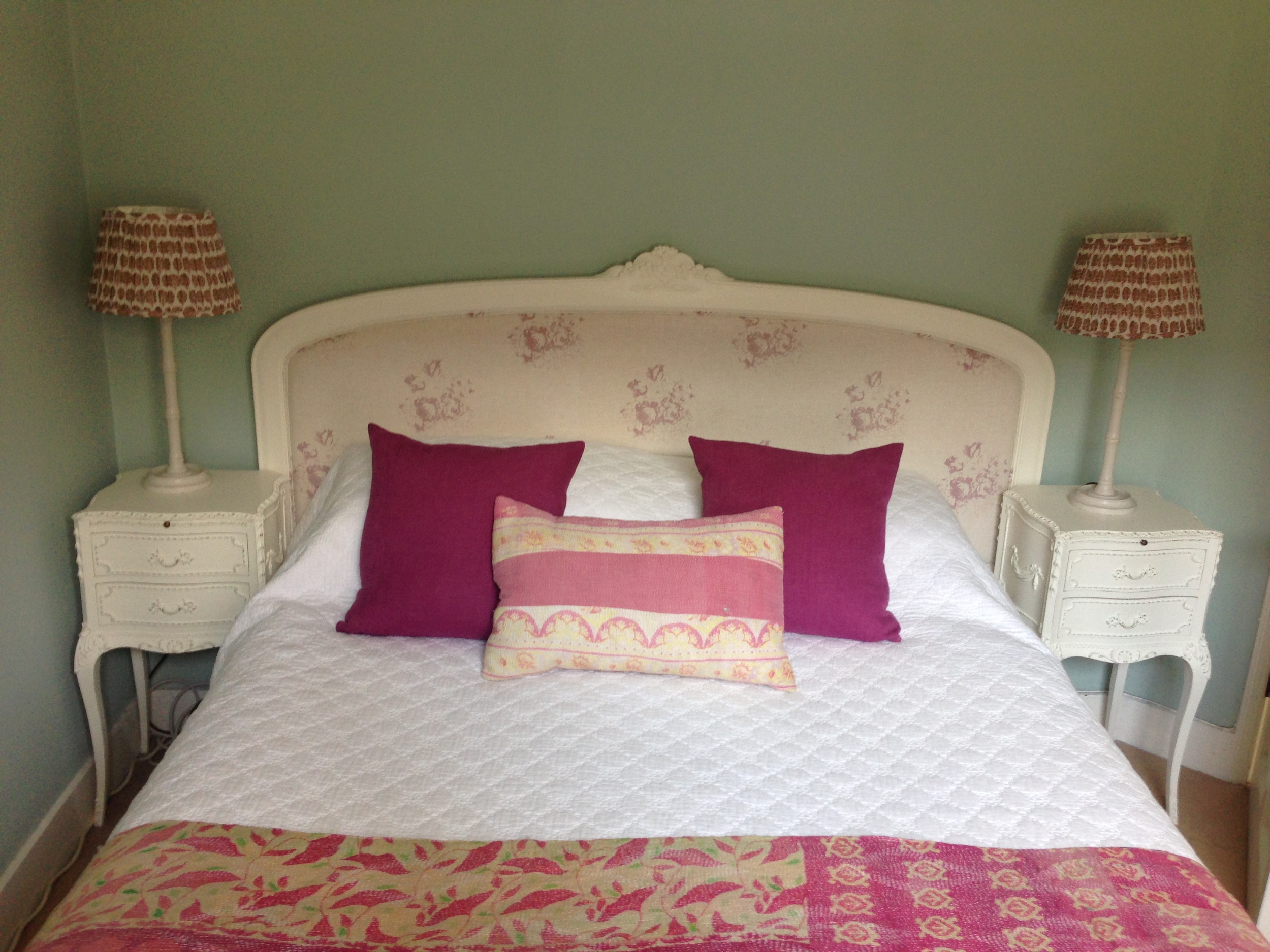
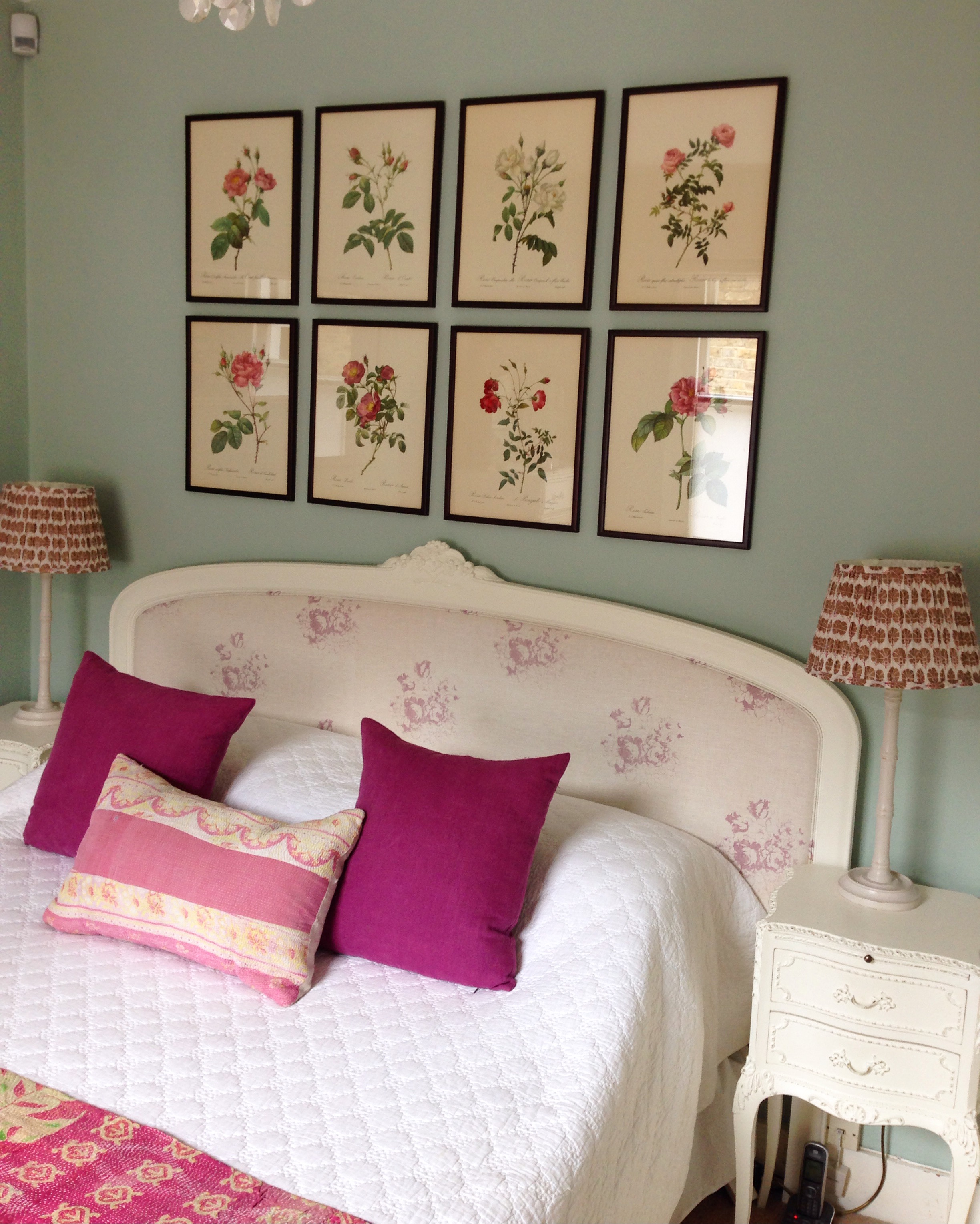
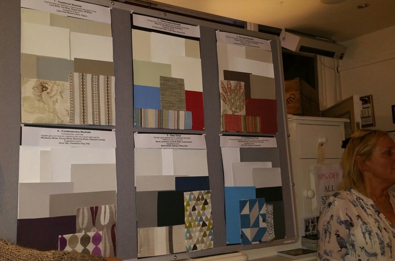
I prepared a board for each of the Farrow and Ball neutral families and I included some accent colours and also a couple of fabrics to create a sort of mood board so that the audience could imagine how these could work in a room.

For those of you are not familiar with the Farrow and Ball neutral families, they are:

Traditional Neutrals - Soft grey-green tones, sophisticated - Lime White, Old White, Slipper Satin, Off White. Suggested accents: Light Gray, Mouse's Back, Pigeon

Yellow-based Neutrals - Creamy undertones, prettiest group, country feel - White Tie, New White, String, Matchstick. Suggested accents: Cord, Cat's Paw, Tanner's Brown, Mouse's Back or for a country scheme try Cooking Apple Green, Cook's Blue and Rectory Red

Red-based Neutrals - Red undertones, warmest group - Pointing, Dimity, Joa's White, Oxford Stone. Suggested accents: London Stone, London Clay, Eating Room Red

Contemporary Neutrals - Lilac undertones, appear grey, add edge but retain warmth - Wimborne White, Strong White, Skimming Stone, Elephant's Breath. Suggested accents: Dovetail, Charleston Gray, Pelt

Easy Greys - Neither too warm nor too cool, delicate gauzy appearance - Wevet, Ammonite, Cornforth White, Purbeck Stone. Suggested accents: Mole's Breath, Railings, Stiffkey Blue

Architectural Cool - Cool with blue undertones, have architectural edge - Blackened, Dimpse, Pavilion Gray, Plummett Suggested accents: Down Pipe, Railings, Stiffkey Blue

Here are my boards of the six neutral families and accents:
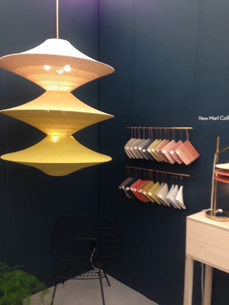
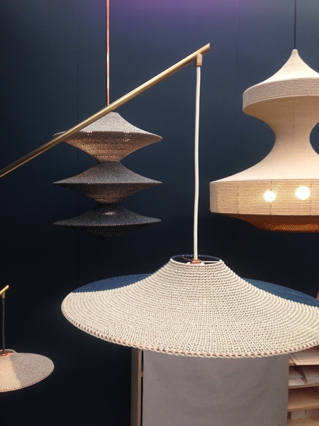
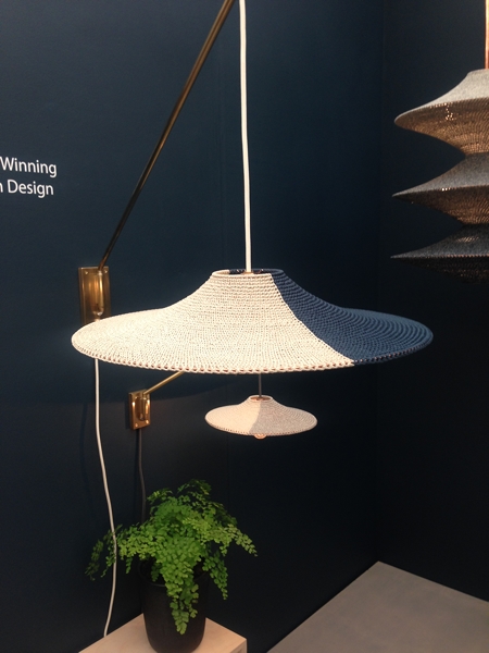
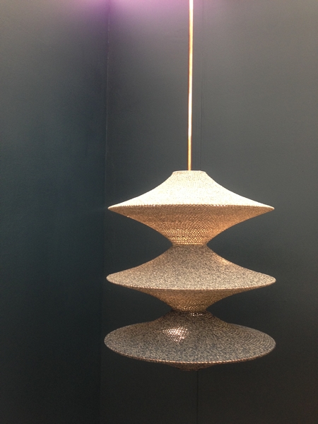
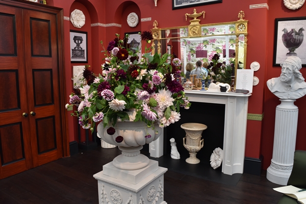
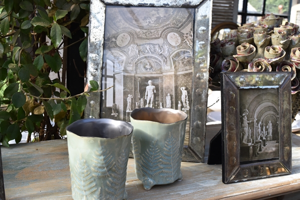
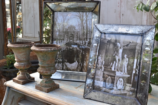
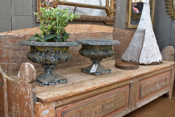
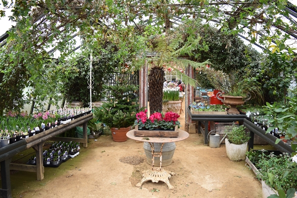
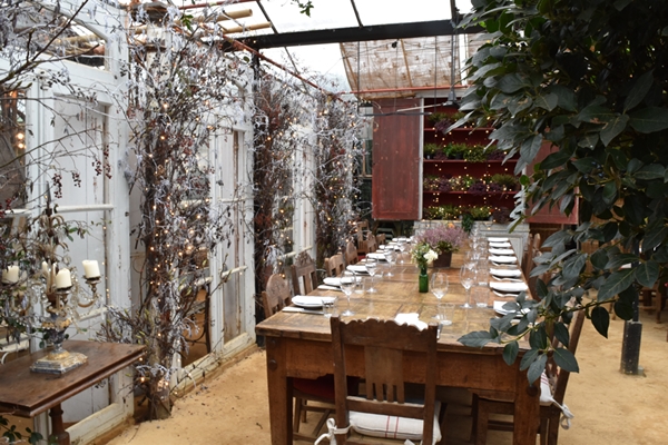
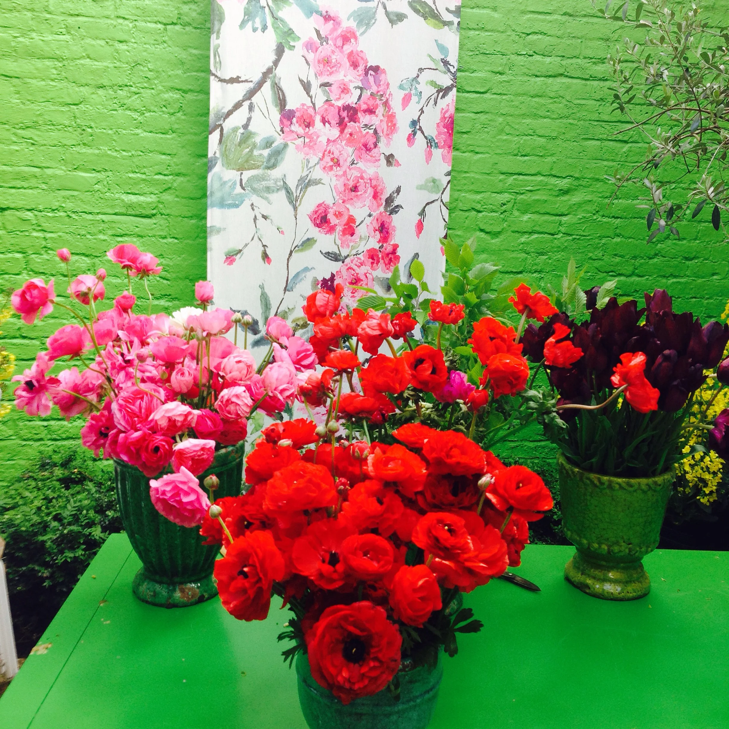
I also created some separate colour schemes on smaller boards again with a complementing fabric and these were pinned to the reverse of the presentation board for viewing after my talk.

We had a full house for my talk and the evening was animated and sociable fuelled by plenty wine and food and lots of shopping!  Never the most flattering when you are being photographed talking animatedly and passionately and waving your arms around but here goes .......... !1

I would love to hear how you have introduced colour into your home and what paint brand and colours you have used. Or if you have any questions you would like to ask me, don't hesitate to get in contact.


You may also like to read


An invite to an exclusive blogger event

Hi everyone. I had the pleasure of being invited by India Jane to an exclusive blogger preview event today, Tuesday 1st December, at their flagship store in Kings Road, Chelsea, London.  For those of you not familiar with India Jane,  it's a family-owned home interiors business which was founded in 1992.  Their signature style embodies the understated elegance of updated classics and sleek lines of contemporary sophistication. They have ten stores in the UK but none abroad, at least not that I'm aware of. There were five of us (all ladies!) handpicked discerning bloggers of interiors!!  We were given a talk by their head of Marketing and PR, the very charming James Neil, on the key trends and latest products of India Jane while being offered bubbly and nibbles.  We were also offered 15% discount on everything we purchased and it was very much the embarrassment of the choice as to what to buy as it all looked so incredibly inviting, beautiful and luxurious.  And if that wasn't sufficient, they offered us a goodie bag when we left which I discovered this evening when I got home, contained a selection of gorgeous India Jane homewares.  I know Christmas hasn't come yet but I felt as if all my Christmases had come at once! 

I adore this time of year when the shops are dressed and styled to the hilt. Indian Jane is certainly no exception!  I'm no stranger to India Jane; I have a house full of their furniture, mirrors, soft furnishings, accessories and lighting (I have no less than five of their chandeliers in my home!). However I never tire of browsing one of their stores as they are styled within an inch of their lives but with the utmost taste.  Glitz and glamour but understated and refined. What more could you want?!

I took some photos on my iPhone but they aren't the greatest quality (says the gal who has just done a course in DSLR photography!) so do excuse the poor quality of some of the shots. I think I was overcome with the emotion of trying to decide what I could afford to buy when all I wanted to do was transport the entire shop to my home!

 India Jane is one of those shops, you have to buy something. I've never left empty handed! I'd love to hear about any interiors local shop that you frequent and the things they sell that you cannot live without. 


You may also like to read