My client owns a Victorian four bedroom home in south west London. They moved out into rented accommodation while they had a loft conversion and kitchen extension built and the whole house renovated. They contacted me to help them with the colour schemes and finishes for each room. With a small child and a baby due imminently it was a race against time to get the house completed. They achieved it in four months from beginning to end which is quite a feat.
The client has quite traditional taste with a contemporary edge and she isn't afraid of colour. We were working with all the existing furniture and the original features of the home which obviously influenced the schemes for each room. Her husband left the colour schemes up to her to choose as he claims not to have a great eye for colour!
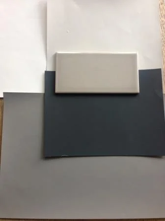
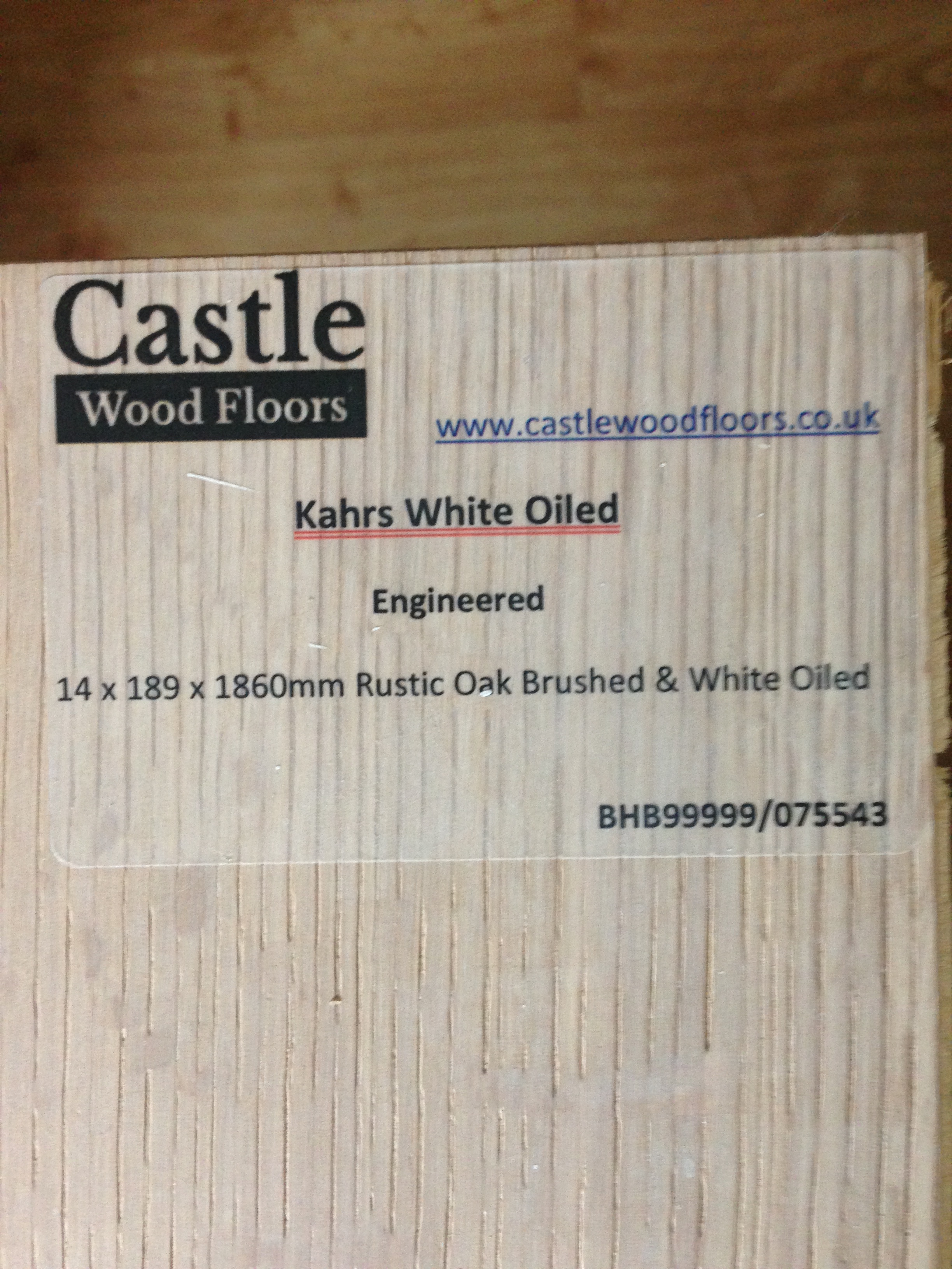
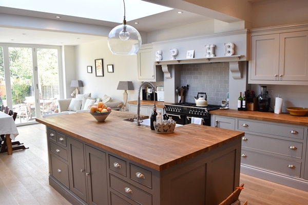
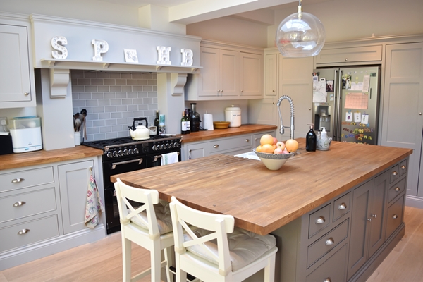
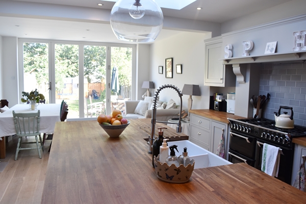
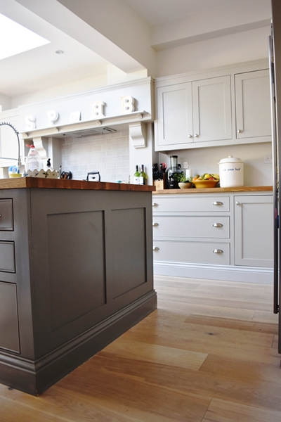
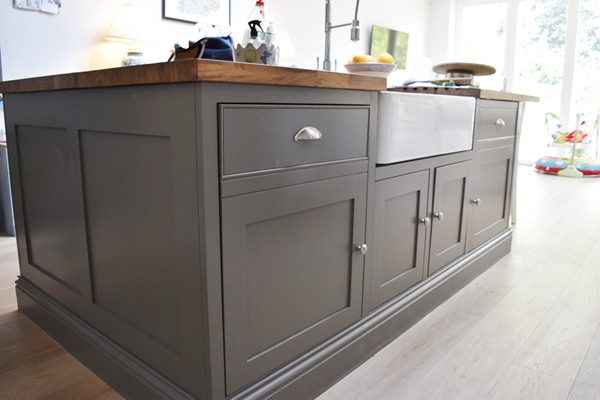
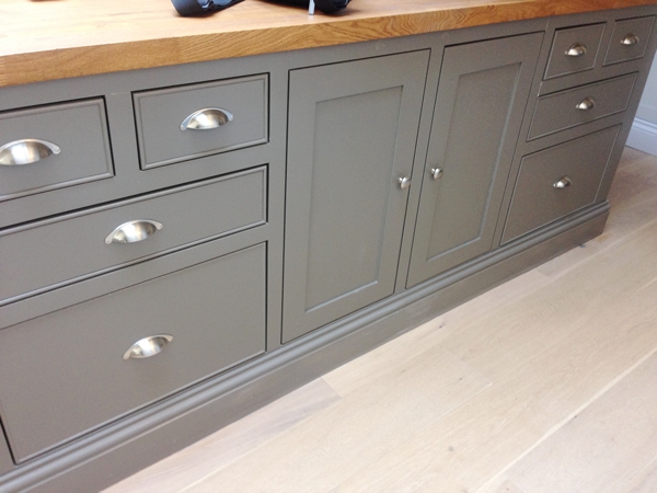
The first room we tackled was the new kitchen/diner which had been extended both into the garden and into the side return. The room faces north east. This is the room where the family spend most of their time (the separate sitting room at the front of the house is much smaller and is really a grown-up space where the couple spend their evenings). The client found a kitchen designer with whom she worked to create a traditional style kitchen but she wanted a more contemporary grey colour scheme. I chose a palette from the Farrow & Ball 'Easy Greys' neutral group. These greys are neither too cool nor to warm and have a delicate gauzy appearance so perfect for understated decoration which was the look she wanted to achieve. I suggested using a darker grey on the island which would make the island more of a feature and given this stronger colour would be below eye level it would not encroach on the light and airy feel that we were trying to create. The Farrow & Ball palette I chose was: Ceiling and woodwork - All White, Walls - Strong White, Kitchen Unit - Purbeck Stone, Island - Mole's Breath. The floor is a brushed and white oiled oak and we decided against a contrasting tile colour for the splash back tiles so chose a grey metro tile that works beautifully with the colour palette. My advice was for wooden bench tops to add warmth to the scheme.
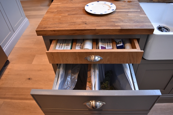
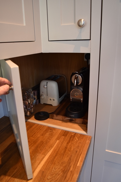
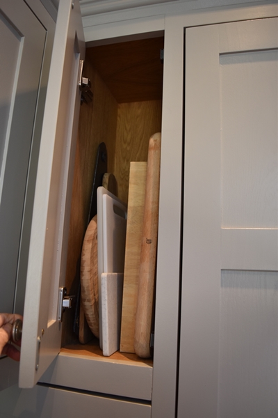
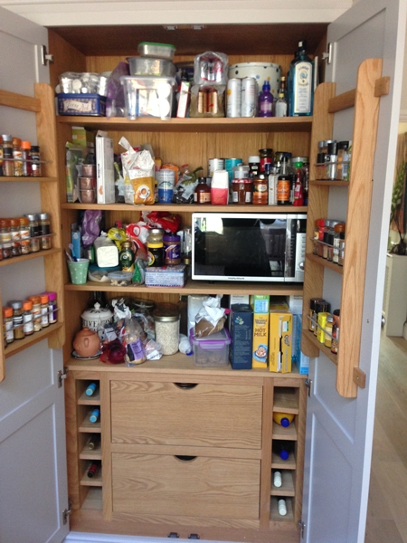
The client worked with the kitchen designer to maximise every inch of space. She devised some ingenious storage solutions!
And here is the completed space which has transformed this family's lives after years living in a small dark kitchen.
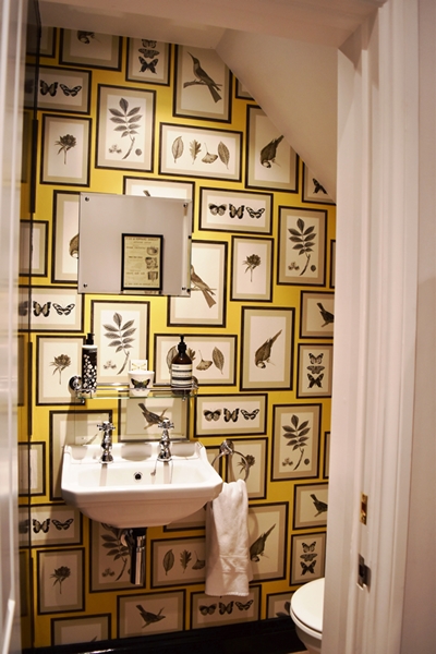
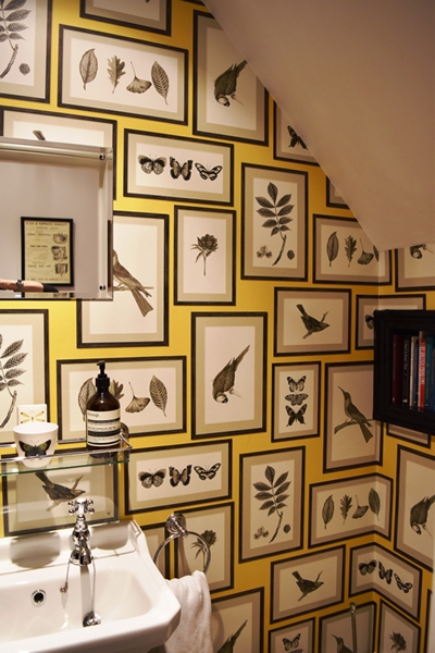
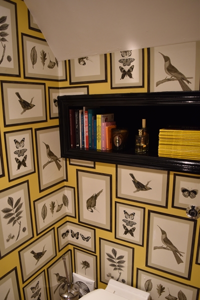
Just off the kitchen is a very small downstairs loo. This is the room where I advise my clients to have some fun and if they are afraid of colour it's the perfect room to introduce some. My client didn't need any encouragement and had already earmarked a fabulous Sanderson wallpaper. My advice was to paint the woodwork in Farrow and Ball 'Off Black' and the ceiling also. She wasn't brave enough to paint the ceiling in this colour so we settled for white.
The finished room speaks volumes!!
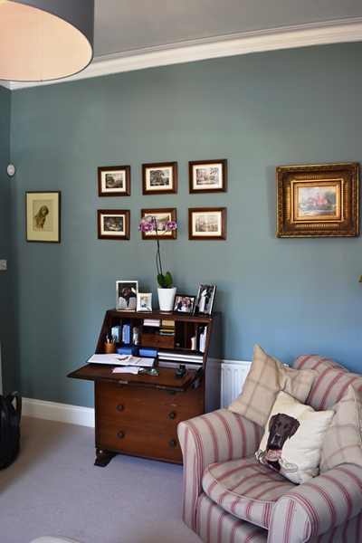
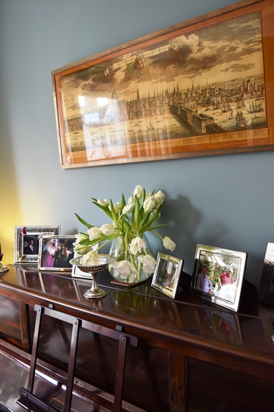
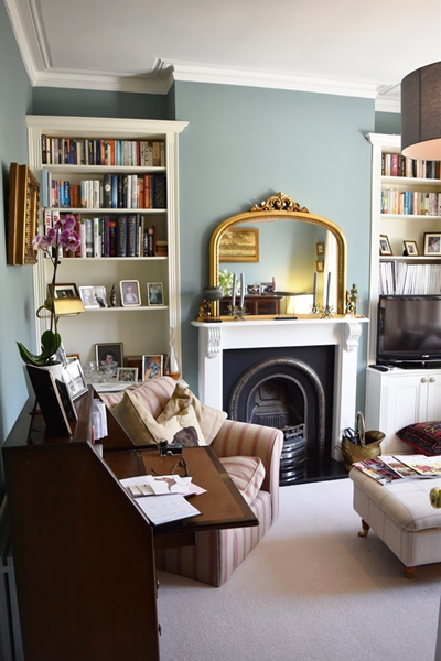
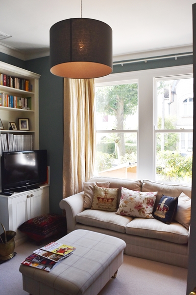
The other room on the ground floor is a small southwest facing sitting room. Their furniture is traditional (mahogany pieces, sofas and chairs in natural fabrics and an old upright piano) as well as a gilt mirror over the fireplace.. I chose one of my favourite Farrow & Ball colours 'Oval Room Blue'. This blue is the most blackened of their blues and it has a timeless feel to it so works beautifully with traditional furniture. It's a colour that can work well in a hall, a cosy TV room or sitting room like this one.
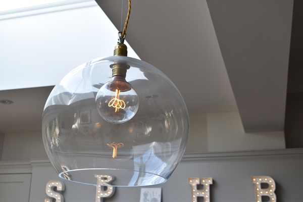
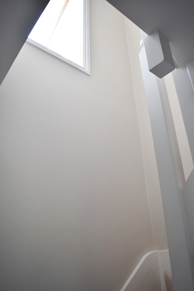
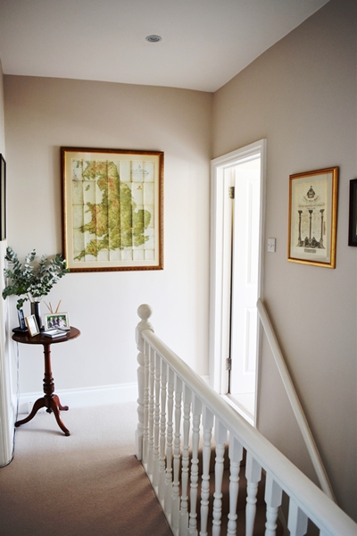
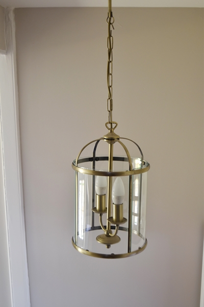
The colour I chose for the hall, stairs and landing was Farrow & Ball 'Skimming Stone' which is one of their Contemporary Greys group. Below the dado rail by the front door I used a slightly darker colour in the same group, Elephant's Breath. These contemporary greys have lilac undertones though appear grey. They add edge but retain warmth so can be used in any room in the house. The lantern pendant light is from John Lewis.
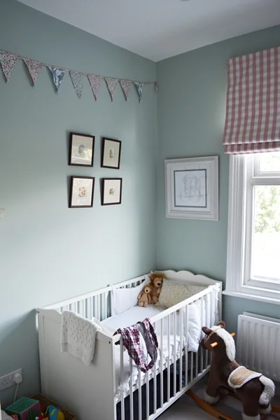
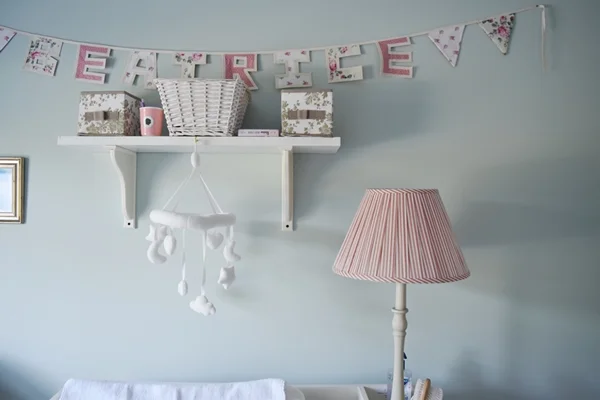
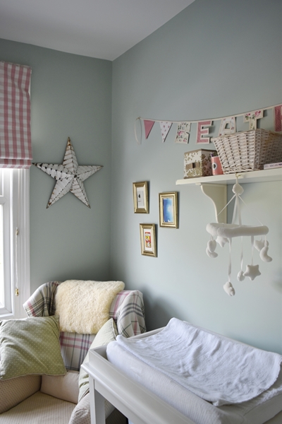
Moving upstairs to the first floor, I chose another of my favourite Farrow & Ball colours 'Teresa's Green' for the new baby's room. In fact I have this colour in my own bedroom as I love its freshness resulting from its blue base and the warm green tones. It has a therapeutic and calming feel so is perfect for bedrooms.
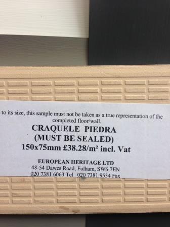
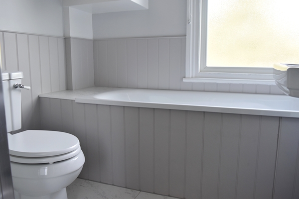
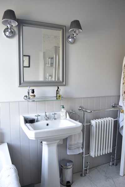
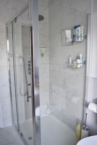
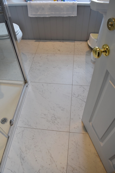
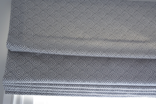
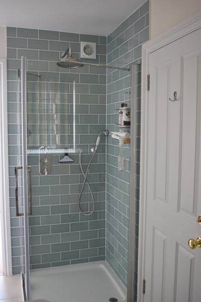
For the first floor bathroom the client already had seen a friend's bathroom with porcelain marble tiles Marmi Carrarra from European Heritage (600mm x 600mm) and wanted to use the same tiles on the floor and also in the shower cubicle. I chose Farrow & Ball 'Blackened' for the walls and ceiling as it is the best colour to work with marble. It is the coolest of the Farrow & Ball whites and works beautifully with Pavilion Gray which is the colour I used for the tongue & groove and the skirtings in the bathroom. The client did not want an accent colour in this bathroom so I sourced a geometric fabric in similar greys for a Roman blind.
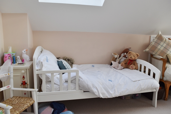
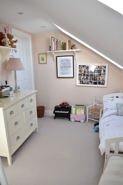
The bedroom for the three year old is on the top floor (the converted loft) together with the au pair's bedroom which did not need redecorating. Their daughter had an adorable mahogany sleigh bed so I chose the prettiest Farrow & Ball pink 'Pink Ground' which has a large dose of yellow pigment creating the softest and dustiest blush of colour on the wall. It is feminine and warm and creates a soothing room without being too sugary pink. Due to the yellow pigment this colour works brilliantly with mahogany furniture. However she has now grown out of the mahogany sleigh bed but the colour is still as soft and pretty!
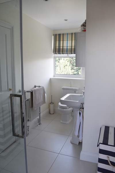
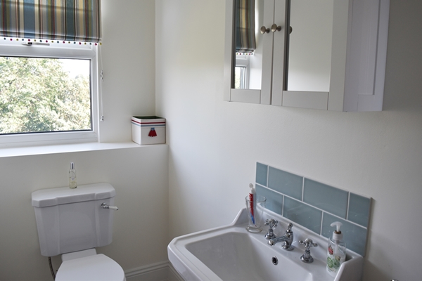
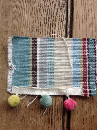
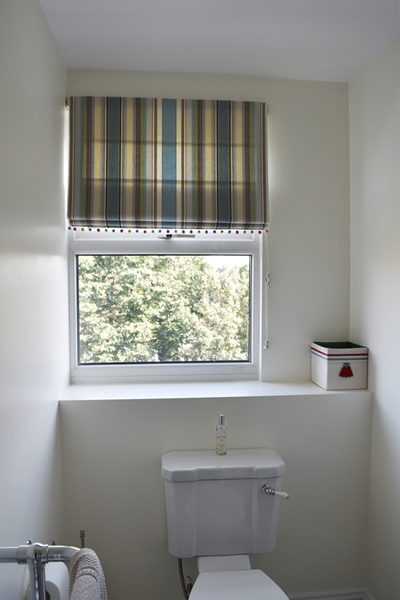
The top floor bathroom is a Jack & Jill bathroom between two bedrooms. I chose Farrow & Ball 'Skylight'. It is a definite cool blue in small spaces but beomes paler and greyer in larger spaces such as bedrooms. I sourced a pretty striped fabric for the blind and my client added the quirky pom pom trim to the blind.
This project was one of the most enjoyable I have done as the client was so relaxed and flexible despite being 8 months pregnant! We have become good friend having working together which from my perspective makes my job worthwhile. Here is the feedback from the client:
Angela was a godsend when it came to making decisions re colours and finishes for the house. It was like going shopping with a friend; but just one with a very keen eye for design and detail, who would listen to your views and yet make suggestions to broaden your horizons. Using Angela took the stress and hassle out of decision making and made the whole process an enjoyable experience. We are delighted with the finished product and couldn't recommend Angela enough.
If you would like more information about how to choose the right colour for the direction of your room(s) click here.
If you would like a colour consultation, I offer this in person (if you live in south London) or via Skype as my Colour Clinic.
You may also like to read


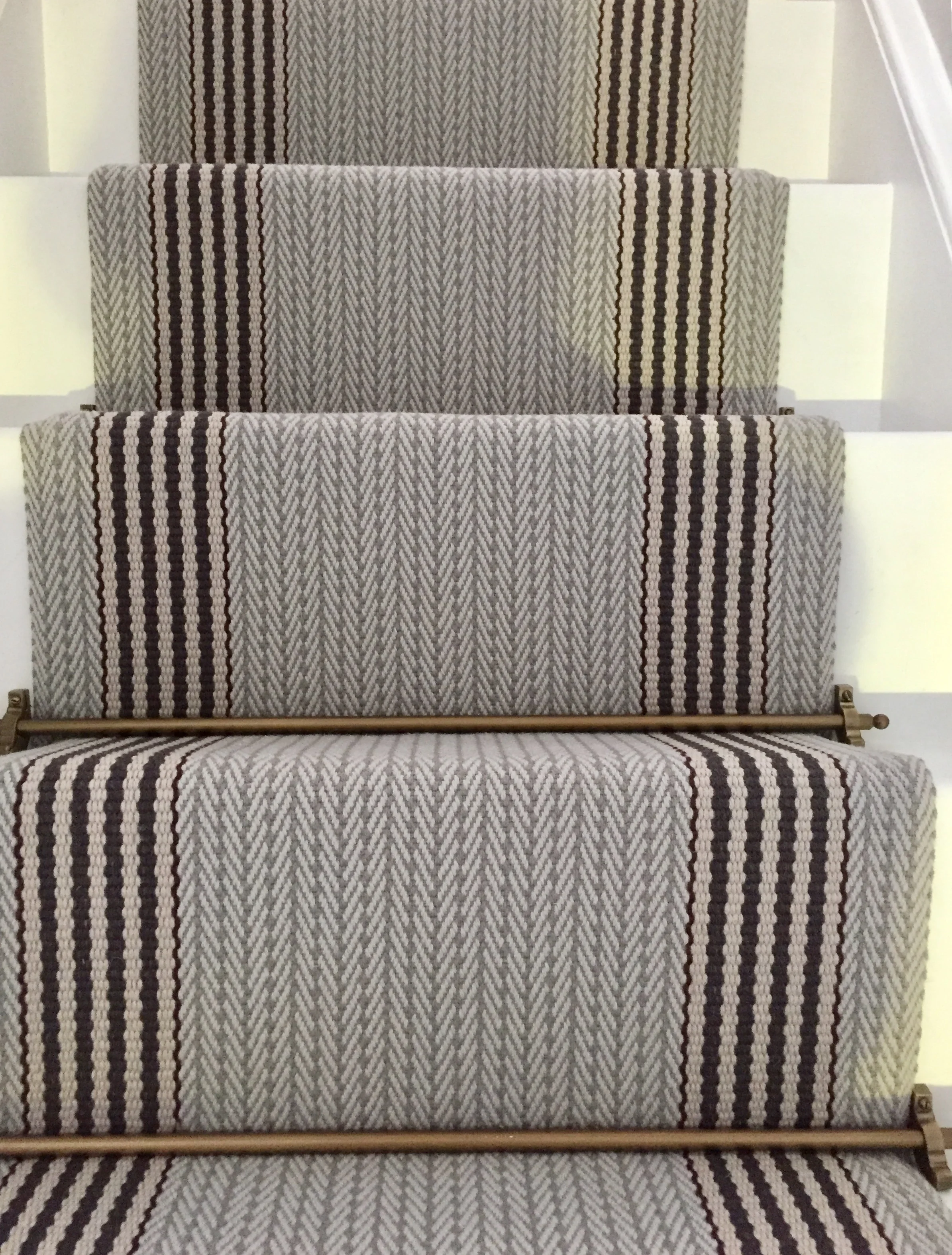


It's so important to create an instant visual impact because people form an opinion of your home within the first 20 seconds of entering. Here's another beautiful stair runner I created.