CLIENT PROFILE:
30 something professional couple; first home they have owned; South West London first floor two bedroom apartment; south facing; adding a loft conversion to give them a master suite.

The clients initially sought my help with paint colours for the whole flat but I ended up providing a full interior design service for many of the rooms.
After an initial onsite meeting, I always have the second meeting with clients at my apartment. This is to give clients the opportunity to see how I have designed and styled my home. It's always easier to view someone's home rather than having to imagine a colour scheme or view it on a smartphone. On some occasions I'm asked to recreate one of my rooms or even to replicate my stair runner in their homes which is very flattering! Here is an image of my stair runner which I designed from three antique, handwoven Peruvian rugs.
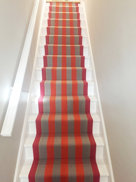
These clients are not afraid of colour and wanted a similar 'ta-dah' stair runner. They also loved the sisal flooring that I've used throughout the apartment and requested the identical one.
I'm afraid I don't have any "before" images because I was contacted by the client once the builders were well underway with the loft conversion and work to the existing rooms so it was impossible to take any photos.
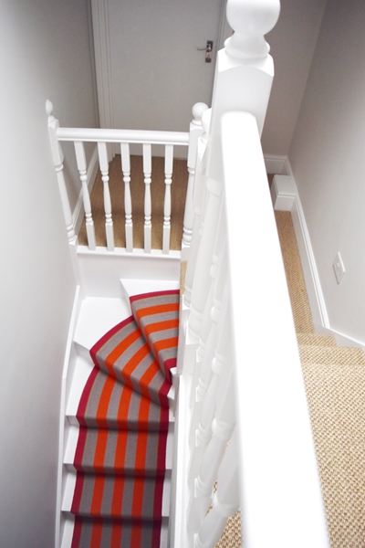
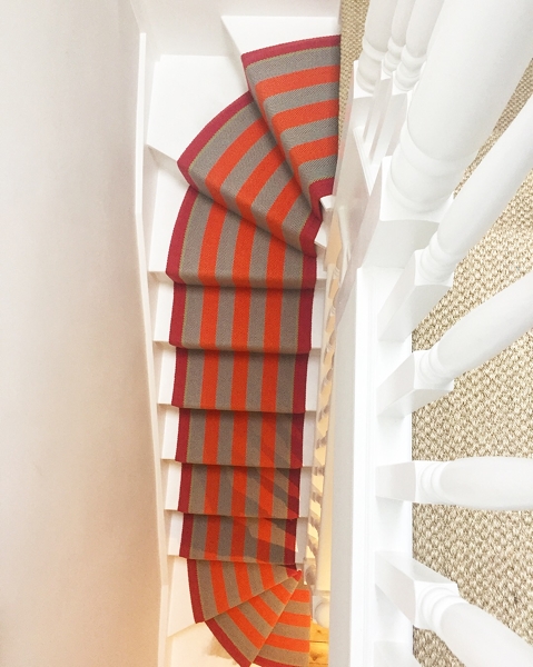
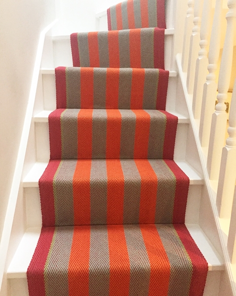
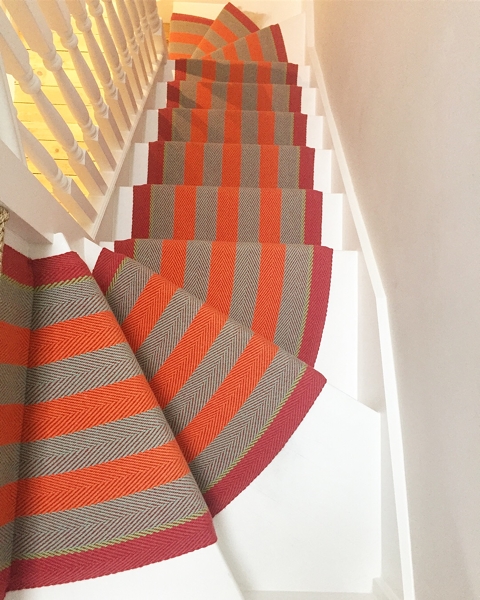
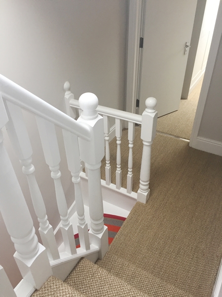
The main event in the apartment is definitely the stair runner. The clients were sold on the idea of having something similar to mine to create a wow factor when you open the front door. My go-to company for stair runners is always Roger Oates. Their beautiful, 100% wool, flat weave runners come in a wide range of colours and patterns. I chose one of their most striking runners for my clients' stairs - Fitzroy Bright - which has wide stripes of orange and aqua punctuated with soft green. I chose Farrow and Ball 'Ammonite' for the walls in the hall, stairs and landings. It's a perfect colour for these areas as it's an understated grey. For the flooring in the entrance I used dark brown coir matting laid wall-to-wall (it just sits on top of the floorboards cut to size). As you can see from the image above, I have coir in the entrance but it is a warm honey colour which sadly seems to be discontinued. For the first floor landing the original floorboards were restored and polished and for the loft conversion master suite the client the Tiger's Eye sisal was used. You can't help but be wowed by the stair runner!

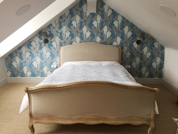
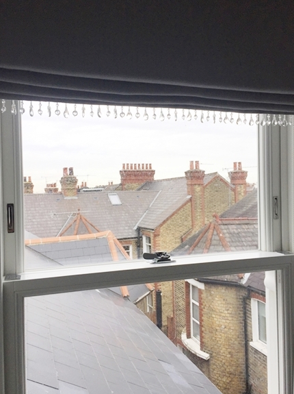
The loft conversion created a master bedroom and a clever use of the long low roof pitch created a long narrow dressing room/bathroom. I continued Ammonite on the walls in both the master bedroom and ensuite (as well as the ceiling and woodwork to create a feeling of height given the ceilings are quite low). In the bedroom we used Farrow and Ball 'Wisteria' wallpaper in the blue and silver colour way to create a feature wall behind the Loaf bed. It is such a pretty, classic English wallpaper but the colours give it real drama. It comes in some beautiful colour ways so click here to see them all. I kept the window dressing simple with Roman blinds in Warwick's Slubby Linen 'Pewter' and with the addition of glass bead trim.
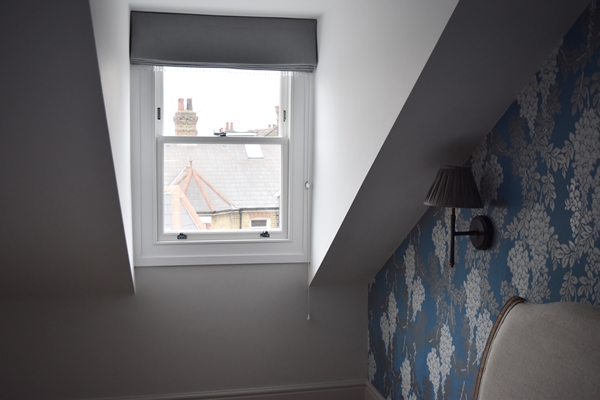
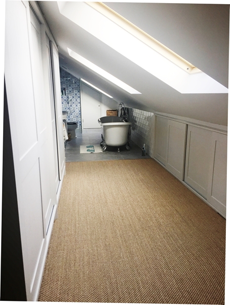
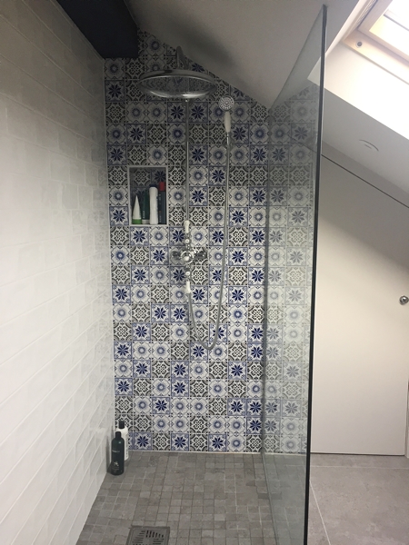
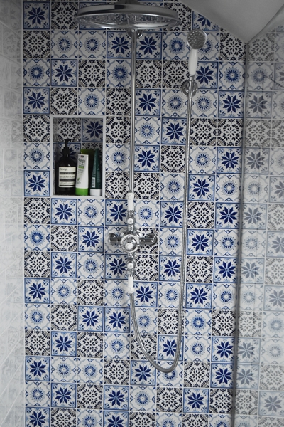
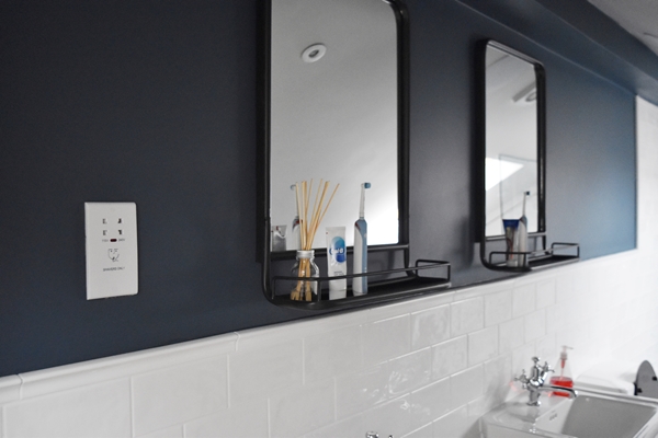
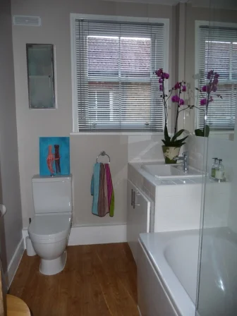
The master ensuite is a triumph in converting a difficult space under a low roof pitch. My clients aren't exceptionally tall so were able to maximise this space. As you enter there are floor-to-ceiling wardrobes on the left and clever storage under the Velux windows on the right. The sisal flooring continues in the dressing room. This leads directly into the bathroom where I chose Farrow and Ball 'Stiffkey Blue' for the wall on the left to work with the feature wall in the shower of Fired Earth Acapulco tiles. The floor is Mandarin Stone's 'Chicago Storm' tiles . I sourced two industrial style mirrors with shelves from Rose and Grey to hang over his and her basins which look fabulous on the dark blue wall.
The kitchen is north facing so gets no direct sunlight. The clients love the colour blue but the tone of blue they had in the kitchen was a bit cool so I chose a beautiful warm Farrow and Ball colour 'Mizzle' which is a grey green. The addition of the green pigment minimises the cool blue tones which gives the kitchen a lovely feeling of warmth. I've not used Mizzle before and I was very impressed with the results and would happily use it again.

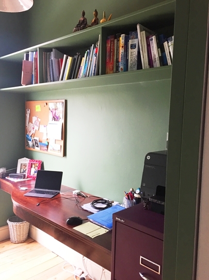
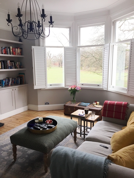
The study is a small, south-facing room with views across Tooting Common. The clients initially wanted the Farrow and Ball 'Bumble Bee' wallpaper in the green & gold colour way but budget restrictions meant that this wasn't an option. However I created a scheme using the moreorless the same colour as the wallpaper for the walls, Farrow and Ball 'Calke Green, minus the gold bees of course! I chose Farrow and Ball 'Old White' for the woodwork and 'Slipper Satin' for the ceiling thus eliminating any white in the room.


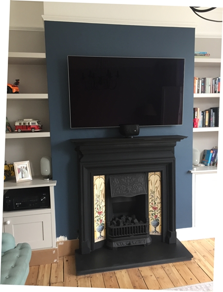
In their south facing sitting room the clients wanted the same colour as I have in my sitting room Farrow and Ball 'Cornforth White'. It's one of Farrow and Ball's Easy Greys and is neither too cool nor too warm and has a lovely calming quality so it works well in a south facing room. However in a cooler north facing room Cornforth White would need plenty of pops of colour to make the room feel warm. The client wanted to put the television on the wall over the fireplace (not something I encourage!) so the best way to make the TV "disappear" into the wall is to paint the wall a dark colour. In this instance I chose Farrow and Ball 'Stiffkey Blue' which works particularly well with Cornforth White.
The original Victorian fireplace had been removed by previous owners. The clients found a fireplace specialist shop in nearby Wimbledon with the delightful name Grate Expectations and bought this beautiful cast iron re-pro fireplace. The company did a full survey, sourcing and installation including the gas hearth, surround and tiles. I highly recommend them!


I must apologise for the poor quality of some of the images, all taken rather hastily I'm afraid.
If you would like to book a colour consultation or any other interior design services, do give me a call on +44 (0)7960 934427 or email me at info@angelabuntcreative.com Or if you have any questions or comments regarding this project, feel free to contact me.
You may also like to read


It's so important to create an instant visual impact because people form an opinion of your home within the first 20 seconds of entering. Here's another beautiful stair runner I created.