CLIENT PROFILE:
Single professional male; first home he has owned; South West London two bedroom ground floor Victorian apartment; east facing.
The client had no furniture when he moved in except a deck chair! The whole apartment needed to be painted, decorated and styled with furniture & accessories. It also needed new wooden floors throughout and cafe shutters on all the windows. His brief was for a stylish and comfortable design as his previous abode had been a real bachelor pad! And all on a small budget.
COLOUR SCHEME:
I took my client to see a recently completed similar Victorian apartment of another client. He took one look at the colour scheme and asked me to replicate it. The apartment was painted in one colour to give a feeling of flow and space - Farrow and Ball 'Skimming Stone' which is a lovely warm grey with a contemporary feel. Given that this client loves the colour purple, Skimming Stone is the perfect neutral with its lilac undertones which retain a feeling of warmth. I use Skimming Stone frequently in clients' homes as an alternative to the cooler greys like Ammonite, Cornforth White, Pavilion Gray, Blackened.
For this client, the only exceptions to the Skimming Stone walls were in the guest room which I painted in the lighter Farrow and Ball 'Strong White' to complement the furniture that the client wanted to buy for that room. I also created a feature wall in the kitchen/diner in Farrow and Ball 'Brinjal' to "disguise" the TV on the wall and to add a pop of his favourite colour, purple.
I'm afraid there are no before photos of this apartment as it was just an empty box with white walls.
Here is the (Farrow and Ball) colour scheme: from left to right: Strong White, Skimming Stone, Charleston Gray, Brinjal, Downpipe

FRONT DOOR:
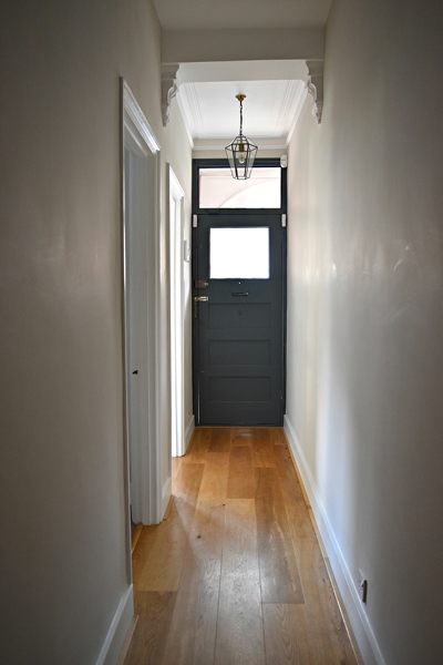
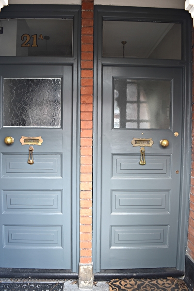
I chose Farrow and Ball 'Downpipe' for the client's front door to create a wow factor. Given the neighbouring apartment's front door is right next to my client's door, the neighbour agreed to have their door painted the same colour. As you can see below, I used Downpipe on both sides of the door and frame (thresholds still need to be repainted black). The hallway is painted Skimming Stone.
Tip: Paint the frame of the front door the same colour as the door as it makes the door feel much wider and creates more impact. Also paint the inside of the door in the same colour (including frame) or in another colour but a contrast to the wall colour.
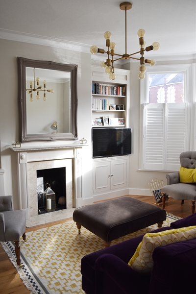
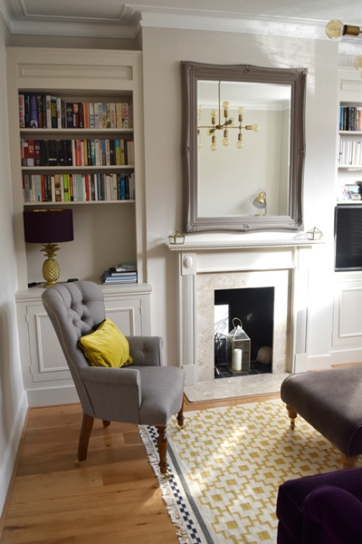
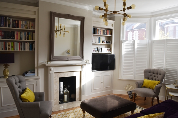
SITTING ROOM:
The walls are Skimming Stone as are the alcoves so as not to make a feature of them as they are not items of architectural beauty. The fireplace is not the original Victorian one was painted cream. I painted it in Skimming Stone so that it blended with the (not very attractive) stonework of the surround and hearth.
The mirror over the fireplace, from Quirky Dovetail (the local shop I manage once a week), is painted in one of my favourite Farrow and Ball colours 'Charleston Gray'. This colour is in the same Contemporary Neutral group as Skimming Stone.
Being a ground floor apartment I chose cafe shutters for privacy and security. I am not a fan of covering windows top and bottom with plantation shutters because it makes a room claustrophobic (once you have shutters, it's highly unlikely you will ever open them, except the slats). Roman blinds are a better option for the upper part of sash windows and these will be added at a later date if the client wishes to have total privacy in the evening.
The overhead statement light is a modern industrial style pendant from Lighting Superstore. The client didn't want a traditional chandelier but something large that provided interest and a wow factor. I particularly like this one as it has a lovely old gold finish and doesn't look too feminine!
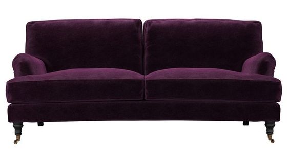
Given my client's love of purple, I chose the Bluebell sofa from sofa.com in Plum velvet. I combined it with an ottoman from Sofa.com in Donkey velvet. The two stylish, button-back armchairs in brown herringbone and the gold velvet cushions on the chairs are both from Quirky Dovetail.
The Jacques nest of two tables and floor lamp are both from Graham and Green.
The rug is the Alvine Ruta from Ikea which grounds the whole room scheme and adds warmth. It is only £150 so if you have budget restrictions it's the perfect rug.
We still need to add artwork in the room, in fact in the whole flat. I encourage clients to buy artwork that they really love and this obviously takes time.
Tip: If your sitting room isn't large (like this one) choose a sofa (and armchairs) without a skirt that you can see underneath and also with low arms (high arms create barriers in a room).
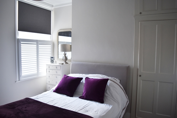
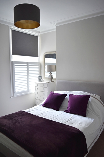
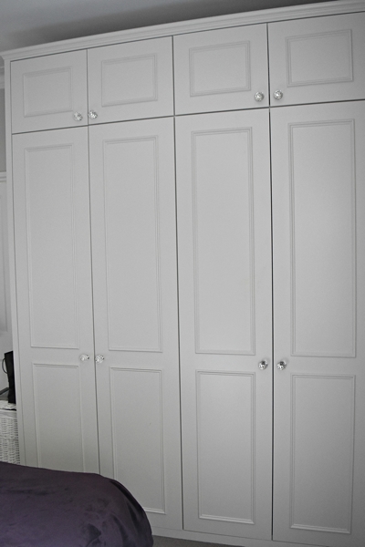
MASTER BEDROOM:
The master bedroom, also painted in Skimming Stone, had no storage so my carpenter made a bank of floor to ceiling wardrobes. I painted them the same colour as the walls.
The bed is from Warren Evans with a Dove Grey headboard. The chest of drawers, mirror, table lamp and purple velvet cushions are all from Balham shop Quirky Dovetail.
Cafe shutters and a roller blind complete the window dressing.
The overhead lampshade is Maserlo from Lighting Superstore.
Tip: Paint built-in wardrobes the same colour as the wall; highlighting them in a contrasting colour just draws attention to them. They aren't attractive architectural features!
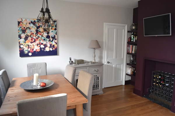
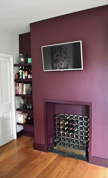
KITCHEN/DINER
Once again, walls painted in Skimming Stone but a feature wall in Brinjal to minimise the appearance of the wall mounted television.
Henriksdal Stornas table and chairs from Ikea. Vintage sideboard and table lamp from Quirky Dovetail. The sideboard has been painted in Farrow and Ball 'Charleston Gray.
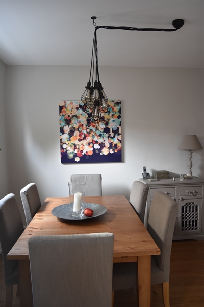
Billie seven-light cluster pendant from BHS. Check out BHS lighting as they have a fantastic range and at affordable prices.
Artwork is a stretched canvas Simon C Page - Cuben Cubic Spine from John Lewis.
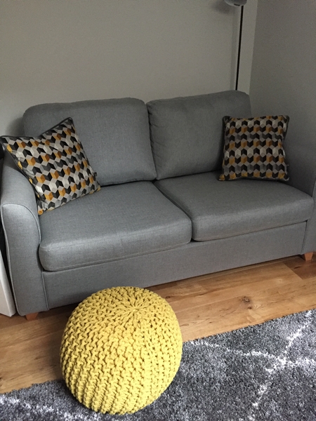
The second bedroom (being used as an office) is painted in Farrow and Ball's 'Strong White' another of their Contemporary Neutrals, a shade lighter than Skimming Stone. Strong White is my favourite F&B white - they describe it as having a "subtle urban feel of its light grey undertones adding a contemporary twist to period homes". I chose this colour because the client wanted to purchase a vintage desk from Quirky Dovetail which had been painted in Farrow and Ball 'Railings' and a mid grey sofa bed (the 'Carnaby' from Debenhams) , both of which work well with Strong White.
The lamp shade is the Peggy from BHS. Check out BHS Lighting as they have the most fantastic range of affordable lighting.
The grey 'Logan' rug adds warmth and texture to the room and the Saffron geometric cushions from Dwell add a pop of colour.
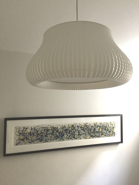
Artwork is a Jackson Pollock print 'Summertime' from John Lewis.
If you would like to book a colour consultation or any other interior design services, do give me a call on +44 (0)7960 934427 or email me at info@angelabuntcreative.com Or if you have any questions or comments regarding this project, feel free to contact me.


It's so important to create an instant visual impact because people form an opinion of your home within the first 20 seconds of entering. Here's another beautiful stair runner I created.