CLIENT PROFILE:
Large Edwardian family home in Tooting, South West London, with a well established bed & breakfast Parklands Bed & Breakfast.
I was contacted by the client to revamp the guest suites and communal areas with new colour schemes and to restyle each room with different accessories. In most instances I was able to recycle all the accessories in the property.
Some of the after photos (obviously the best ones!) were taken by freelance photographer, Tom Nicholson who I have credited against his images.
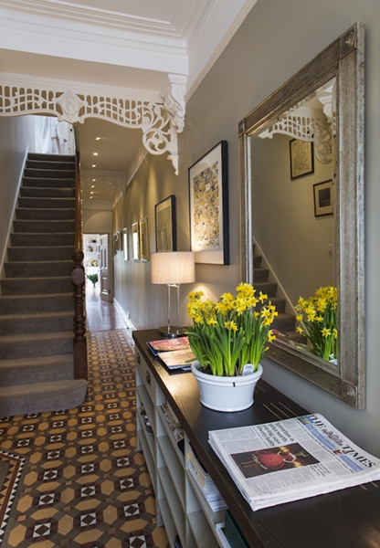
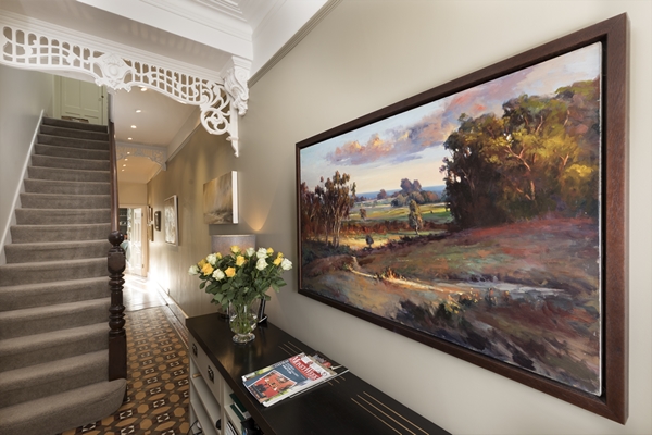
ENTRANCE HALL:
I wanted to add more of a wow factor (I call it a "ta-dah" factor!) to the entrance hall. I changed the wall on the right hand side to the sophisticated Farrow & Ball 'French Gray'. This colour is more green than grey depending on the time of the day. Previously the picture rail was white but I took the colour up onto the picture rail which gives the space more sophistication. I replaced the mirror with a large and long piece of original art which was more suited to the length of the built-in storage unit and it creates a dramatic effect when entering the home.
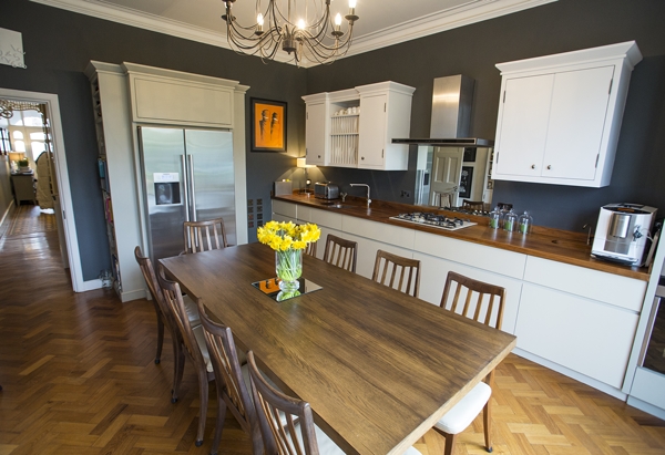
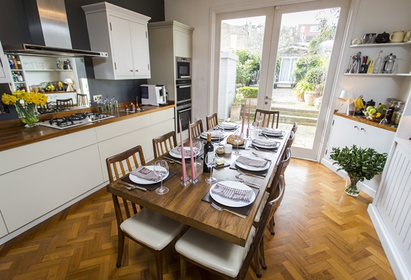
KITCHEN
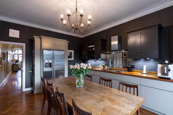
The kitchen walls were Dulux 'Night Jewels 2' and the woodwork Farrow & Ball 'Hardwick White'. I worked with these colours by painting the upper units the same colour as the wall and I continued the Hardwick White on the display units opposite which were previously white.
Tip: Paint the upper kitchen units the same as the wall colour and they will effectively "disappear" into the wall and therefore not feel overbearing.
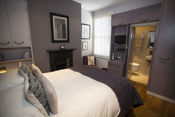
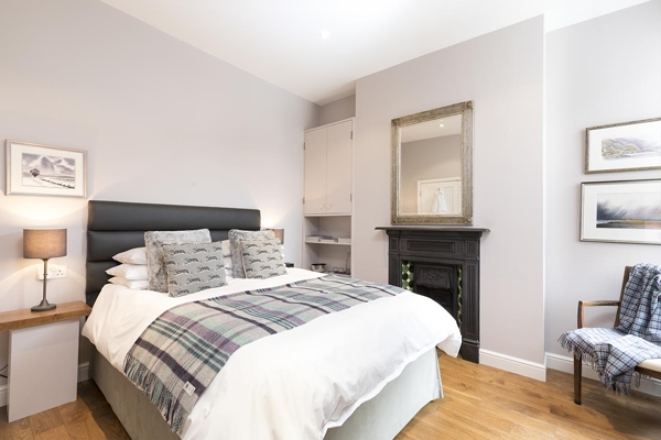
Bedroom 1:
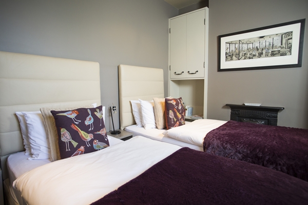
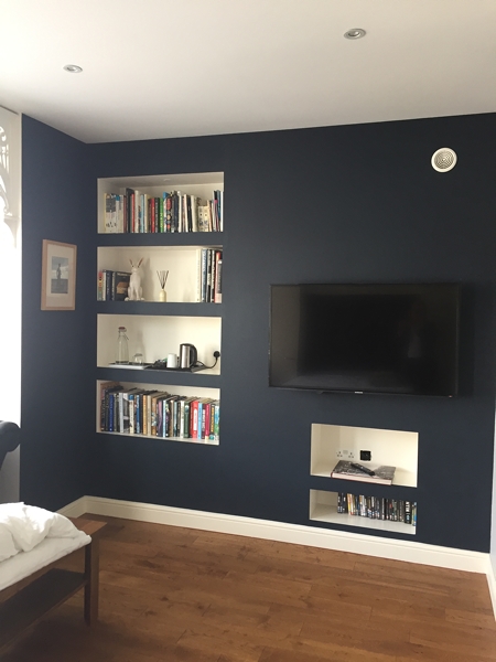
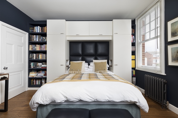
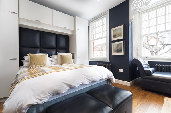
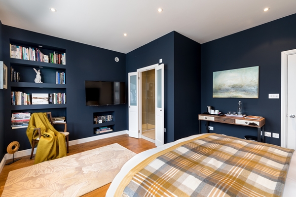
This guest room was previously painted Farrow & Ball 'Savage Ground' which is a yellow based stone colour. I chose a darker wall colour that would work better with the large headboards and would also create some drama and wow factor. I also painted the built in cupboards in the same colour as the walls and changed the handles to more discreet cut glass knobs. My colour choice was the fabulous Farrow & Ball 'Inchyra Blue' a blue grey and one of their more recently introduced colours. This dark blue/grey doesn't make the room feel dark as it is a sunny south facing room. However being a darker colour it enhances the artwork and makes it pop.
Tip: Paint any built-in cupboards and shelves in the same colour as the wall. You don't want to make a feature of them if they are not architecturally pleasing on the eye.
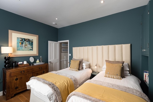
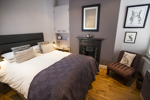
Bedroom 2:
This guest room was a shrine to lavender with a mix of Farrow & Ball 'Brassica' and 'Calluna'. Both of these colours are beautiful but a little overpowering in a room this size and also they are not colours to everyone's taste. I updated the room by painting it one of the most stunning Farrow & Ball colours 'Peignoir' a soft pink with a heavy dose of grey. This gives the room a lighter and more contemporary feel with a feeling of calm. All the woodwork has been painted the same colour as the walls except the white skirting boards. I changed all the handles on the cupboards to discreet cut glass knobs. The transformation of this room is the most dramatic of all the rooms.
I have used Peignoir many times in clients' homes, usually in bedrooms but I have also used it in a sitting room with Farrow & Ball 'Downpipe' to great effect. For all intents and purposes it is a pink colour and a lot of men would balk at the idea of sleeping in a pink bedroom but Peignoir has a hefty dose of grey in it so I have yet to have a male client complain; in fact they love it !
Tip: For built in cupboards that need a knob/handle to open them, keep them simple and discreet. I use cut glass knobs a lot as they reflect the colour(s) in the room and they look classy. I would advise that you do skimp on the quality of cut glass knobs as there are a lot of cheap alternatives out there.
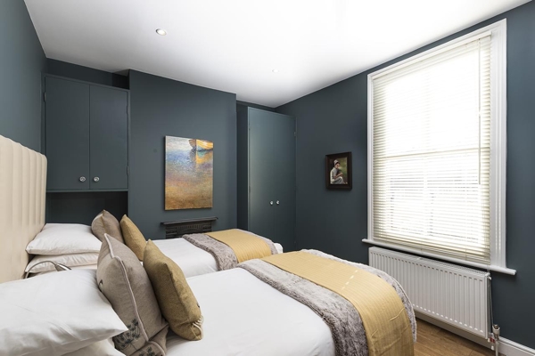
Bedroom 3:
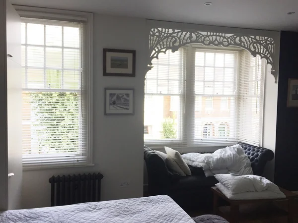
This guest room is a huge room at the front of the property with gorgeous fretwork around the bay window. The room was already painted Dulux Cobalt Blue so I extended this colour to the walls that were white as well as some of the woodwork. The dark blue walls and a lot of the woodwork has given the room a much more dramatic look. At a later date we will also paint the cupboards around the bed in the same blue.
Tip: If using a very dark wall colour in a room with low ceilings I recommend painting the skirtings in the same colour as taking the colour right to the floor will make the ceiling feel higher. This room has very a high ceiling so the white skirting doesn't make the ceiling feel low.
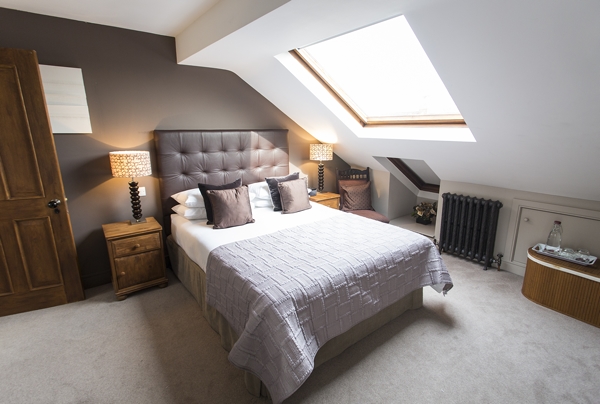
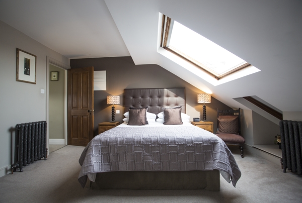
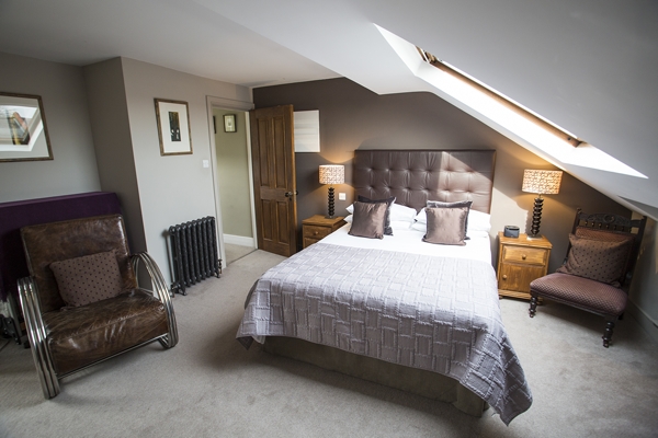
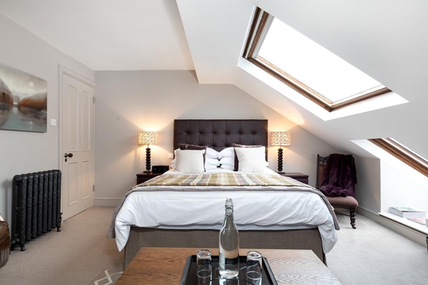
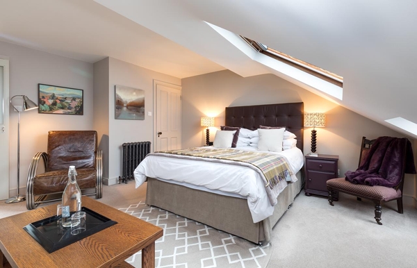
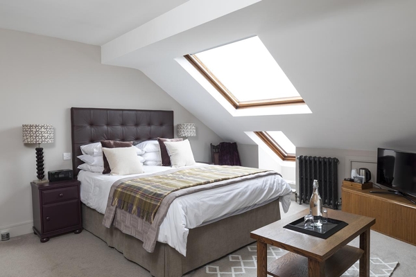
Bedroom 4:
And finally the 4th guest room which is in the loft conversion. It was previously painted Farrow & Ball 'Elephant's Breath' with the headboard wall painted Farrow & Ball 'London Stone'. I extended Elephant's Breath to the headboard wall and to add an accent colour I painted the pine bedside tables in the fabulous aubergine colour Farrow & Ball 'Brinjal'. I added a Weaver Green Juno rug in 'Dormouse' at the end of the bed. These rugs are made entirely from recycled plastic bottles and look and feel just like wool. I have added these rugs in many of my clients' homes as they are hard wearing and versatile being machine washable and they are very reasonably priced.
Tip: Don't underestimate the impact of a rug in a room as it will ground the whole room scheme. If you don't already have a rug, I advise you wait until the room scheme has been established before choosing one.
The client has a huge collection of original art so the choices I could make for each room meant the art did not determine the wall colours rather the reverse. One of the highlights of this project was selecting the artwork for every wall (I was like a pig in mud!!). T
The owner of this stunning Edwardian home, Sally, and her two sons are all so charming and hospitable which made this one of the most enjoyable projects I have worked on. I would highly recommend their home as a B&B to anyone needing accommodation in a beautiful part of South West London.
You may also like to read


It's so important to create an instant visual impact because people form an opinion of your home within the first 20 seconds of entering. Here's another beautiful stair runner I created.