From where to start, how to choose a brand and a colour, through to adding little pops of colour to a grey-themed room, here are my tips on how to lighten up.
Read moreInspiring locals with my 'Colour in the Home' talk
Hi Everyone, I guess you are in the throws of starting to decorate your homes for Christmas and furiously buying presents. It's a lovely time of year; I love all that anticipation.
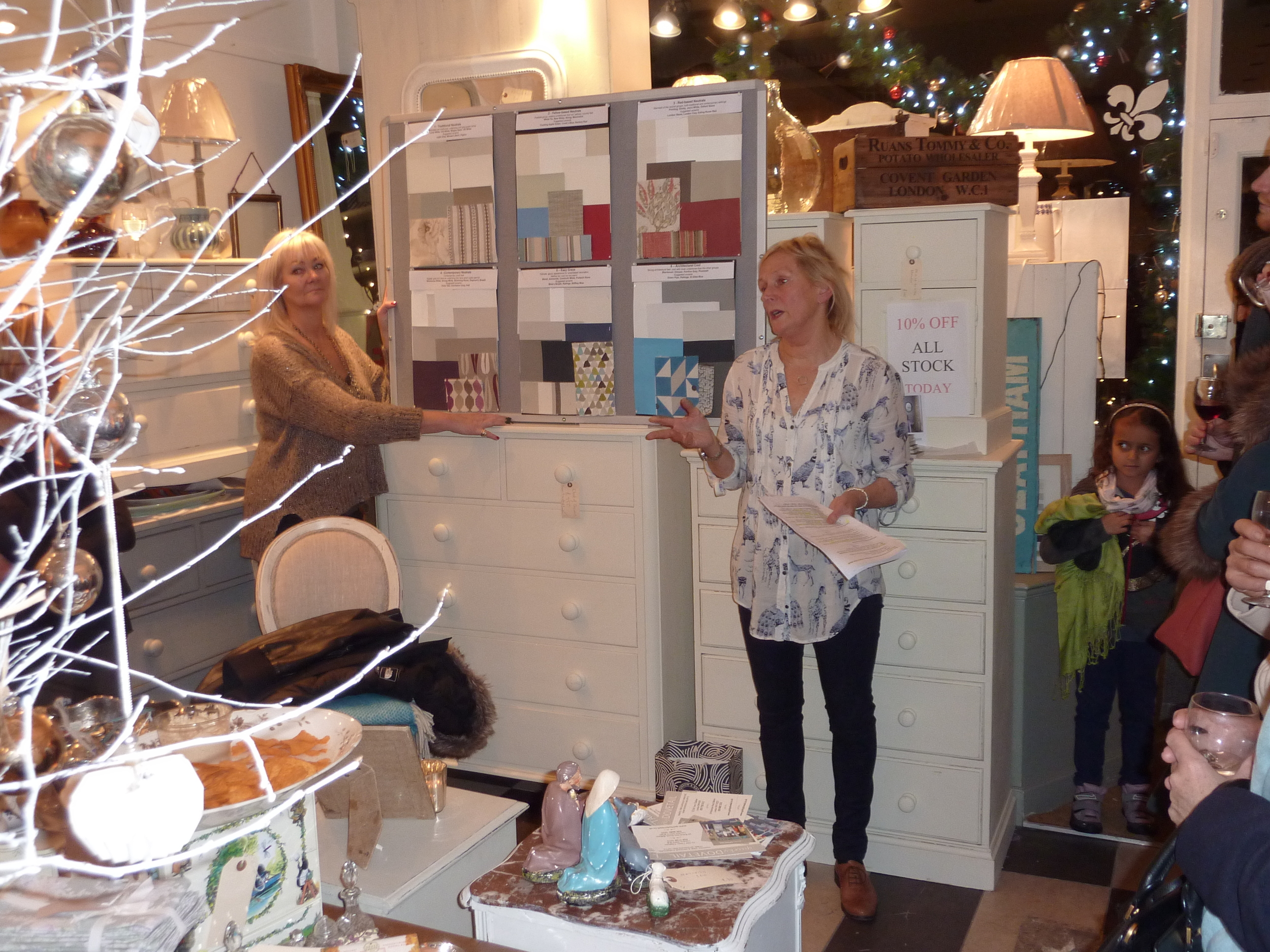
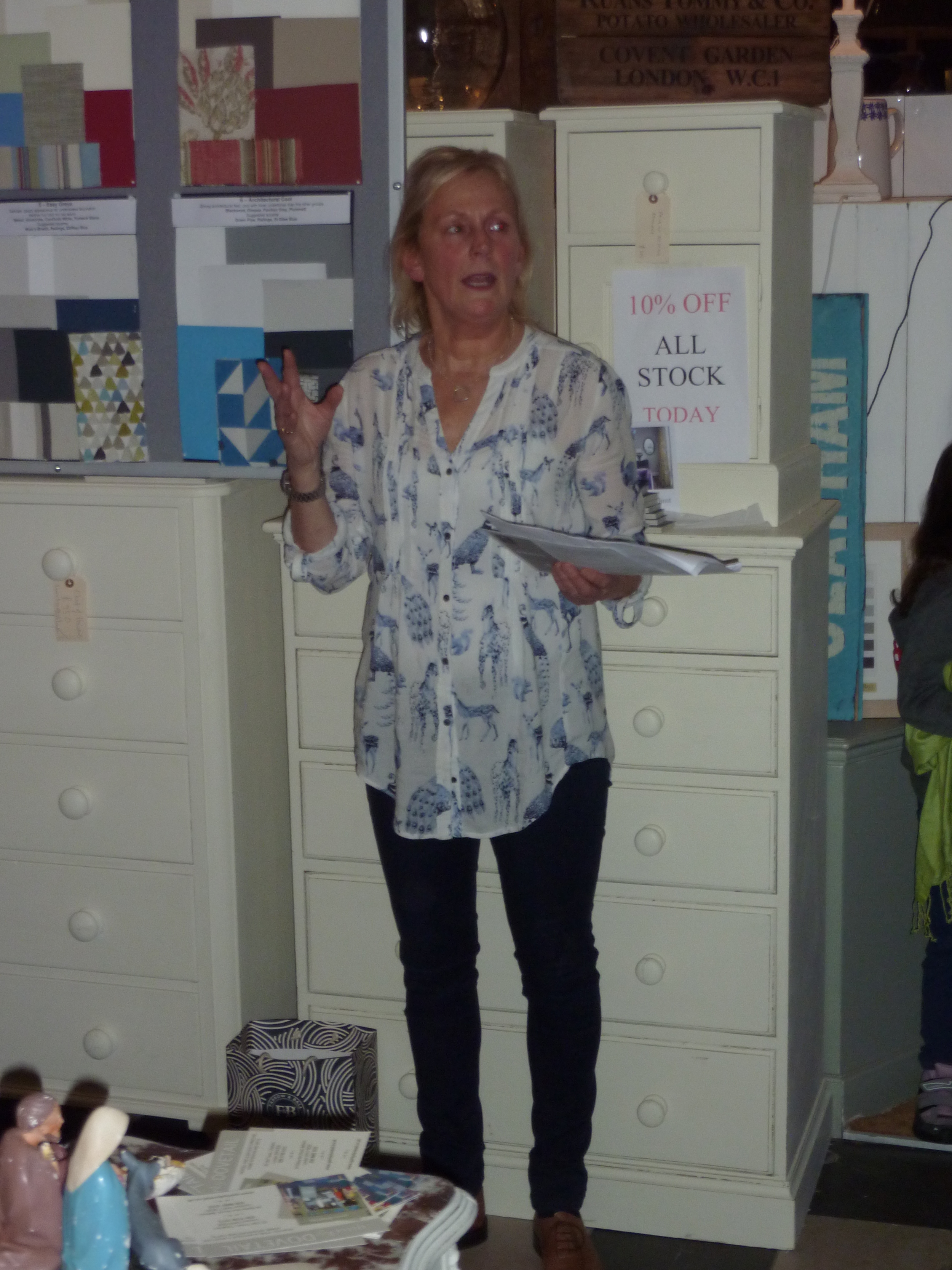
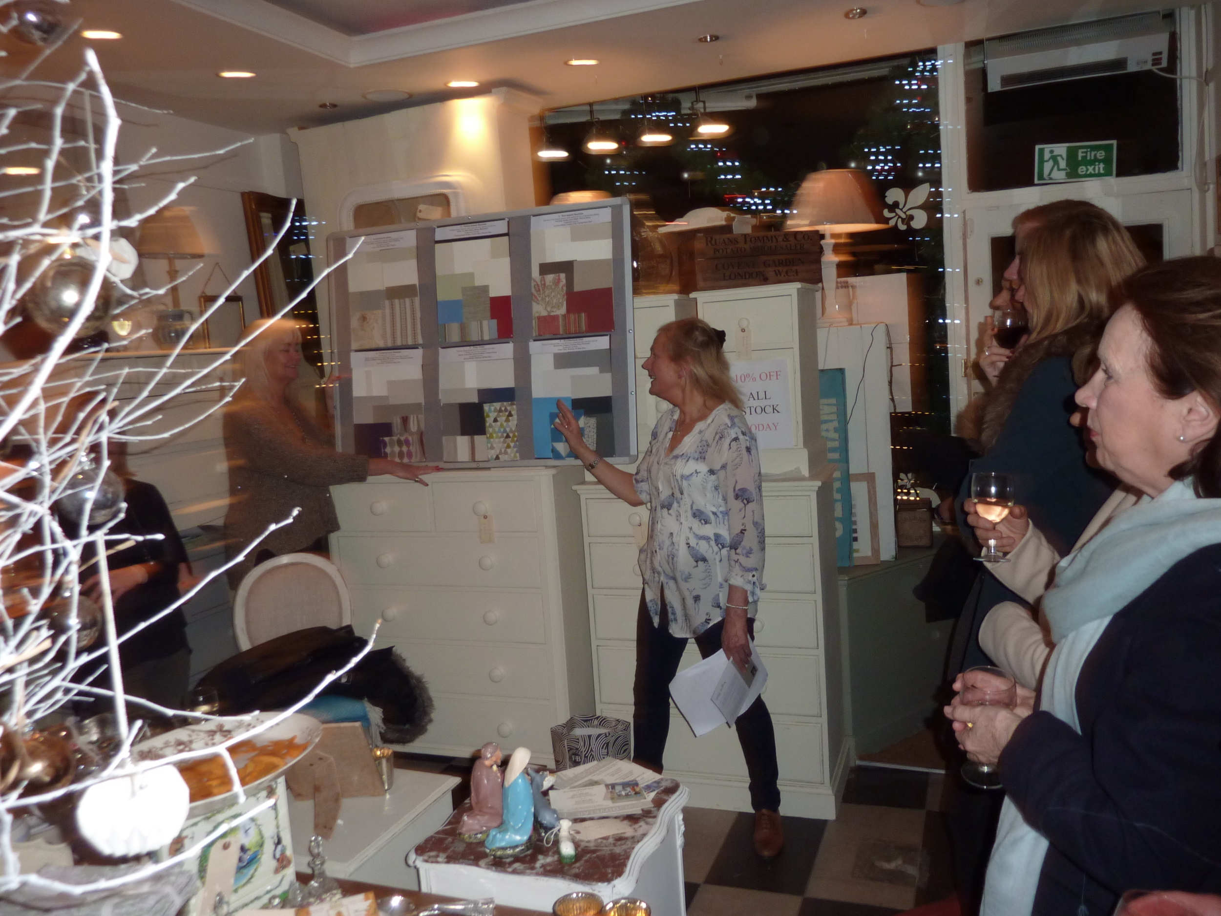
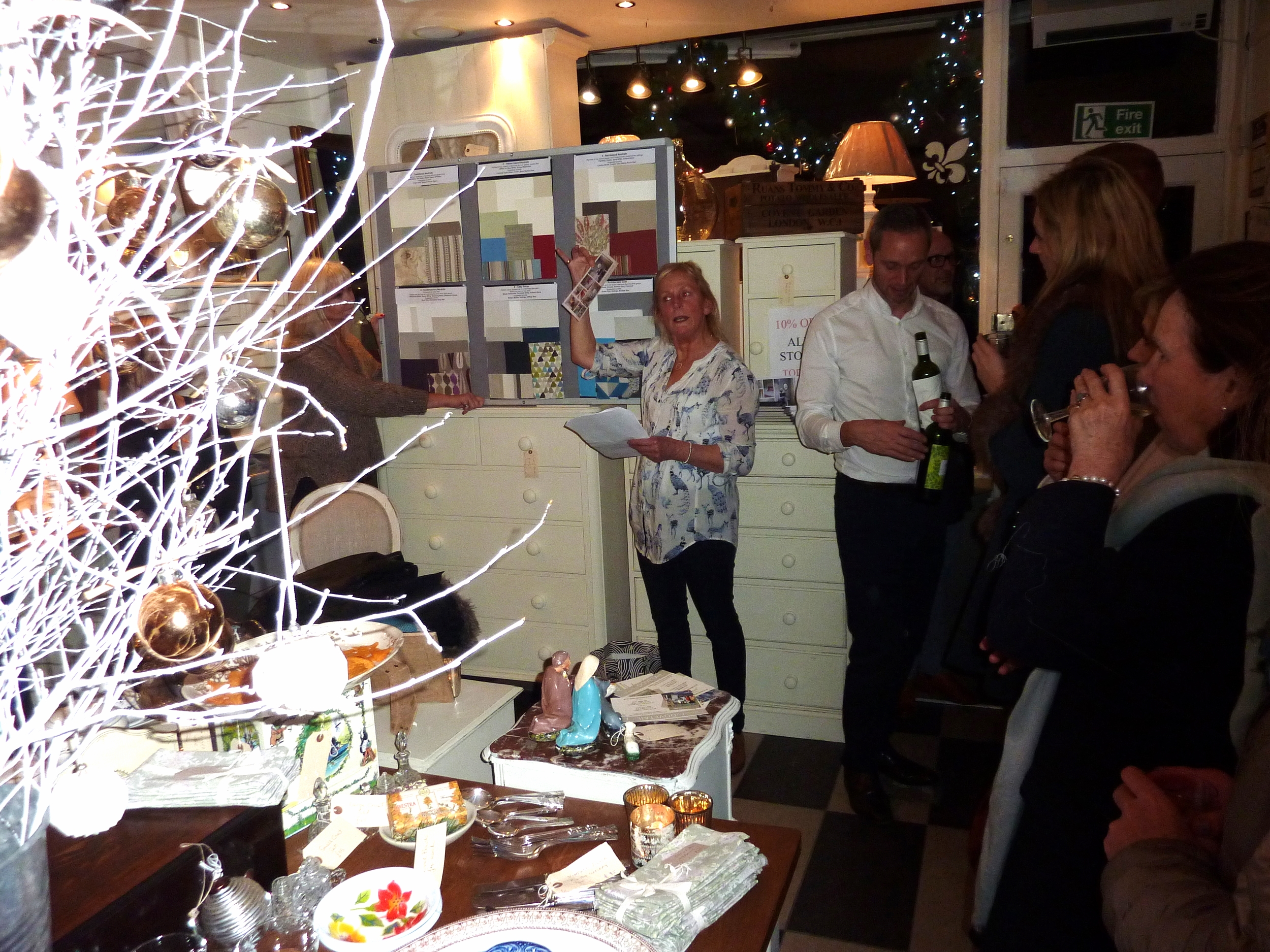
Last week I gave a talk on 'Colour in the Home' at the local interiors shop where I work two days a week, Quirky Dovetail. This is a lovely local interiors shop where I've been working (running the shop) part-time for the last three years. We specialise in up-cycling old furniture and painting it in Farrow and Ball neutral paint colours as well as selling antique and vintage items and homewares. The event at which I spoke was our annual Christmas shopping evening which is always well attended by regular clients, new clients and friends. Given that I am an interior decorator and colour consultations are a crucial part of my services, and also I'm absolutely passionate about colour, I decided to give a half hour talk on how to use colour in the home. The majority of our clients are afraid of colour so I wanted to show them how they could inject some colour into a neutral colour scheme. Grey is definitely the trend currently and many people paint rooms grey, add grey flooring and furniture but then wonder why the room looks bland and insipid. I hope I inspired them enough to introduce some colour; the feedback after my talk certainly gave that impression!
Given that Quirky Dovetail paint furniture in Farrow and Ball paint, I used the six Farrow and Ball neutral families as the basis for my talk. There are so many colour brands and each paint chart has way too many colours but I like the fact that Farrow and Ball have created these six neutral families to make our lives easier when selecting a colour scheme. And Farrow and Ball paint is particularly lovely with such high levels of pigment and such depth of colour.
I know the word 'neutral' can sound really dully and boring, even a bit of a cop-out to some of you, however neutrals are easy to live with, elegant and un-demanding if they are used correctly. It's all about how you put the neutral shades together as to whether the effect is sophisticated or insipid.
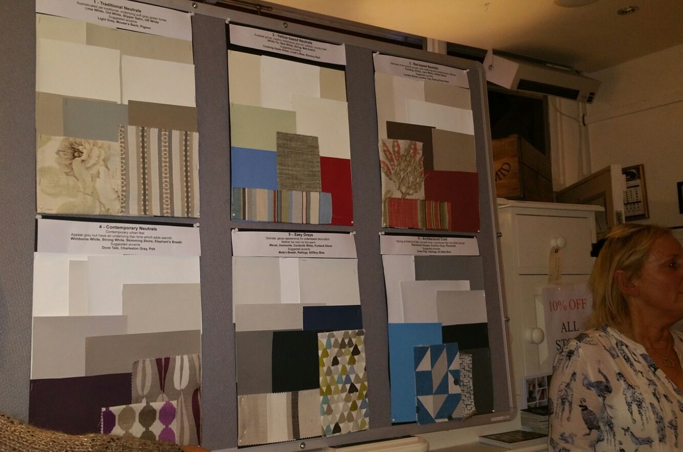
I prepared a board for each of the Farrow and Ball neutral families and I included some accent colours and also a couple of fabrics to create a sort of mood board so that the audience could imagine how these could work in a room.
For those of you are not familiar with the Farrow and Ball neutral families, they are:
Traditional Neutrals - Soft grey-green tones, sophisticated - Lime White, Old White, Slipper Satin, Off White. Suggested accents: Light Gray, Mouse's Back, Pigeon
Yellow-based Neutrals - Creamy undertones, prettiest group, country feel - White Tie, New White, String, Matchstick. Suggested accents: Cord, Cat's Paw, Tanner's Brown, Mouse's Back or for a country scheme try Cooking Apple Green, Cook's Blue and Rectory Red
Red-based Neutrals - Red undertones, warmest group - Pointing, Dimity, Joa's White, Oxford Stone. Suggested accents: London Stone, London Clay, Eating Room Red
Contemporary Neutrals - Lilac undertones, appear grey, add edge but retain warmth - Wimborne White, Strong White, Skimming Stone, Elephant's Breath. Suggested accents: Dovetail, Charleston Gray, Pelt
Easy Greys - Neither too warm nor too cool, delicate gauzy appearance - Wevet, Ammonite, Cornforth White, Purbeck Stone. Suggested accents: Mole's Breath, Railings, Stiffkey Blue
Architectural Cool - Cool with blue undertones, have architectural edge - Blackened, Dimpse, Pavilion Gray, Plummett Suggested accents: Down Pipe, Railings, Stiffkey Blue
Here are my boards of the six neutral families and accents:
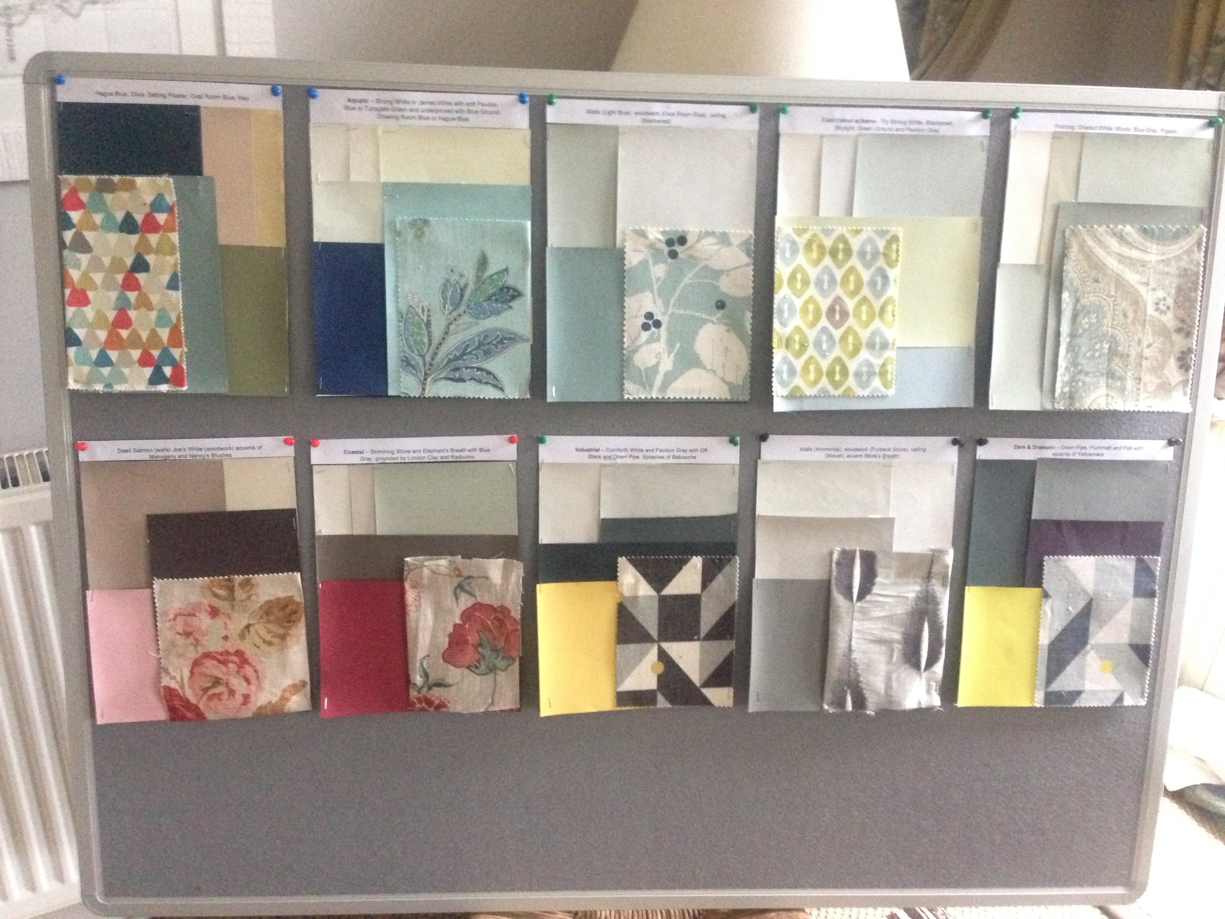
I also created some separate colour schemes on smaller boards again with a complementing fabric and these were pinned to the reverse of the presentation board for viewing after my talk.
We had a full house for my talk and the evening was animated and sociable fuelled by plenty wine and food and lots of shopping! Never the most flattering when you are being photographed talking animatedly and passionately and waving your arms around but here goes .......... !1


I would love to hear how you have introduced colour into your home and what paint brand and colours you have used. Or if you have any questions you would like to ask me, don't hesitate to get in contact.
You may also like to read
Featured


A lesson in flower arranging at Perch Hill, Sussex
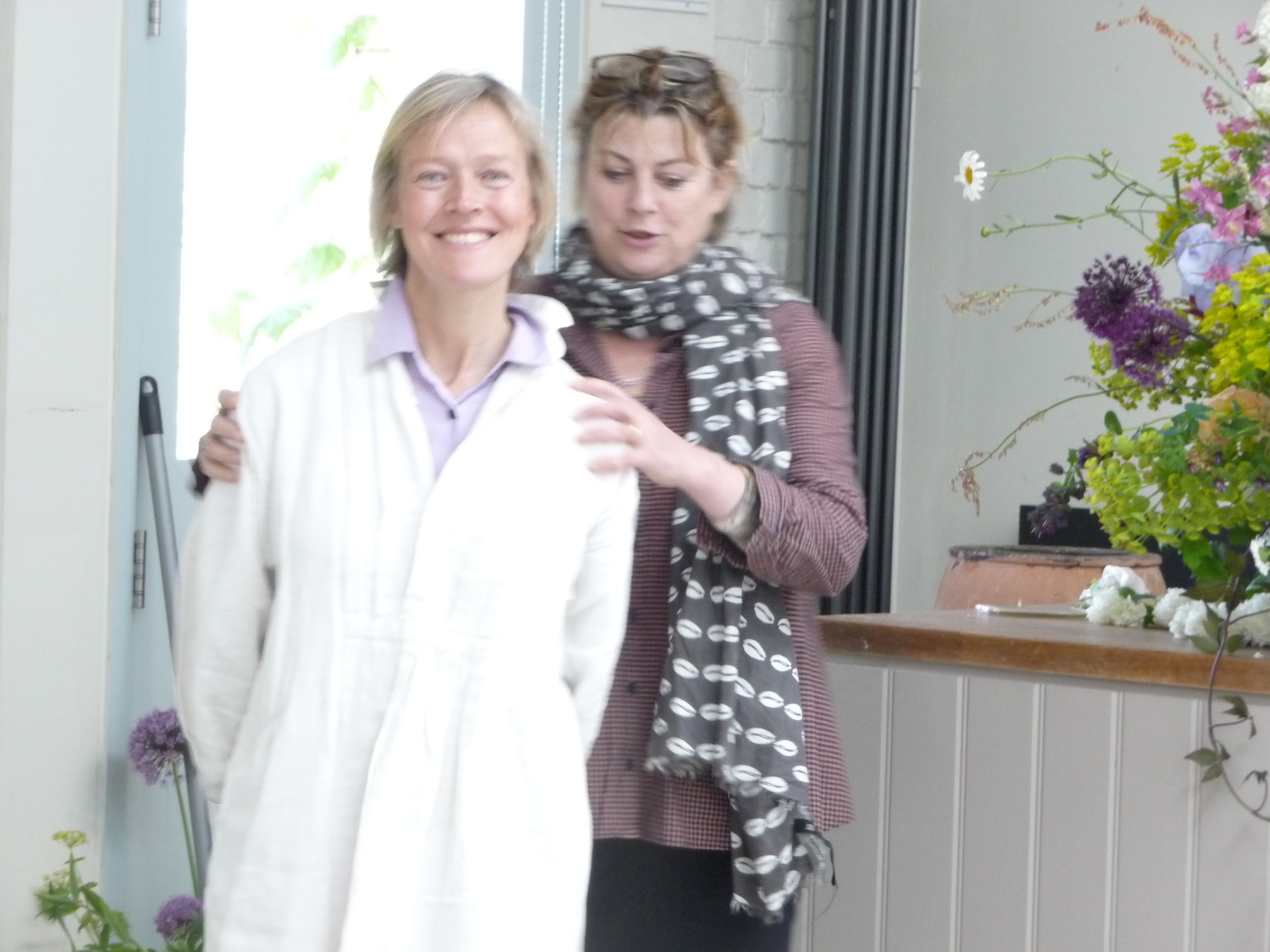
It's been a crazy week and I'm behind in my blog posts, still catching up on posts relating to my friend's visit - she's been gone over a week! My friend from back home who stayed with me for two weeks (see previous post 'Route Marching Around Richmond Park) very kindly paid for the two of us to attend a Sarah Raven course with the charismatic and charming Juliet Glaves of Thoughtful Flowers. The course was at Sarah Raven's inspirational garden at Perch Hill in Sussex which is in the most glorious setting. For those of you who don't know Sarah Raven, she is a well-known gardener, writer and television presenter and she runs a garden and cookery school at Perch Hill.
Juliet Glaves had a pop-up florist in The Designers Guild during the Chelsea Flower Show week. You can see the beautiful displays of flowers and arrangements she had in the Designers Guild in my post 'Designer's Guild Embraces Chelsea Flower Show' dated 25 May.
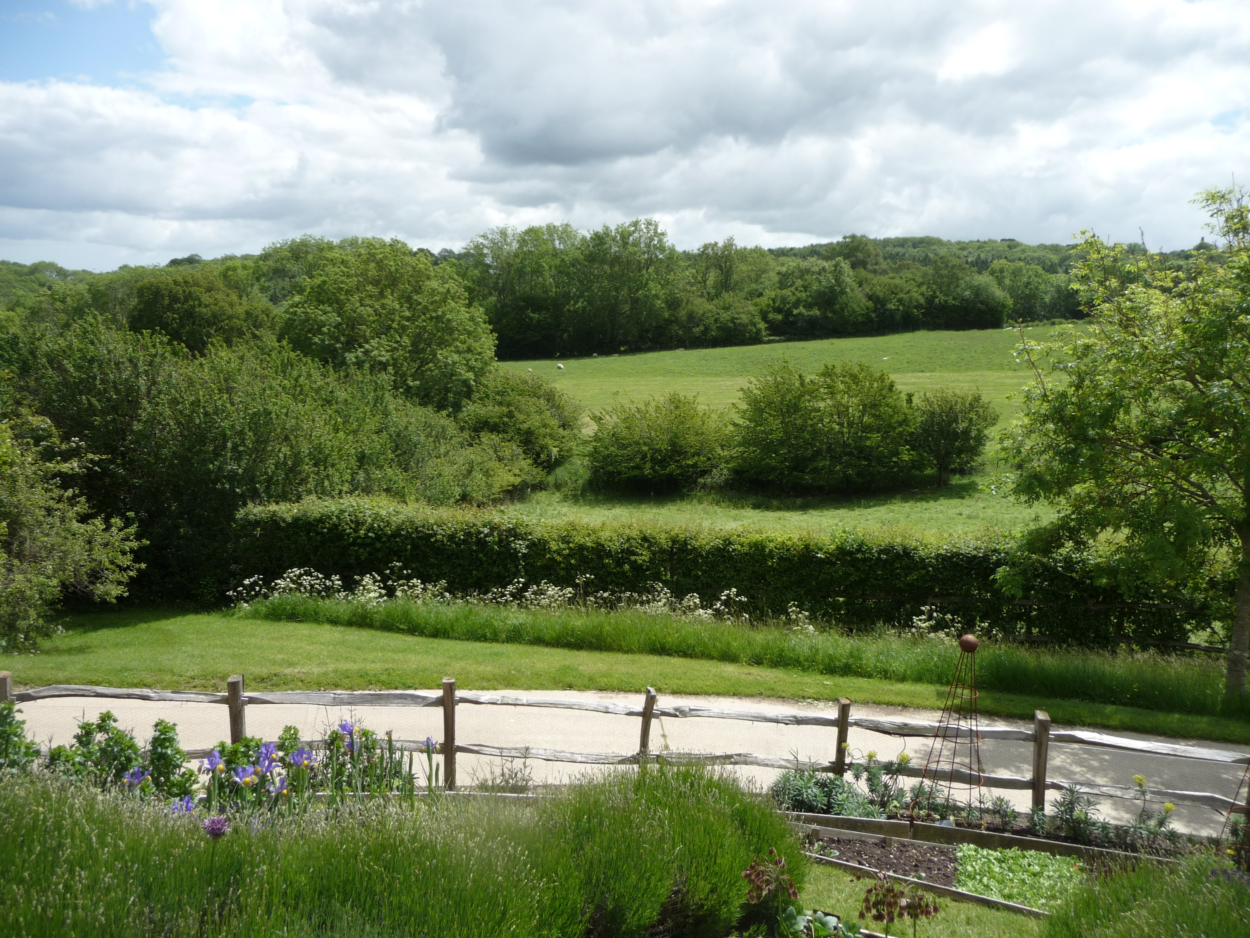
It was wonderful to head out of London in the car on a glorious sunny day and head into the countryside. Everything is very green and lush at present so it's the perfect time of year to appreciate the English countryside. I don't get out of London enough but have made it a resolution this year to escape London more often. It's so good for the soul!
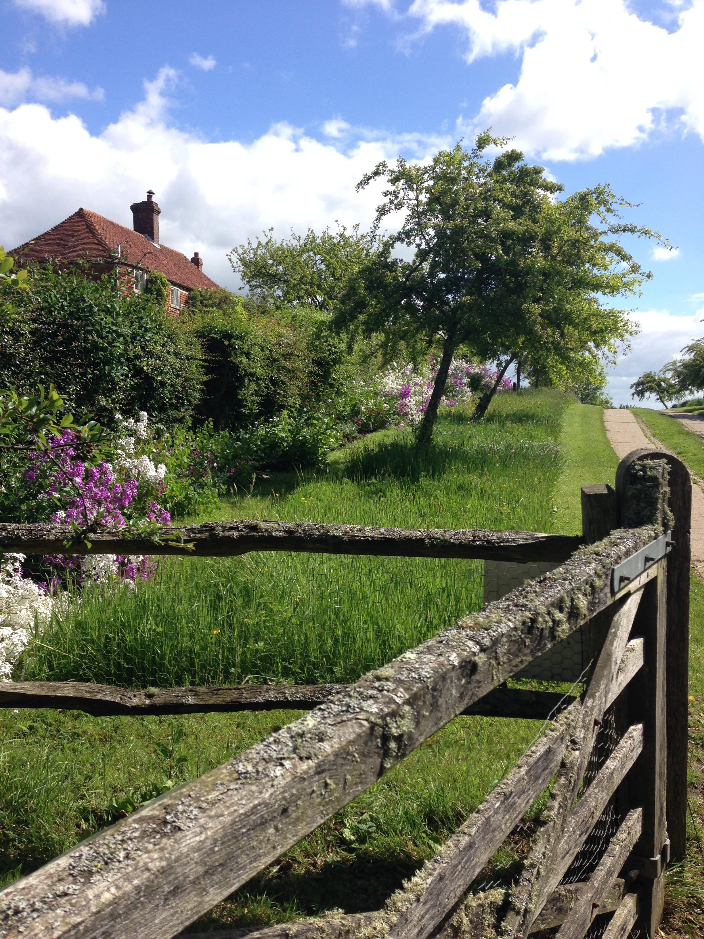
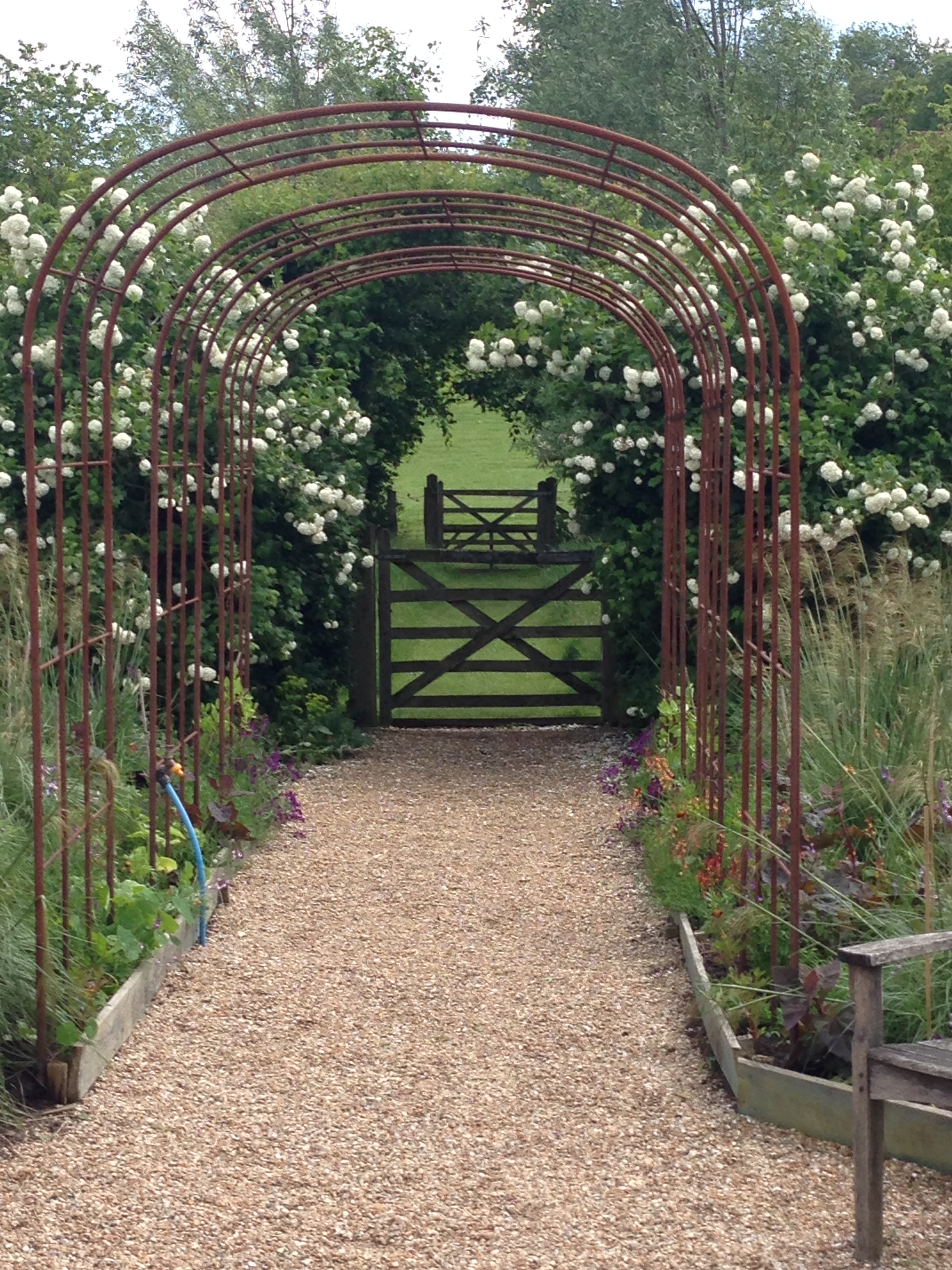
Perch Hill is off the beaten track down a long winding road. The entrance to it is stunning - the lichen covered gate and the purple and white wallflowers flanking one side of the driveway:


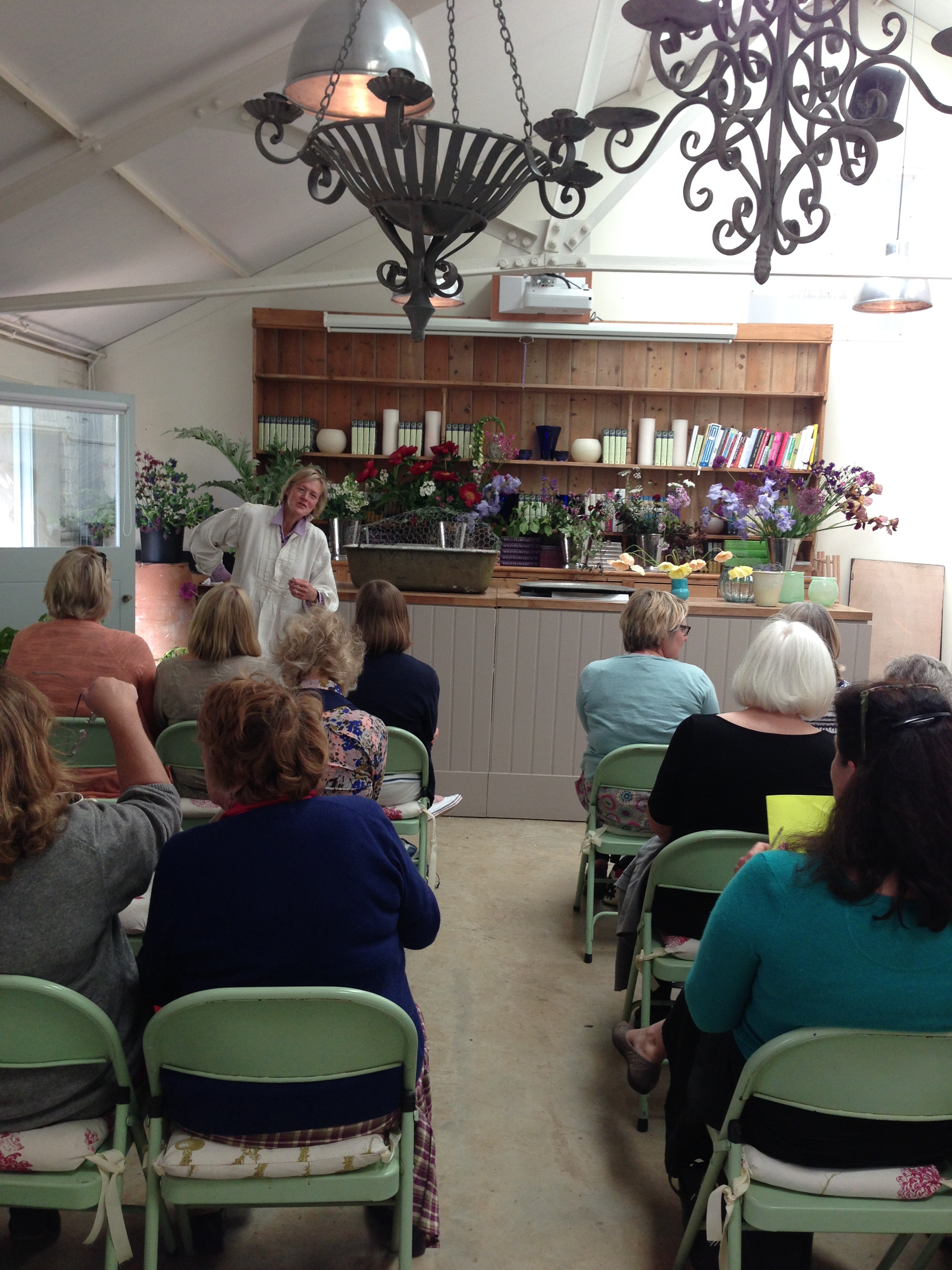
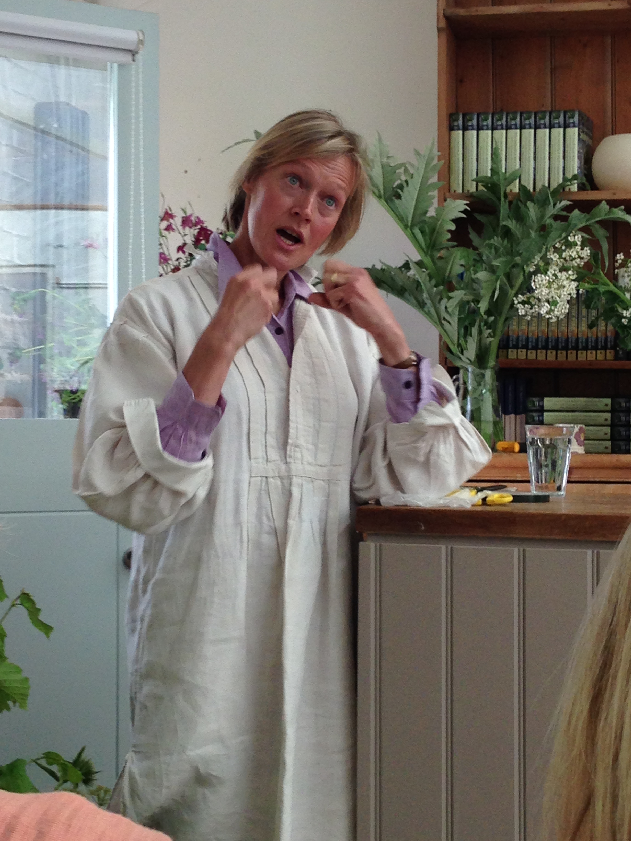
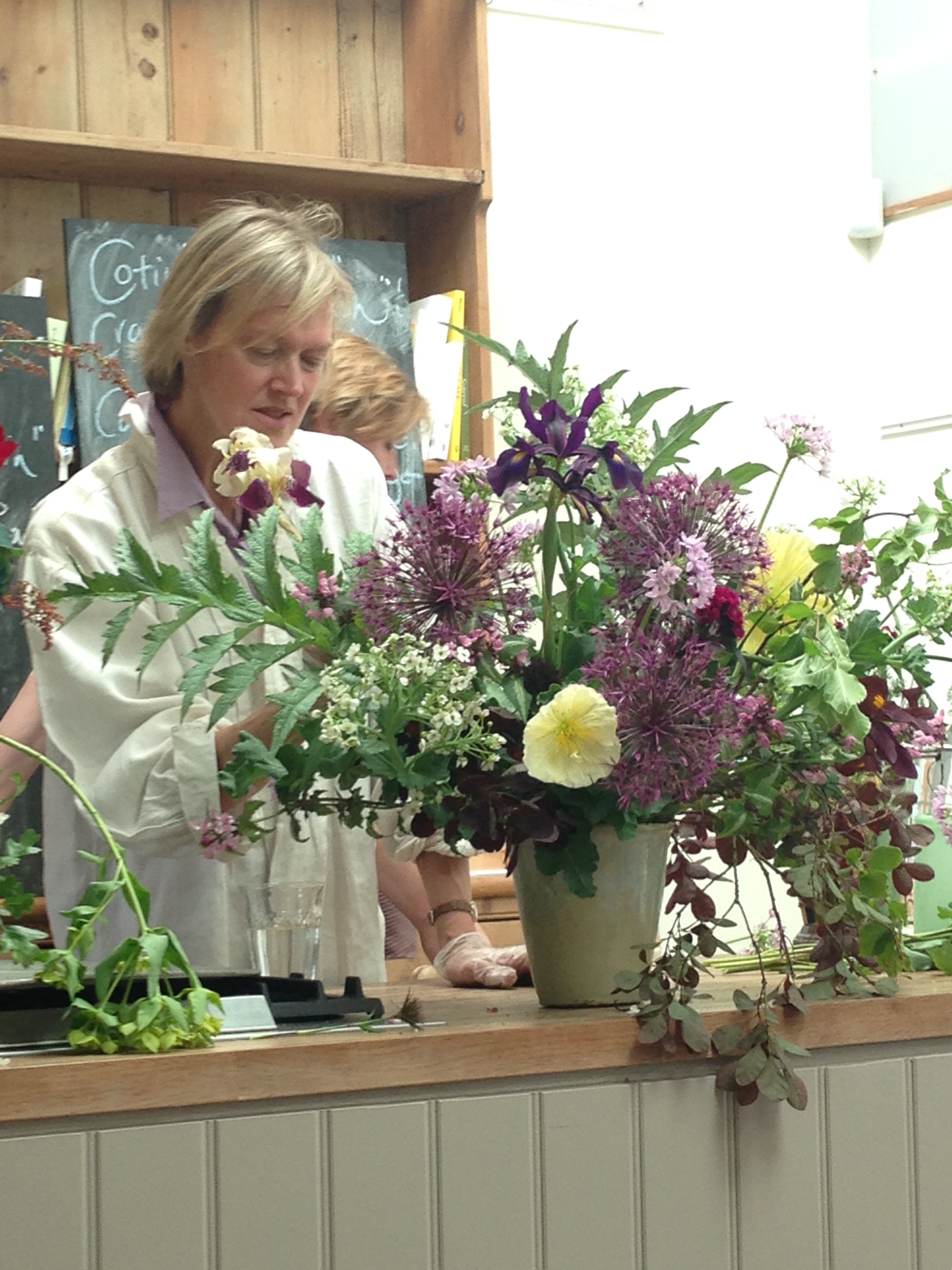
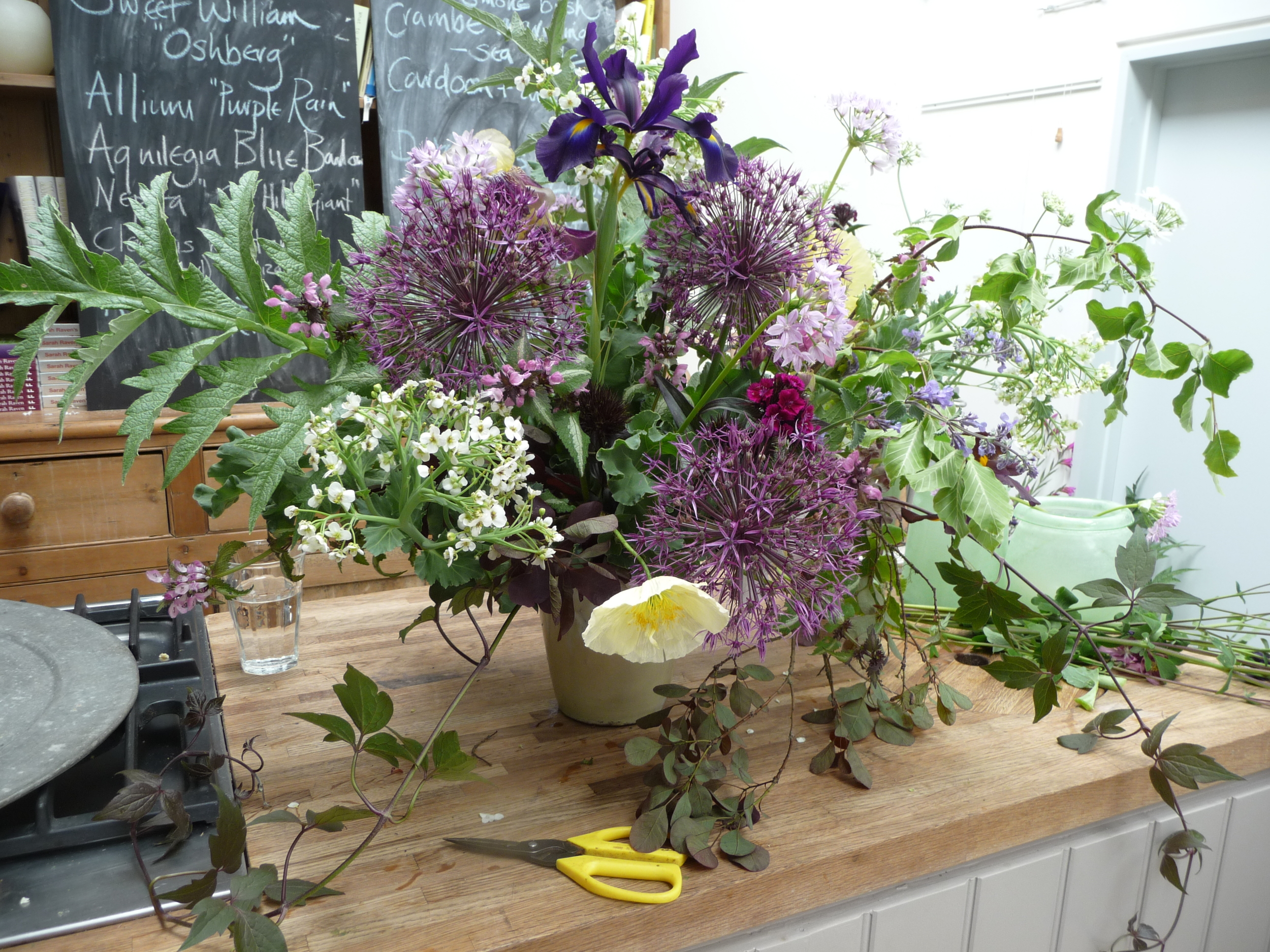
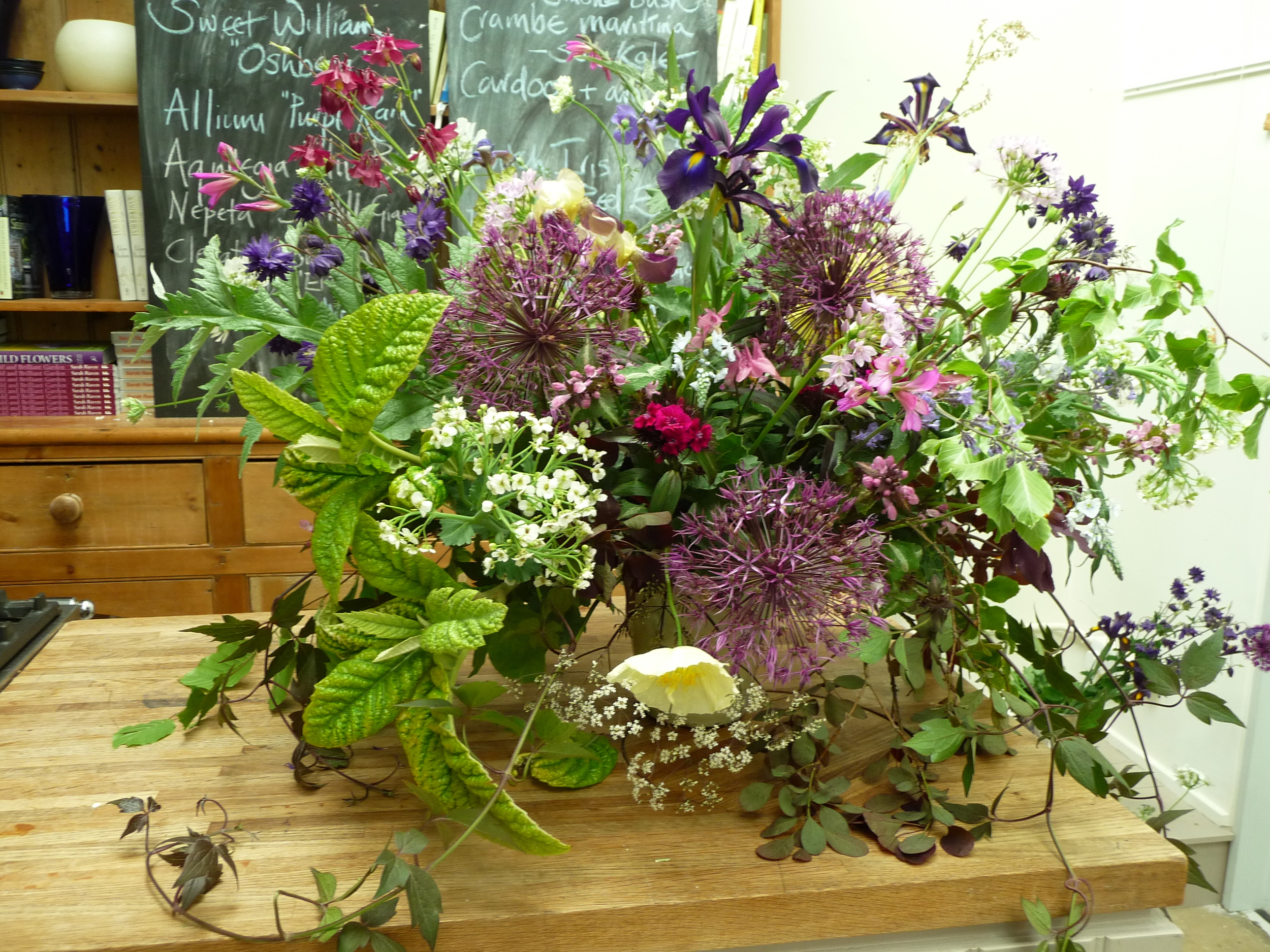
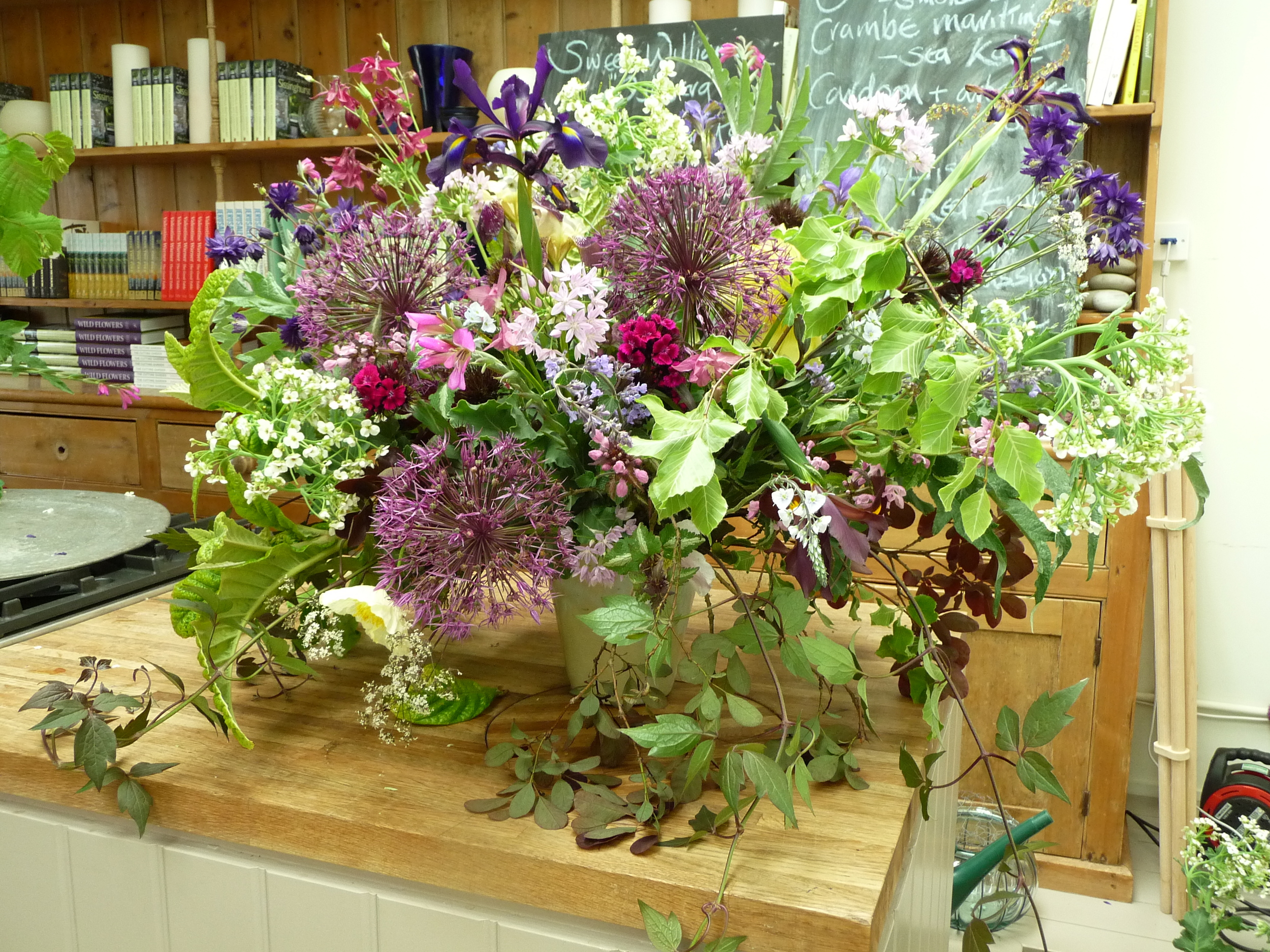
There were about 30 of us on the course, all women, and all passionate about flowers and flower arranging. Even as an experienced florist there was plenty to learn from Juliet Glaves, whose style of flower arranging is much less formal than the way I was taught. She and her husband grow all their own flowers as well as picking wild flowers from the hedgerows so all the flowers she used in the two arrangements she made were home-grown.
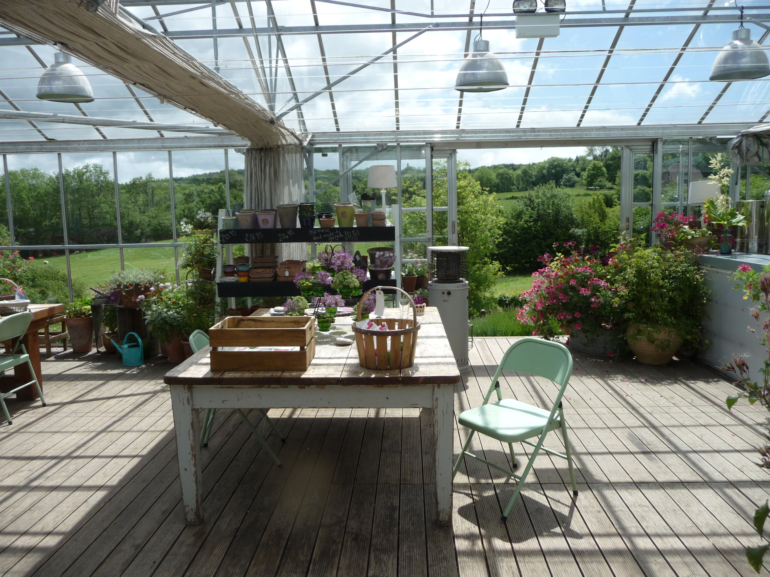
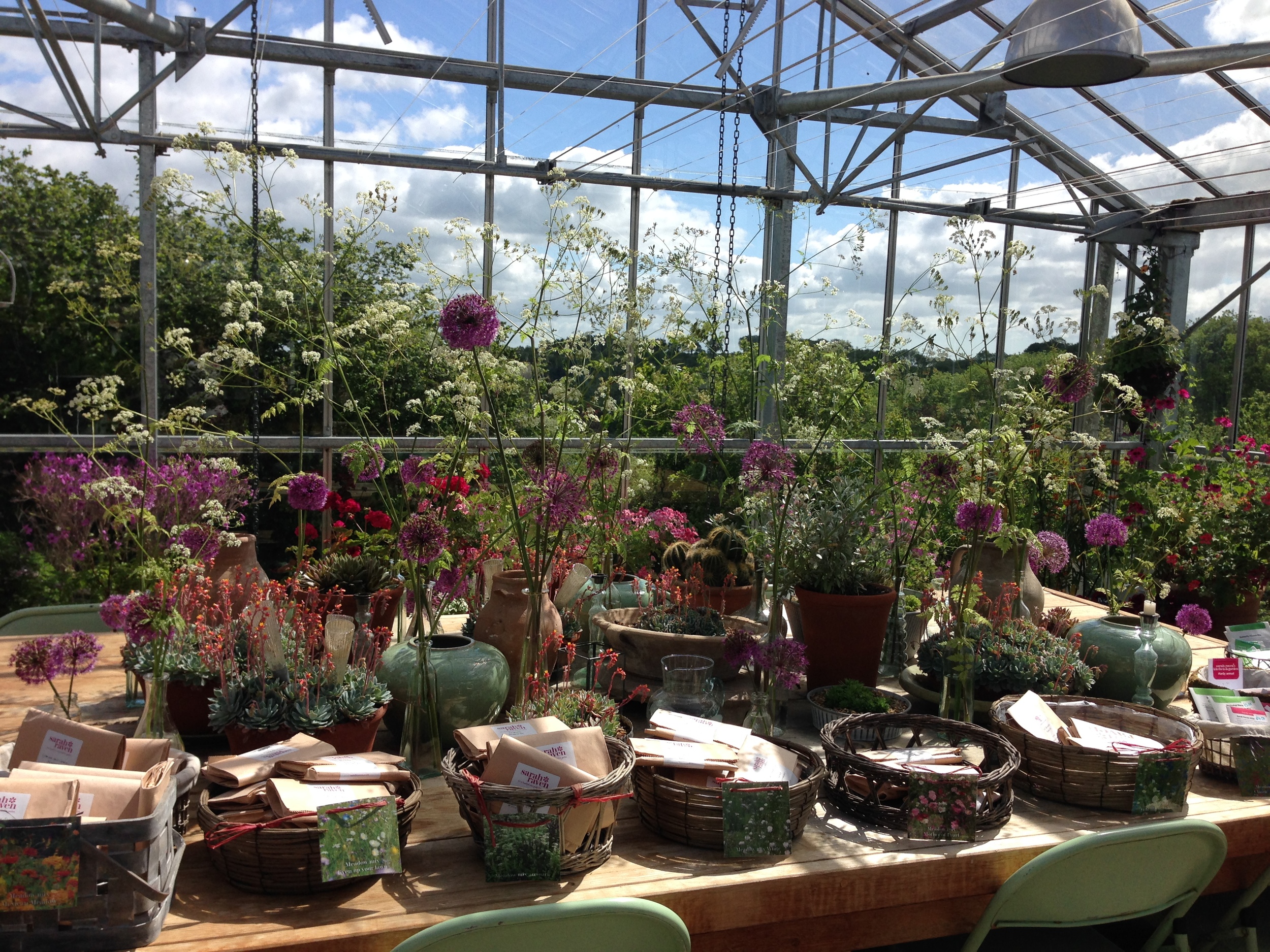
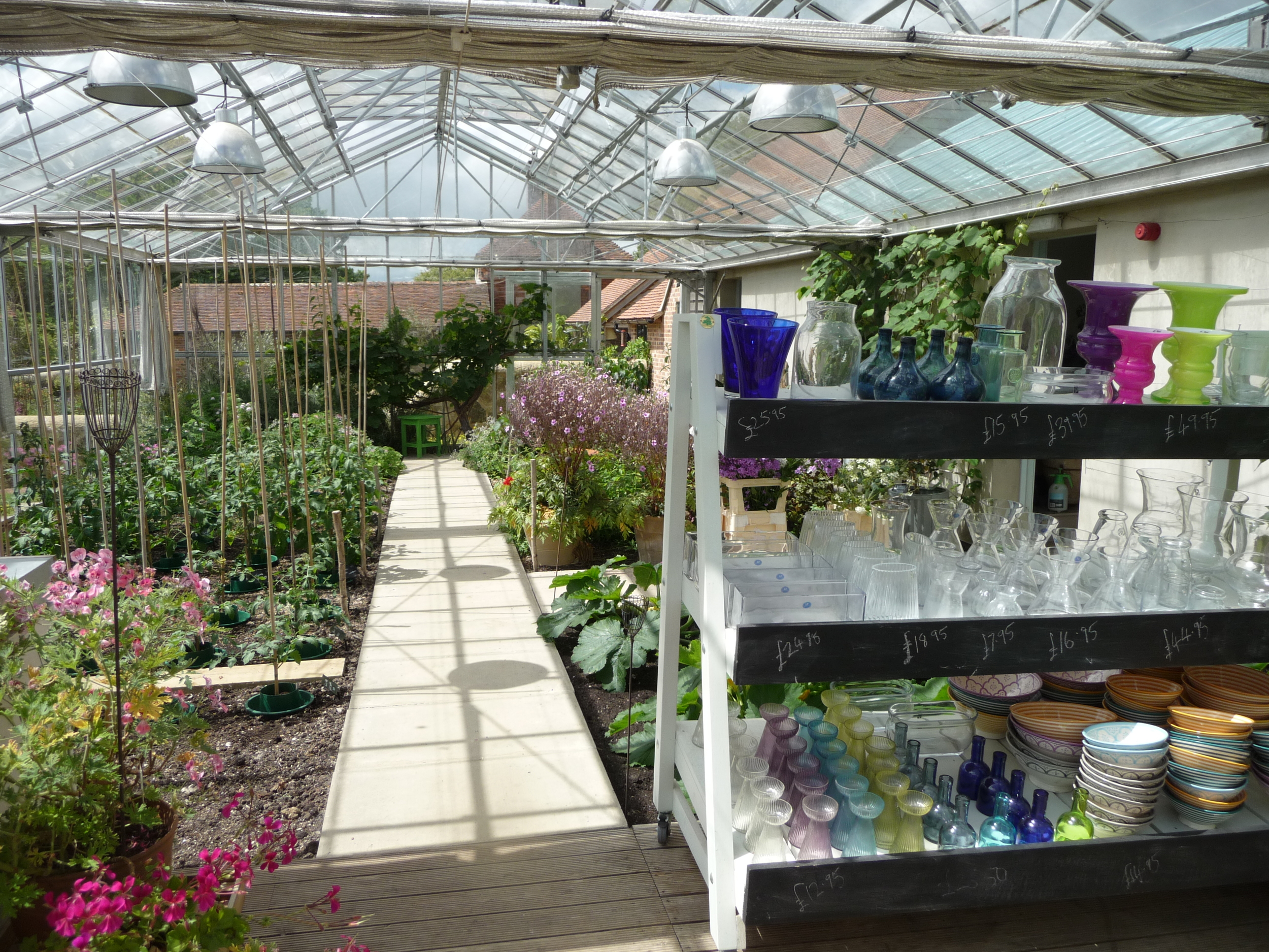
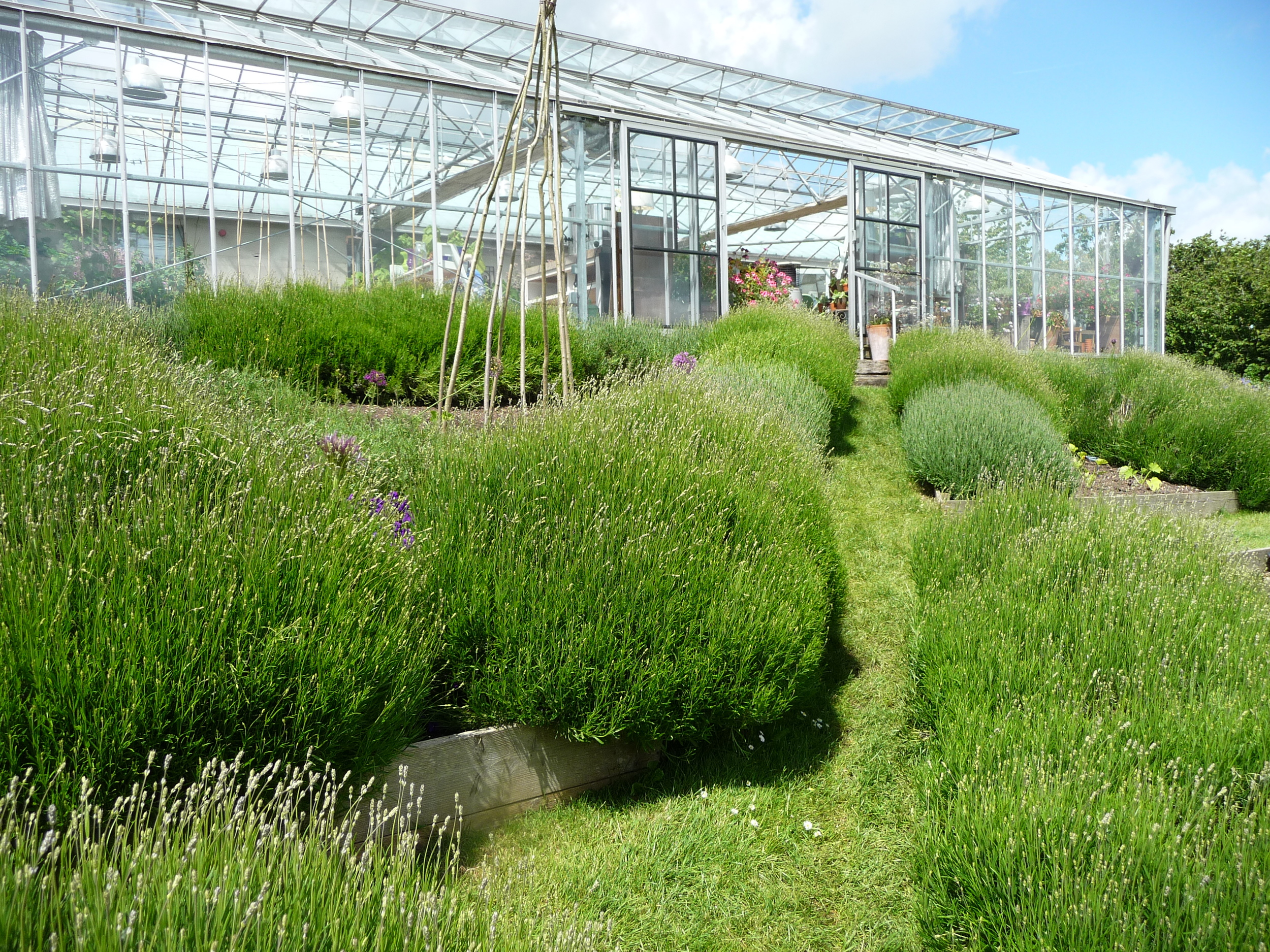
When you first enter the Perch Hill building, you walk through the small shop (full of lots of fabulous items to buy) to a large glasshouse/conservatory which has the most spectacular view of the countryside. Coffee and delicious cakes were served here while we soaked up the view.

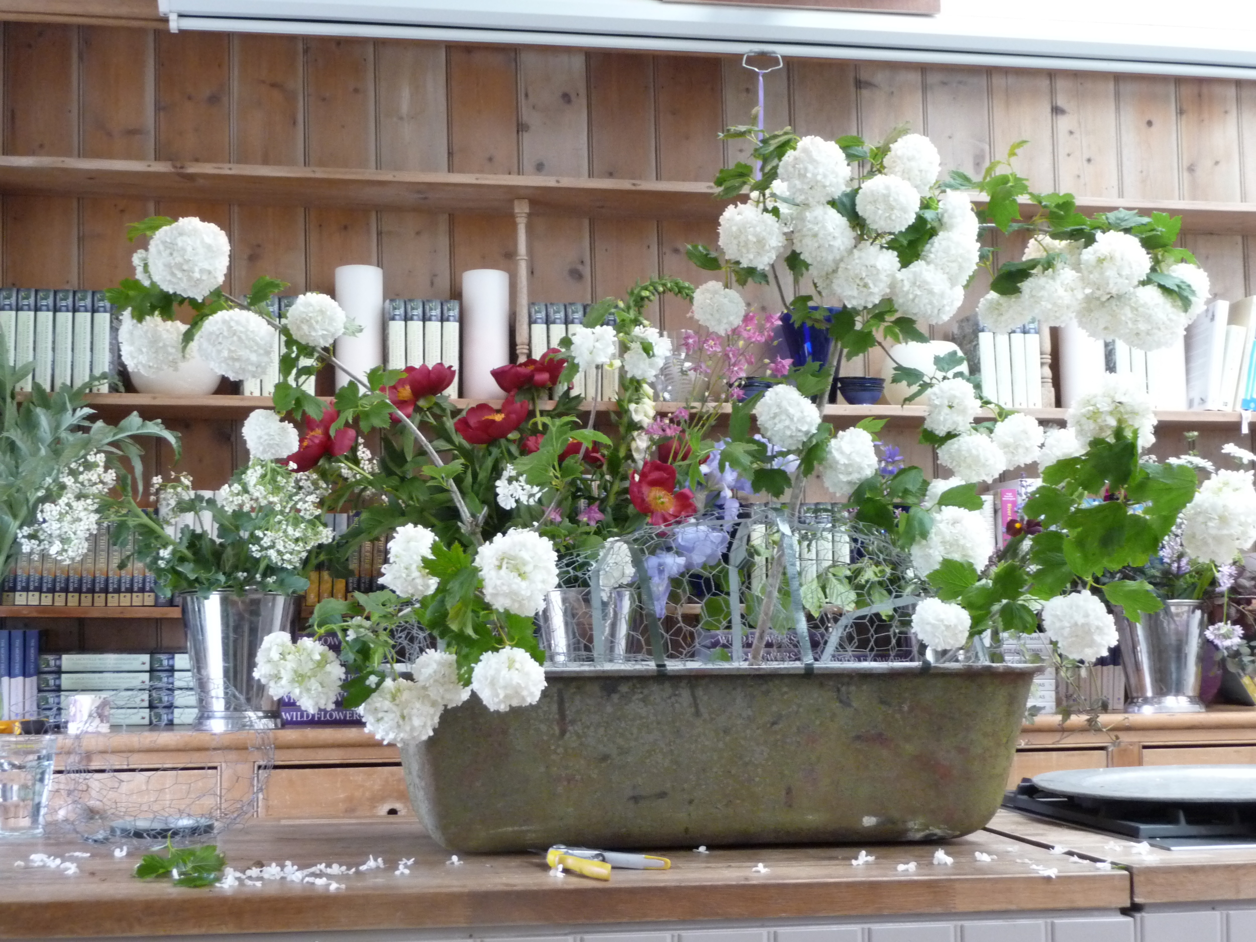
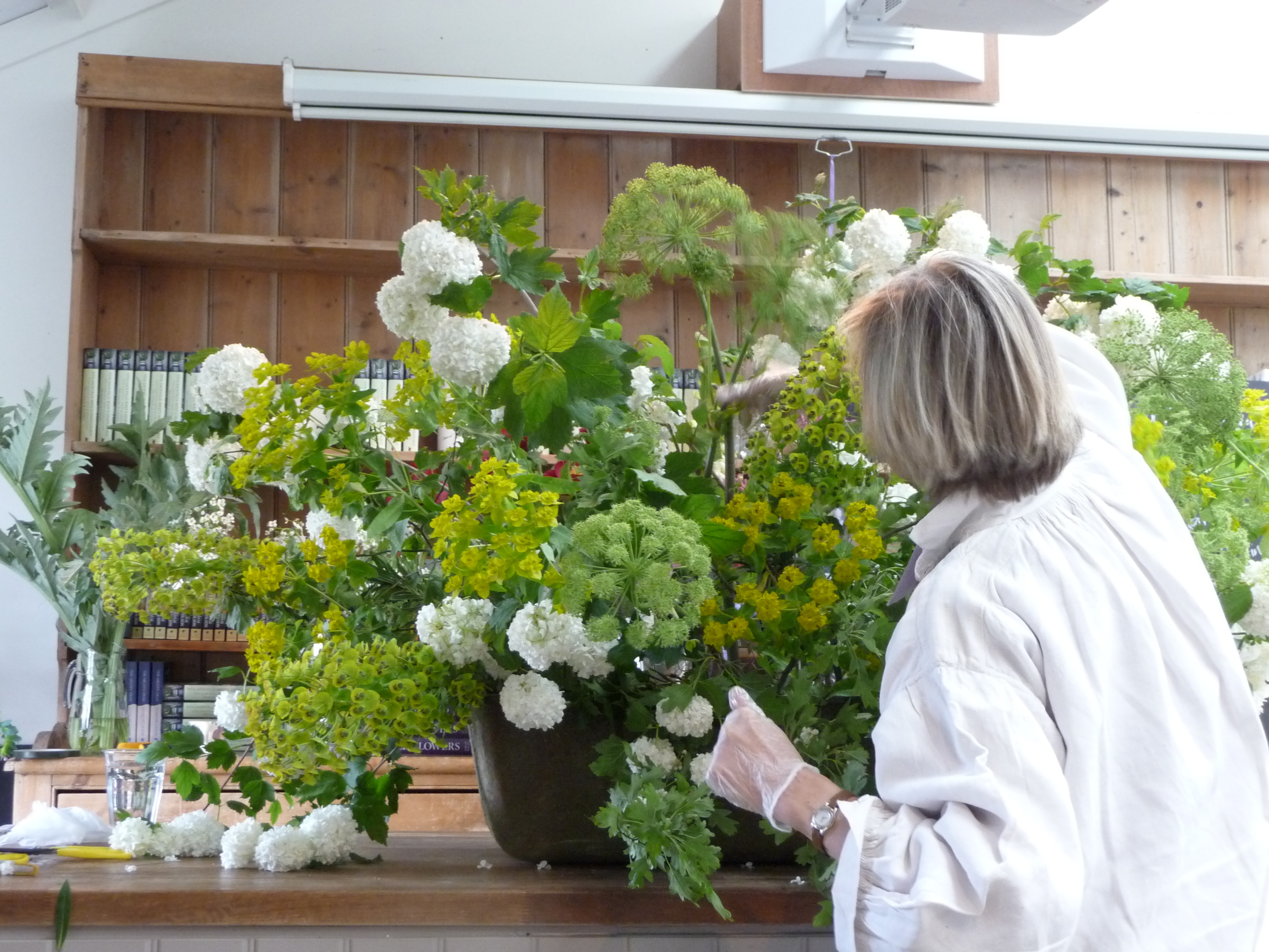
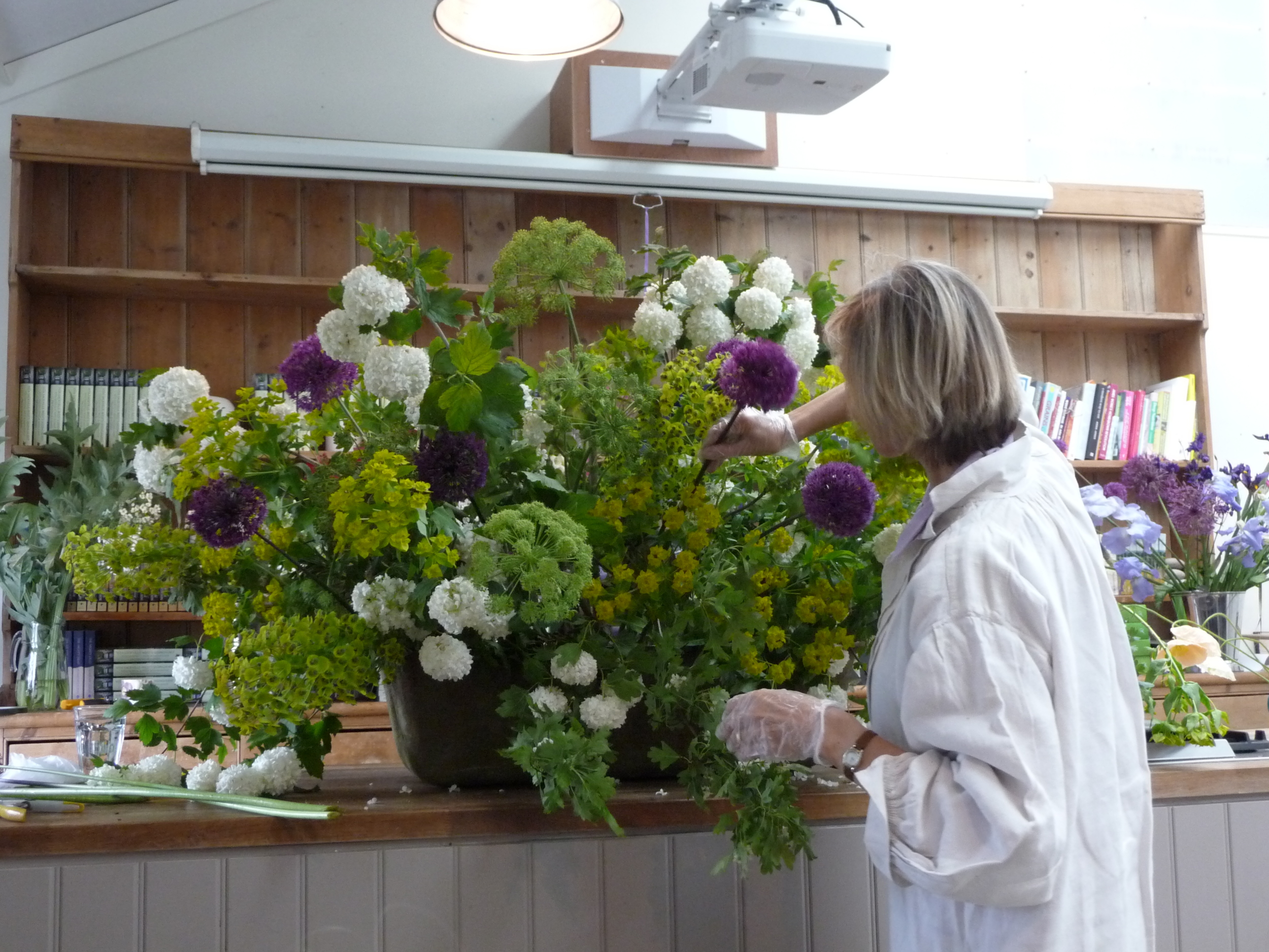
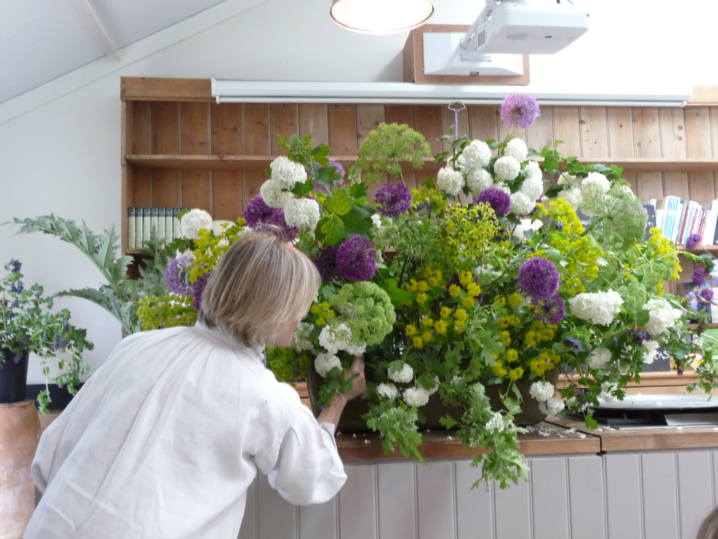
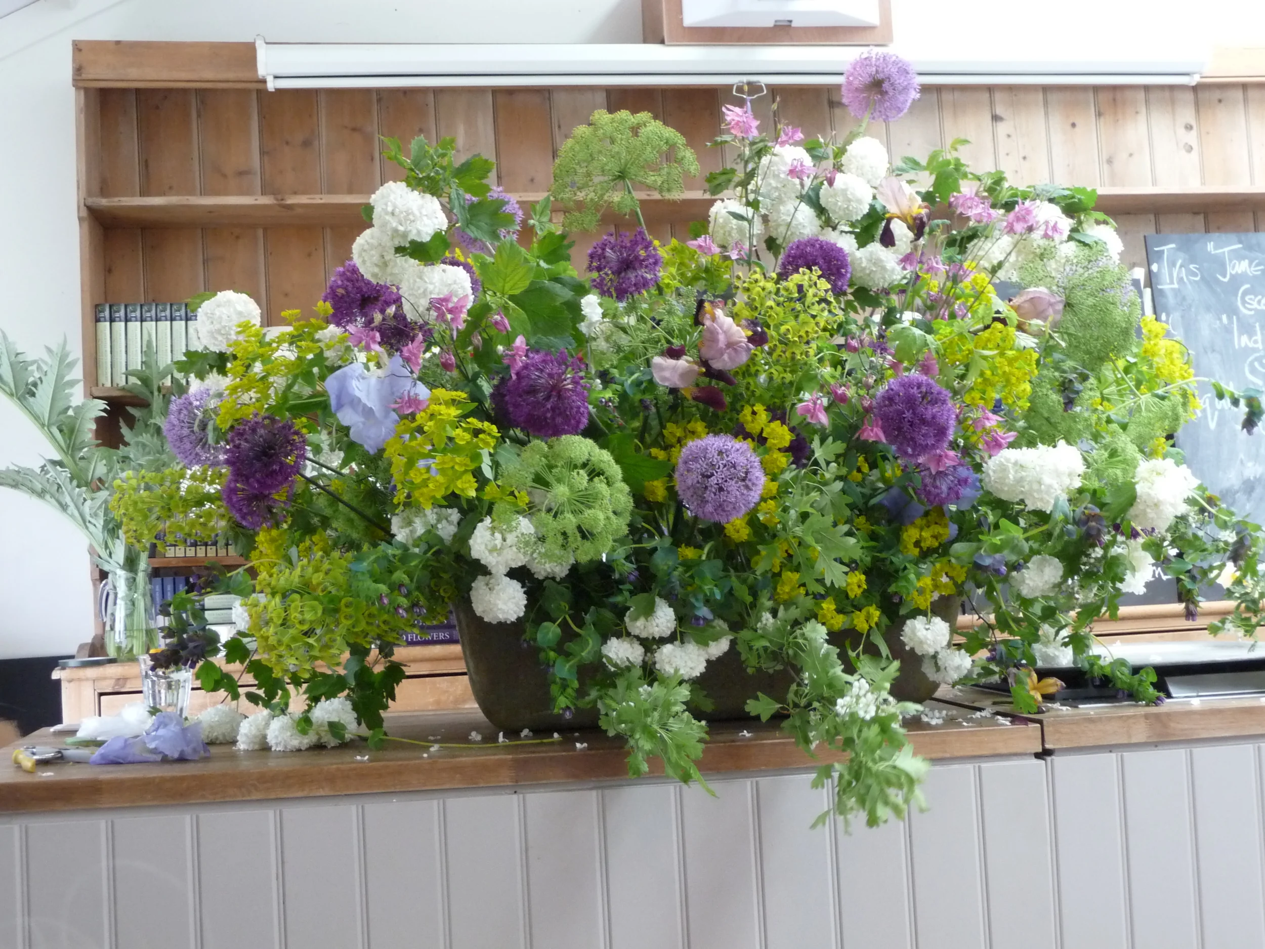
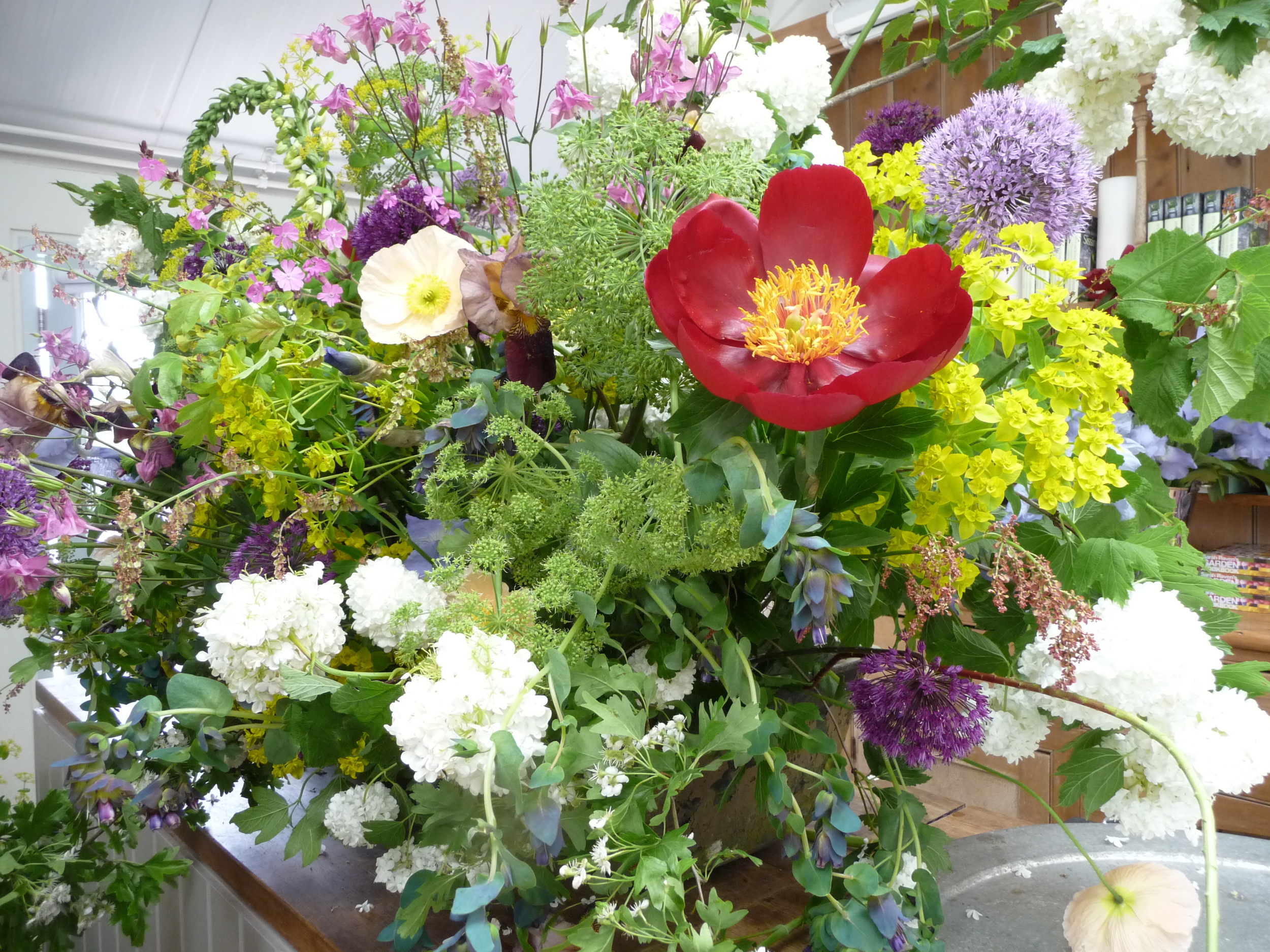
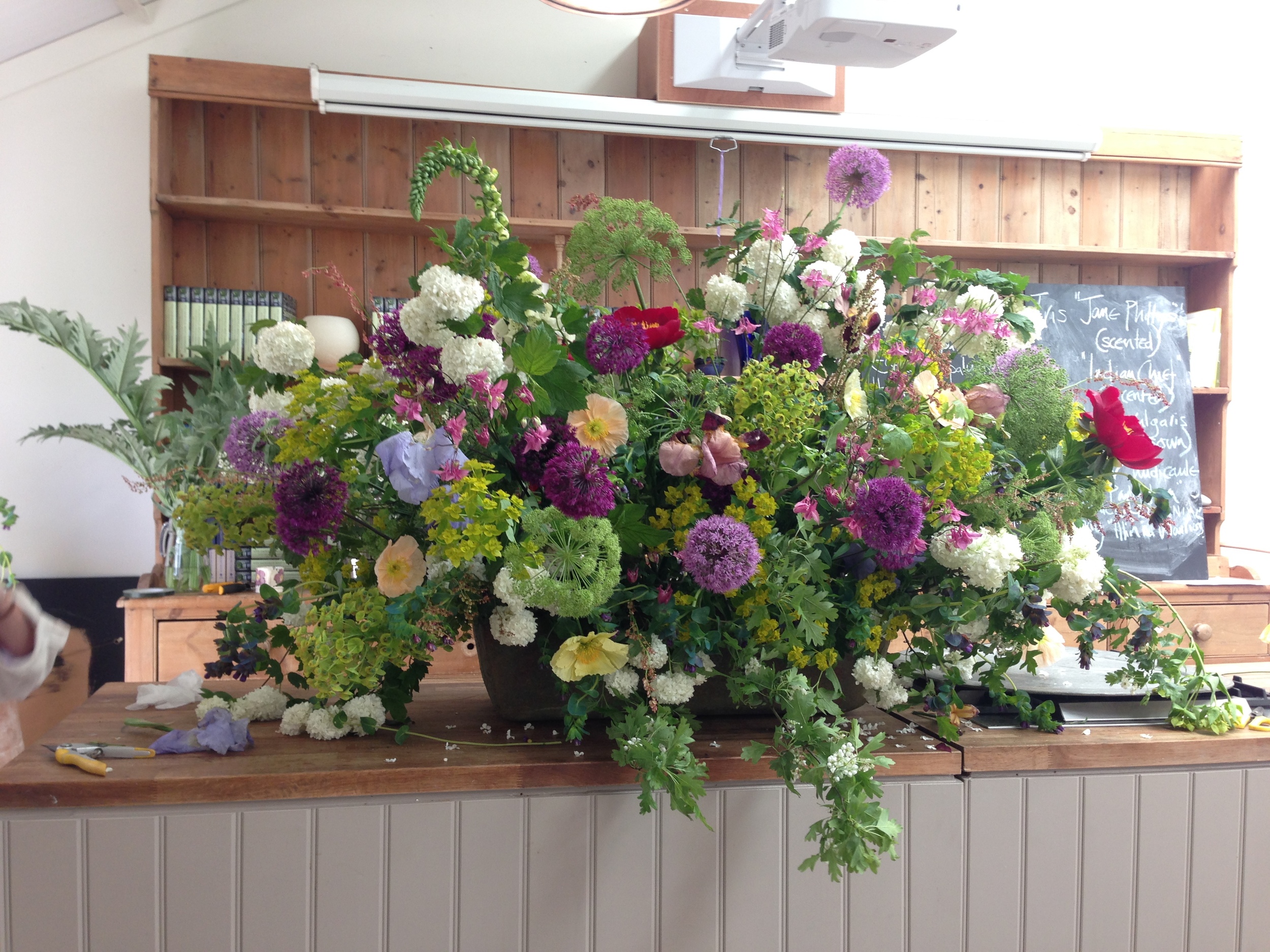
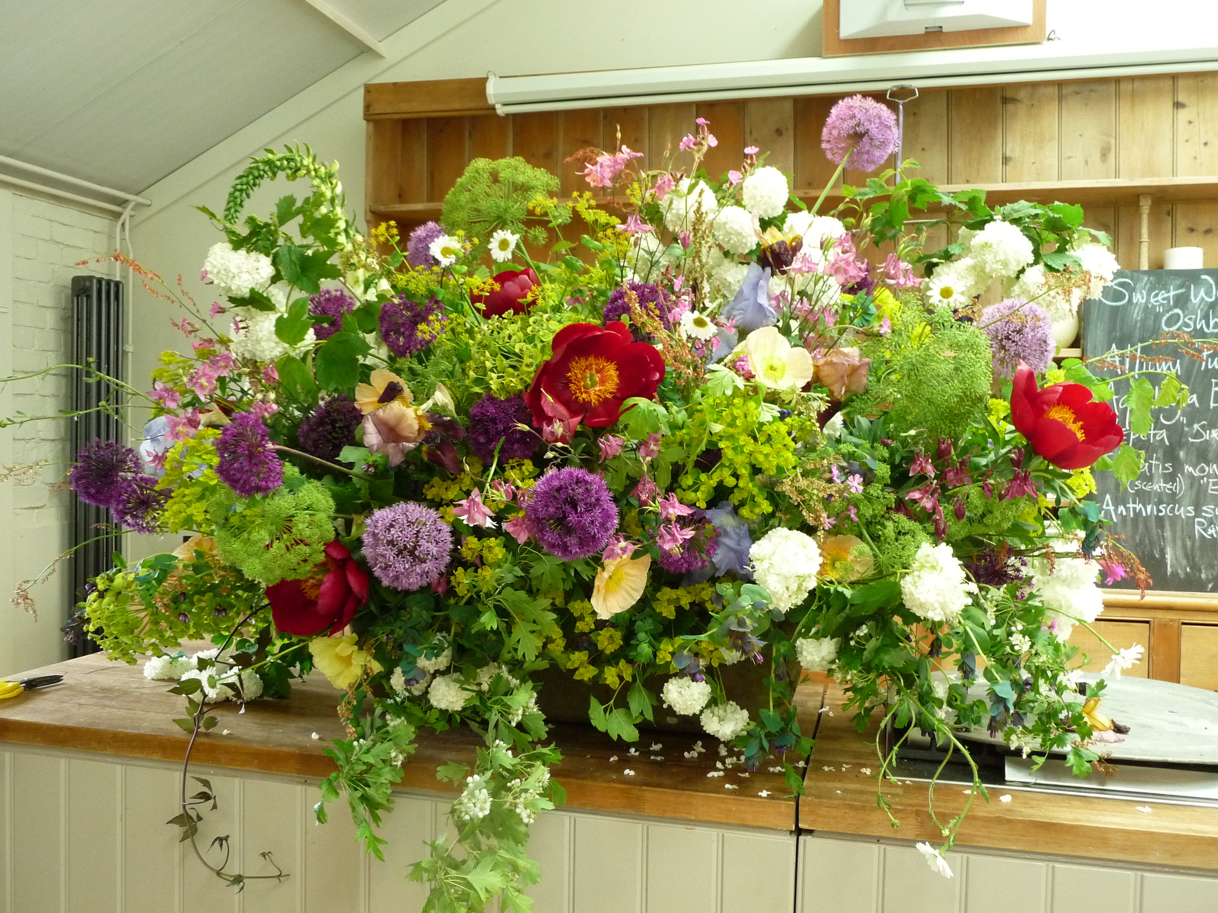
Juliet began her first masterpiece in a large metal horse's trough. She uses chicken wire rather than oasis which she attaches with tape. Chicken wire is a lot more effective and versatile in large containers especially if using tall and/or heavy stems. Juliet chatted to us as she created her masterpiece and answered all of our questions. We all took copious notes! I've shown below the progress as she added more and more gorgeous flowers that she had grown. It was amazing to watch the way the arrangement transformed. Right at the end she decided to add a few red peonies and there were gasps from the floor as these pops of red suddenly transformed the whole arrangement and it took on another dimension.
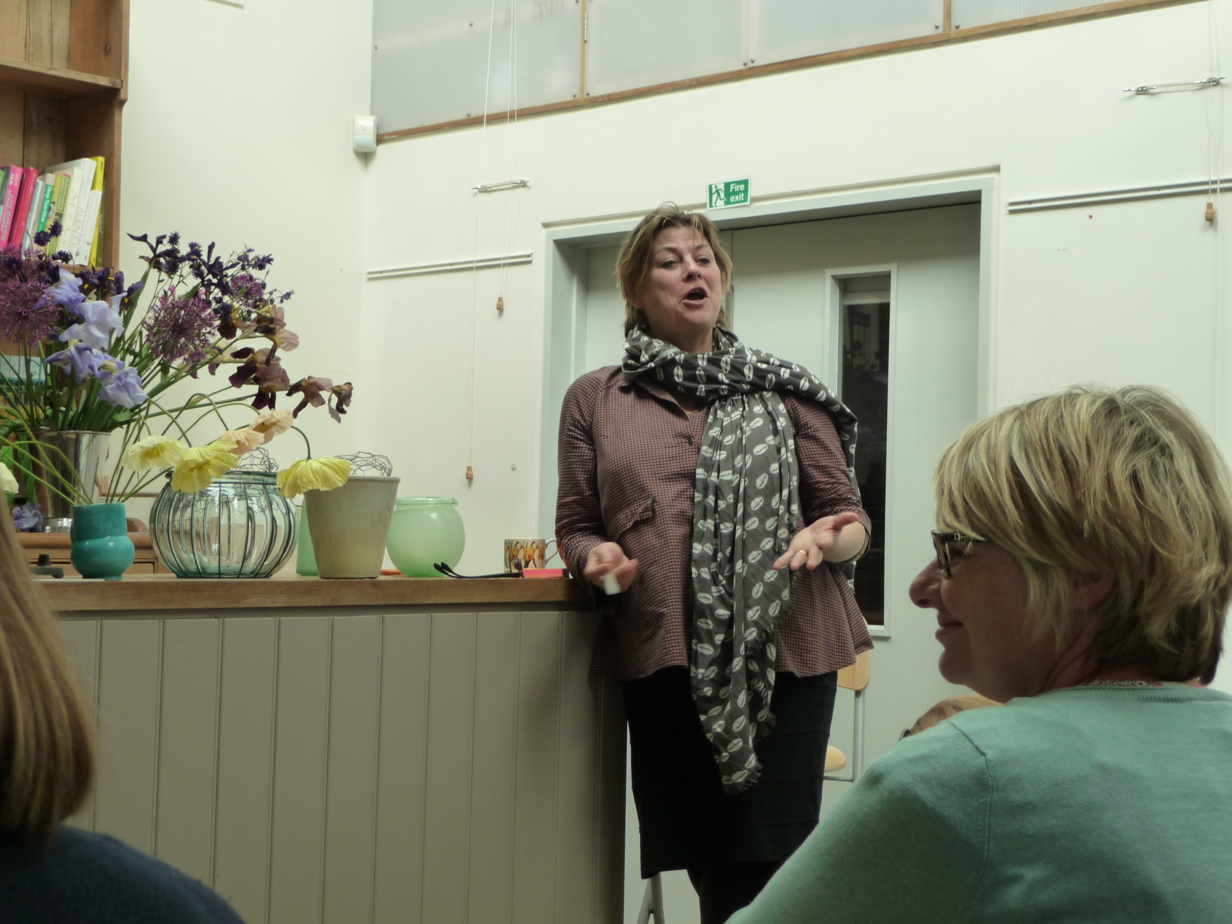
Sarah supported Juliet's presentation by providing the botanical names of each flower and how they are best cultivated. They were a great double act!!
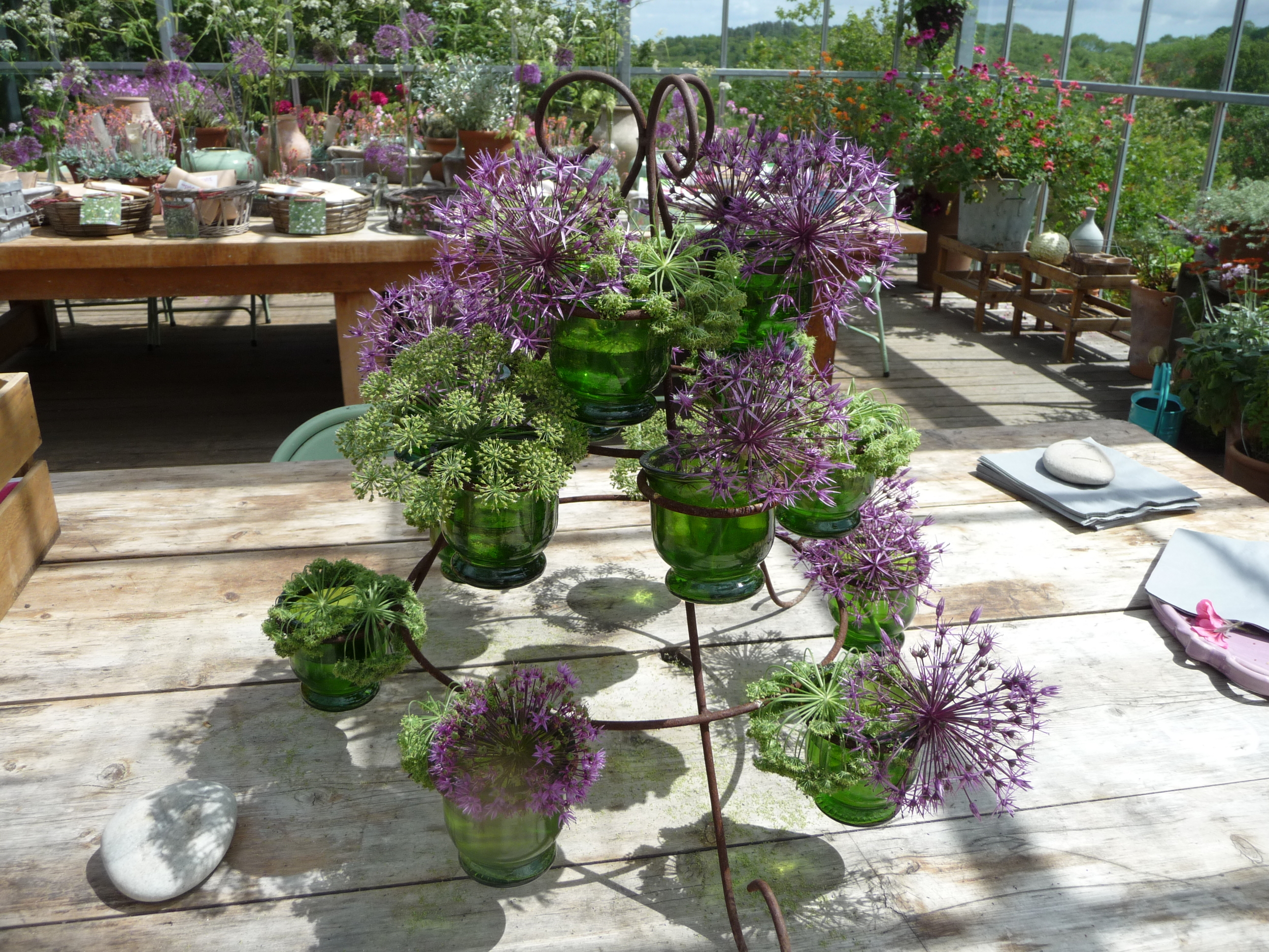
The second arrangement that Juliet created was much smaller but equally as stunning. She used a smallish glass vase and it's incredible the size of the arrangement that she put in it.
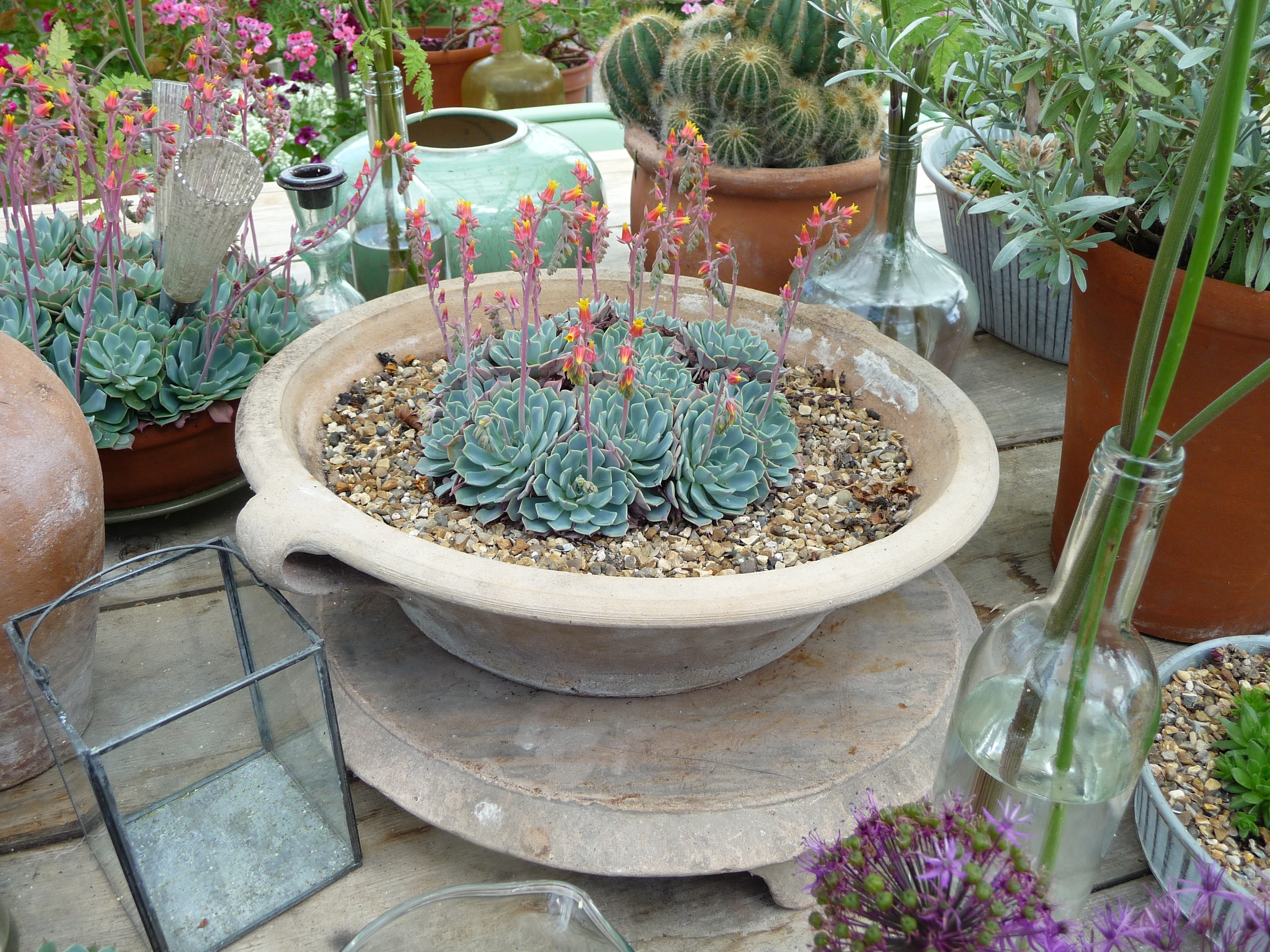
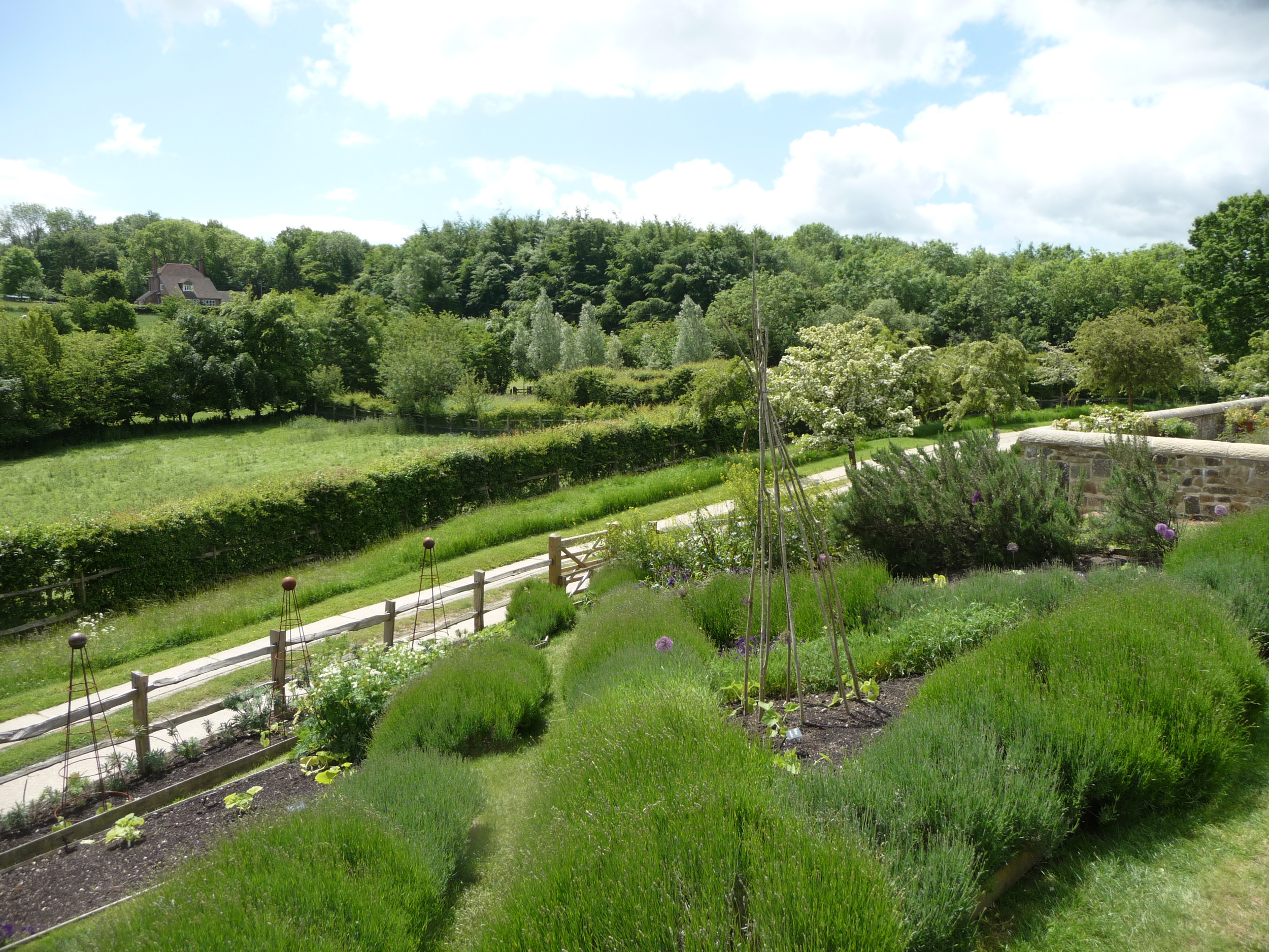
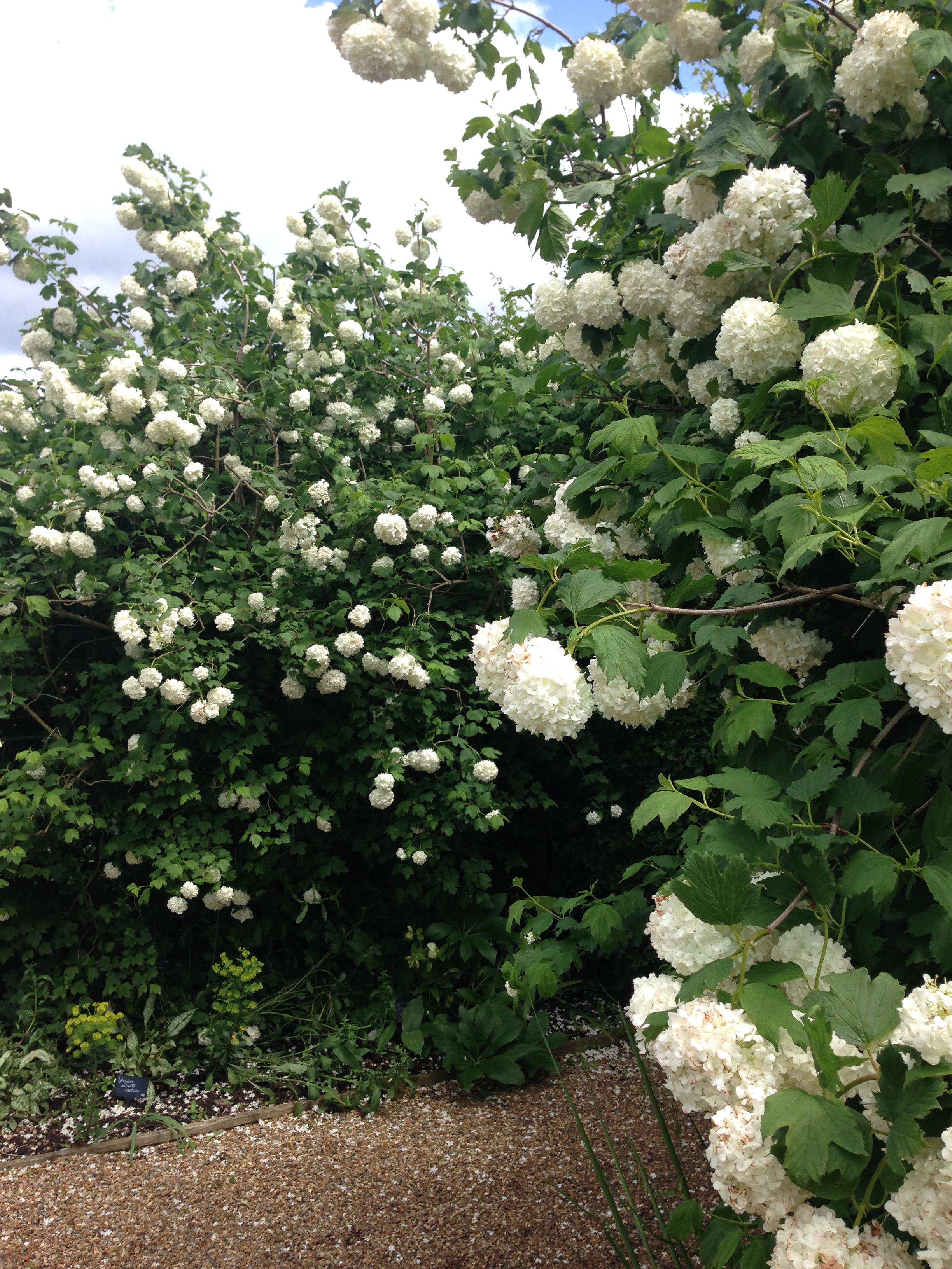
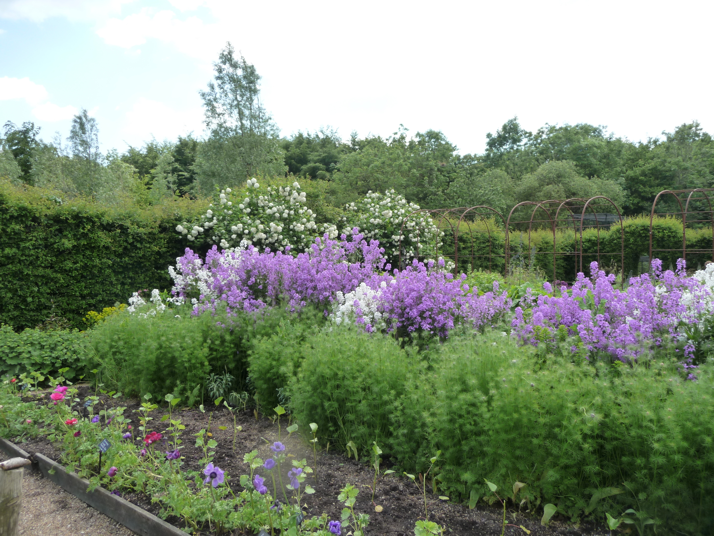
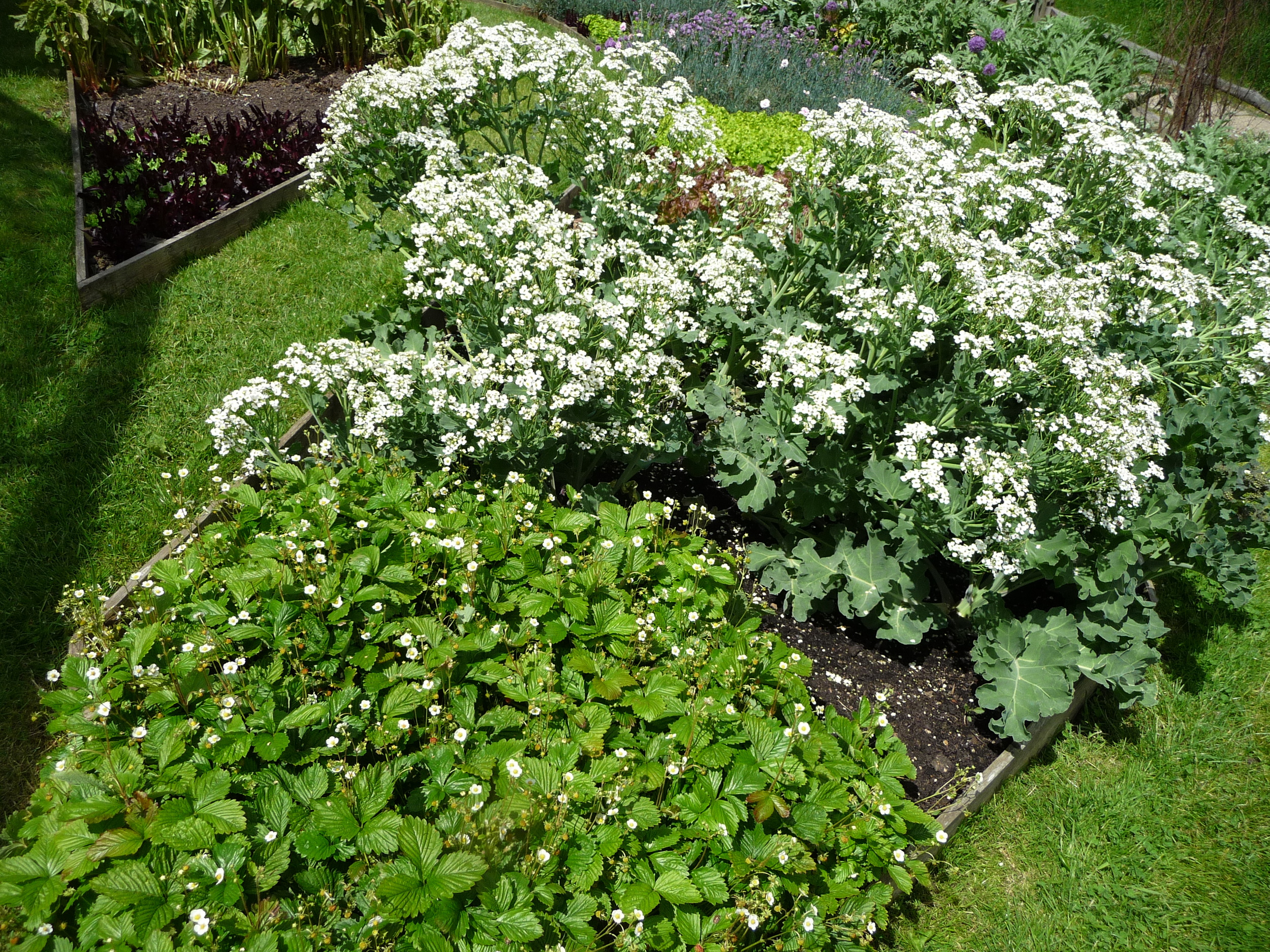
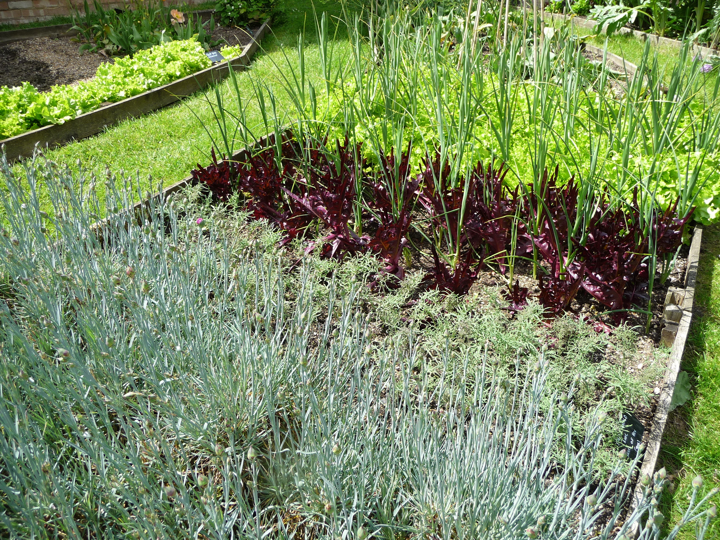
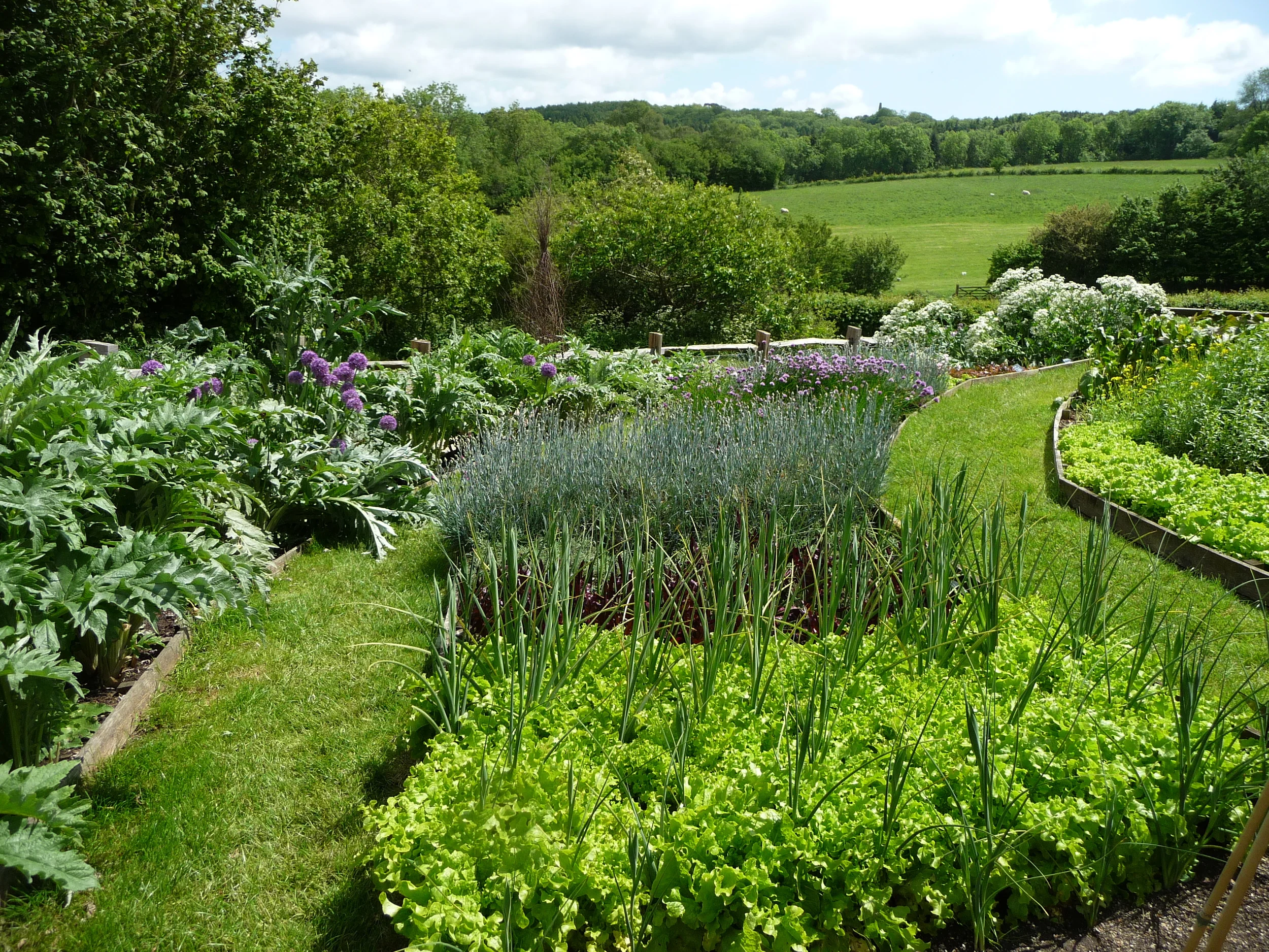
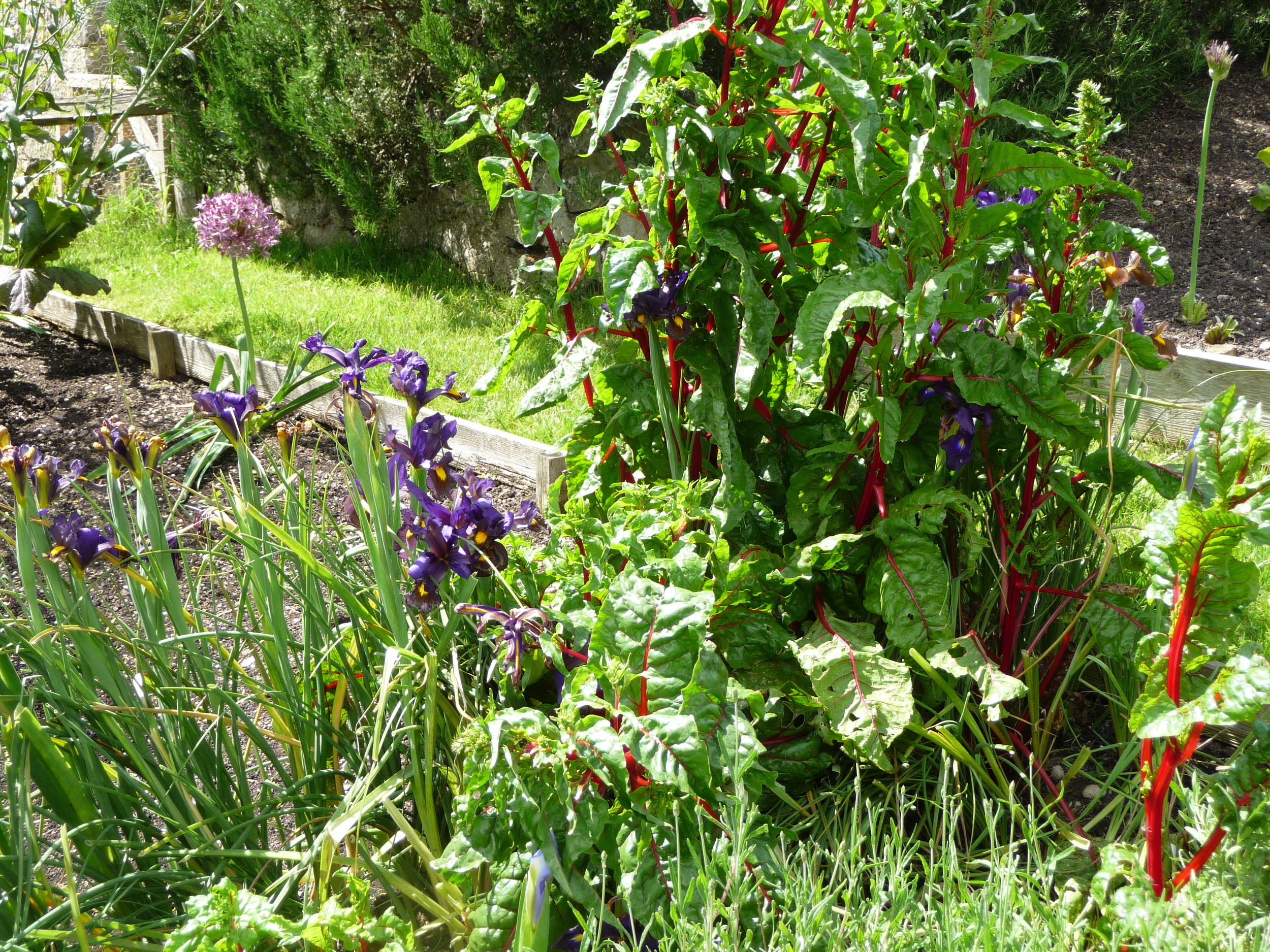
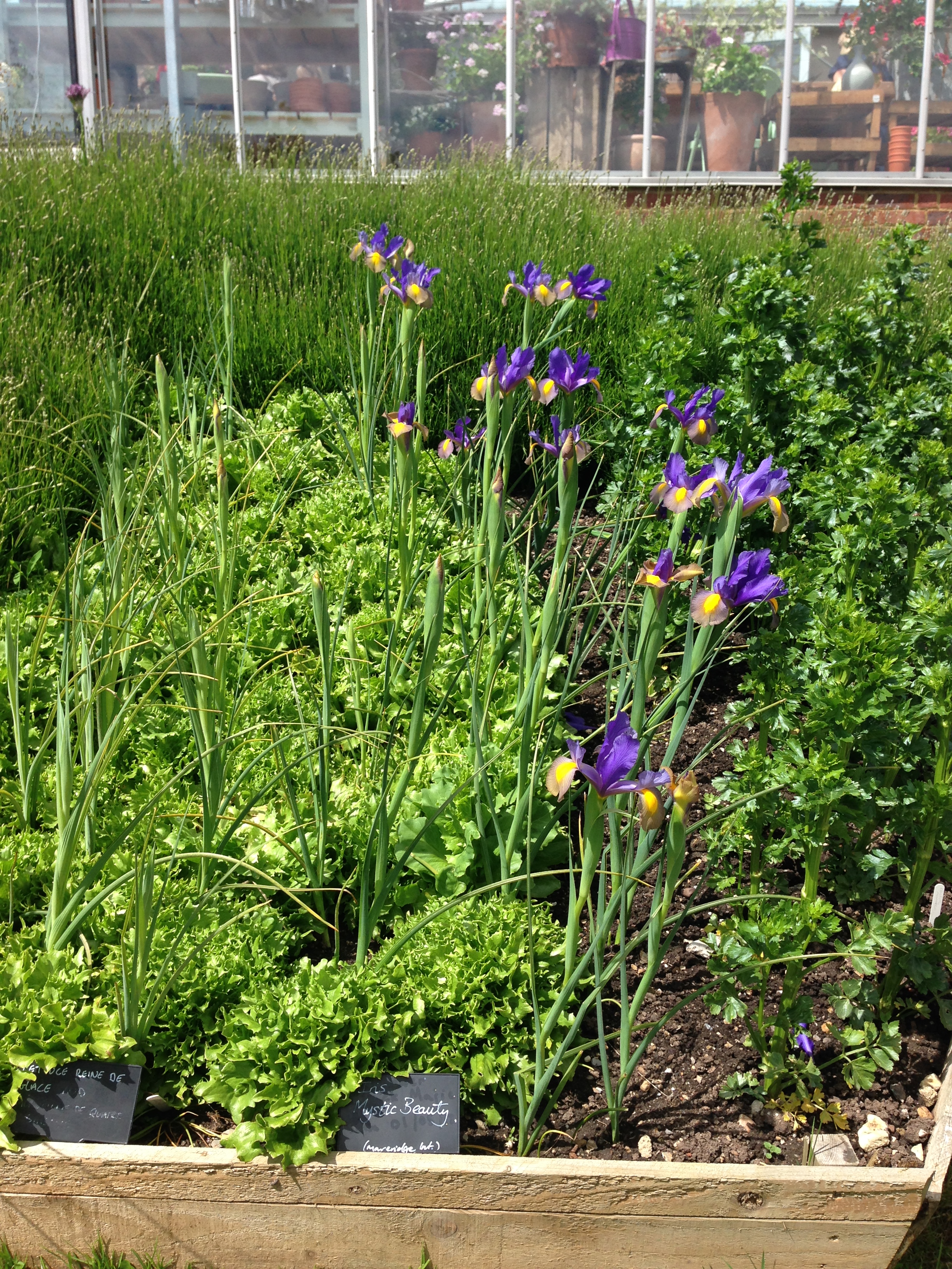
After a delicious lunch made from vegetables produced on the farm we had the chance to wander around Sarah's magnificent vegetable gardens and cutting gardens. They really are absolutely stunning. The vegetables and flowers are mainly used for the courses that Sarah runs. For some of the flower workshops you get to go and pick your own flowers from her gardens. Now that really would be a treat!! I've split the photos into the flower gardens followed by the vegetable gardens.


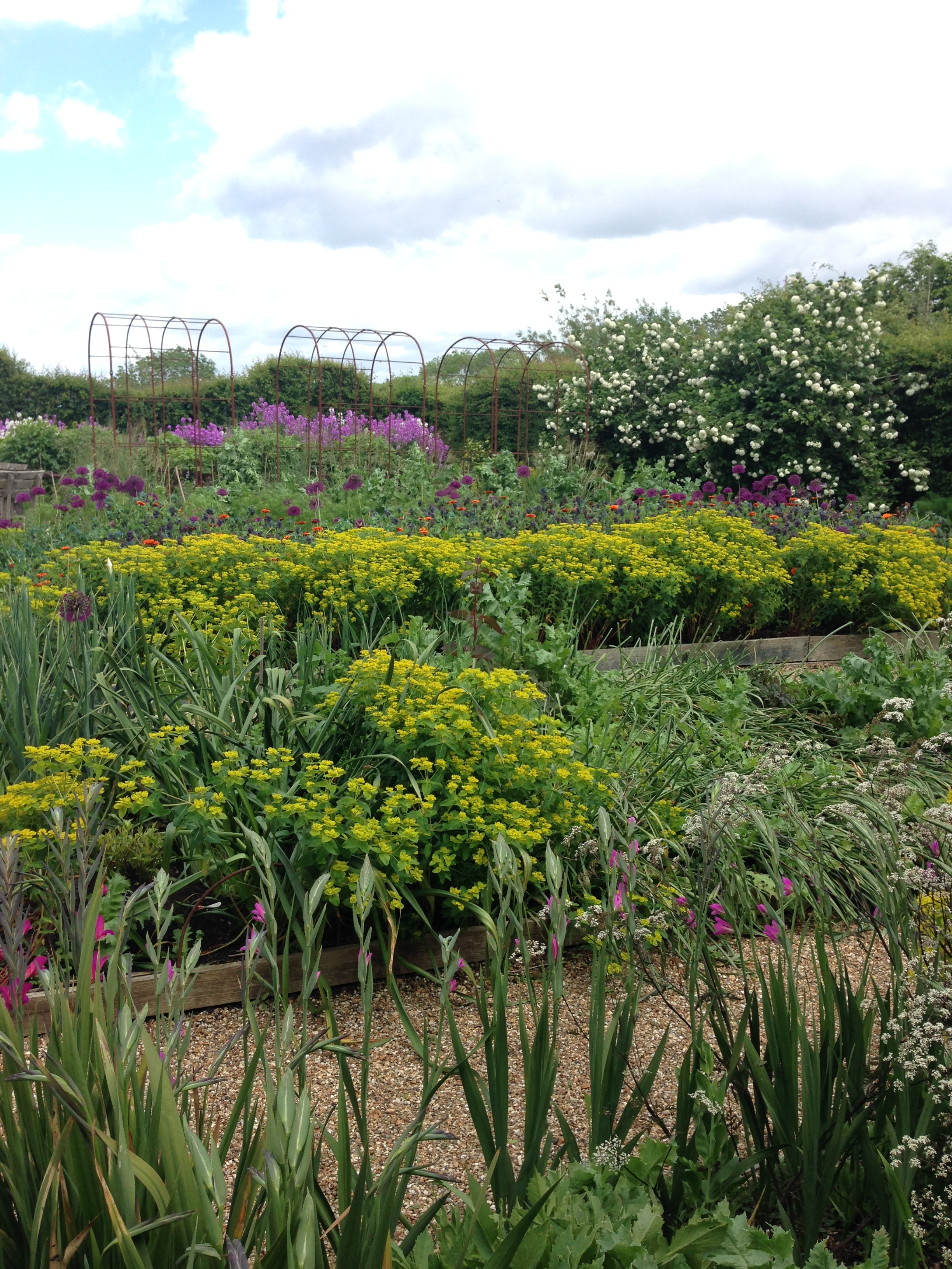
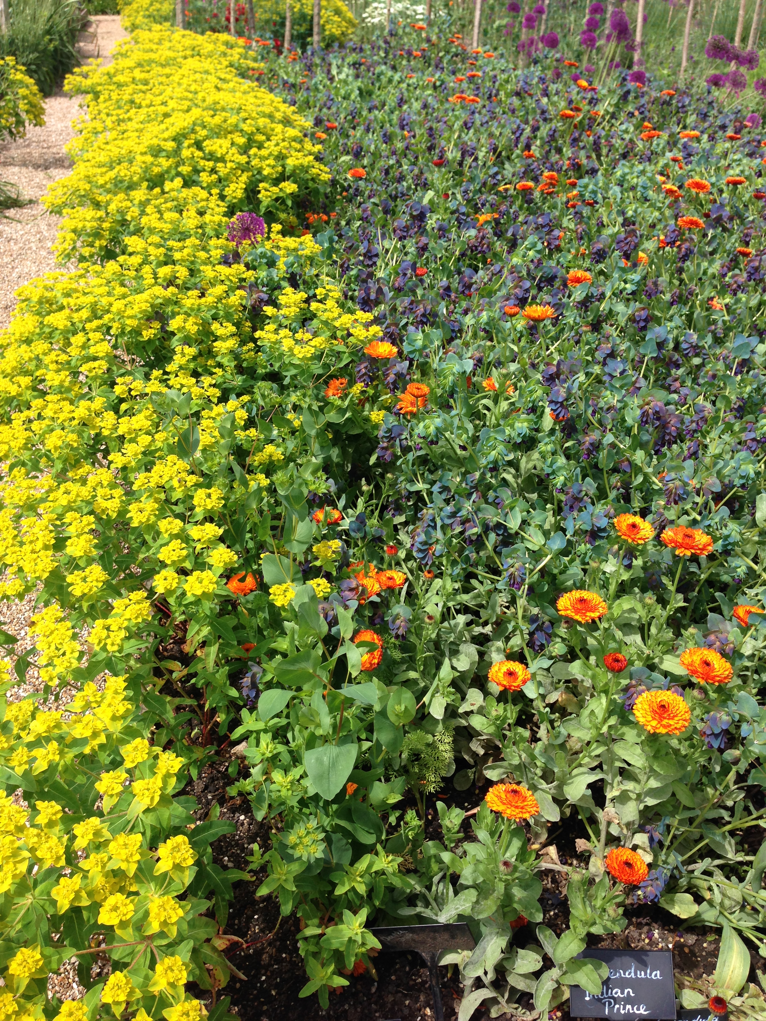
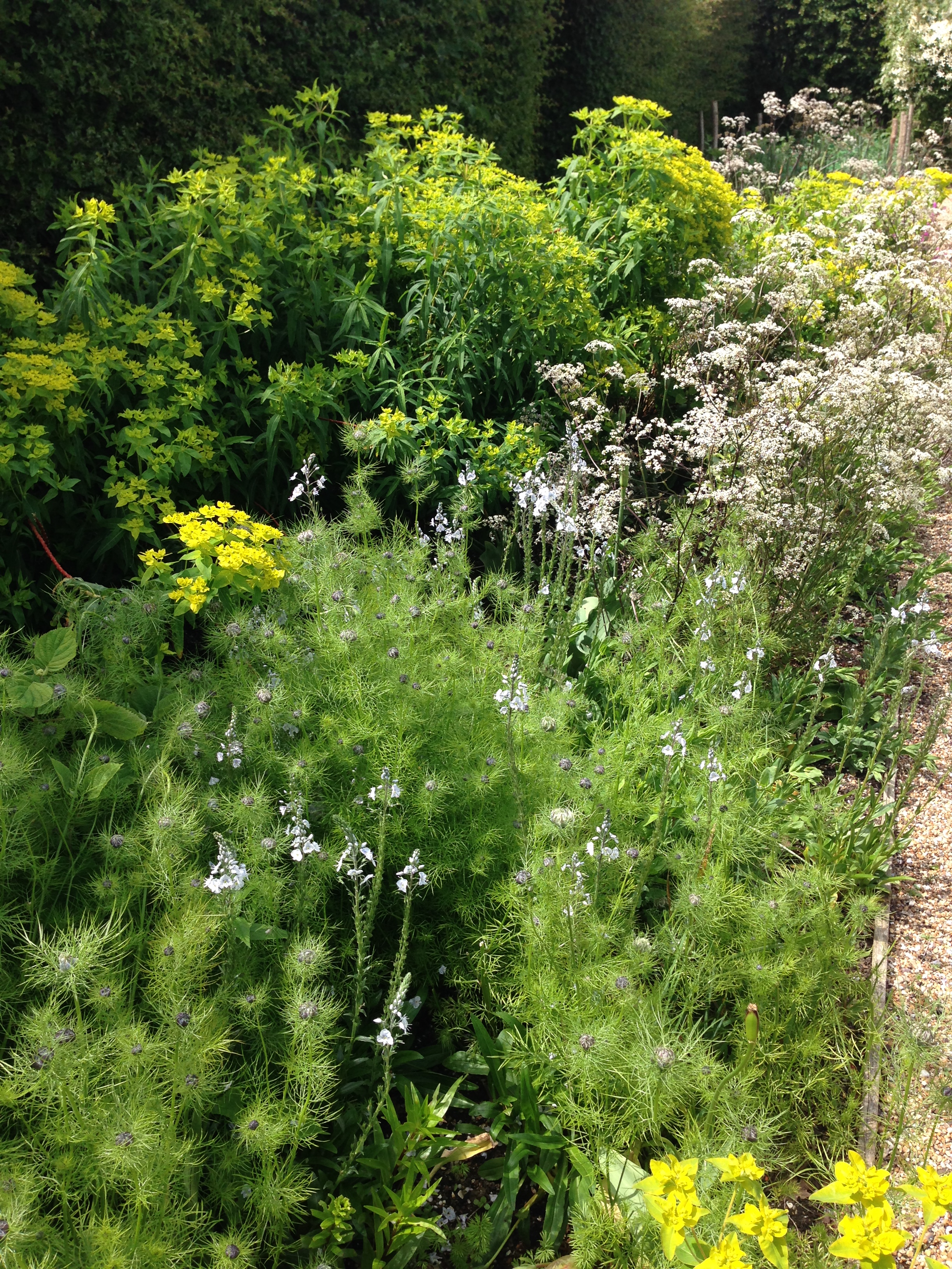
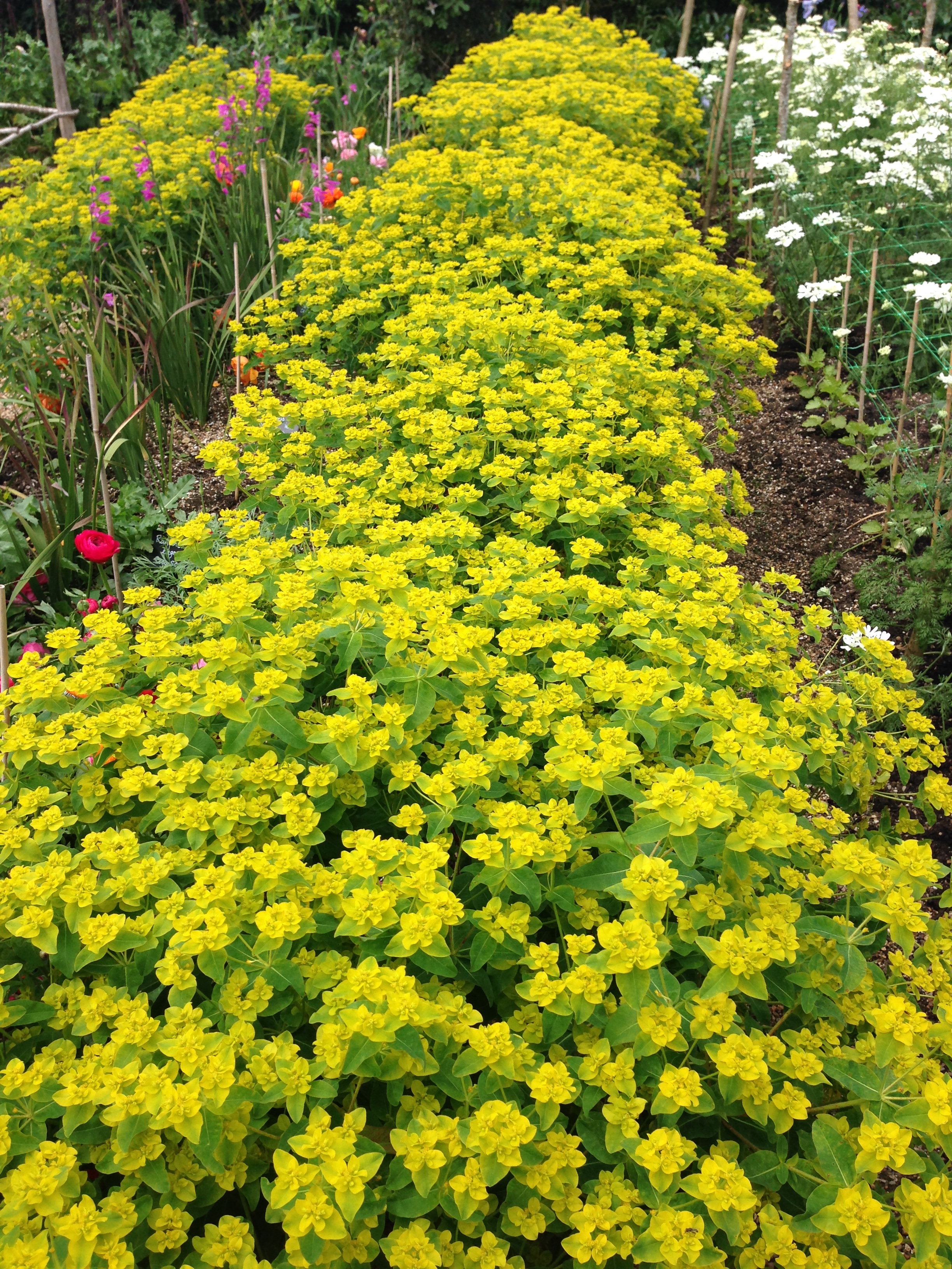
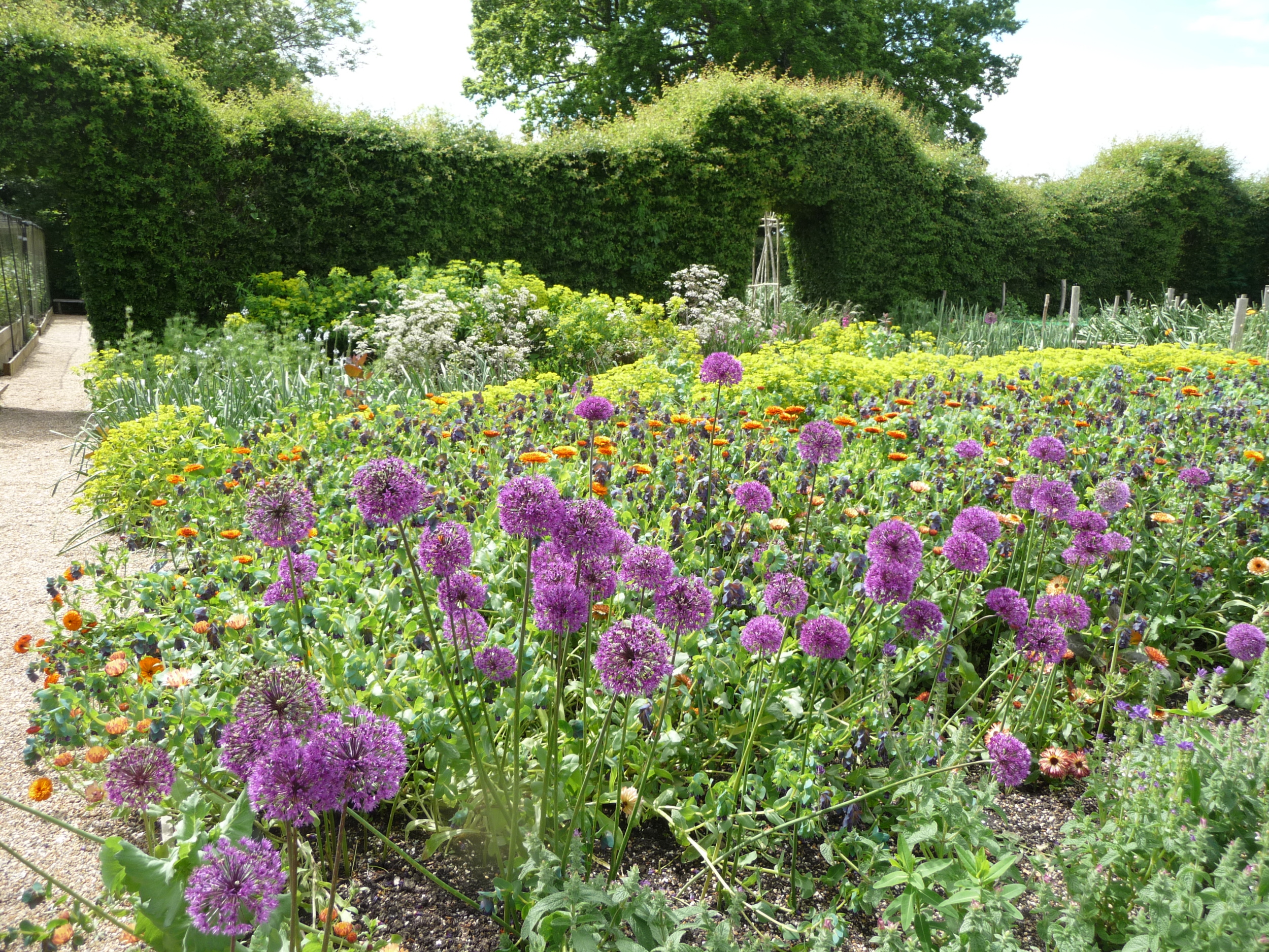
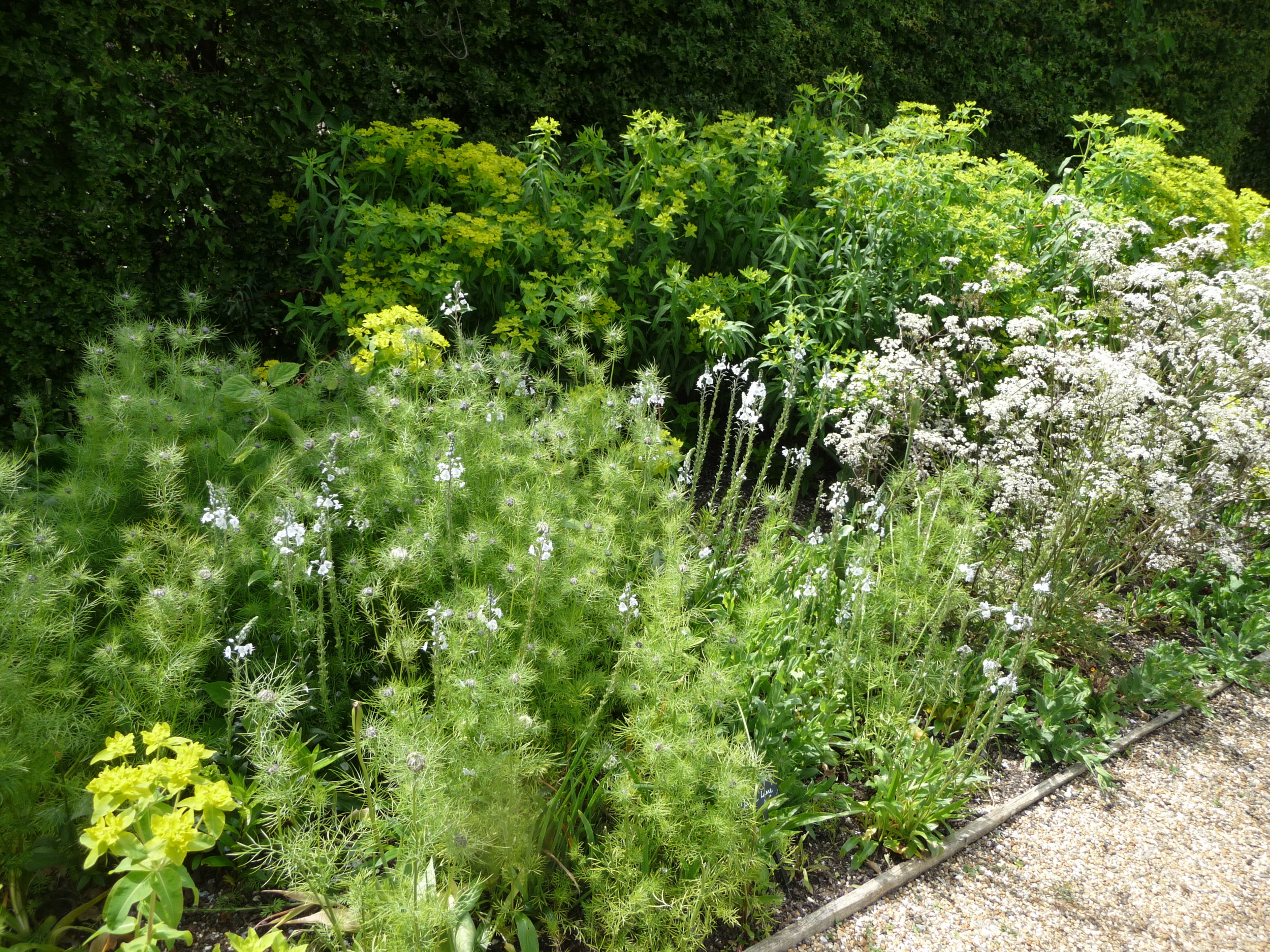
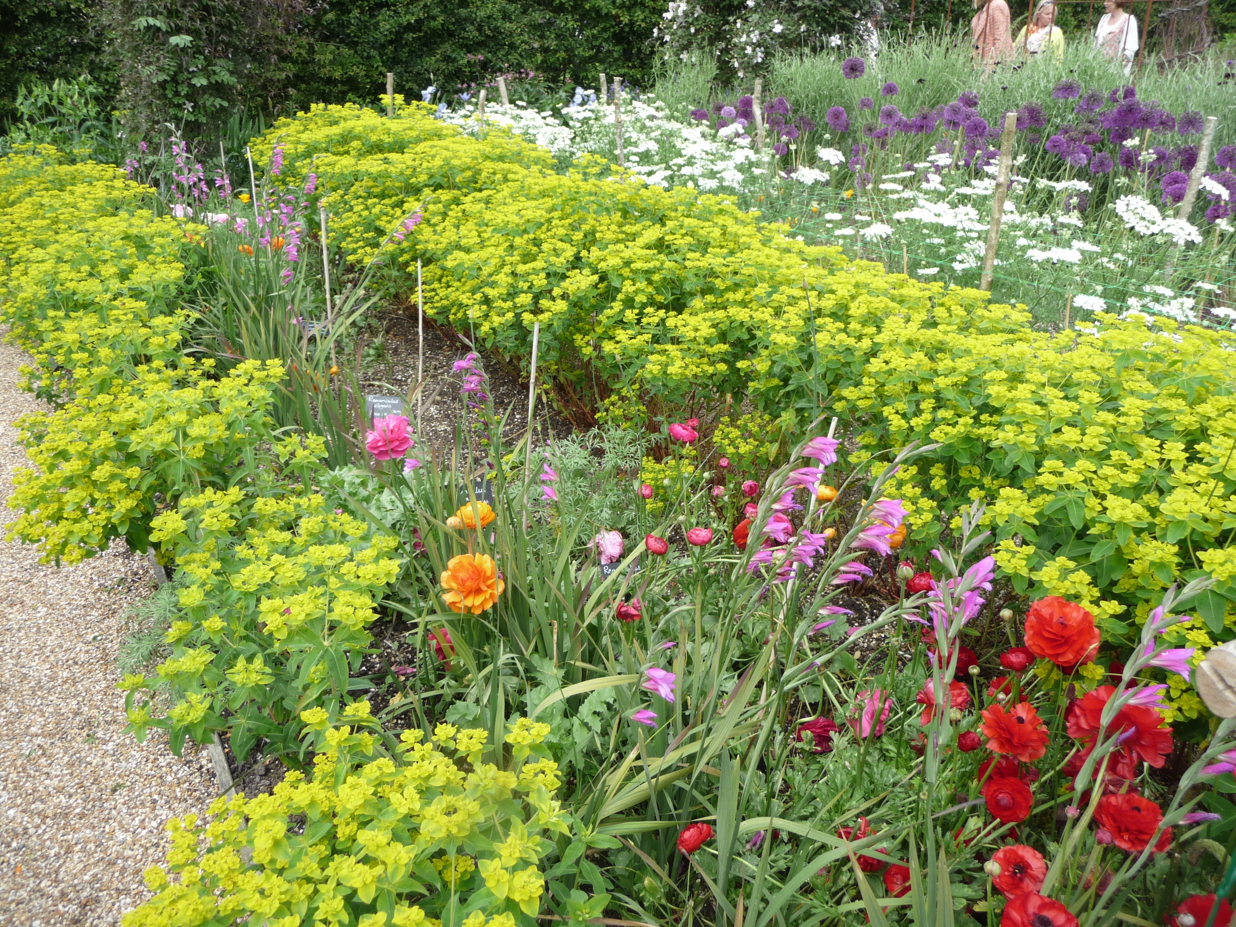
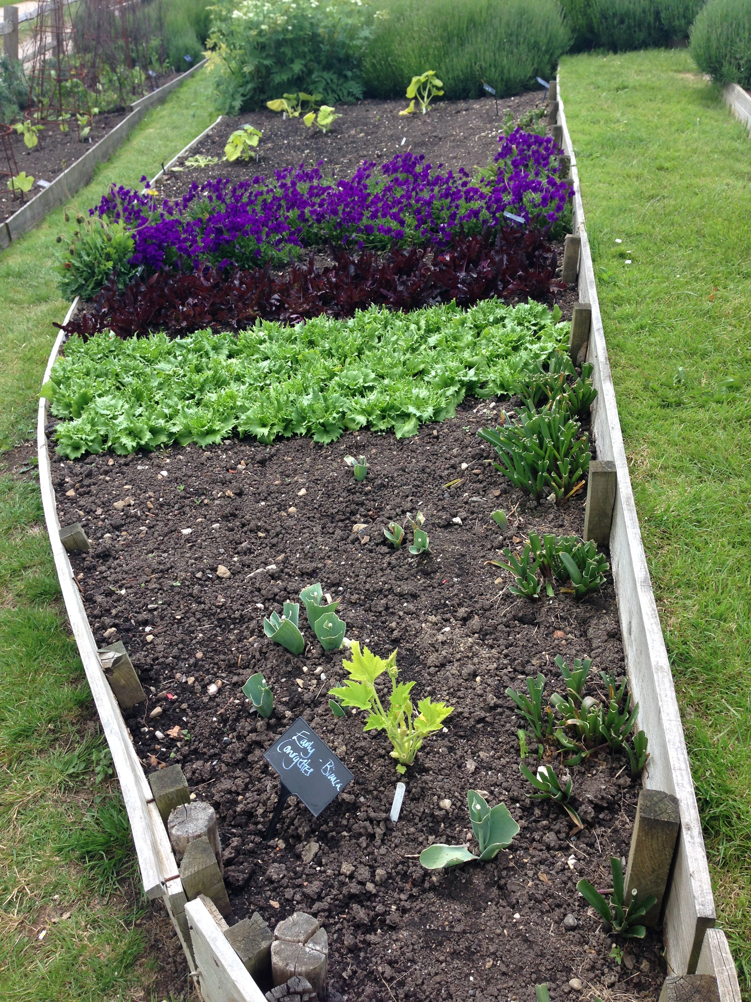
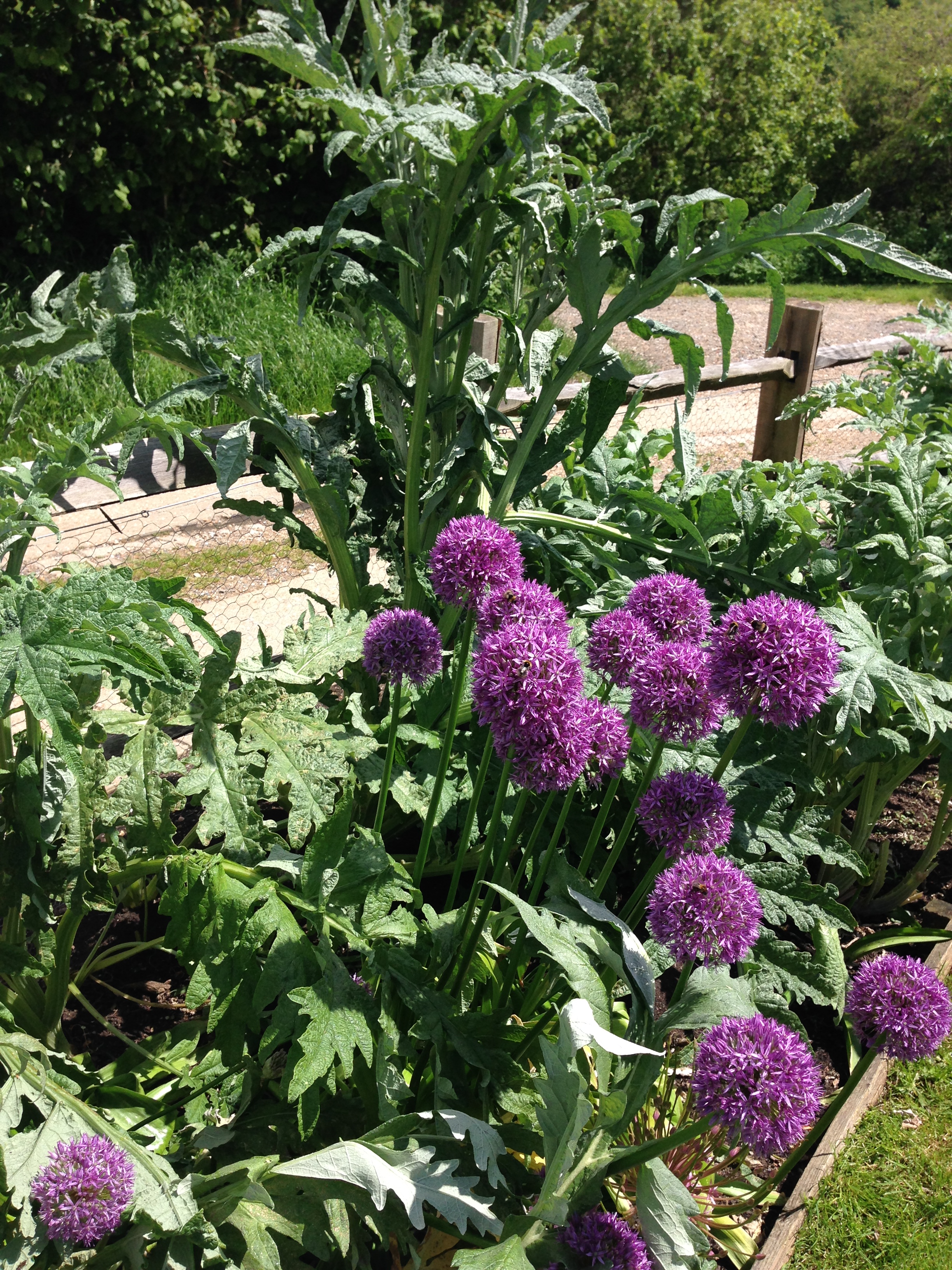
And here are some photos of the vegetable gardens. I love the way some of the vegetables have been interspersed with rows of flowers or beds of lavender.


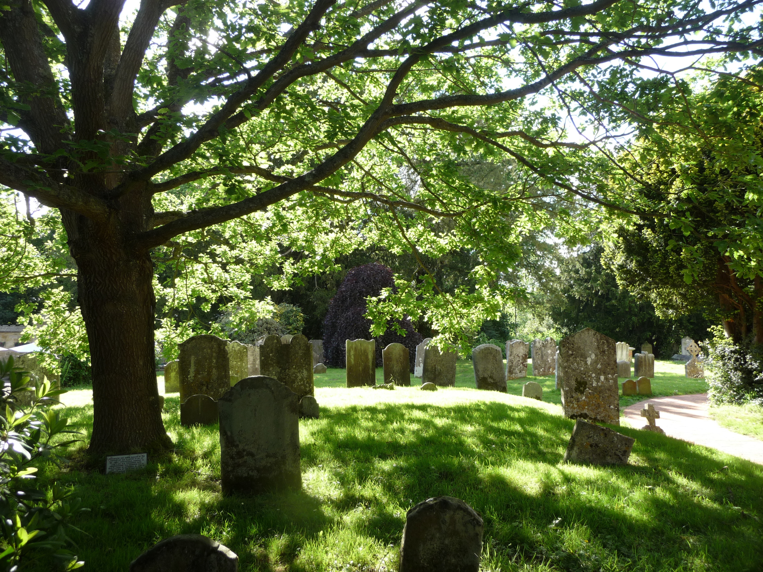
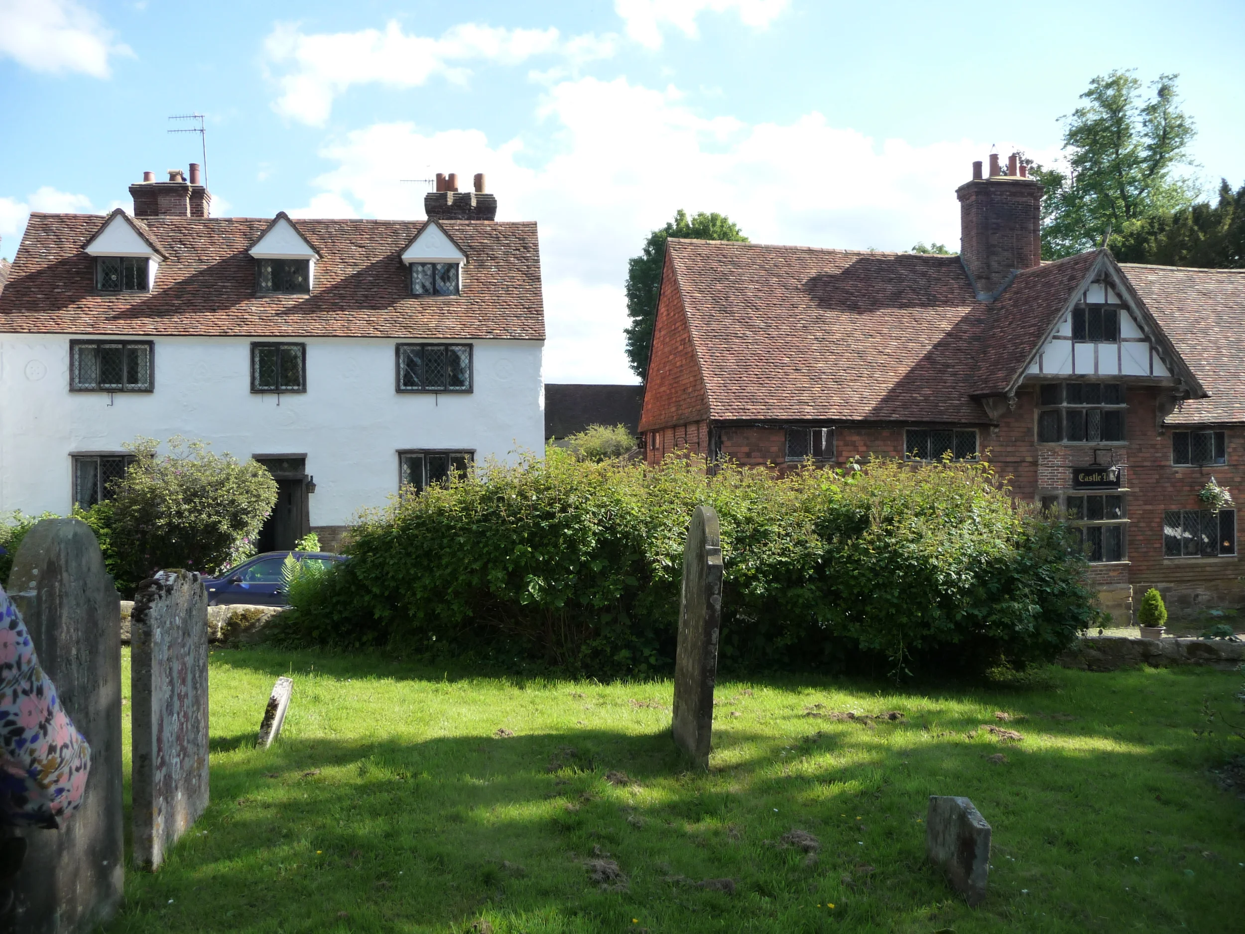
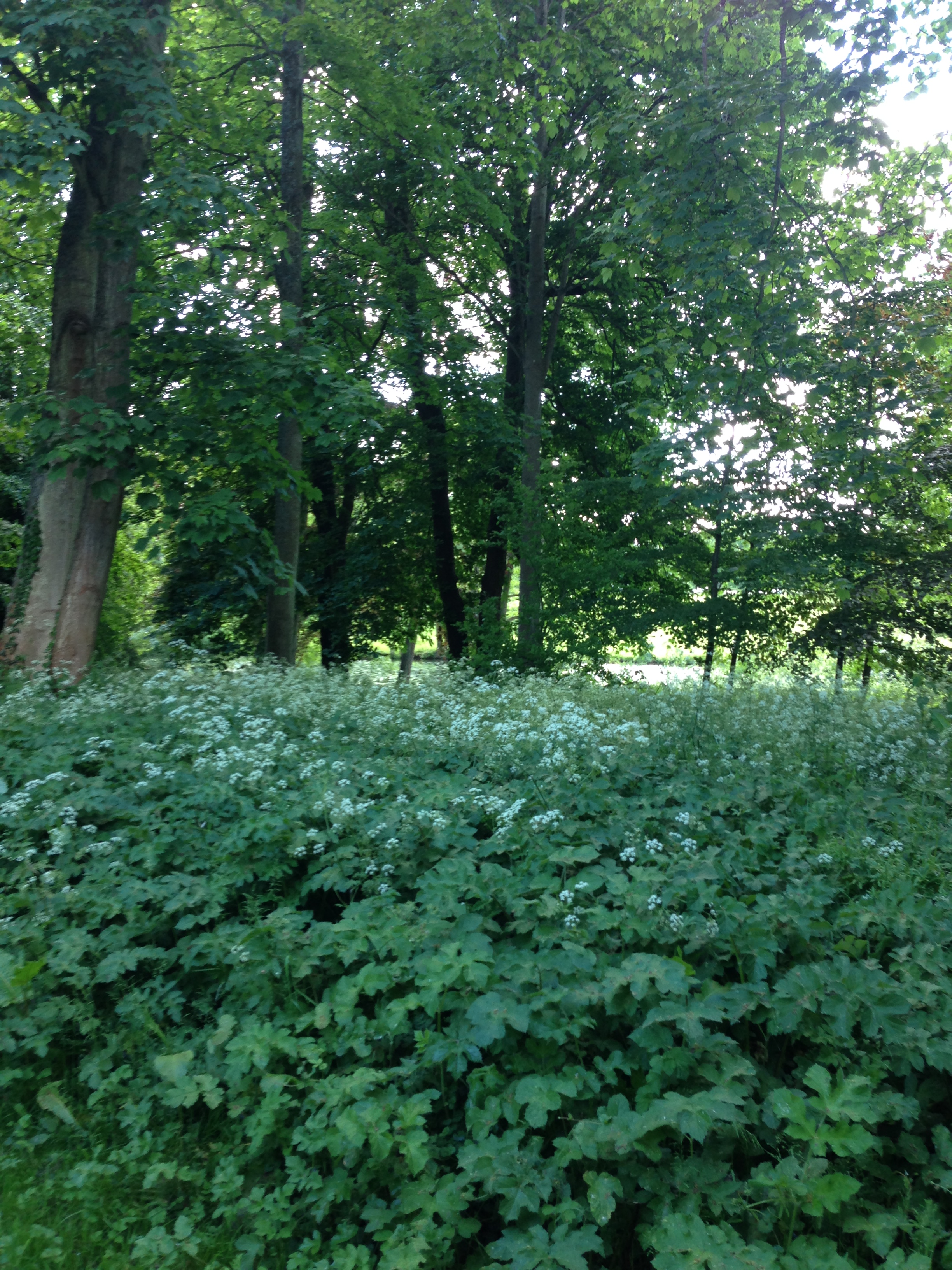
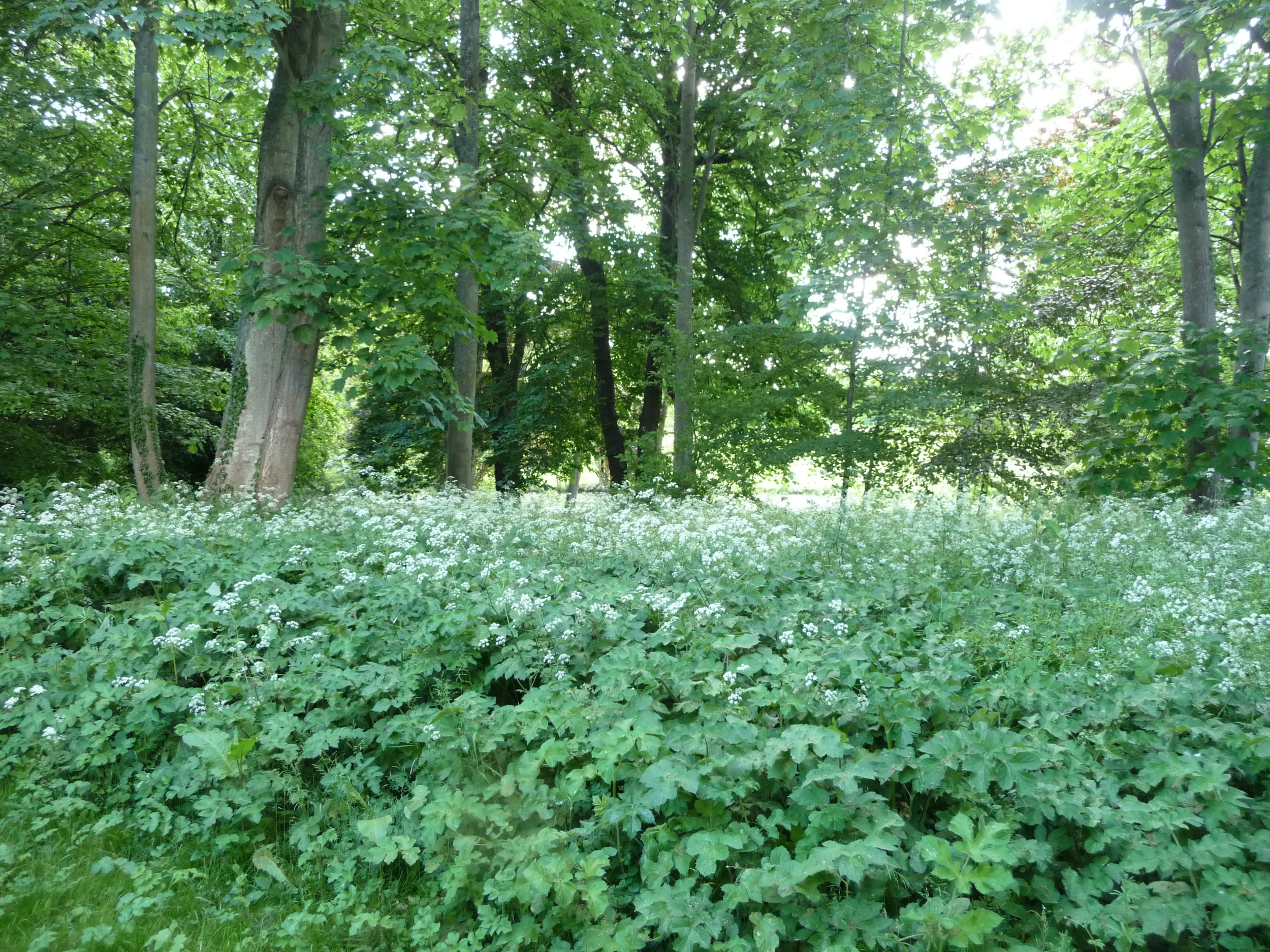
After we left Perch Hill we decided to return to London via the village of Chiddingstone in Kent. This is where the movie, Room with a View, was filmed and it's one of my favourite villages in the South East. It was one of those limpid afternoons and the village was sleepy with hardly any cars passing. We parked up next to the church and sat on the wall of the church yard listening to the birds. I wandered through the gate that leads to Chiddingstone Castle into a wooded area thick with cow parsley. It was truly magical. What would have made it even better would have been a pint in the village pub but given I was driving that wasn't an option!
I hope you have enjoyed the feast of colour and texture from the photos above. Always remember that what works in nature also works in the home. Don't be afraid to use colour(s) in your rooms, be they pops of colour or painting/wallpapering whole rooms or walls in strong colours. Take another look at Juliet Glaves' arrangement above with those pops of red peony colour in that huge masterpiece of hers. I would never have thought to introduce red but then I always say "be brave, follow mother nature in your interiors and you can't go wrong".
SEEKING STYLE INSPIRATION?
If you’re working on your own home decorating project, need help with your outside space, home staging if you are about to put your home on the market or just some de-cluttering/organising techniques, please get in touch and see how I can help. I always offer an initial free consultation with no obligation so contact me to book this.


Learning interior styling in London

The theme for the course photoshoot was "gypsy" so we used rustic items with splashes of bright colours. I think we managed to achieve that, don't you?
The University of the Arts London Interior Styling course offered more insights for me into the styling industry — styling in PR, editorial, residential and corporate commissions, magazine analysis, trend forecasting and methods of visual presentation.
Read moreBeyond the Diploma of Interior Design

I'm excited to start this new phase of my life, having just completed the National Design Academy's Diploma of Interior Design.
Read moreStudying Professional Interior Design in London

I'm currently studying for a Diploma of Professional Interior Design through the National Design Academy. This will give me a formal qualification to work as an interior designer.
Read more

It's so important to create an instant visual impact because people form an opinion of your home within the first 20 seconds of entering. Here's another beautiful stair runner I created.