Designer's Guild embraces Chelsea Flower Show

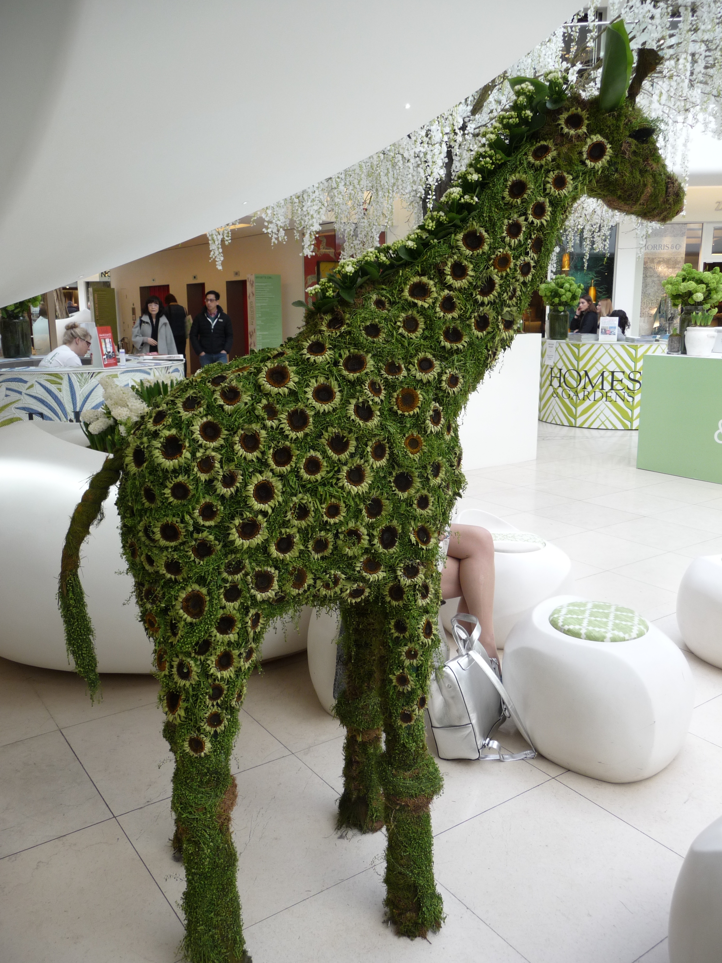
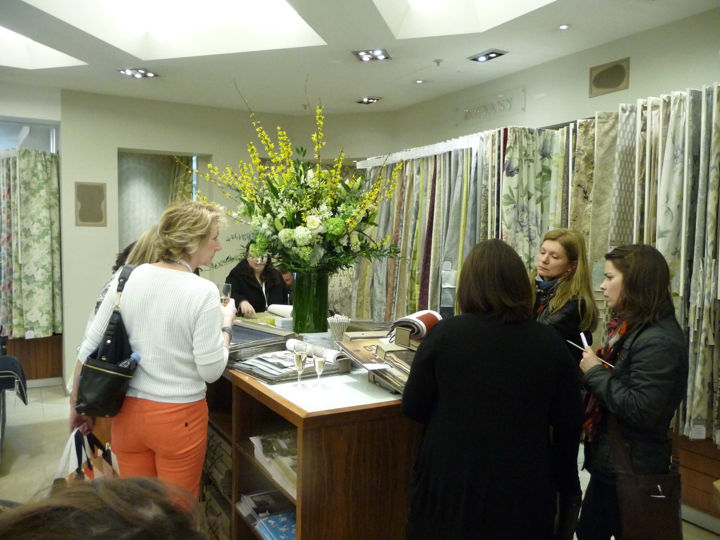
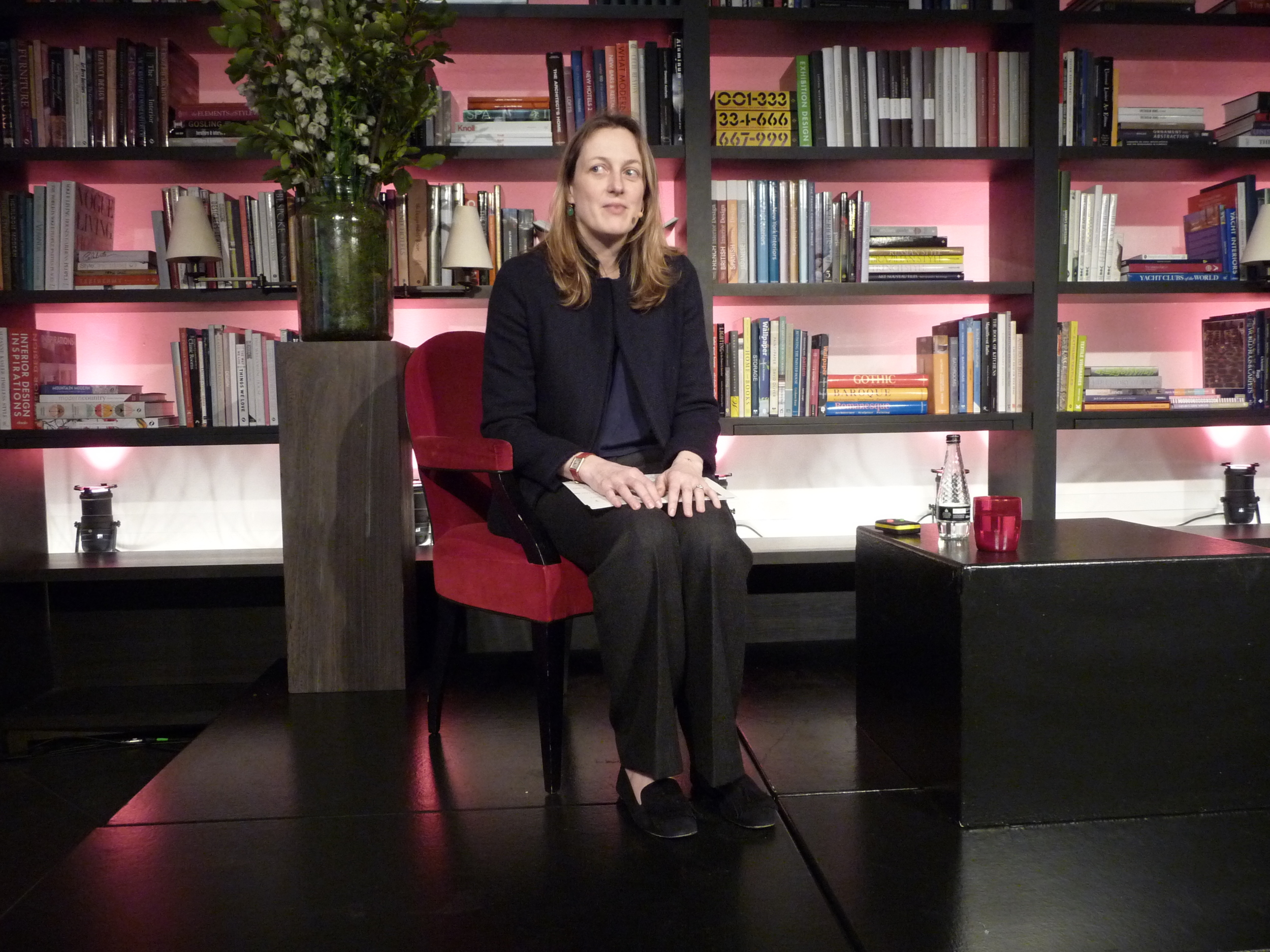
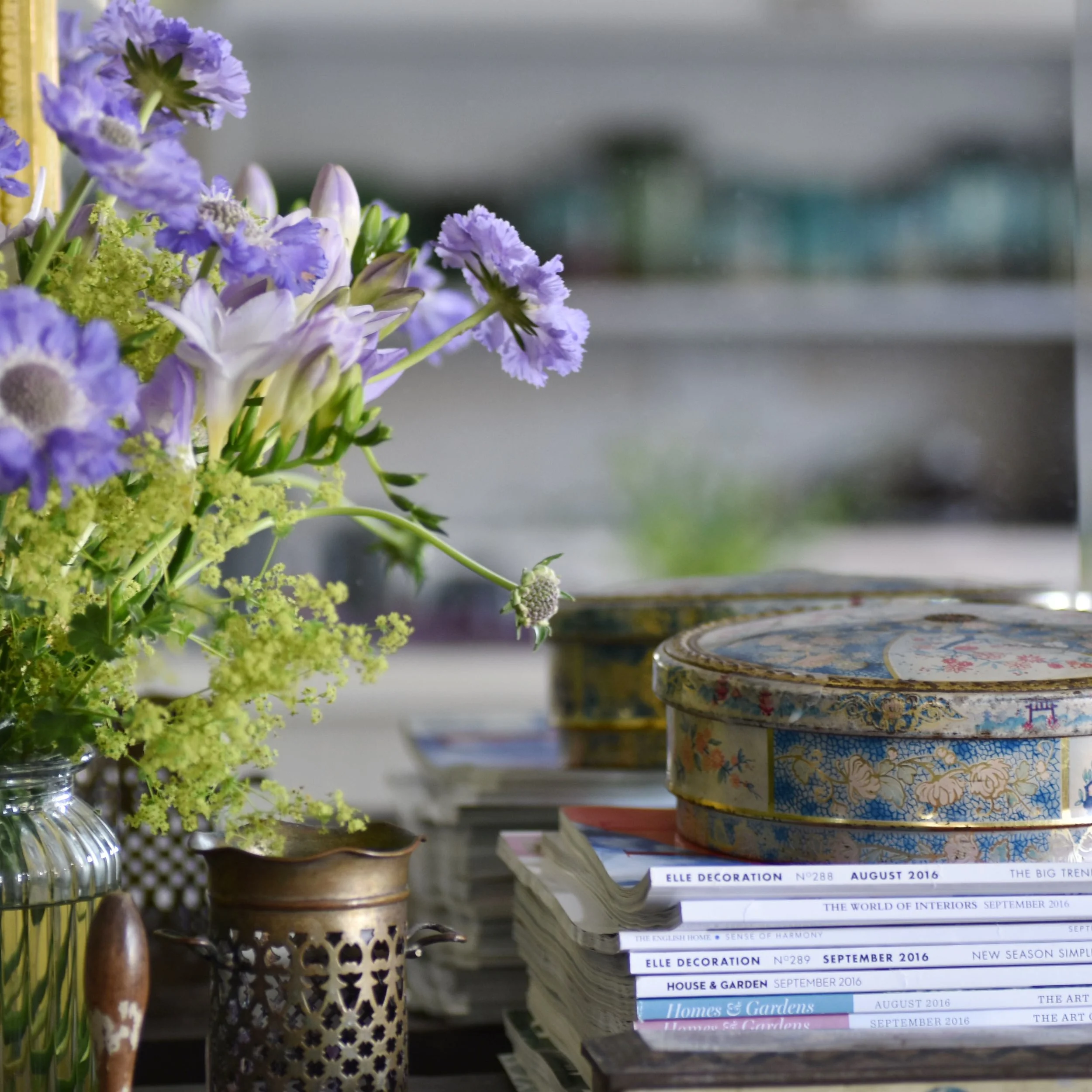
Every year during the Chelsea Flower Show I visit Designers Guild in the Kings Road, Chelsea as I love the way they embrace the Flower Show by having a florist pop-up shop in the internal courtyard.

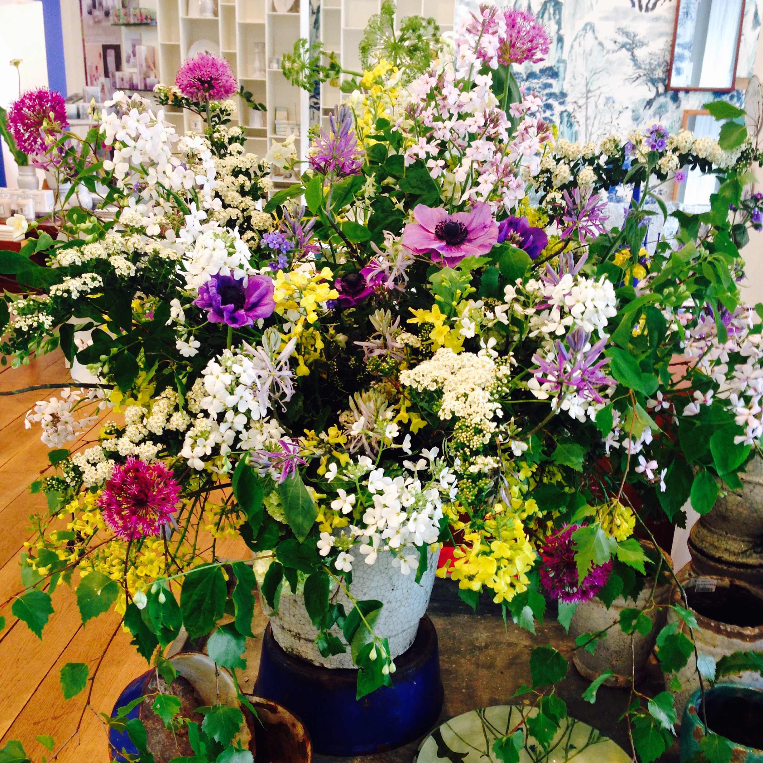
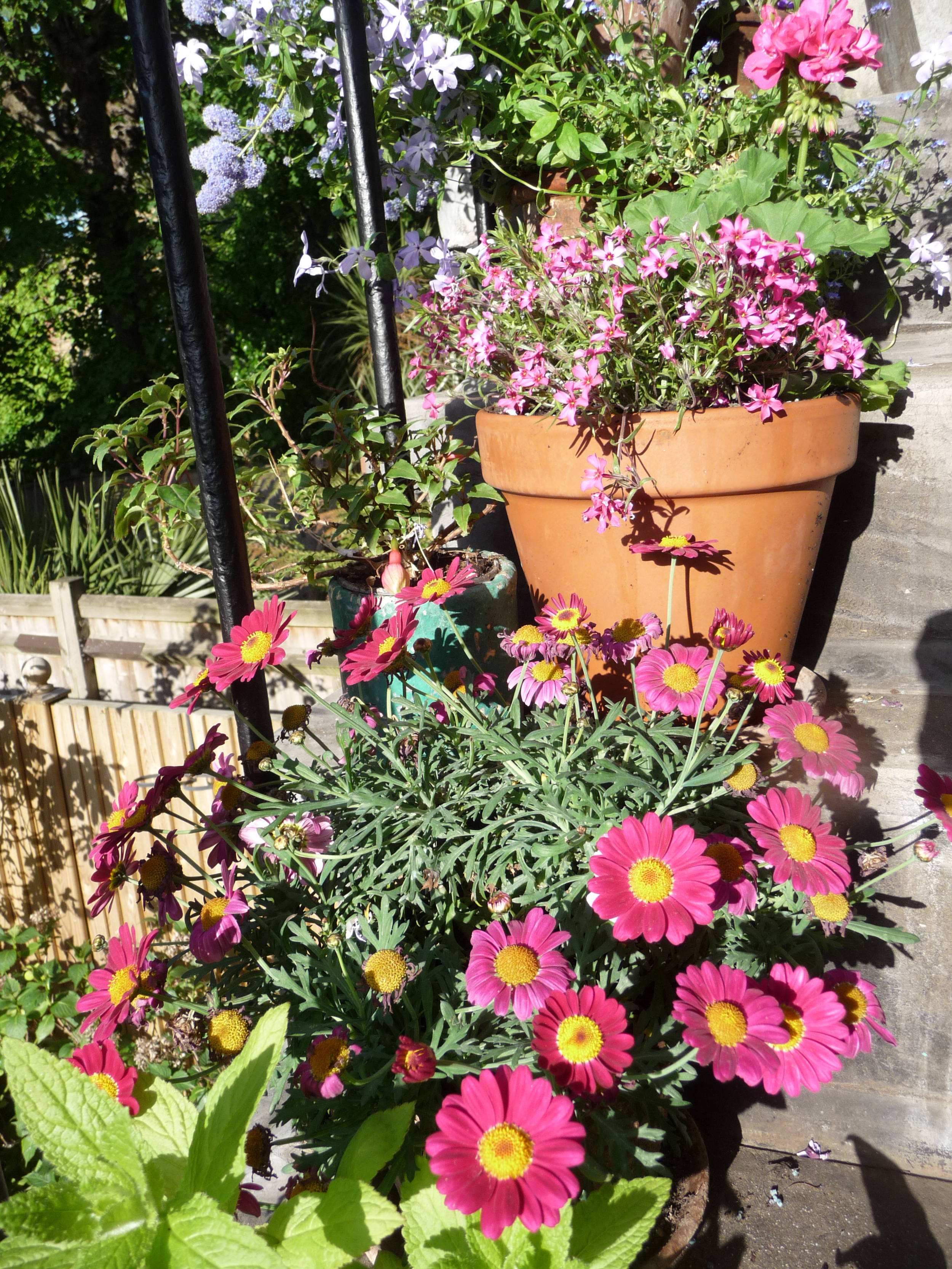
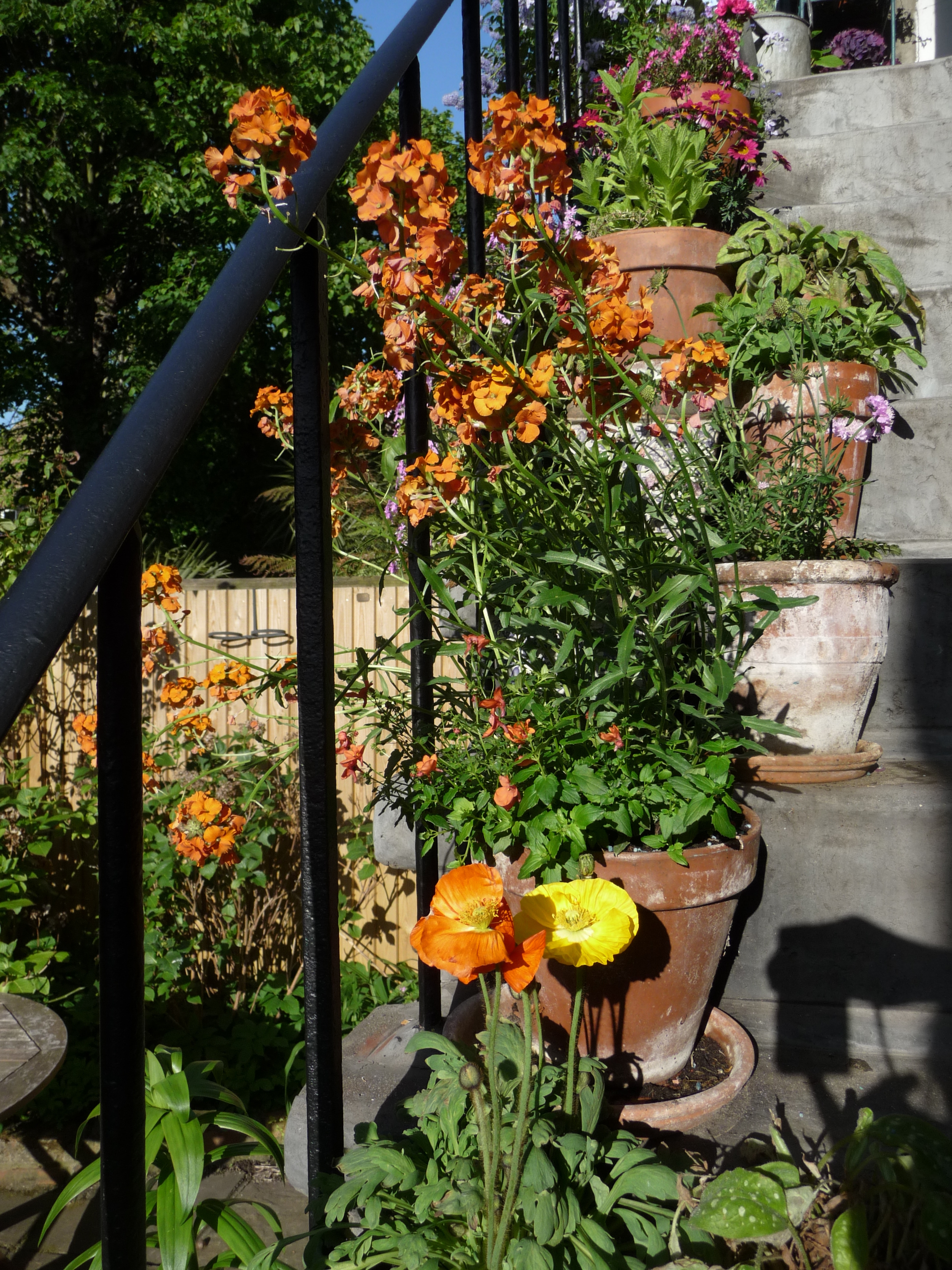
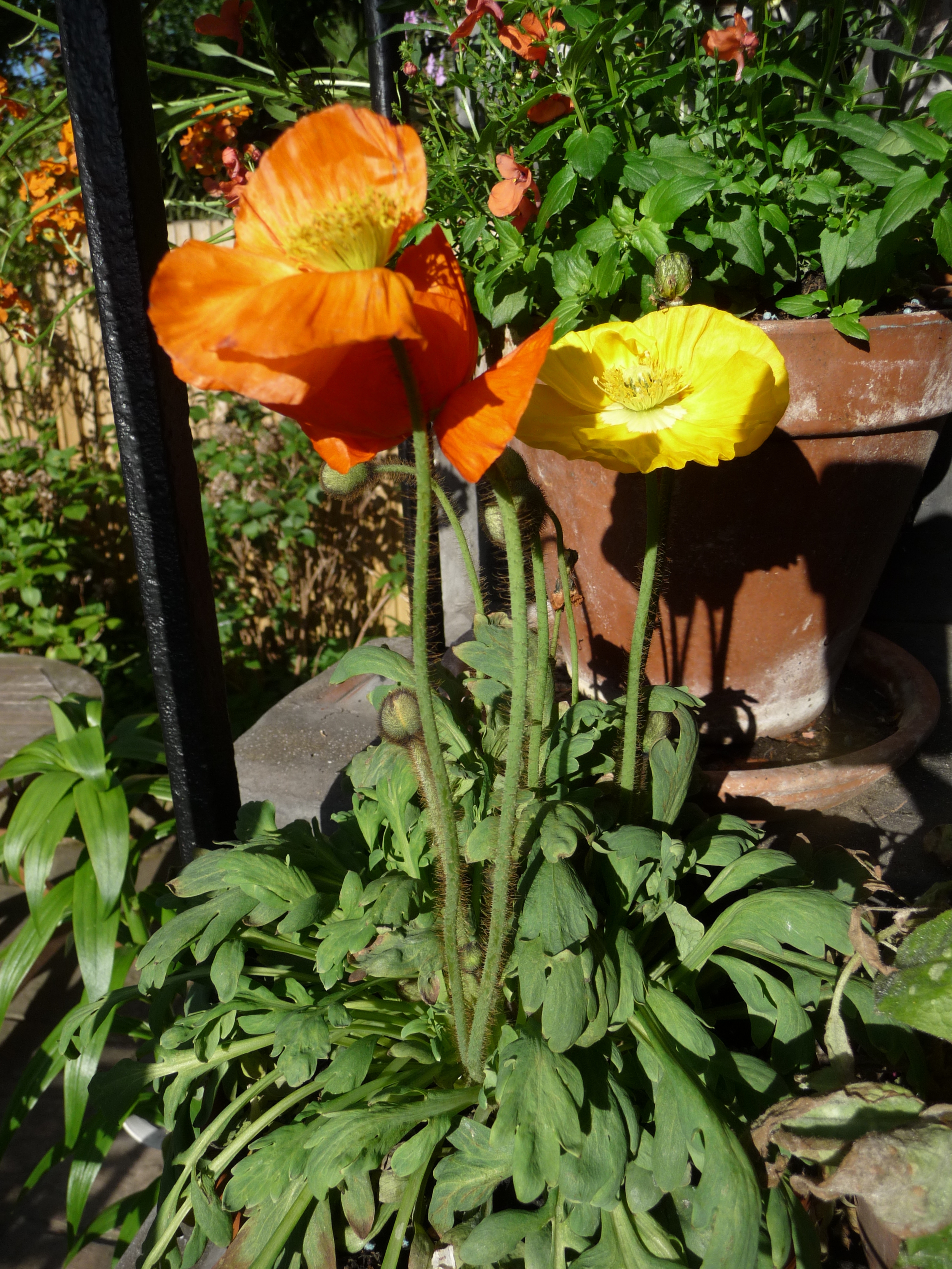
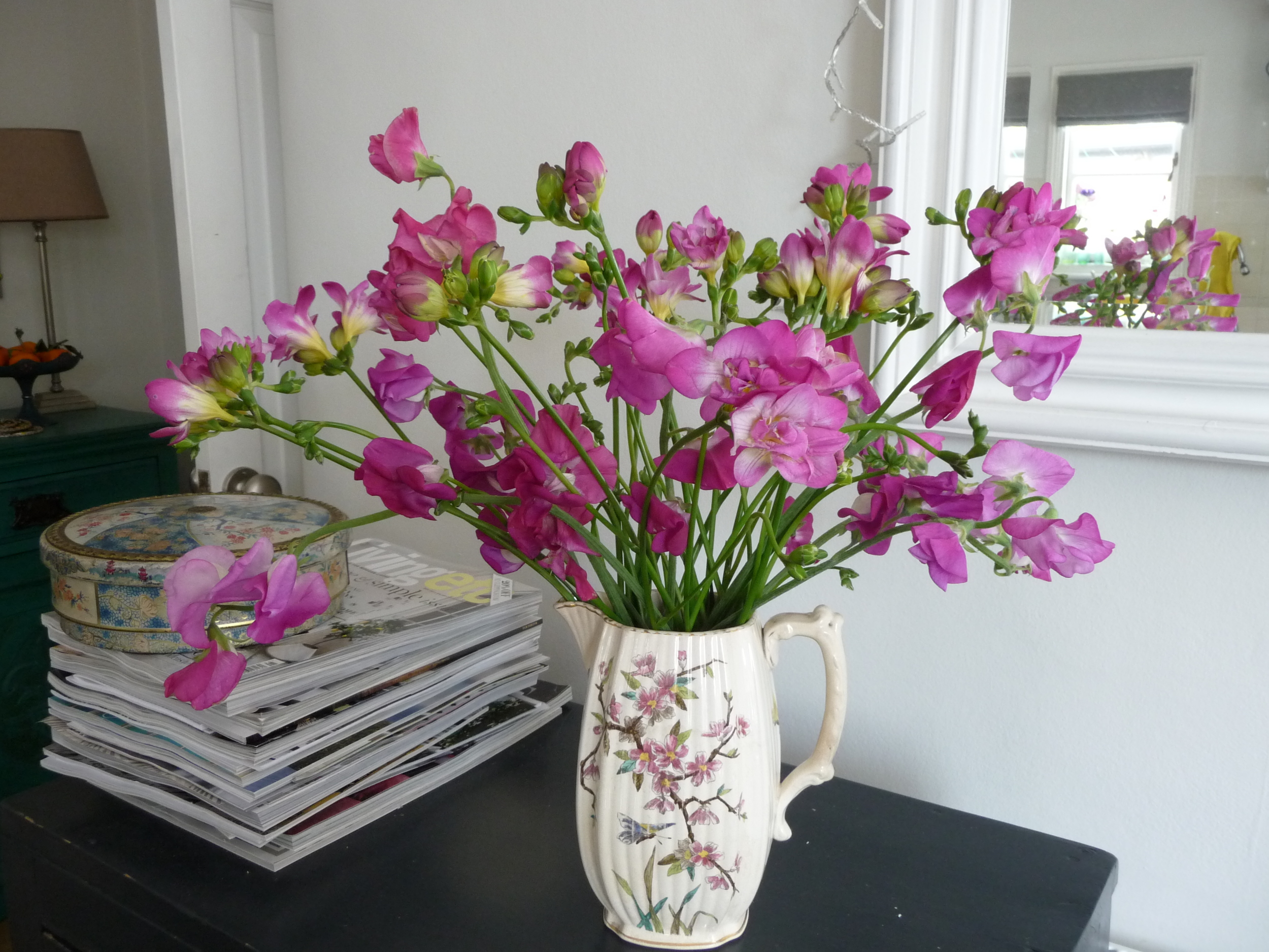
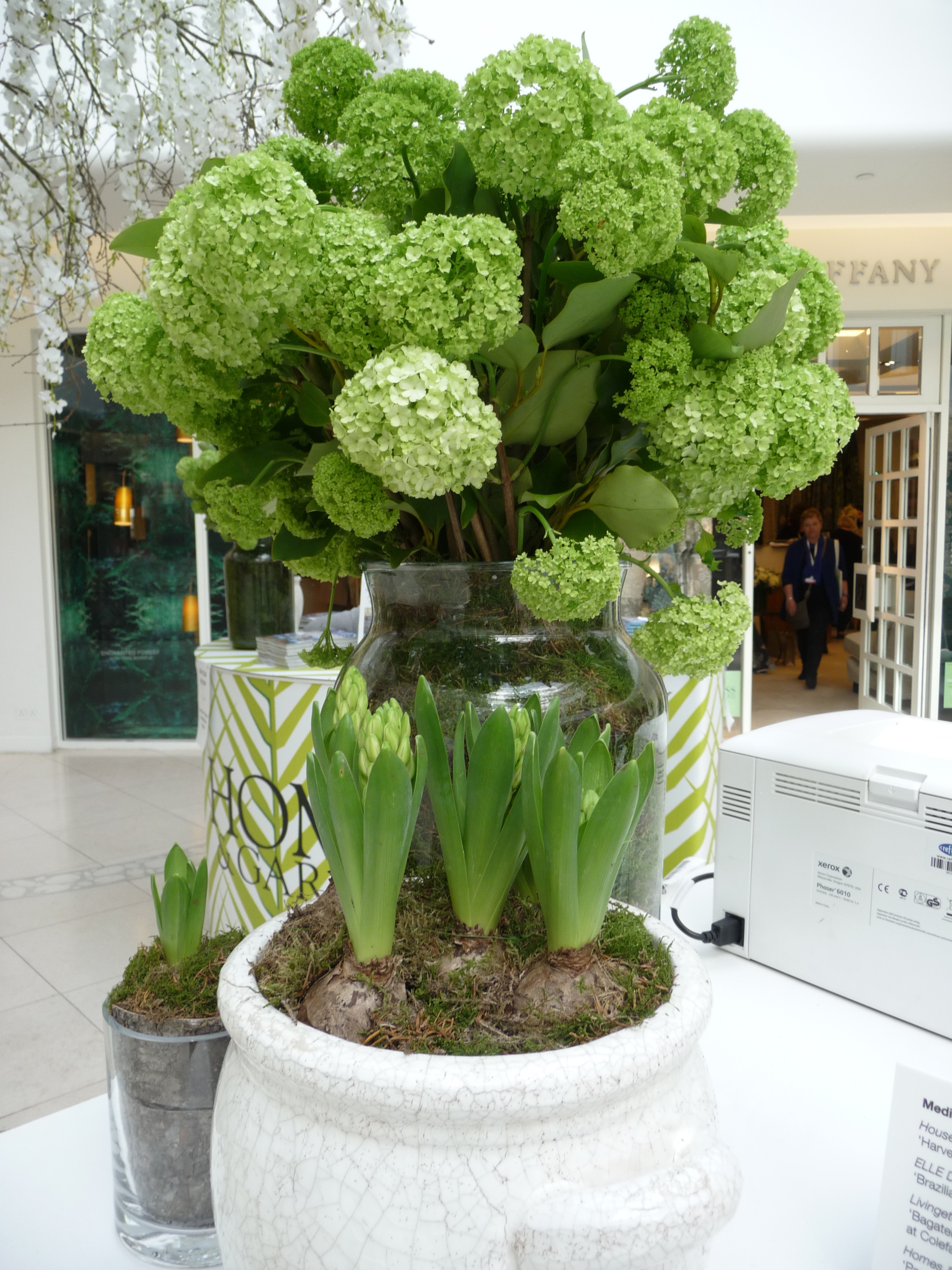
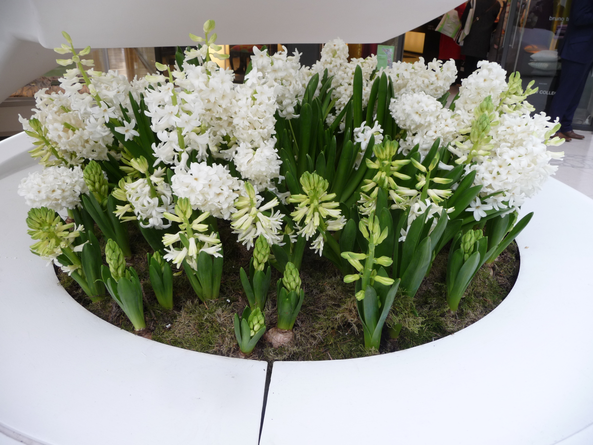
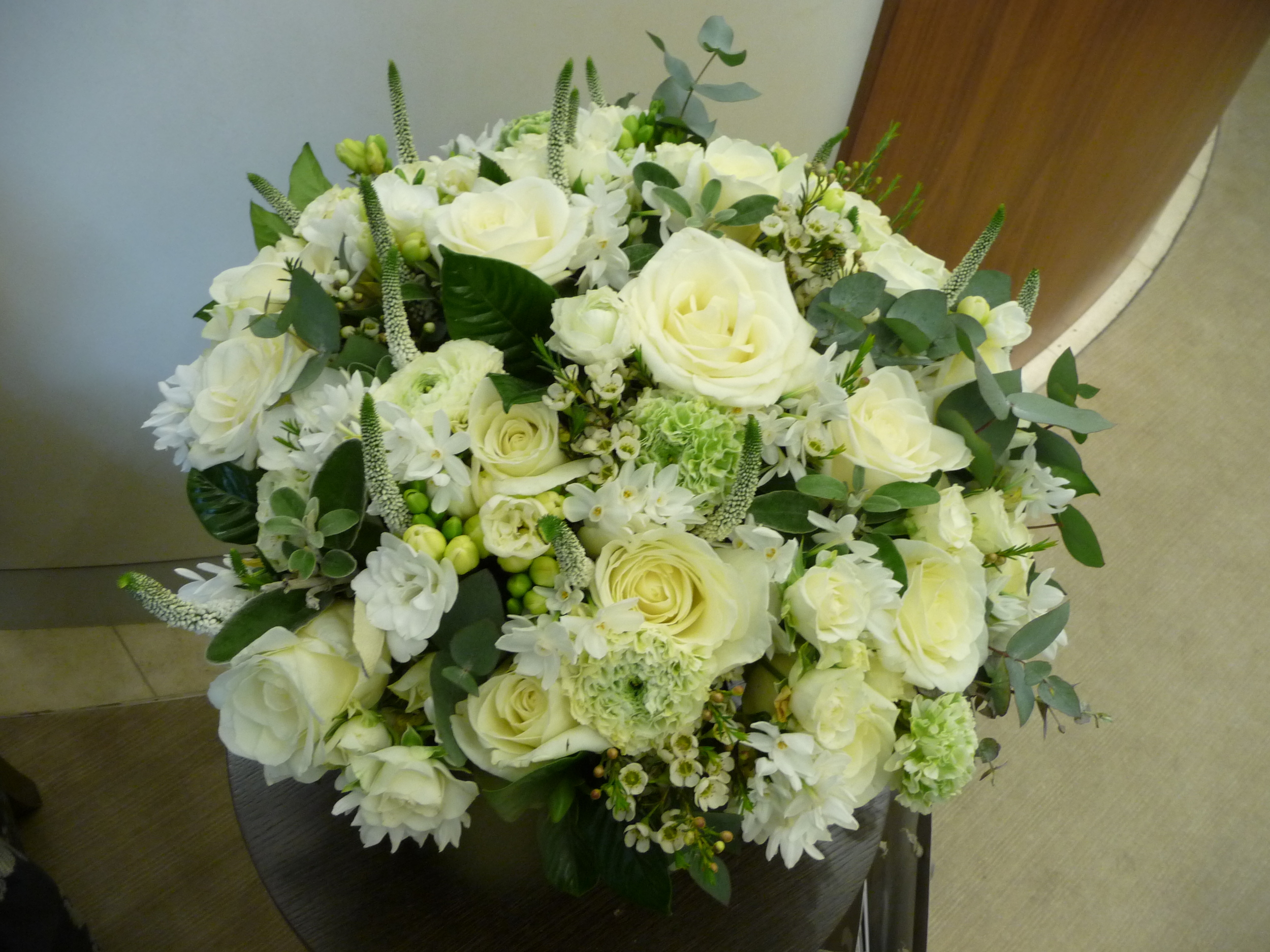
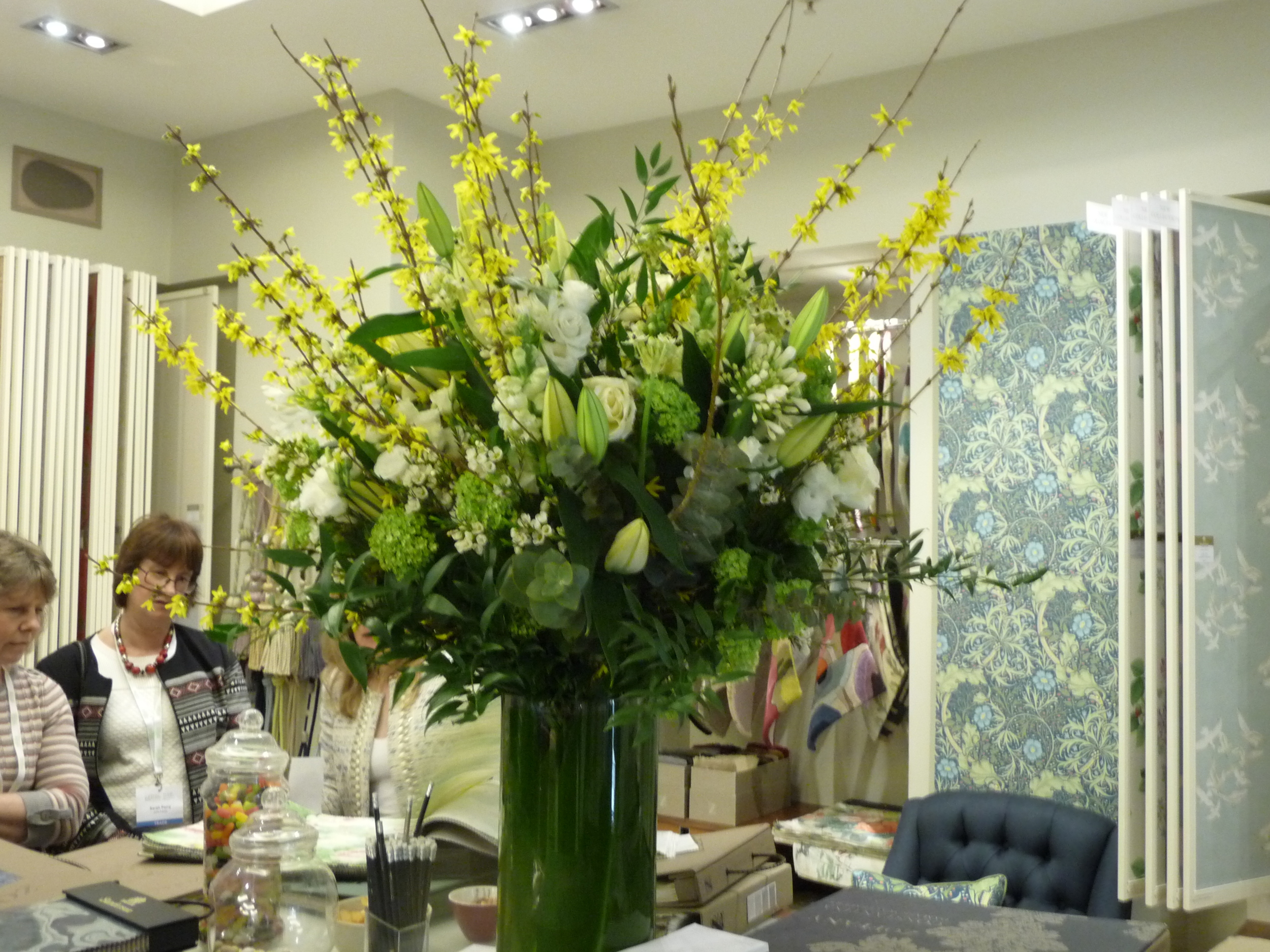
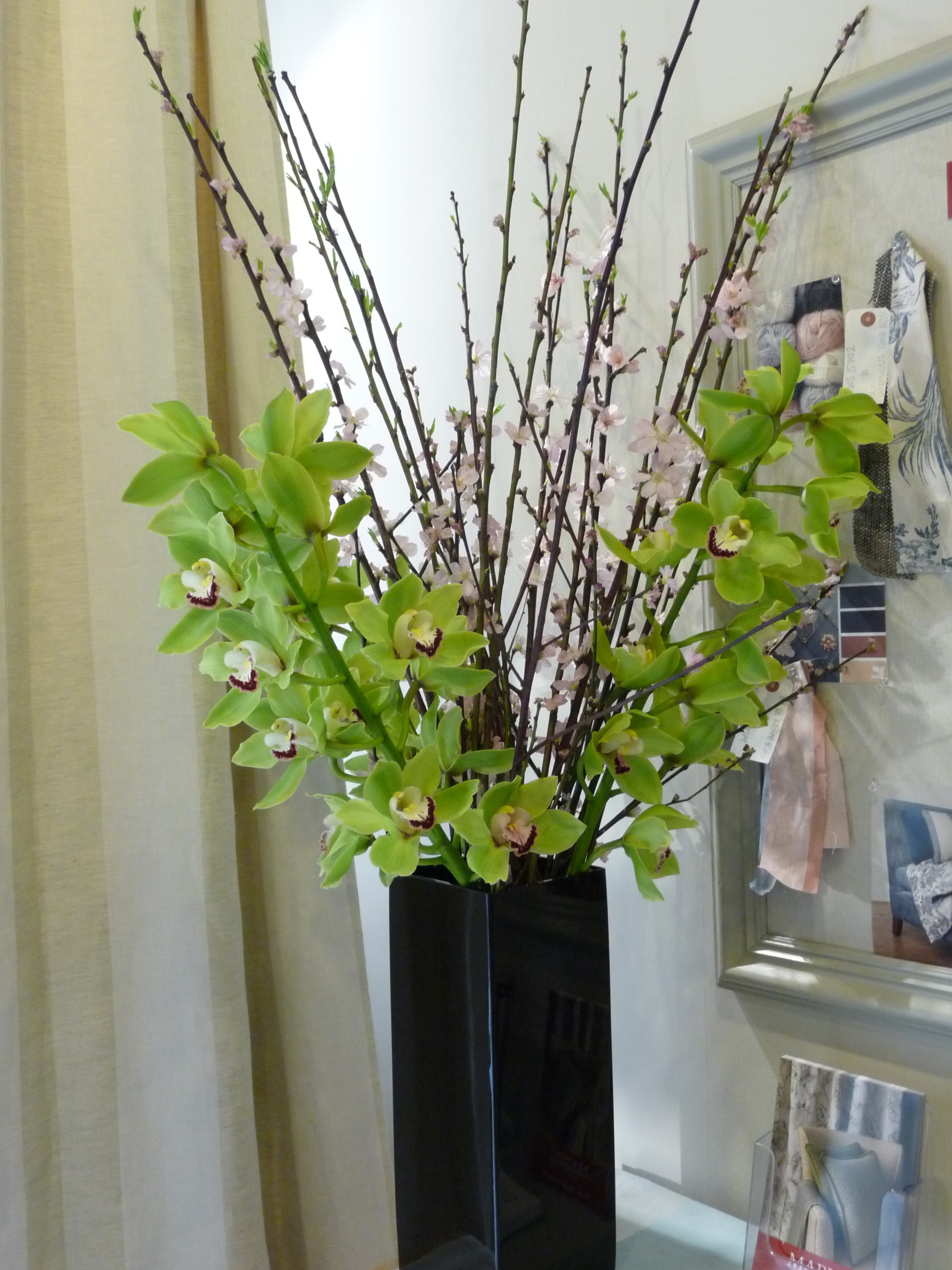
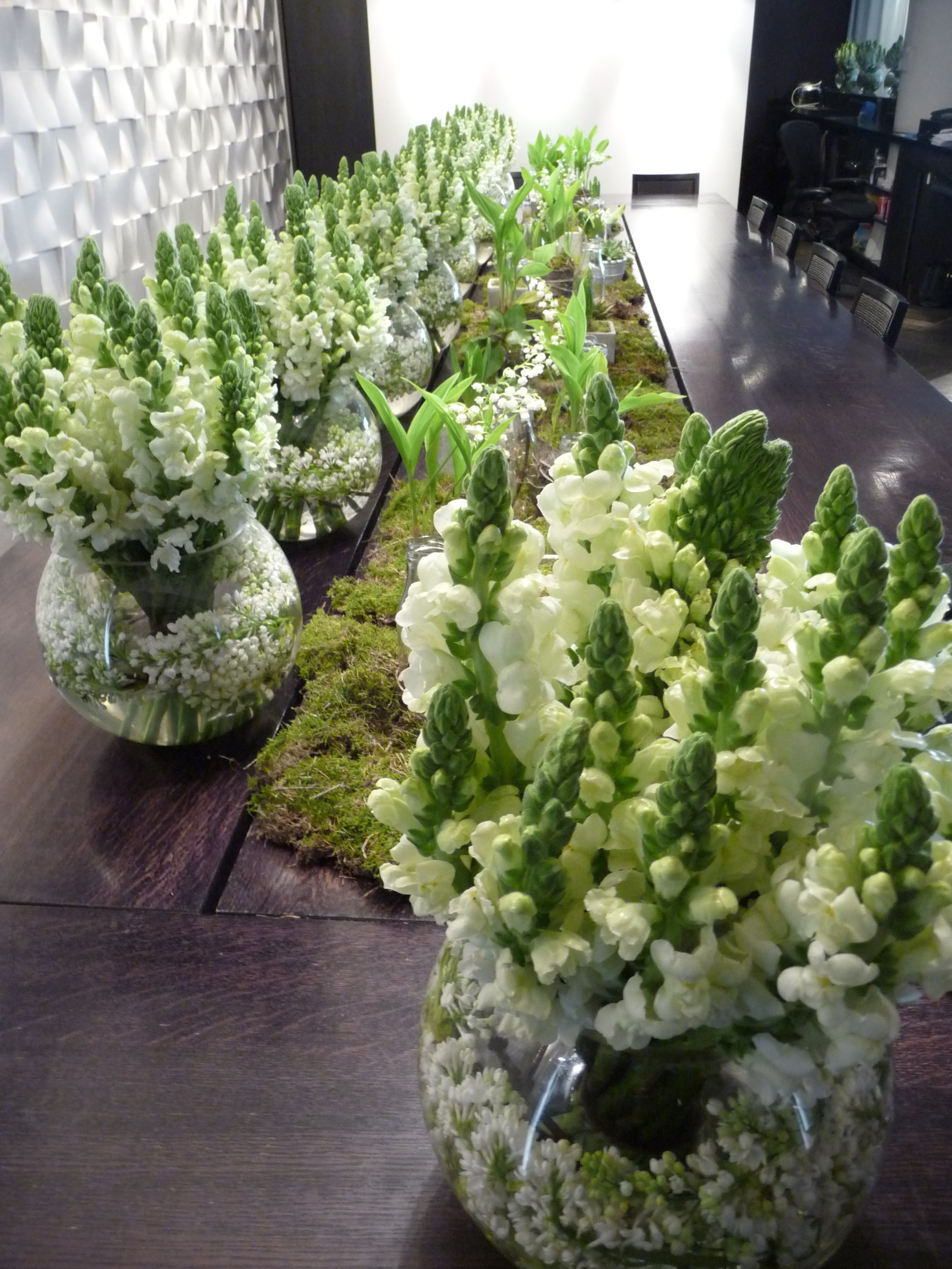
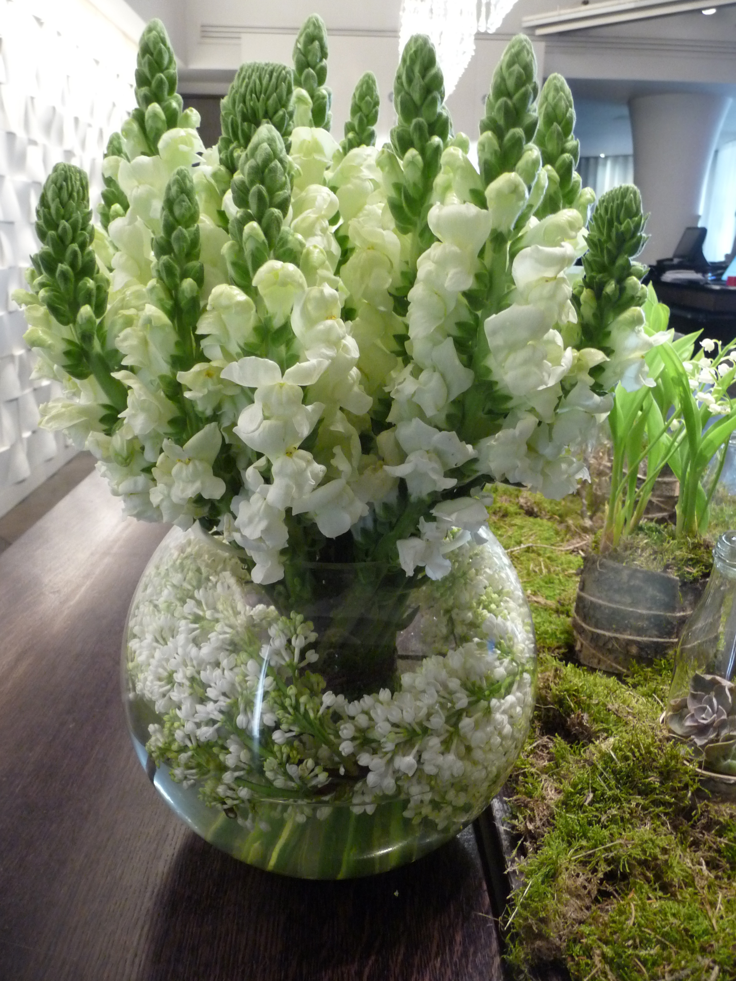
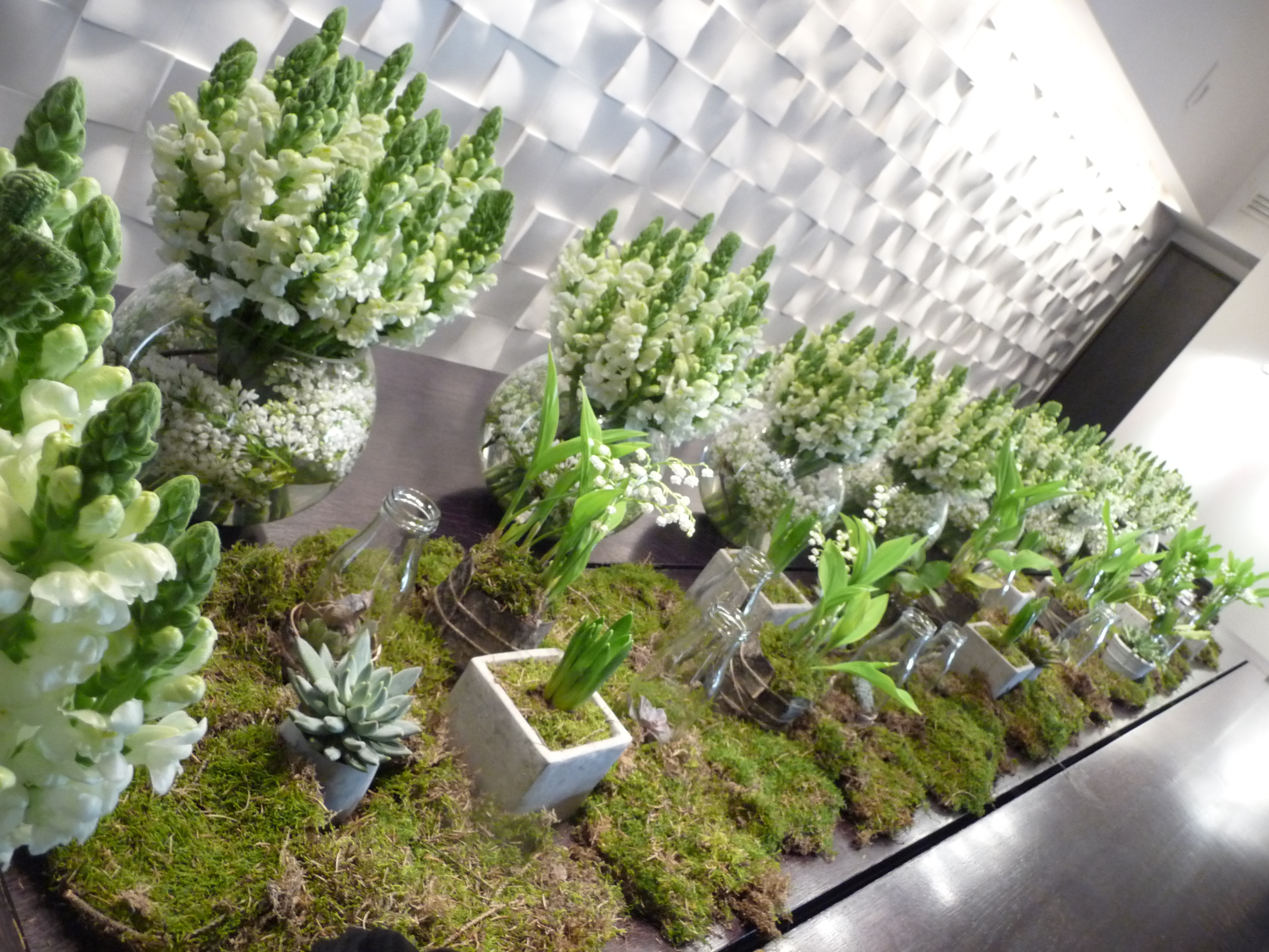
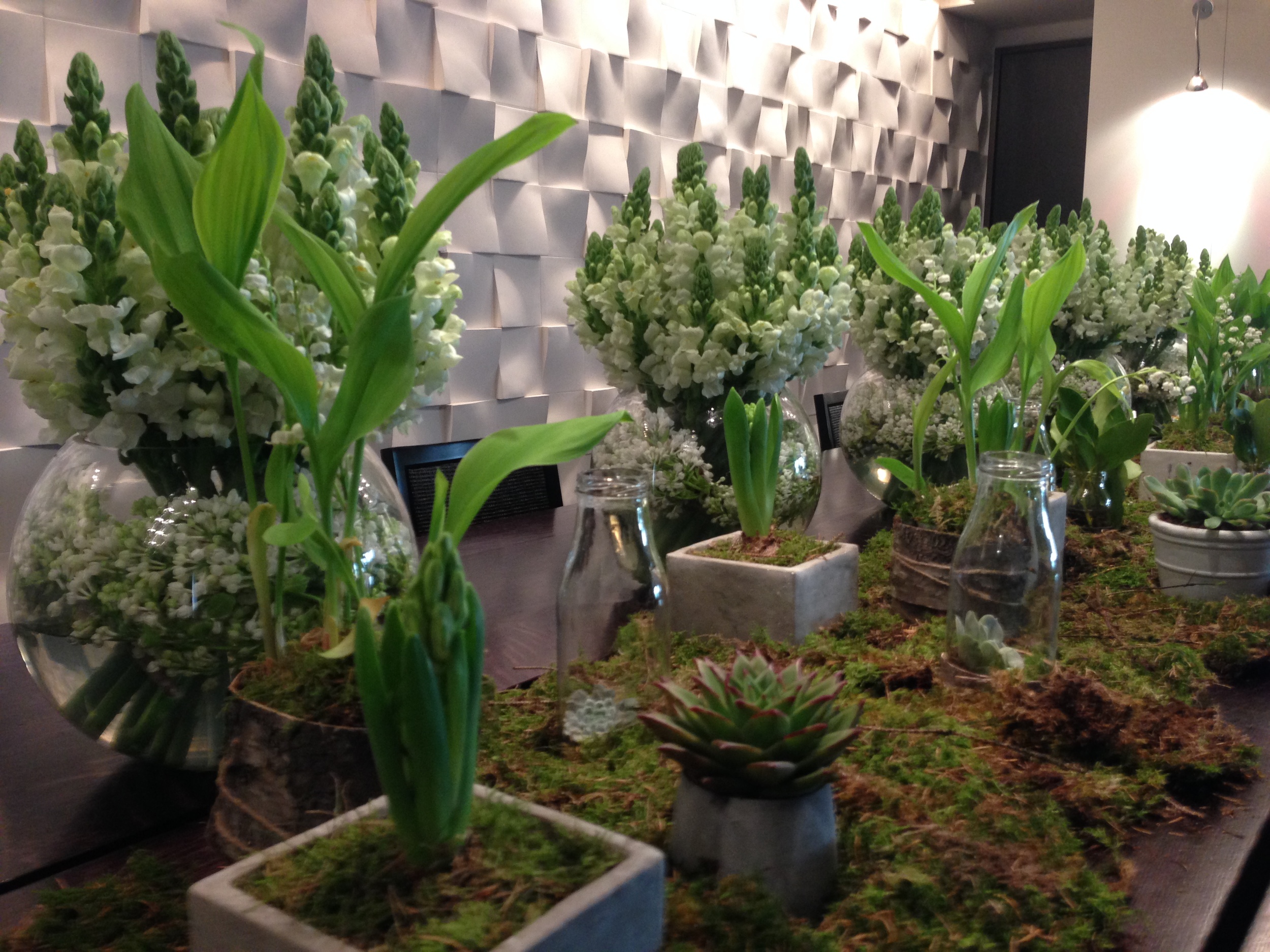
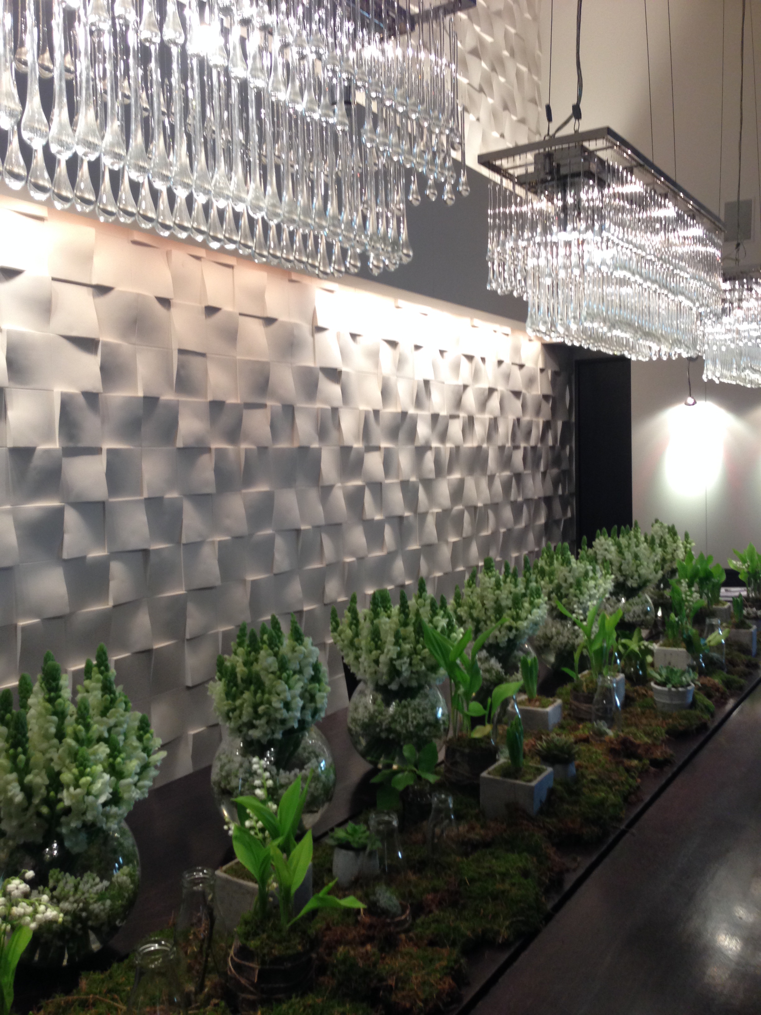
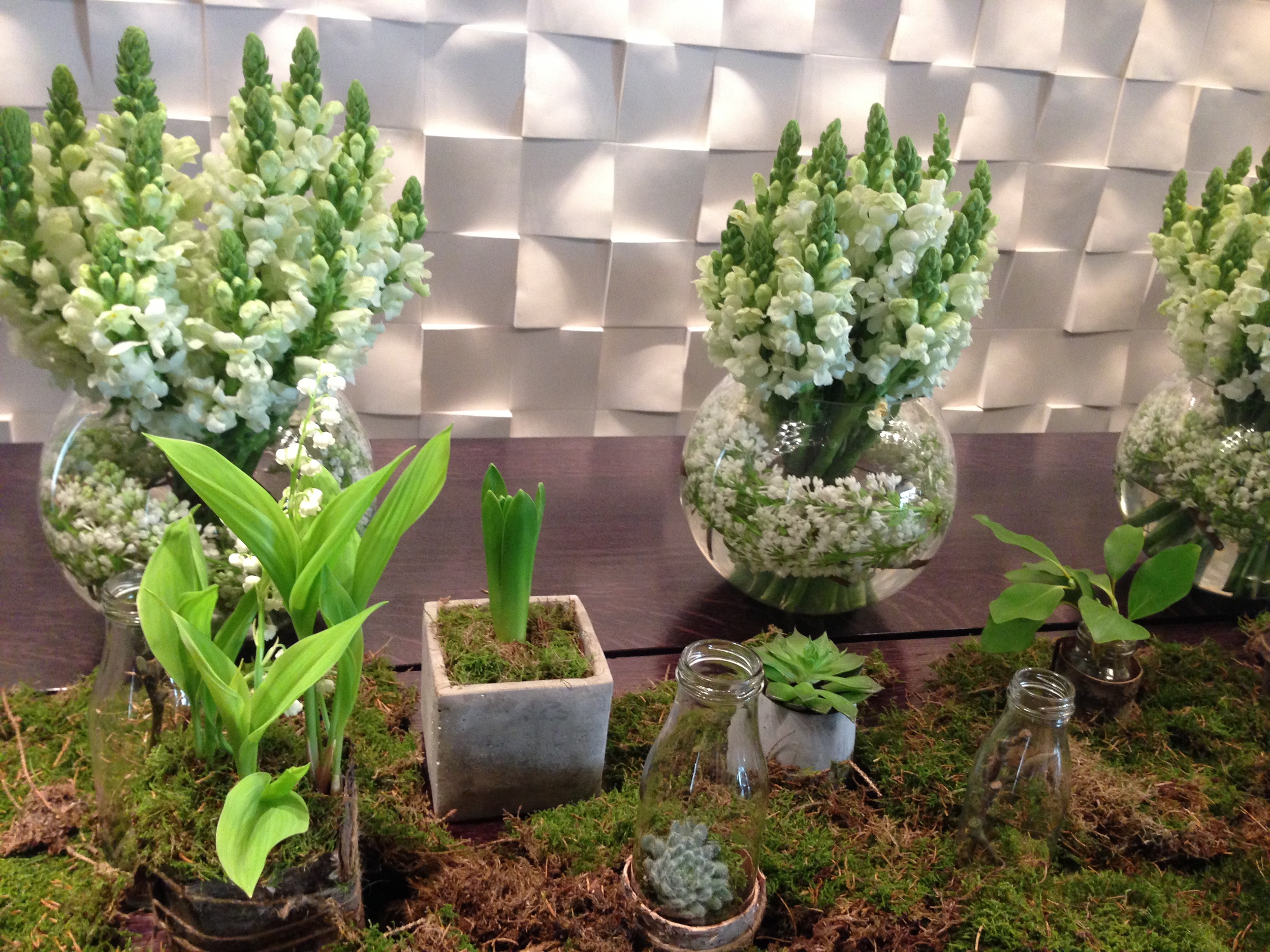
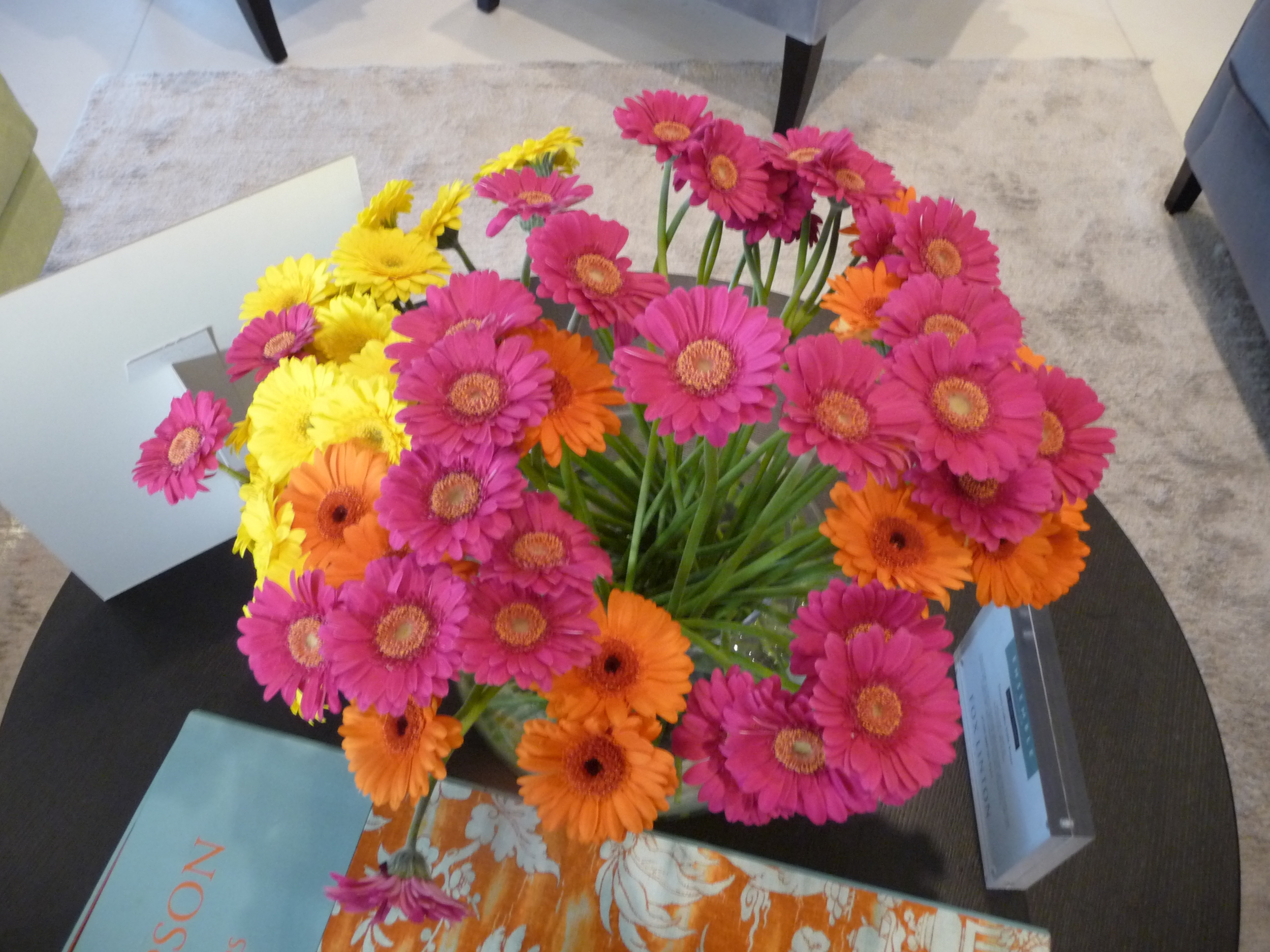
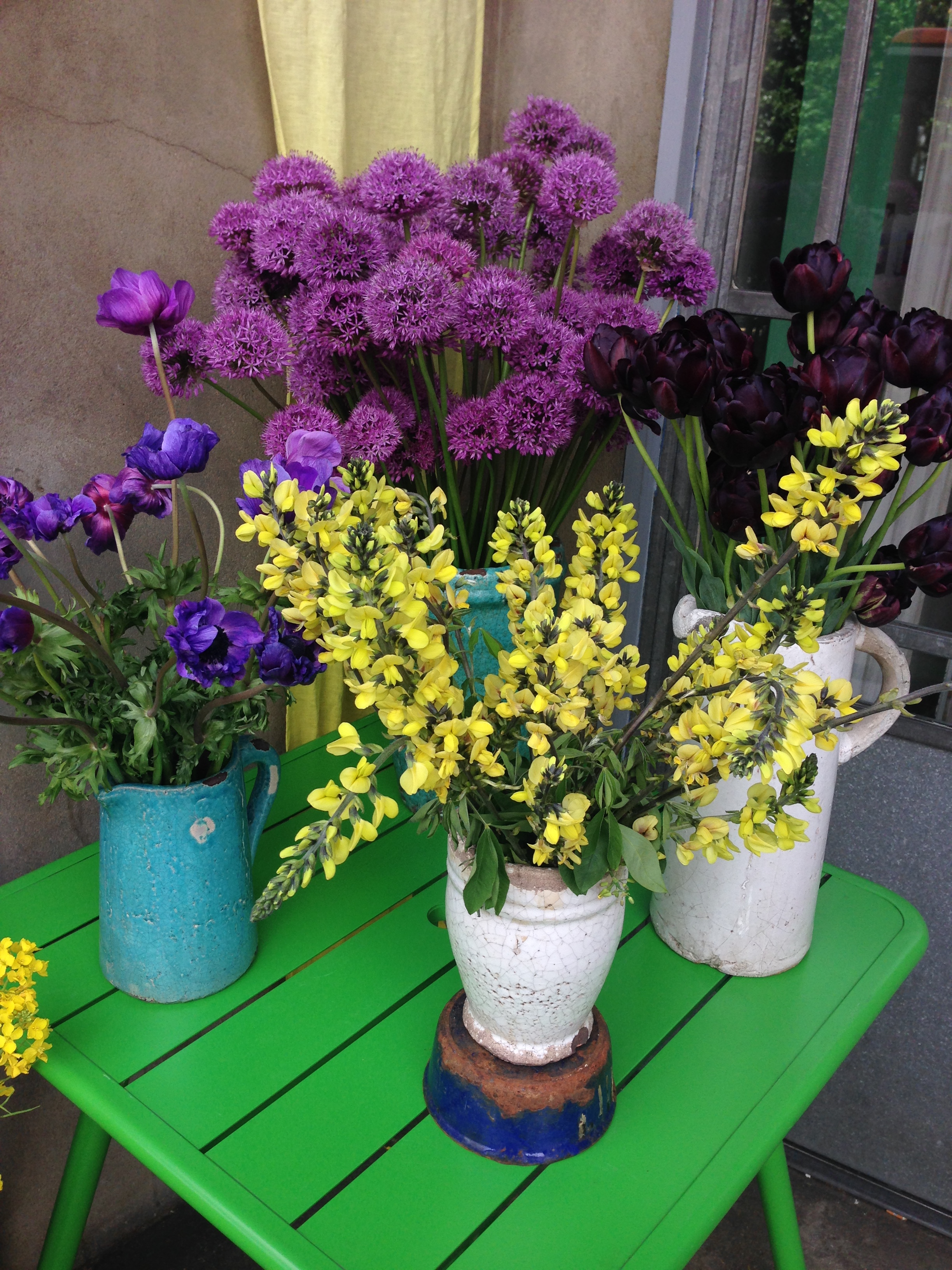
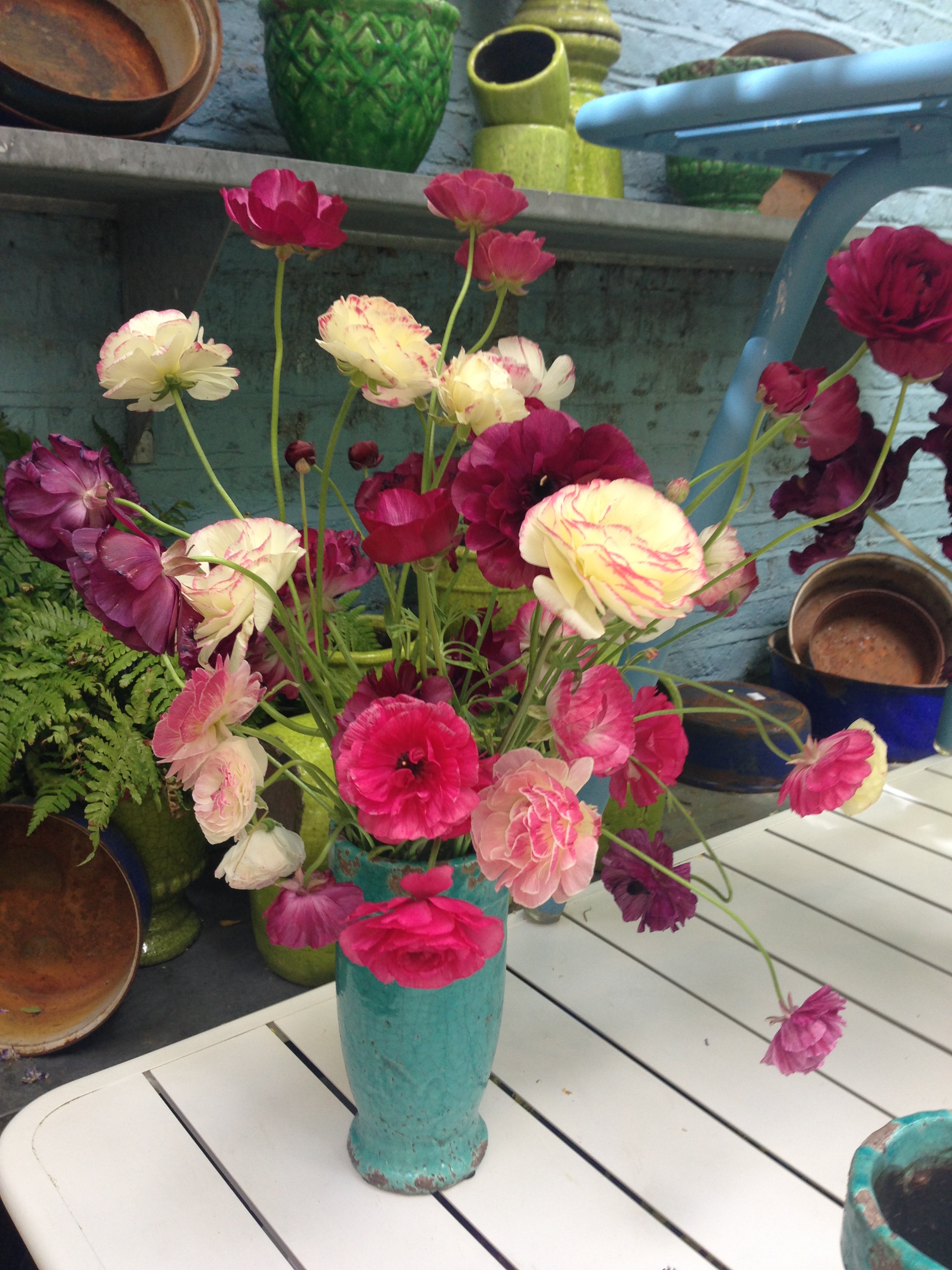
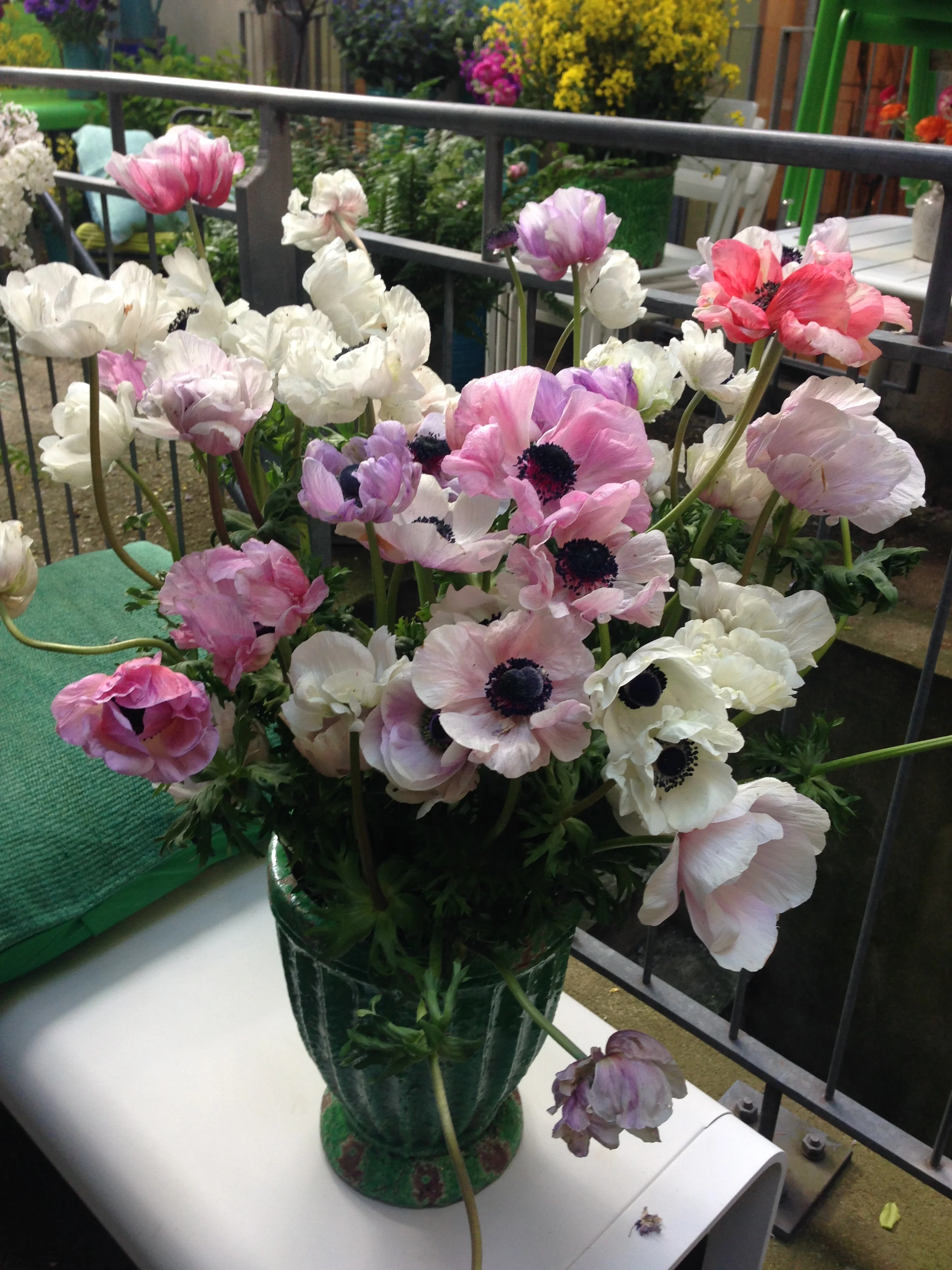
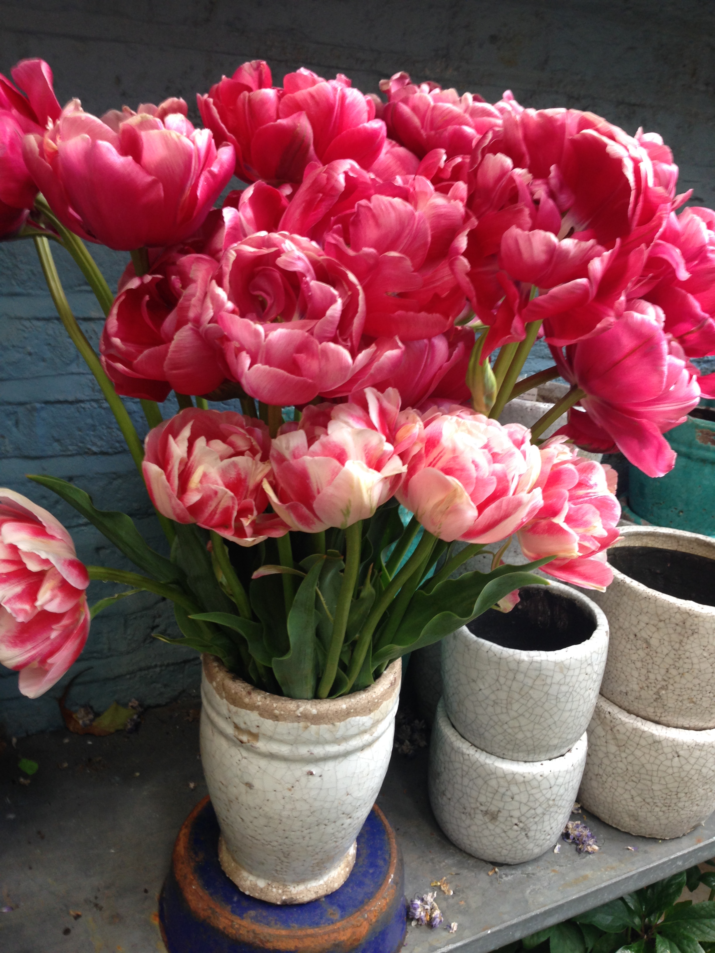
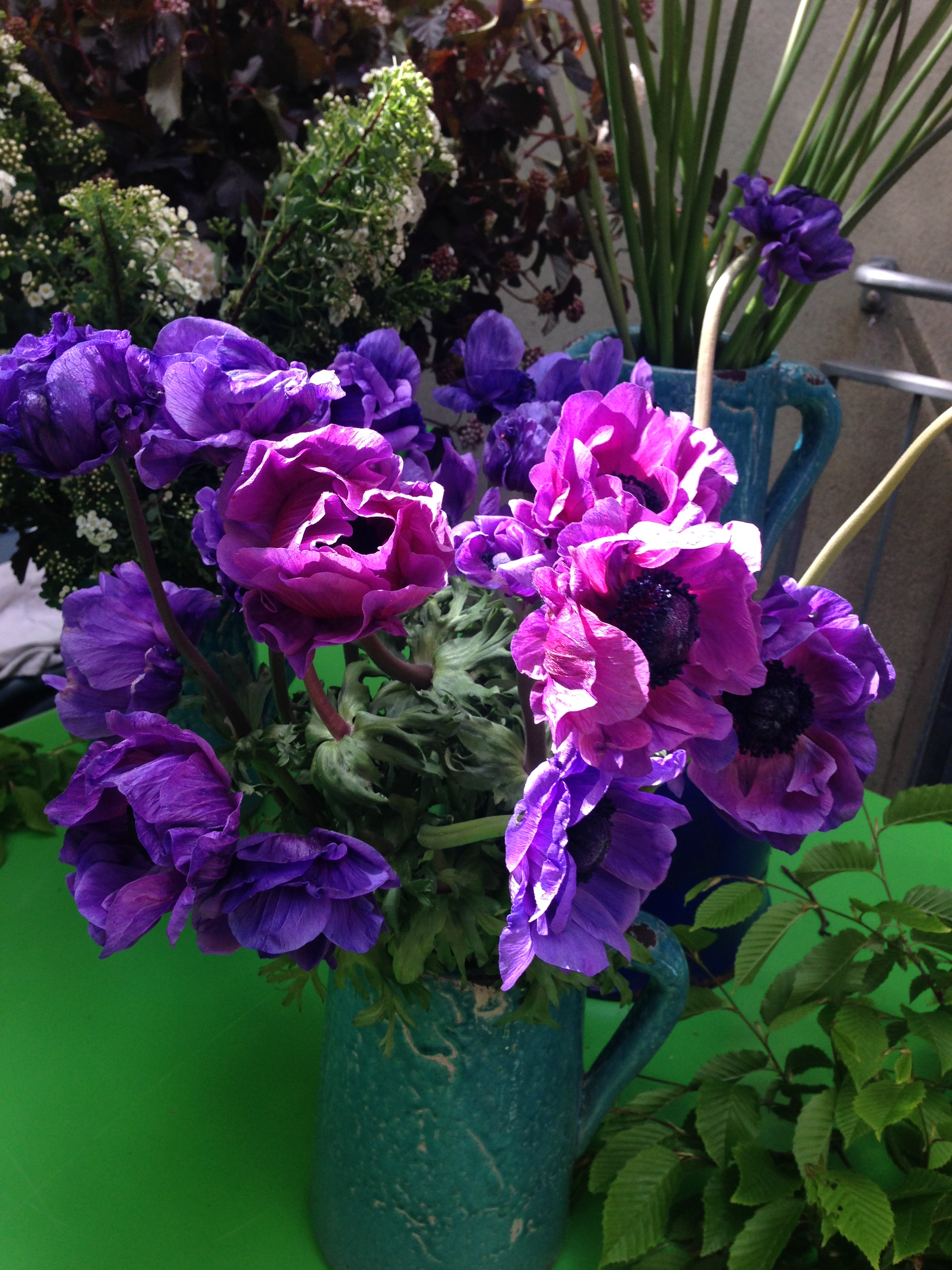
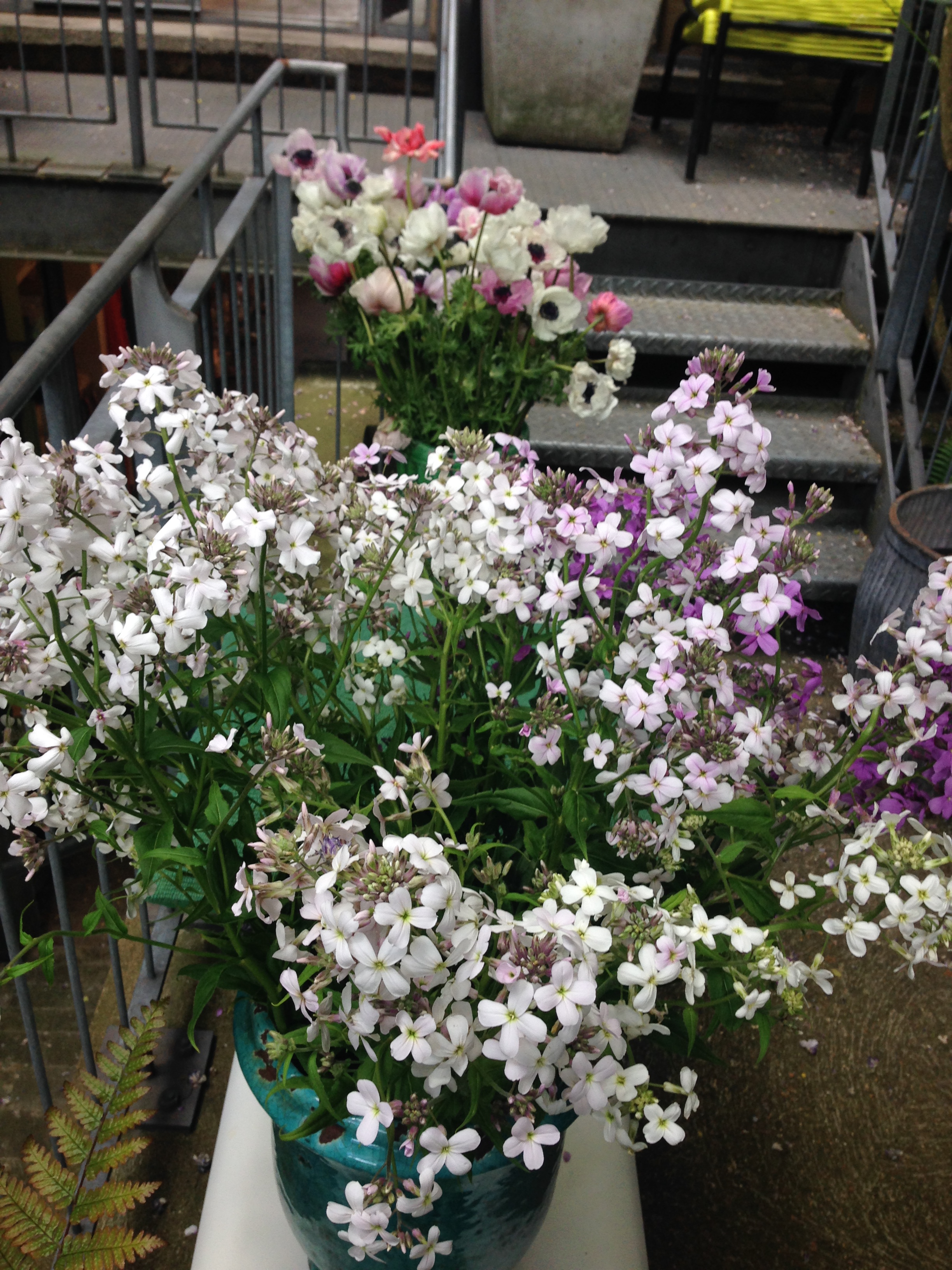
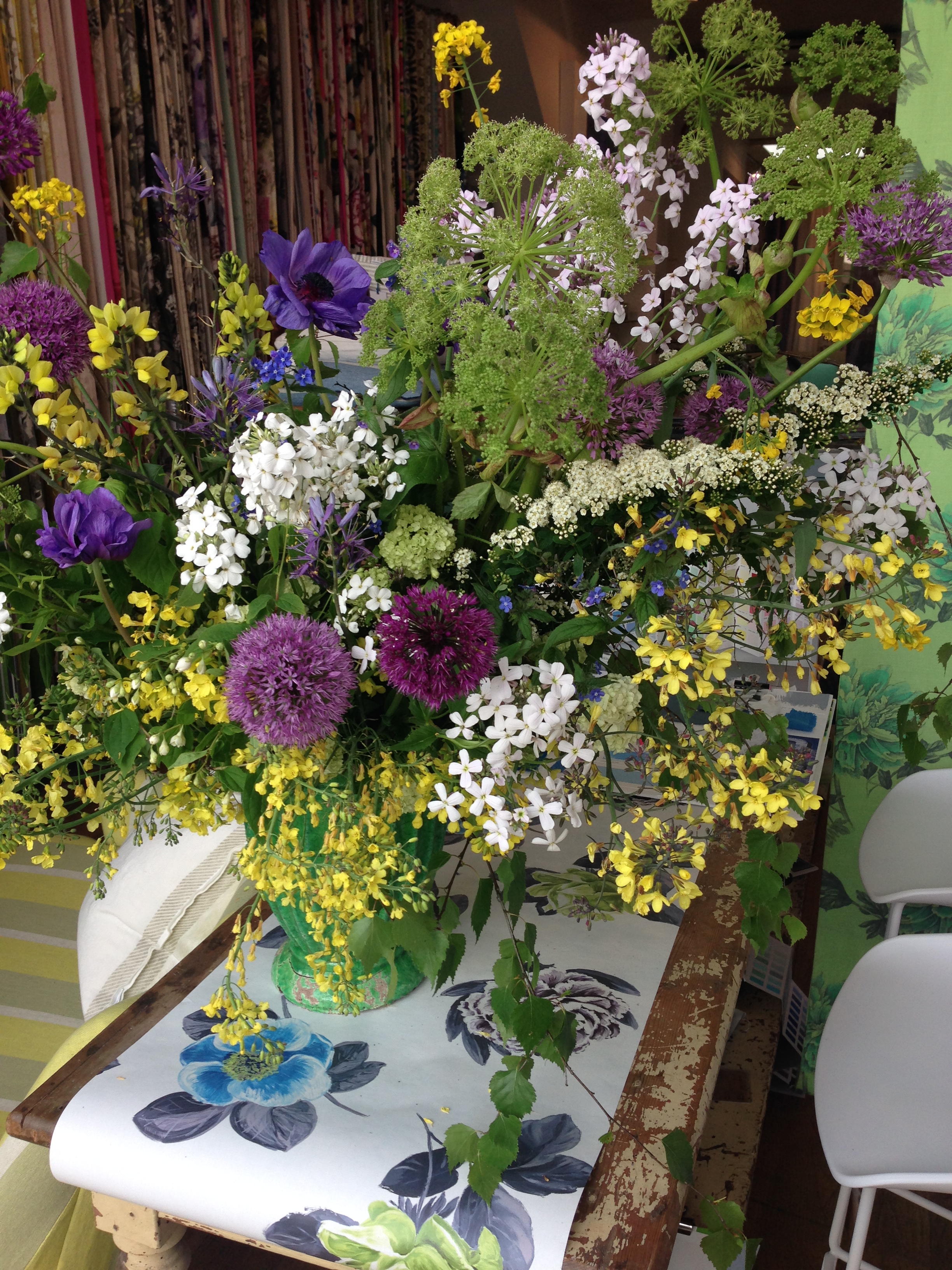
This year the florist was Thoughtful Flowers  and I had the pleasure of meeting the owner Juliet Glaves in the shop. As you can see from the photos below, she creates natural and creative arrangements to enhance the beauty of the garden-grown flowers and some  harvested from hedgerows. I am actually doing a course on 3rd June Really Romantic Flowers at Perch Hill Farm with the wonderful duo Sarah Raven and Juliet Glaves. This should be a fantastic day and it includes lunch made with fresh produce from the garden at Perch Hill.

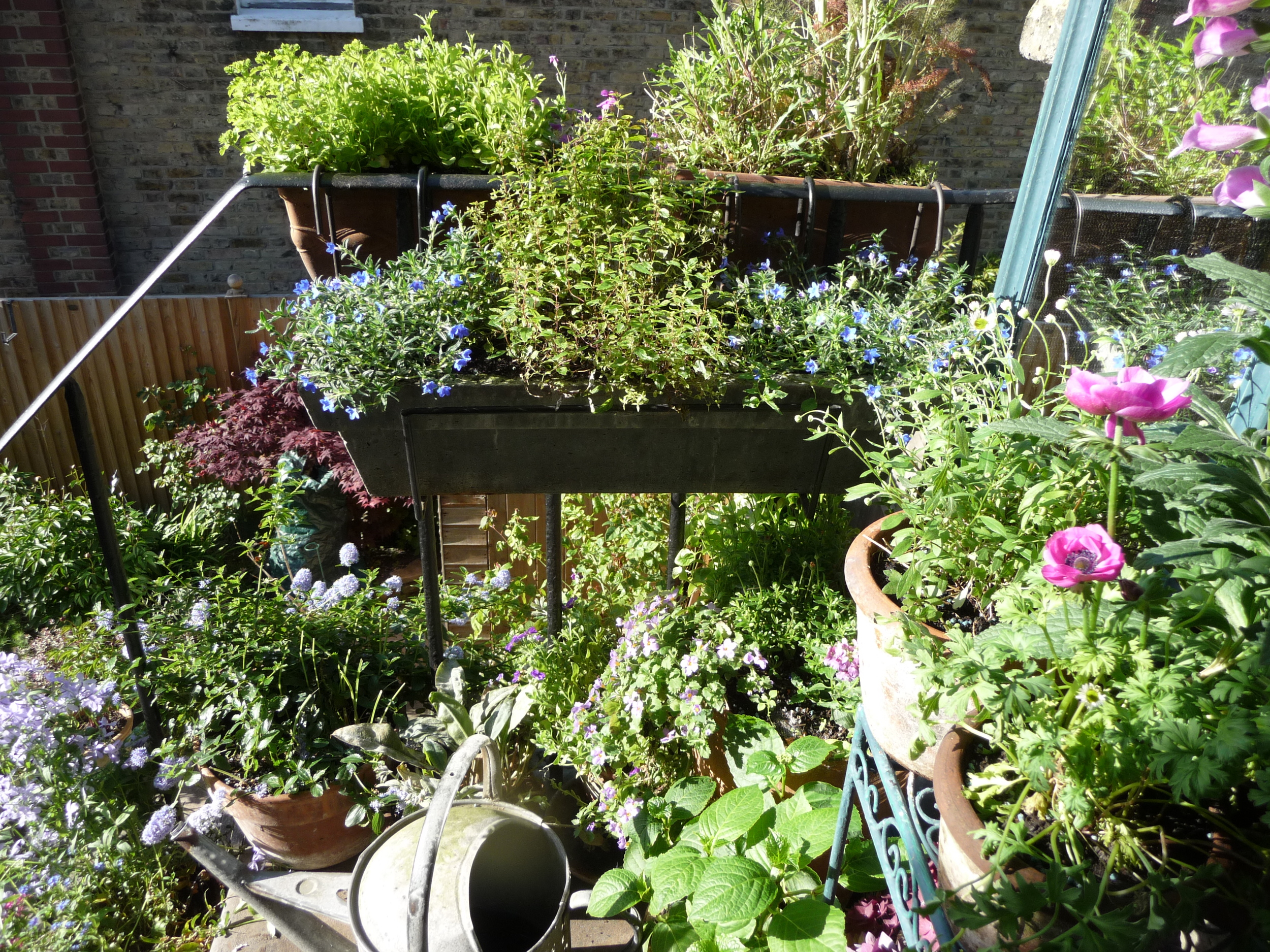
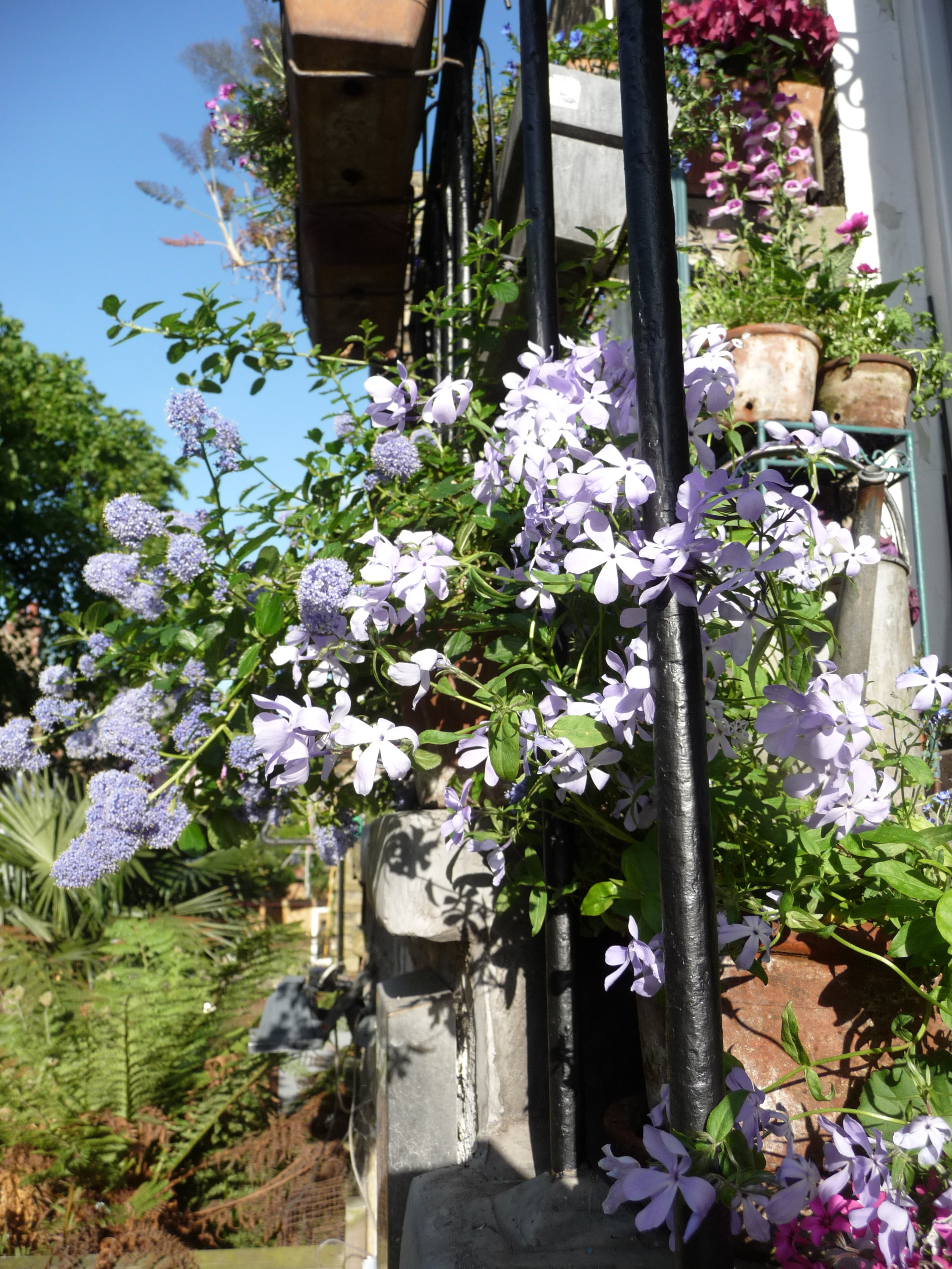
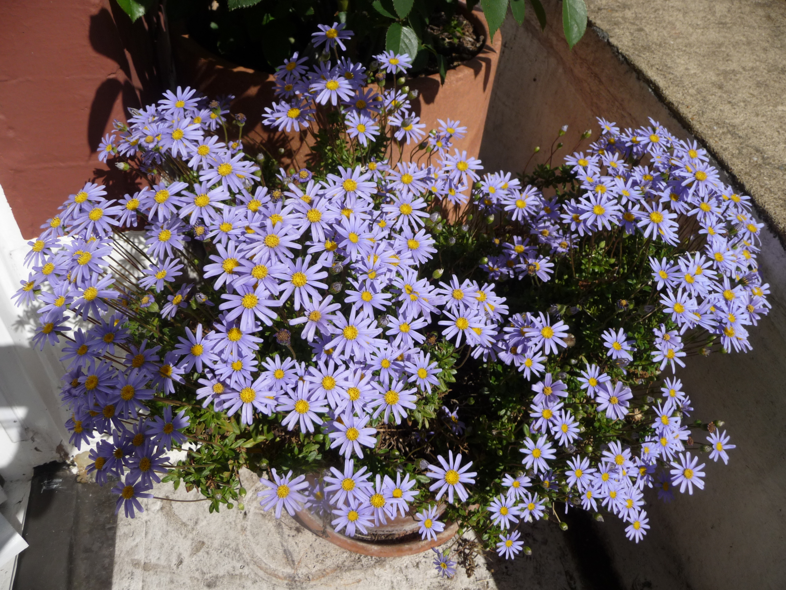
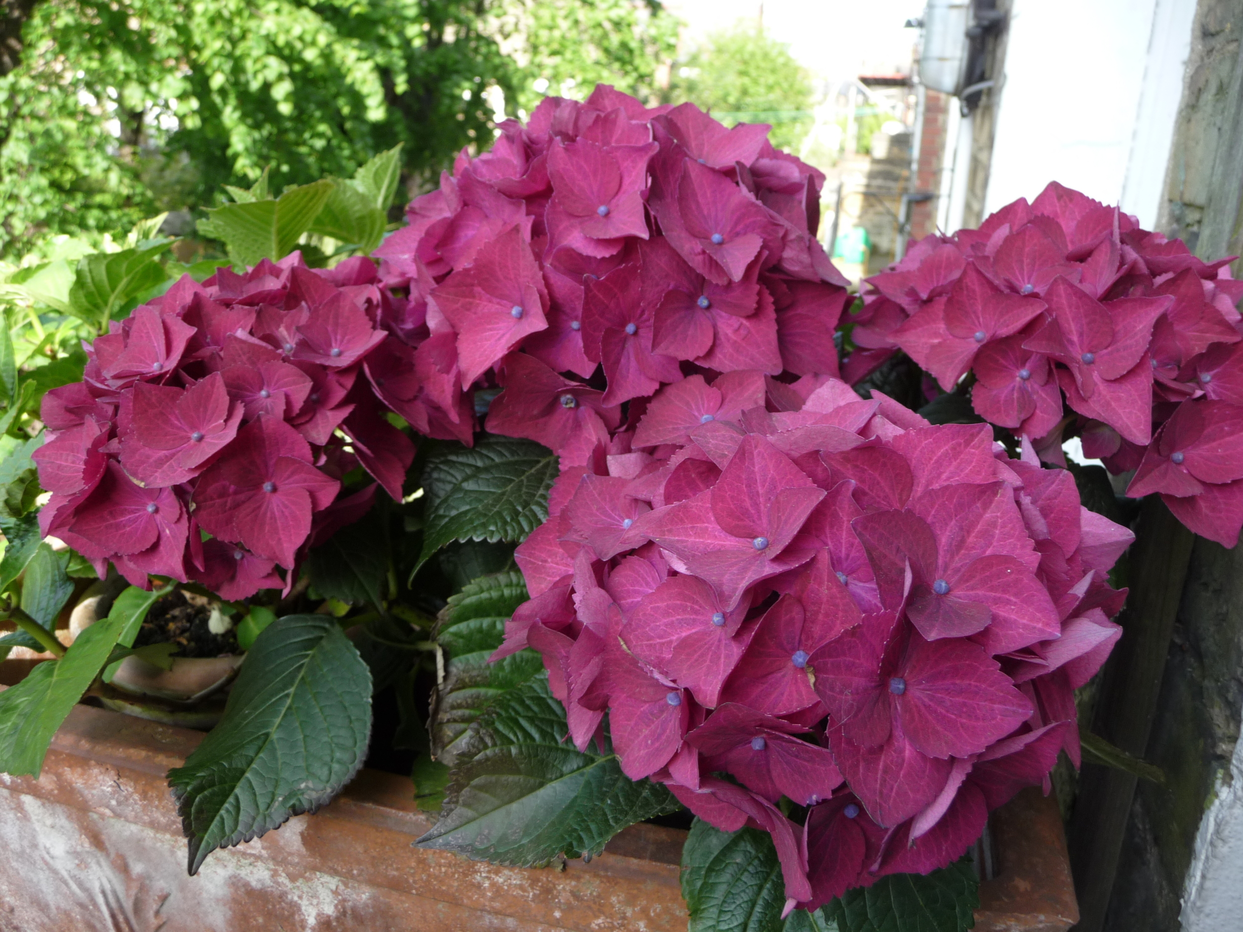
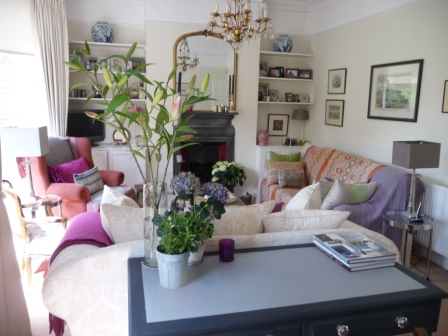
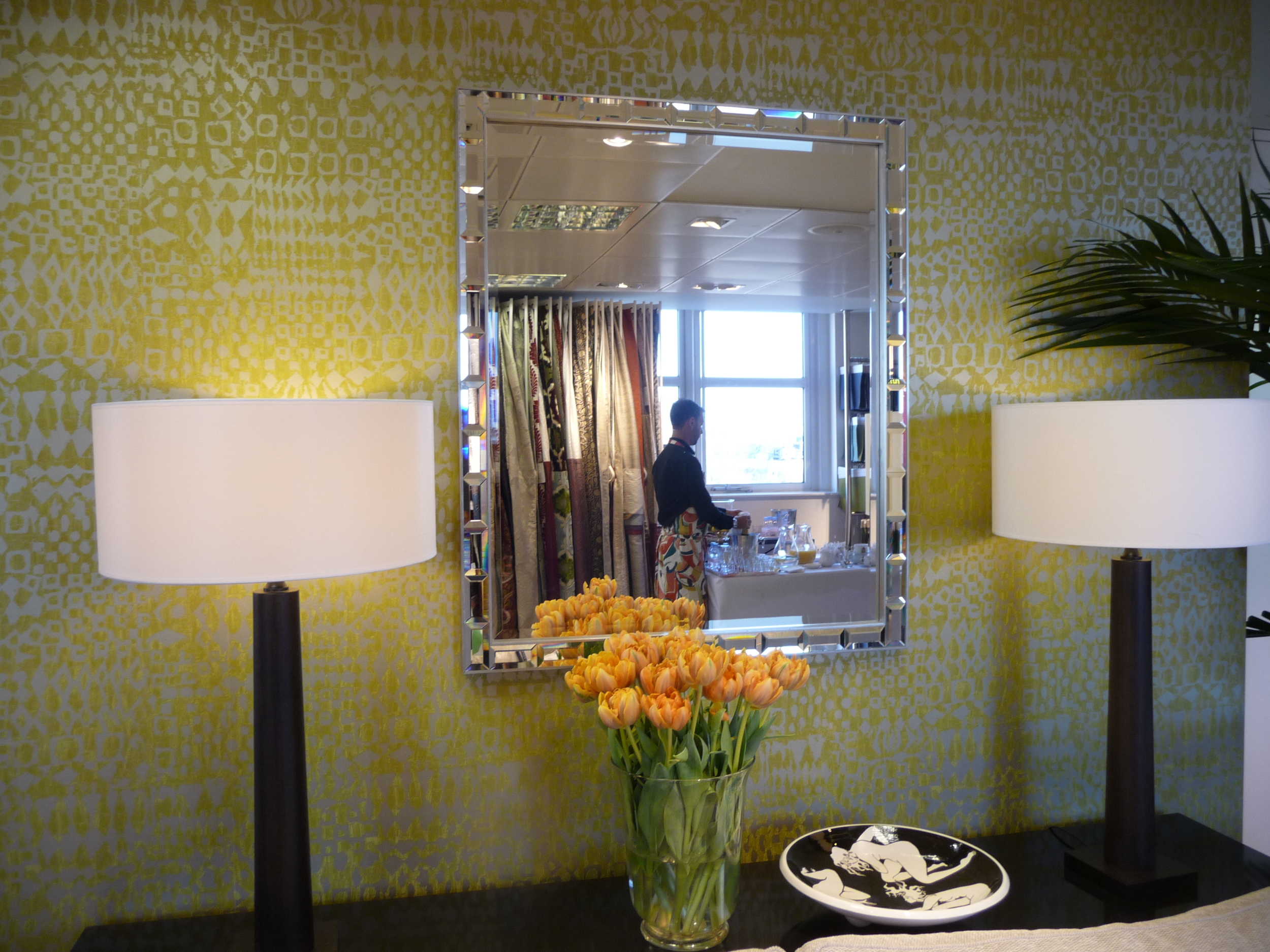
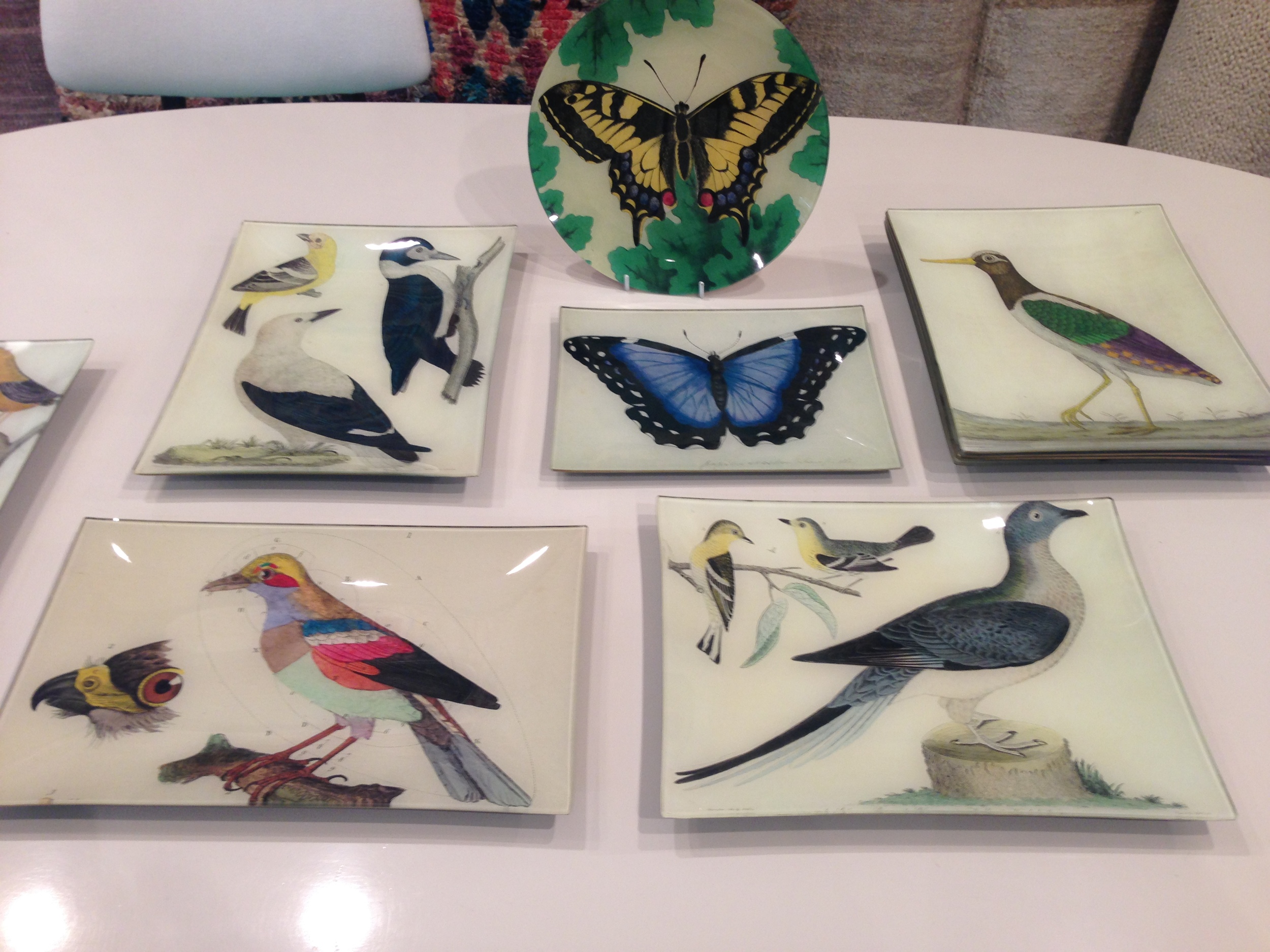
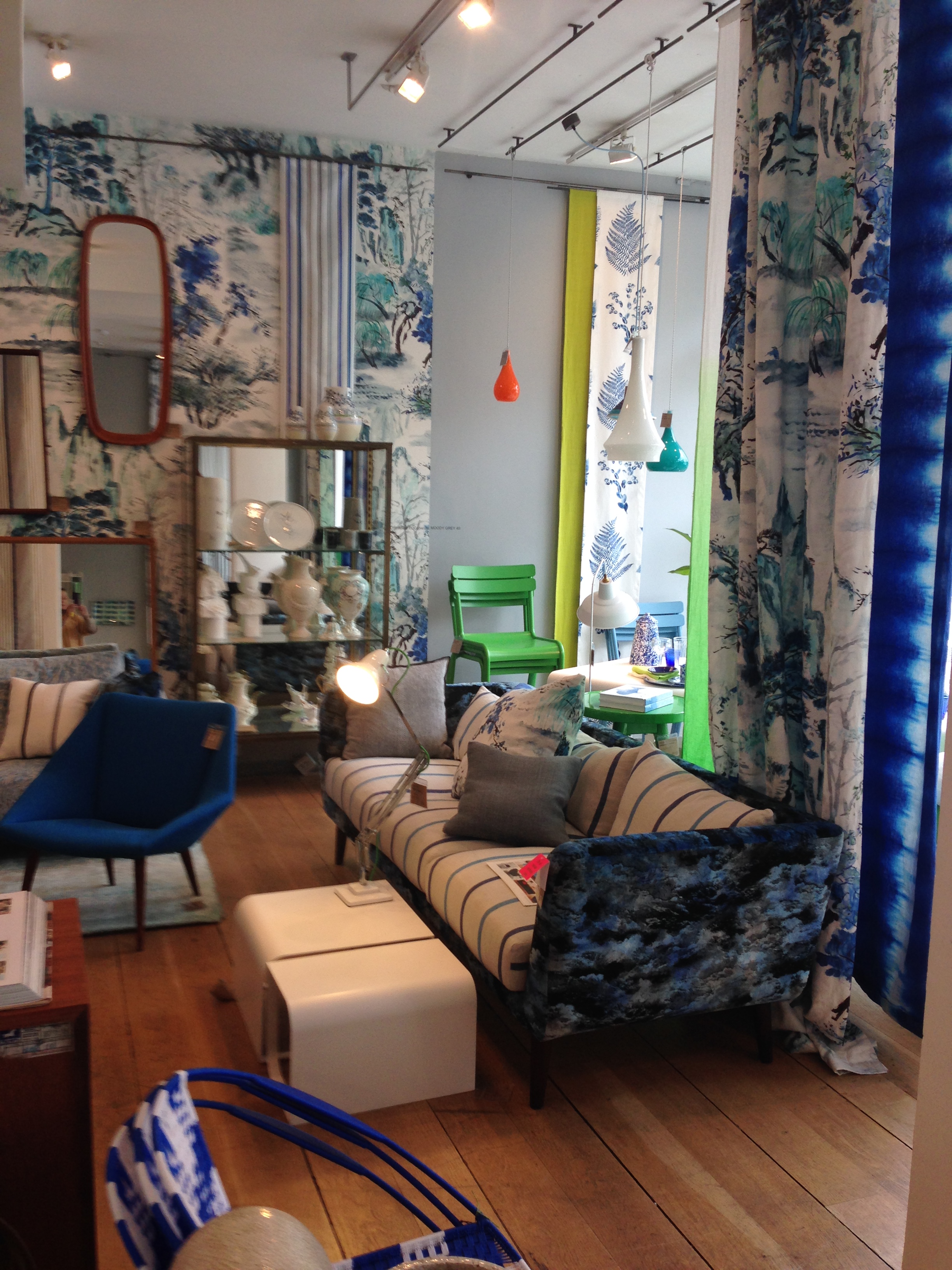
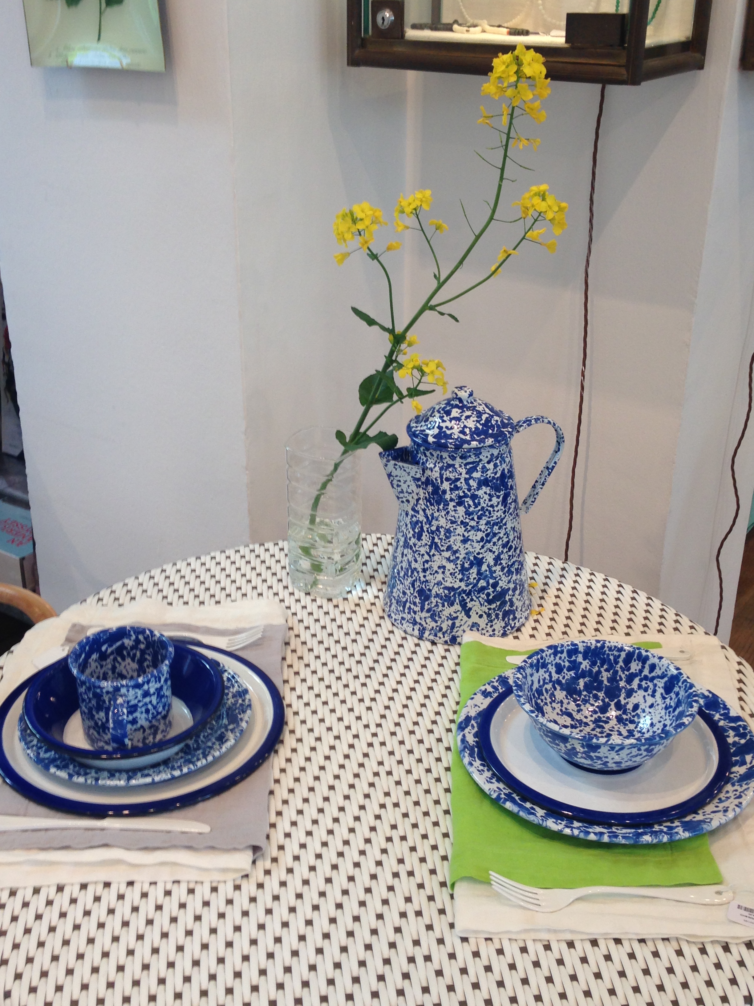
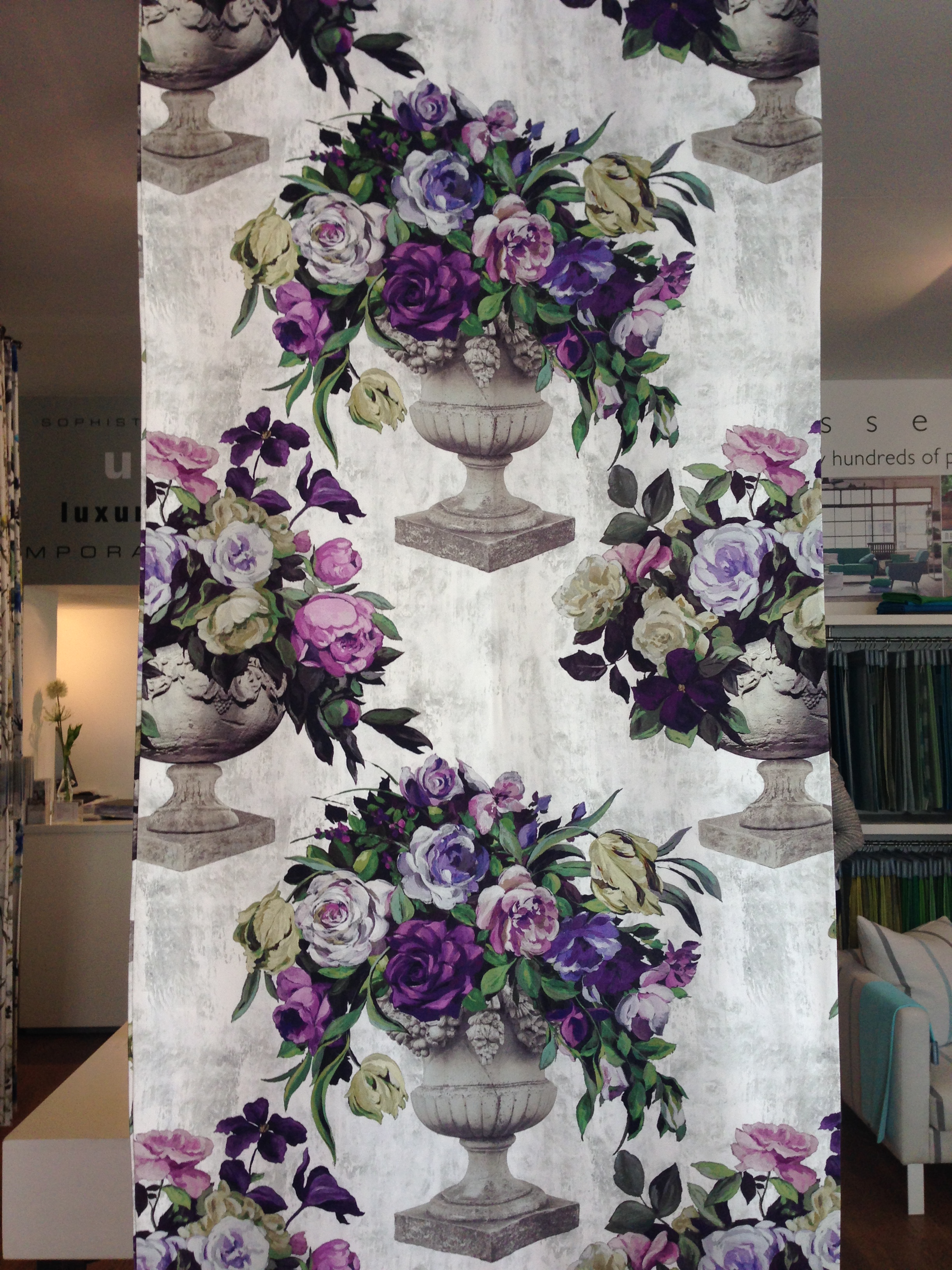
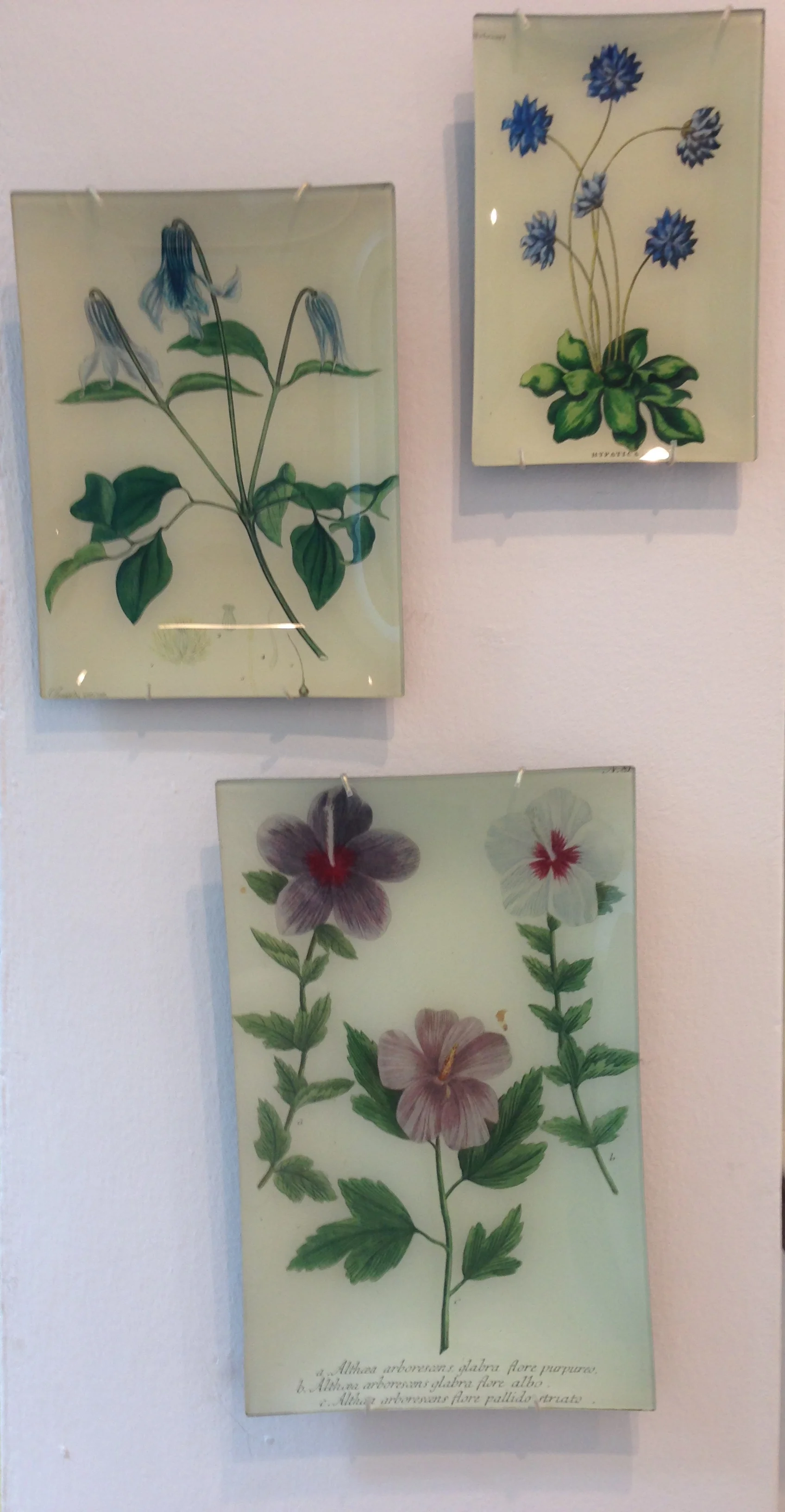
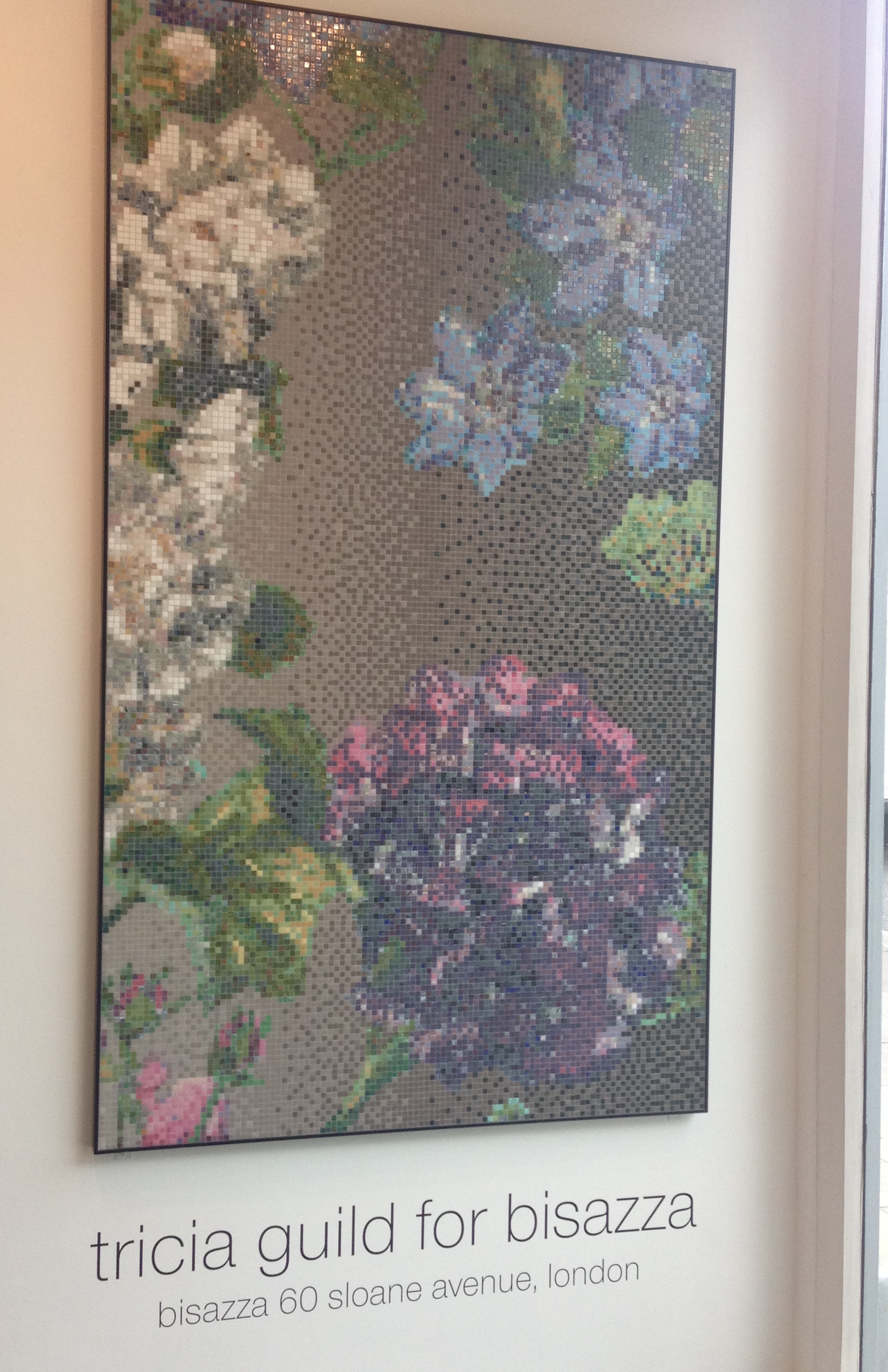
I love the way Juliet's flowers complement the beautiful surroundings of the Designers Guild showroom. The Designers Guild is  bit of a mecca for me as I always find inspiration especially on using colour and of course I usually end up buying one or two things! Below I've included a mix of images of Juliet's gorgeous flowers and Designers Guild items including fabric and wallpaper.  I hope the colours inspire you as much as they do me.


Seeking style inspiration?

If you’re working on your own home decorating project and looking for some inspiration, please get in touch and see how I can help. 

Spring slowly injects colour into my three square feet of outdoor space

Spring continues to slowly make its mark in my tiny outdoor space, all of three square feet outside the kitchen door and the steps leading down to the garden belonging to the flat downstairs.

It's been a pretty miserable May so far with a lot of rain and cold days. I've even had to use the central heating on a couple of occasions which is unheard of in May. Colour is so slow to appear in my outdoor space this year which is frustrating so I've resorted to buying some plants already in flower to inject some colour. 

I design and style my outdoor space in much the same way I do with interiors and usually apply similar principles - maximum of three colours per space, grouping colours, mixing up the textures to create interest, creating a focal point and I even use mirrors to reflect light and make the space seem larger. 

I am a huge fan of monochromatic garden schemes as they create such an impact but this year I've chosen to break the habit and have chosen pinks, blues and a splash of orange. And a random yellow poppy found its way into the scheme!! Blue flowers are superb for attracting bees and butterflies and my garden is no exception. 

I've even got a planter of rocket and fennel (the herb) which I've had for several years. The rocket is absolutely delicious and tastes so much better than the stuff you buy in supermarkets.  The fennel herb is very useful in fish dishes and many of Ottolenghi recipes.

I'd love to see photos of your own gardens and how you style them so do share your thoughts, comments and photos with me.


You might also like to read previous blog posts about my three square feet of outdoor space

An epidemic of grey interiors!

What is it about the colour grey and the current obsession with using it everywhere in the home (I admit that I've fallen foul of it myself!)?  I can accept that you might want to use it in one or two rooms but not a different shade of grey in every room, with little or no thought to  whether the room is sunny or dark and no pops of colour out of fear to introduce colour. Even the mirrors and light fittings are lacking in colour!

Don't get me wrong, I love the colour grey and a year ago I changed my sitting room walls from off-white to grey (Farrow & Ball's Cornforth White) and all the furniture, window dressing and accessories accordingly.   It's a very sunny room; with plenty of colour (purple and gold) in the furniture and accessories, the room does not feel clinical or cold.  Here are my sitting room before and after photos - transformation from beige to grey!

I manage a local interiors shop twice a week in which we sell up-cycled furniture.  It seems that most of our customers have some or all of their rooms painted in a shade(s) of grey (usually Farrow & Ball)! There is a definite "sheep" mentality going on where people are painting grey rooms because they've seen it in a friend's house and don't want to be left behind. They therefore want the furniture that they buy from us to also be painted in grey shades.  We therefore have moved away from painting furniture in the yellow or red based Farrow & Ball neutrals to the greys or colours with grey undertones.  These tend to be more contemporary than the traditional red and yellow based neutrals. There is a definite trend to transform homes into more contemporary spaces - open plan living, mid-century furniture, natural surfaces like concrete .....  However a lot of people are afraid to introduce colour and these grey interiors appear flat and dull.  What these interiors need are pops of yellow, orange, purple, turquoise, pink, red .... in fact any colour and what about a bit of that gilt to warm up the room in a mirror or chandelier?  

I always recommend to my clients when doing colour consultations that they start introducing colour with small items that can be removed/replaced easily such as cushions, flowers & plants, vases etc. There's nothing more beautiful than a bowl full of fresh lemons (and limes) to add a pop of colour to a grey interior.  I love colour and don't stick to rules, rather am guided by my gut instinct and my love of flowers (I find nature to be the best inspiration for how to use colour). It's very rewarding when I can convince a client to introduce some colour and to see their reaction to the way it has enhanced the room. Shock-horror followed swiftly by a broad smile. Warms the cockles of my heart to see these reactions!

If you are thinking of painting a room grey, think of what colour(s) you will use to complement the grey. For example, a grey with lilac undertones (Farrow & Ball 'Skimming Stone' or 'Elephant's Breath') looks superb with pops of purple, turquoise or pink. I recently painted my bathroom Elephant's Breath and have added pops of turquoise and purple in artwork, mirrors and towels.

Be a trail blazer, break the "sheep" mentality and be the first of your friends to introduce colour into your grey interior.  Trust me, you won't regret it. If you don't have the confidence to do it alone, I'm happy to help.  Give me a call or drop me a line.